Maps
Map your data
Let's plot the longitude and latitude data in our data set.
Creating a Map
-
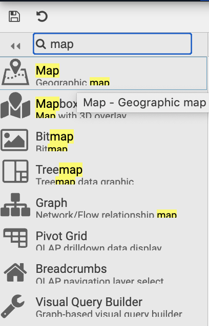
Start by selecting the Map option in the 'Search Components' pane on left hand side and dragging it into the Report
-
From there we can populate the right hand side menu starting in the section titled
Mapto begin with:- Here you can provide a Google Maps API Map Key
- Centralize the map on New York by adding
CenterX:40.75 andCenterY:-73.98
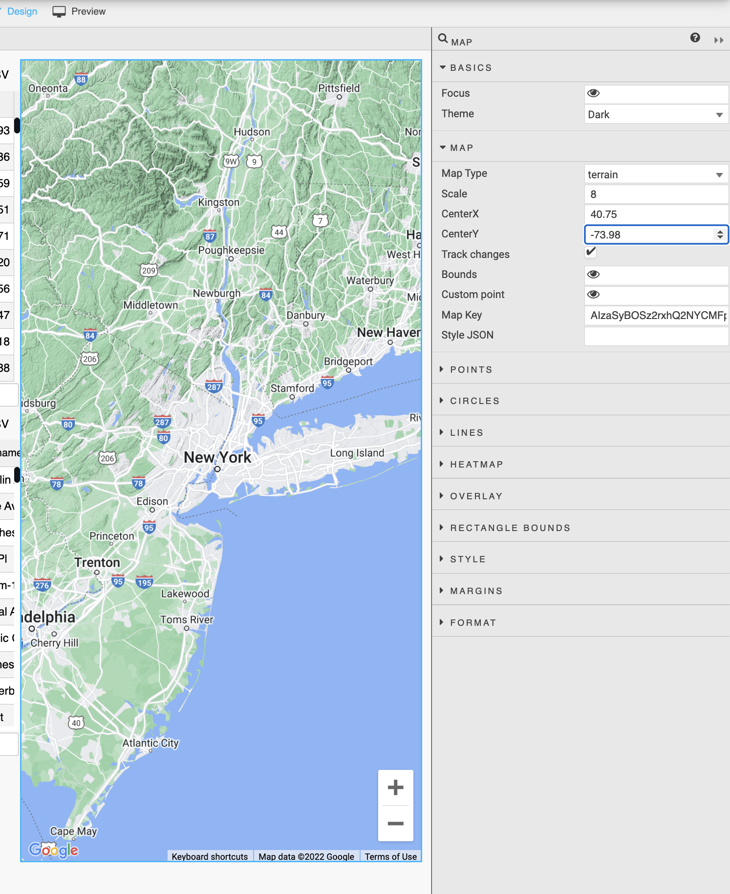
Now you have map of New York ready to plot the weather data onto.
-
Expand
Pointsin the right hand menu and selectData Source. You can add aggregations and groupings here to get your data ready for plotting. Change the following parameters:groupByto columnsnamesensorborough- Within
agg, selectGenerate View Stateand click your new View State. To get the last latitude and longitude values for these grouped columns, follow the input from the image below and clickSelect Itemto save: - Set
Selected Attr:name - Set
Latitude Data:lastlat andLongitude Data:lastlon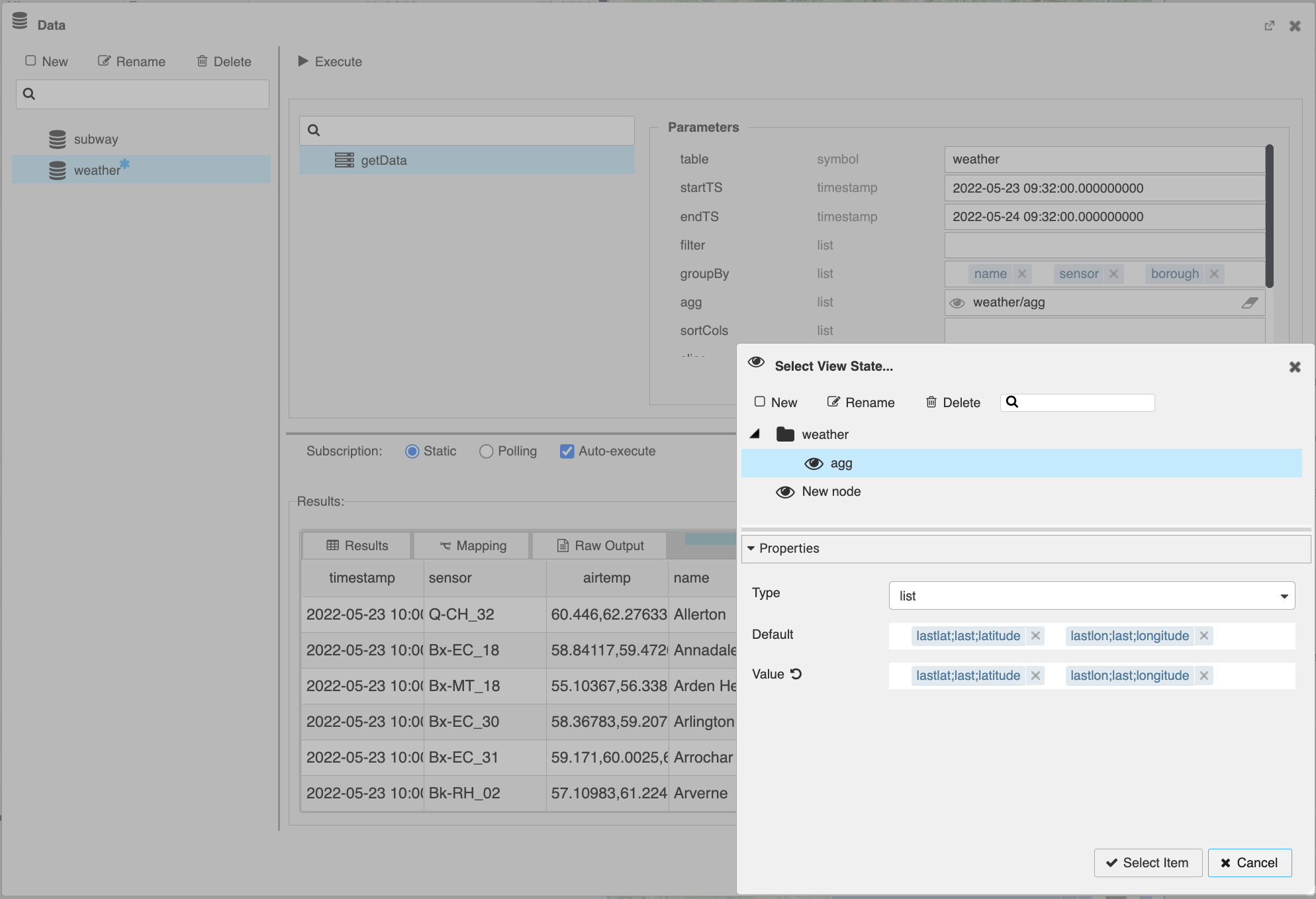
Remember to
:fontawesome-solid-check-circle: Click Apply and Select Item to save and connect the node to the widget
- Set Selected Attr:name
- Set Latitude Data:lastlat and Longitude Data:lastlon from the respective drop-downs
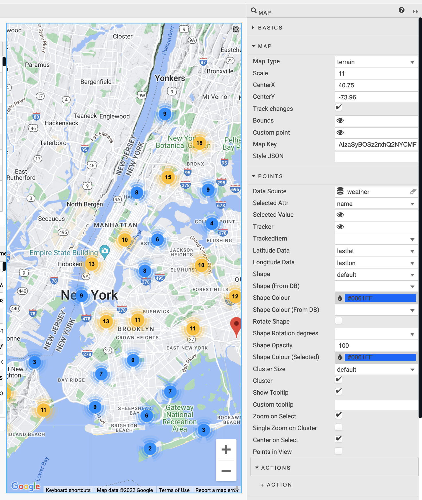
Fantastic! Now you have overlayed your weather geographic data on top of a map. This guides only touch on how to get started with Maps but we hope this will help with the initial stumbling points to continue creating insightful Reports!