Canvas Chart
A custom chart builder using HTML Canvas.
Set up
-
Add a layer, select the chart type from the dropdown.
-
Assign the data source to use.
-
Define the X-Axis ID and Y-Axis ID to plot from your data source
-
Add x axis and y axis labels, and set the Format for each axis.
-
Un-check OffsetGridLines to position a line at the zero value of the y-axis.
-
Use highlight rules to create a color differential in your displayed values; e.g. between positive and negative values.
-
Map view states to Min and Max Viewstate to track the viewable range of the chart.
Basics
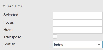
- Selected
- A View State Parameter to store the X-axis value at the selected position; e.g time or date
- Focus
- Linking
- Hover
- A View State Parameter which stores the X-axis value contingent on where the hover bar is on the chart; e.g. time or date
- Transpose
-
Check to switch data from Y- to X-axis and X- to Y-axis.
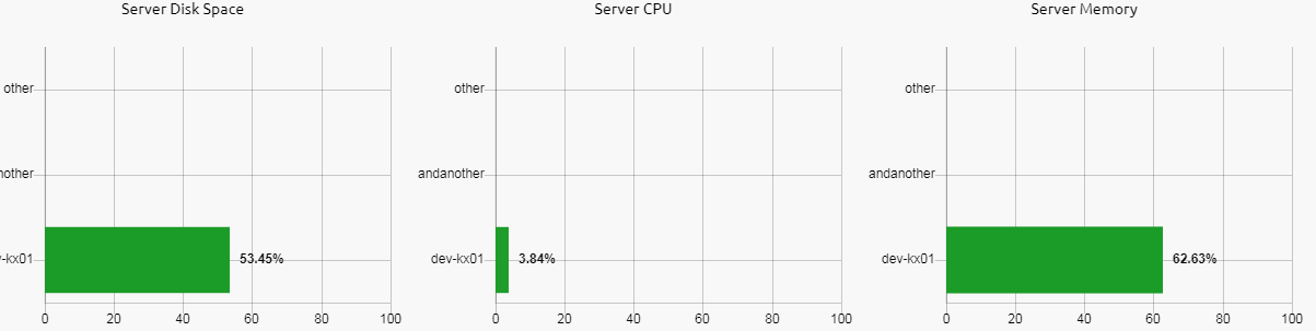
Horizontal Bar Chart
To create a Horizontal Bar Chart, create a standard Bar Chart but check the Transpose box.
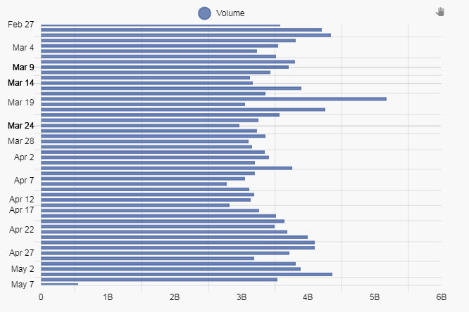
Note, there is no Zoom support for Horizontal Bar Chart.
- Sort By
- Defines the sort order for the x-axis, by either the data source index or the x-axis values
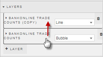
Layers
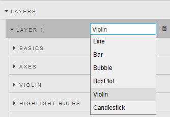
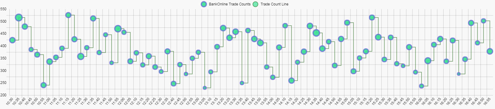
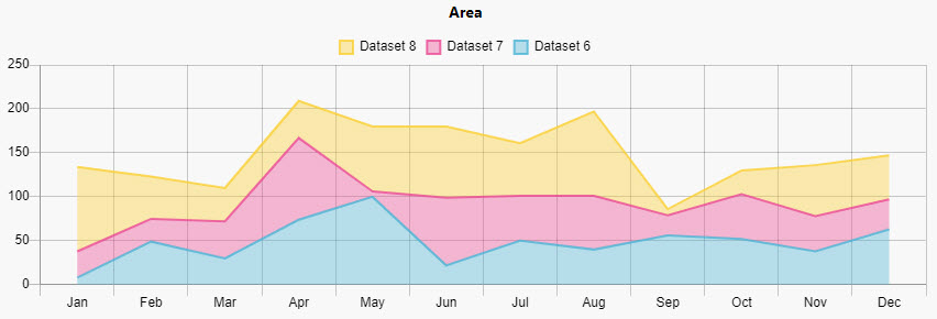
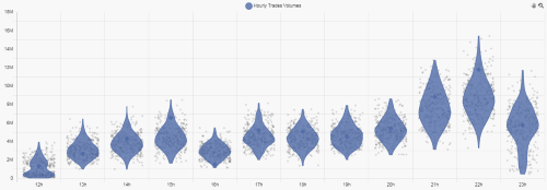
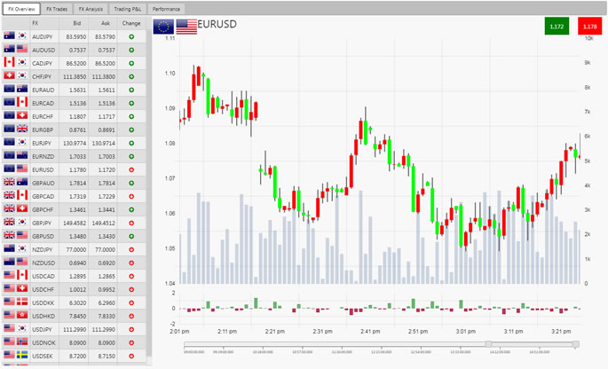
Create a Line, Bar, Bubble, Violin, Box Plot, Waterfall or Candlestick chart
Basics
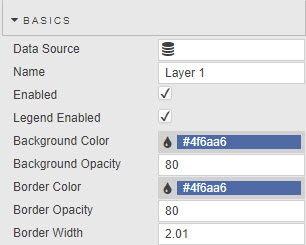
- Data Source
- Data sources
- Name
- Name used as the chart legend label
- Enabled
- Toggles display of the data layer on the chart. Can be tied to a View State Parameter.
- Legend Enabled
- Toggles display of data legend.
- Background Color
- Background Opacity
- Border Color
- Border Opacity
- Border Width
- Color, opacity and width for Line, Bar or Bubble charts; opacity has a value between 0 (transparent) and 100 (full opacity). Border Width is in pixels.
-
Line charts do not require Background Color or Background Opacity.
Change layer order
Use a click-and-drag to rearrange the orders of the layer on the chart. The last layer will be the top layer.
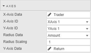
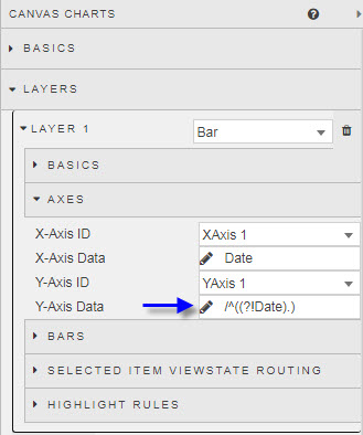
Axes
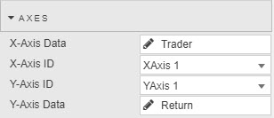
- X-Axis ID
- Select from defined Axes.
- X-Axis Data
- Select from Data source defined in Basics
- Y-Axis ID
- Select from defined Axes.
- Y-Axis Data
- Select from Data Source defined in Basics
- Radius Data
- Radius Scaling
- Select from Data Source the variable to define which attribute to use for bubble scaling, then adjust the scaling variable to define bubble size.
-
Radius
Radius Data and Radius Scaling are only used by Bubble charts. Values less than zero will not display on the chart.
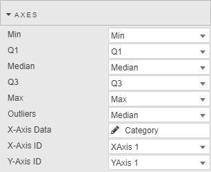
- Min
- Q1
- Median
- Q3
- Max
-
Used for Box Plot. Set column variables in order from lowest Min to highest Max
-
-
- Open
- Close
- High
- Low
- Used only by Candlestick charts; select data columns which correspond to each.
Interpolation
Relevant to Line layers only
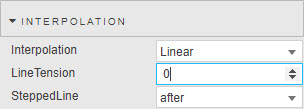
- Interpolation
-
Select from dropdown
type effect Linear 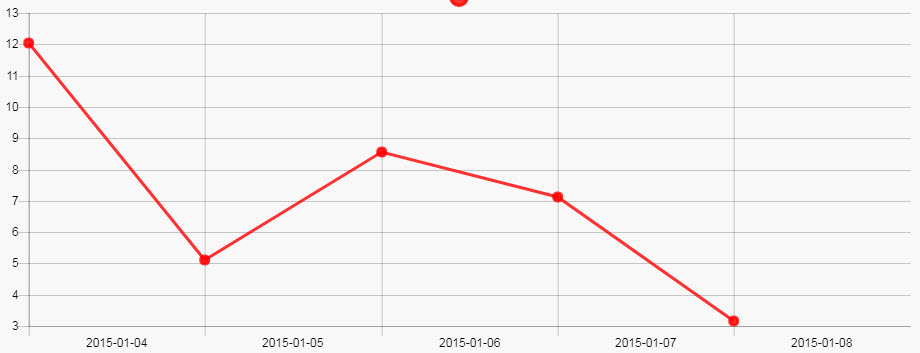
Cubic 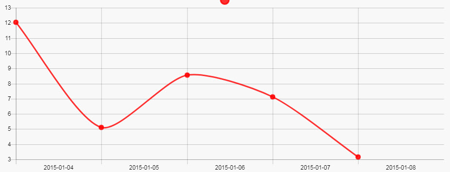 Also requires changes to Line Tension
Monotone 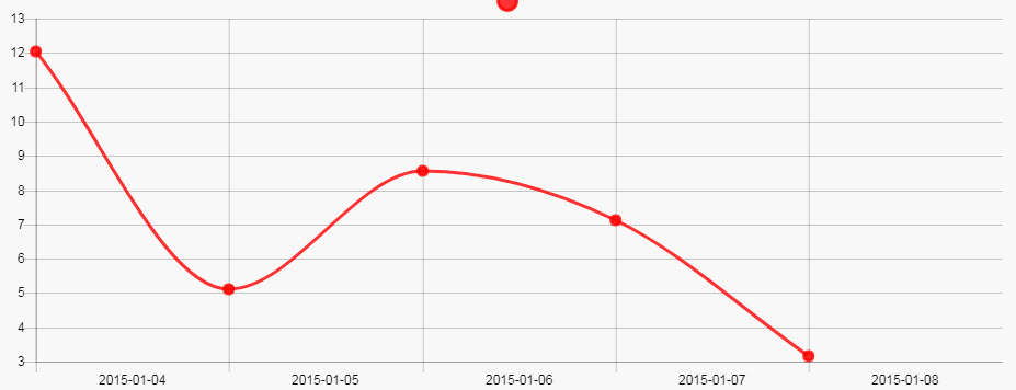
Stepped 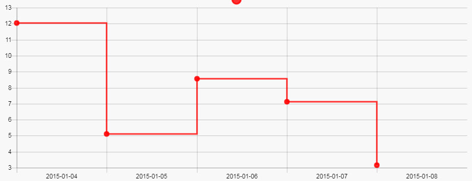
- Line Tension
- Inbuilt algorithm used to smooth curve from discrete data points for
Cubicline charts; integer value - SteppedLine
- Switch between Stepped chart types;
beforeandafter
Line
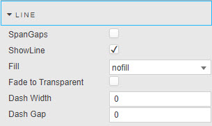
- Show Line
- Check to display / hide line chart
- SpanGaps
- Where there is missing data, check to connect isolated points
- Fade to Transparent
- Where a fill color is employed, a transparency gradient will be applied to the layer
- Fill
-
fill description nofillNo color fill Layer nFor color fill between charted line and selected layer. Uses BackgroundColor originFor color fill between chart line and X-axis +nFor color fill between current layer and nlayers below - Dash Width
- Dash Gap
- Convert from a solid to a dashed line.
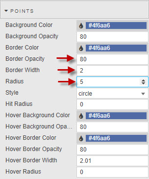
Points
Relevant to Line layers only
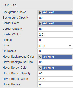
- Hit Radius
- Background Color
- Border Color
- Border Opacity
- Border Width
- Radius
- Background Opacity
- Define visual styling of line point; a PivotRadius of zero will hide the point.
- Style
- Choose between
cross,circle,crossRot,dash,line,rect,rectRounded,rectRot,star,triangle,downTriangle. - Hover Background Color
- Hover Background Opacity
- Hover Border Color
- Hover Border Opacity
- Hover Border Width
- Hover Radius
- Define visual style of line point rollover.
Bars
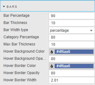
- Bar Width Type
- Dropdown select between
percentage,manual bar thickness - BarPercentage
- Category Percentage
- Defines width of bars, and intra-bar space when
percentageis selected. - Bar Thickness
- Max Bar Thickness
- Defines width of bar, and maximum width of bars (in pixels) when
manual bar thicknessis selected. - Hover Background Color
- Hover Background Opacity
- Hover Border Color
- Hover Border Opacity
- Hover Border Width
- Define visual style of bar rollover
Bubbles
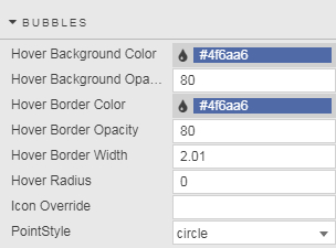
- Hover Background Color
- Hover Backgroun Opacity
- Hover Border Color
- Hover Border Opacity
- Hover Border Width
- Hover Radius
- Define visual style of bubble rollover
- Icon Override
- Define point style from a list of icons
- PointStyle
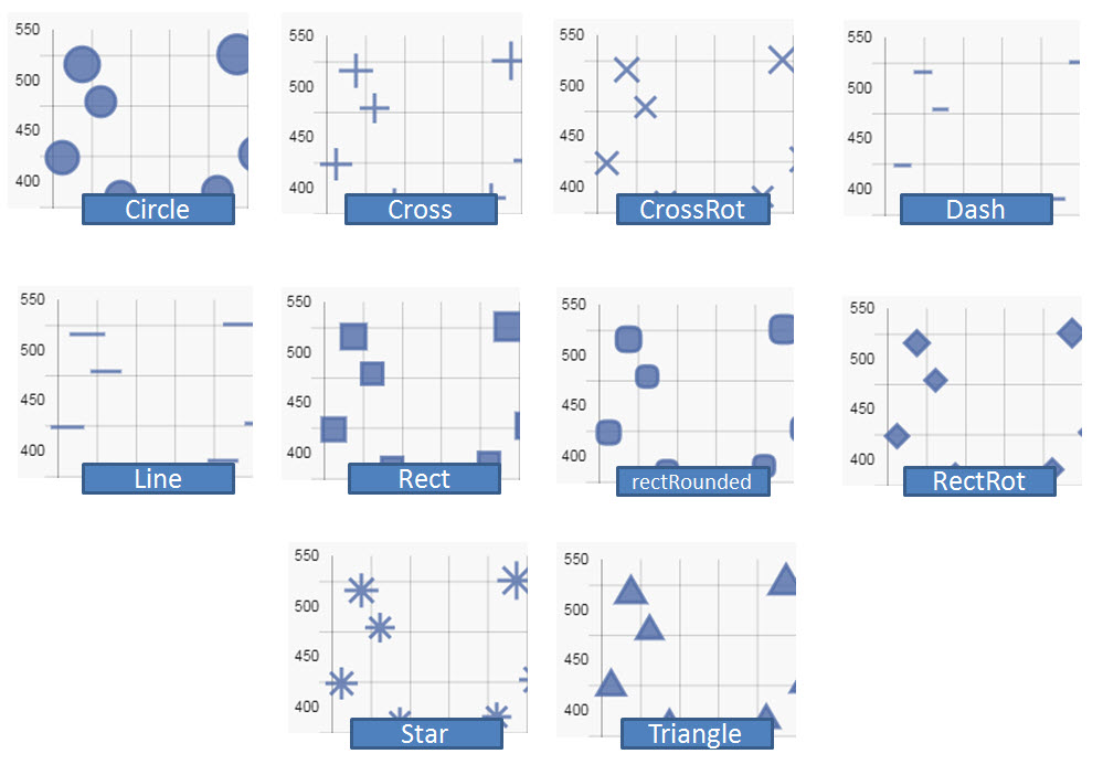
- Choose between
cross,circle,crossRot,dash,line,rect,rectRounded,rectRot,star,triangle.
Box Plot
- Hover Background Color
- Hover Backgroun Opacity
- Hover Border Color
- Hover Border Opacity
- Hover Border Width
- Define visual style of Box plot rollover
- Bar Width Type
- Dropdown select between
percentage,manual bar thickness - BarPercentage
- Category Percentage
- Defines width of bars, and intra-bar space when
percentageis selected. - Bar Thickness
- Max Bar Thickness
- Defines width of bar, and maximum width of bars (in pixels) when
manual bar thicknessis selected.
Violin
- Hover Background Color
- Hover Backgroun Opacity
- Hover Border Color
- Hover Border Opacity
- Hover Border Width
- Define visual style of Violin rollover
- Bar Width Type
- Dropdown select between
percentage,manual bar thickness - BarPercentage
- Category Percentage
- Defines width of bars, and intra-bar space when
percentageis selected. - Bar Thickness
- Max Bar Thickness
- Defines width of bar, and maximum width of bars (in pixels) when
manual bar thicknessis selected.
Candlestick
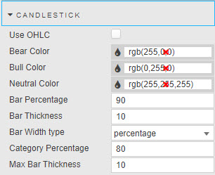
- Use OHLC
- Sets OHLC bar or candlestick
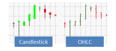
- Bear Color
- Set color for down day candles
- Bull Color
- Set color for up day candles
- Neutral Color
- Set color for flat days
- Border Color
- Set color of candlestick sides
- Bar Width Type
- Dropdown select between
percentage,manual bar thickness - BarPercentage
- Category Percentage
- Defines width of bars, and intra-bar space when
percentageis selected. - Bar Thickness
- Max Bar Thickness
- Defines width of bar, and maximum width of bars (in pixels) when
manual bar thicknessis selected.
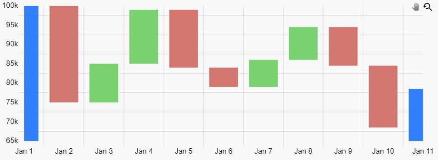
Waterfall
- Bar Increase Color
- Bar Decrease Color
- Define visual style of the Waterfall bar increase and decrease colours based on the previous bar value
Regex for Data
Regular Expressions can also be used to define Axes instead of a data source column. For example, a Y-axis plot to show all column data except the Date column:
Highlight rules
Line Chart
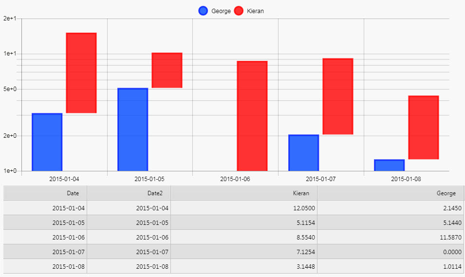
To display a Highlight Rule for a Canvas Line Chart, first set Radius above zero, then adjust Border Width. Highlights will only occur at points.
Action
Labels
-
Data labels can be added to any layers and will place labels next to datapoints/bars as desired. The options for this are as follows.
- Enabled
- Turns on or off data labels, can be tied to viewstate.
- Label Color
- Color of Label Text
- Label Frequency
- Label will be applied to every nth data point where n is the label frequency.
- Align
-
The align option defines the position of the label relative to the anchor point position and orientation. Its value can be expressed either by a number representing the clockwise angle (in degree) or by one of the following string presets:
position description centerThe label is centered on the anchor point (default). startThe label is positioned before the anchor point, following the same direction endThe label is positioned after the anchor point, following the same direction rightThe label is positioned to the right of the anchor point (0°) bottomThe label is positioned to the bottom of the anchor point (90°) leftThe label is positioned to the left of the anchor point (180°) topThe label is positioned to the top of the anchor point (270°) -
The offset represents the distance (in pixels) to pull the label away from the anchor point. This option is not applicable when align is 'center'. Also note that if align is 'start', the label is moved in the opposite direction. The default value is 4.
- Anchor
- An anchor point is defined by an orientation vector and a position on the data element. The orientation depends on the scale type (vertical, horizontal or radial). The position is calculated based on the anchor option and the orientation vector.
-
Supported values for anchor:
anchor description centerElement center (default) startLowest element boundary endHighest element boundary - Offset
- The offset represents the distance (in pixels) to pull the label away from the anchor point. This can be specified as a single number (e.g. 4) or an x,y coordinate (e.g. 4,10).
- Label Rotation
- This option controls the clockwise rotation angle (in degrees) of the label, the rotation center point being the label center. The default value is 0 (no rotation)
- Label Show Overlap
- The display option can be used to prevent overlapping labels.
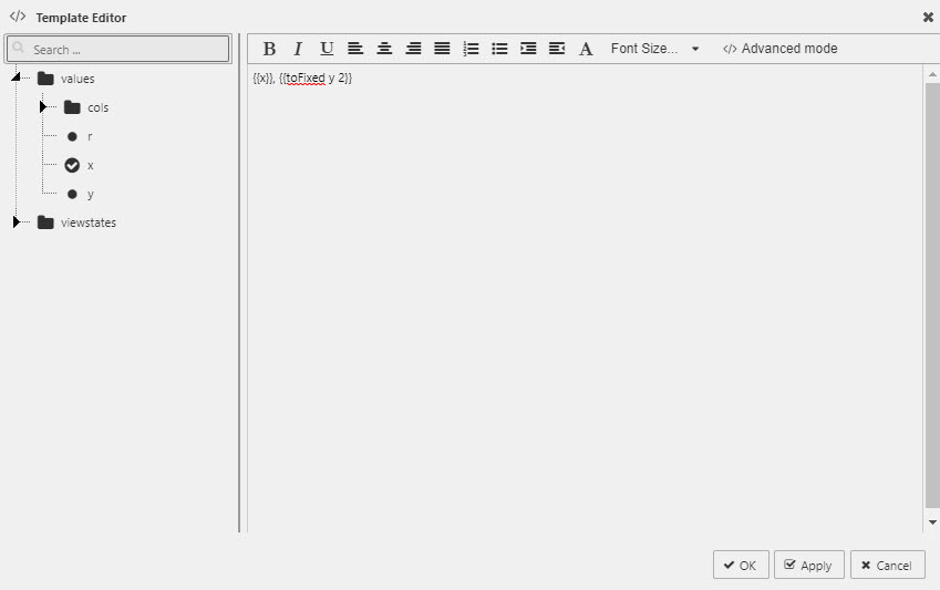
- Label Template
- Define data to display
Must return a string, HTML not supported.
Select data to display with the Template Editor - Basic or Advanced mode. Existing data and view states can be displayed. Handlebar helpers can be used for formats.
- Font -> Bold
- Makes Label bold
- Font -> Size
- Adjust font size in px.
X axes
Click  to add additional X-axis labels
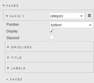
XAxis n
Dropdown menu to select axes type between category, linear, logarithmic and time. Available properties contingent on selected axis type.
- Display
- Check to display X-axis labels
- Stacked
-
When using a
barchart, bars will be stacked.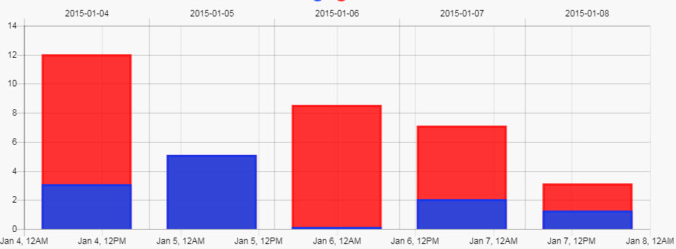
- Position
- Defines axes position; select between
topandbottomof chart area for X axes. - Center
- For
linearselection, center axis at defined value.
Gridlines
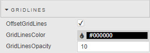
- OffsetGridLines
- Check to shift charted category data from centre alignment to left-alignment
- GridLinesColor
- GridLinesOpacity
- Define visual style of chart gridlines; opacity has a value between 0 (transparent) and 100 (opaque).
Title
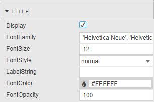
- Display
- Check to display X-axis description label
- LabelString
- Descriptive level for X axis
- FontFamily
- FontSize
- FontStyle
- FontColor
- Font Opacity
- Set font styling parameters for X-axis label. Opacity has a value between 0 (transparent) and 100 (opaque).
Labels
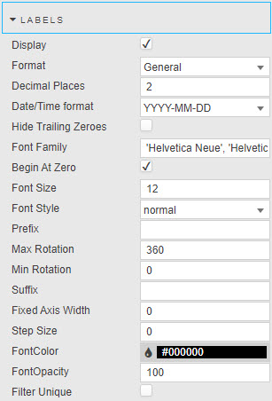
Configure X-axis tick labels
- Display
- Check to display X-axis labels
- Begin at Zero
- X-axis includes zero when enabled; otherwise chart will fit available data. Available for non-
timeaxis selections. - Reverse
- Reverses order of chart axis. Available for
linearandlogarithmicaxis selections. - Offset
- For
linearandtimeselection, adds buffer to start and end of chart to display in full, the first and last data point. - Hide Trailing Zeroes
- Do not display zeroes at the end of numeric data. Available for
linearandlogarithmicaxis selections. - Format
- Format of Y axis:
General,Number,Smart Number, orDatetime. Available for non-timeaxis selections. - Decimal Places
- Precision of numeric data for
NumberandSmart Number. Available for non-timeaxis selections. - Date/Time Format
- Where
Datetimeis selected, define time format to use:YYYY-MM-DD,YYYY-MMM-DD,YYYY-MMMM-DD,YYYY-MM,YYY-MMM,YYYY-MMMM,MMM-DD,MMM Do,YYY-MM-DD HH:mm:ss,YYYY-MM-DD hh:mm:ss,YYYY-MM-DD kk:mm:ss,hh:mm:ss,kk:mm:ss,hh:mm:ss:SS,mm:ssormm:ss:SS. Available for non-timeaxis selections. - Min Rotation
- Max Rotation
- Adjust alignment of tick labels
- Fixed Axis Width
- Defines distance between Canvas Chart component edge and axis. Useful when aligning neighboring charts.
- Step Size
- Sets the grid-line distance between tick labels (numeric).
- Prefix
- Suffix
- Character text added before or after label; e.g. a
$prefix or a%suffix. Available for non-timeaxis selections. - Font Family
- Font Size
- Font Style
- Font Color
- Font Opacity
- Select font for use in axis labels. Choice of font style between
normal,italic,oblique,initialandinherit. Opacity is a value between 0 (transparent) and 100 (opaque). - Filter Unique
- Removes duplicate labels when present in the data for
categorydata.
Time Formats
Time Formats for when X-Axis set to time
Match the required time format for time-based X-axis data.
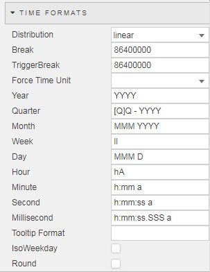
- Distribution
- Break
- TriggerBreak
Smart,LinearorSeriesdefinition.Smartdistribution collapses time to remove null time intervals; e.g. between marked trading hours- Force Time Unit
-
Select from
year,quarter,month,week,day,hour,minute,second,millisecond, as defined in the following parameters.parameter default YearYYYYQuarter[Q]Q - YYYYMonthMMM YYYYWeekIIDayMMM DHourhAMinuteh:mm aSecondh:mm:ss aMillisecondh:mm:ss SSS a - Tooltip Format
- currently not in use (replaced by aforementioned options)
- IsoWeekday
- Use ISO weekday format for X-axis time display
- Round
- Round time to the nearest Force Time Unit scale.
- Show Major units
- If true, major ticks are generated. Each major tick represents a new parent time period (based on the child minor ticks). Minor ticks are shown by default.
Range
Available for linear and logarithmic axis types.
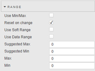
Use data boundaries to define X-axis range
- Use Min/Max
- Defines axis range by minimum and maximum values in plotted data
- Reset on Change
- When Min/Max is set as a boolean control and Soft Range is enabled, will re-scale axis when Min/Max is true.
- Use Soft Range
- Best fit within a suggested Min and Max value; e.g. for dynamic range charts
- Use Data Range
- Use existing data to define Min/Max range. Uncheck to manually set.
- Suggested Min
- Suggested Max
- Will best fit chart by Suggested Min/Max values.
- Min
- Max
-
Define minimum and maximum values to chart.
Hard range
Charted data outside of the set Min and Max range will not be displayed. If all data falls outside the set range, the chart will be blank.
- Use Soft Range
- Best fit within a suggested Min and Max value; e.g. for dynamic range charts
Y axes
Add multiple Y-axes by clicking 
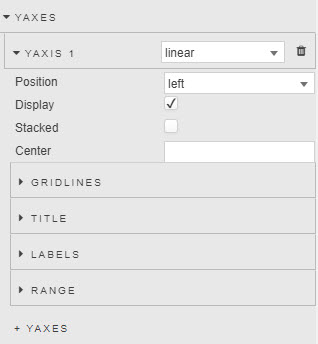
YAxis n
Dropdown menu to select axes type between category, linear, logarithmic and time. Available properties contingent on selected axis type.
- Display
- Check control to display Y-axis labels
- Stacked
-
Check control to parse bars in a Y-axis stack
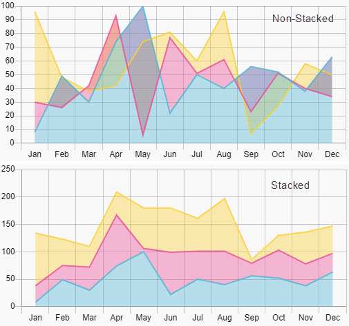
Stacked Y-axis with Line Fill
Stacking stacks lines in numeric order. Line 1 will be the first (highest) line down to the last and lowest line, closest to origin X-axis. Line fill will change accordingly. For example, a line fill with or without Y-axes stacking enabled:
- Position
- Position Y-axis label to the
leftorrightof chart area. - Center
- Set center value for
linearY-axis.
Gridlines
- OffsetGridLines
- Shift charted category data from center alignment to left-alignment
- GridLinesColor
- GridLinesOpacity
- Visual style of gridlines
Title
- Display
- Check to display X-axis description label
- LabelString
- Label description
- Font Family
- Font Size
- Font Style
- Font Color
- Font Opacity
- Select font for use in axis labels. Choice of font style between
normal,italic,oblique,initialandinherit. Opacity has a value between 0 (transparent) and 100 (opaque).
Labels
- Display
- Display Y-axis labels
- Begin at Zero
- Axis data starts at zero. Available for non-
timeaxis selections. - Reverse
-
Reverse order of labels from bottom-up to top-down. Available for
linearandlogarithmicaxis selections.
- Offset
- For
linearandtimeselection, adds buffer to start and end of chart to display in full, the first and last data point. - Hide Trailing Zeroes
- Do not display zeroes at the end of numeric data.
- Format
- Format of Y axis:
General,Number,Smart Number, orDatetime. Available for non-timeaxis selections. - Date/Time Format
- Where
Datetimeis selected, define time format to use:YYYY-MM-DD,YYYY-MMM-DD,YYYY-MMMM-DD,YYYY-MM,YYY-MMM,YYYY-MMMM,MMM-DD,MMM Do,YYY-MM-DD HH:mm:ss,YYYY-MM-DD hh:mm:ss,YYYY-MM-DD kk:mm:ss,hh:mm:ss,kk:mm:ss,hh:mm:ss:SS,mm:ssormm:ss:SS. Available for non-timeaxis selections. - Decimal Places
- Precision of numeric data for
NumberandSmart Number. Available for non-timeaxis selections. - Min Rotation
- Max Rotation
- Rotation of y-axis labels.
- Fixed Axis Width
- Distance between Y axis and the edge of the component (used when making room for Y-axis labels).
- Step Size
- Sets the grid-line distance between tick labels (numeric).
- Prefix
- Suffix
- Character text added before or after label; e.g. a
$prefix or a%suffix. Available for non-timeaxis selections. - Font Family
- Font Size
- Font Style
- Font Color
- Font Opacity
- Font qualities; style, size, color and opacity for the axis label.
Range
Available for linear and logarithmic axis types.
Use data boundaries to define the X-axis range
- Use Min/Max
- Defines axis range by minimum and maximum values in plotted data
- Reset on Change
- When Min/Max is set as a boolean control and Soft Range is enabled, will re-scale axis when Min/Max is true.
- Use Soft Range
- Best fit within a suggested Min and Max value; e.g. for dynamic range charts.
- Use Data Range
- Use existing data to define Min/Max range. Un-check to manually set.
- Suggested Min
- Suggested Max
- Will best-fit chart by Suggested Min/Max values.
- Min
- Max
-
Define minimum and maximum values to chart.
Hard range
Charted data outside of the set Min and Max range will not be displayed. If all data falls outside the set range, the chart will be blank.
Animations
Transition animations when switching data in chart
- Enable
- Check to enable animations
- Hover Events
- By default the chart highlights all bubbles, points and bars that lie along the same x-axis. You can toggle this setting to disable highlighting on the chart. Crosshairs and Tooltips will still function the same. This option should also be checked in charts with large amounts of data, as it will decrease the number of times the chart will have to update while hovering.
- Interaction Mode
- Hovering Mode gives you the option of changing the way the chart highlights points. By default (x), points with the same x value will also be highlighted. You can change with to (y) where points with the same y value will get highlighted, dataset where the entire dataset will be highlighted, or point where only points you are hovering over will be highlighted.
Overlay
Defines use of tooltips and their positioning
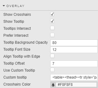
- Show Crosshairs
- Show Tooltip
- Check to show crosshair and tooltip on chart.
- Tooltips Intersect
- When intersect is selected, only bubbles, points or bars that are hovered over are shown in a potential tooltip. Lines do not count as points and will not trigger a tooltip, therefore line points must have a radius in order to be hoverable.
-
Due to limitation of the chart engine, highlight always appears based on the x-axis location
- Tooltips Prefer Intersect
- When tooltip prefer intersect is selected, the tooltip will try populate itself with things that are being hovered on. If nothing is being hovered on, the tooltip will populate with items in the closest x-value.
- Set visual criteria for tooltip; intersect places tooltip at crosshair.
- Crosshairs Color
- Define color for crosshair line.
- Tooltip Background Opacity
- Opacity of Tooltip Background.
- Tooltip Font Size
- Fontsize in px of Tooltip Text.
- Align Tooltip with Edge
- Enable to position tooltip along left chart axis.
- Use Custom Tooltip
- Custom Tooltip
-
Examples:
<table> <thead> <tr style="padding-right: 10px;"> <th> {{xLabel}} </th> <th/> </tr> </thead> {{#each points}} <tr> <td> <svg height="12" width="12"> <rect height="12" width="12" style="fill: {{colors.backgroundColor}}; stroke-width: 3; stroke: {{colors.borderColor}};" /> </svg> {{layerName}}: </td> <td style="padding-right: 10px; text-align: left;"> {{layerData}} </td> </tr> {{/each}} </table>-
To group together layers with the same name, modify the template as follows:
<table> <thead> <tr style="padding-right: 10px;"> <th>{{ xLabel }}</th> </tr> </thead> {{#groupByLayer}} {{#each layers }} <tr> <td> <svg height="12" width="12"> <rect height="12" width="12" style="fill: {{colors.backgroundColor}}; stroke-width:3; stroke: {{colors.borderColor}};"> /> </svg> {{ layerName }}: </td> {{#each layerPoints}} <td style="text-align: left;"> {{data}} </td> {{/each}} </tr> {{/each}} {{/groupByLayer}} </table>-
To display selected layers, set the
namesattribute in#filterLayersto a comma-separated list of layers to display; for example, to showLayer 1andLayer 3use:
<table>
  <thead>
    <tr style="padding-right: 10px;">
      <th> {{xLabel}} </th>
      <th/>
    </tr>
  </thead>
  {{#filterLayers names="Layer 1,Layer 3"}}
    {{#each points}}
      <tr>
        <td>
          <svg height="12" width="12">
            <rect height="12" width="12"
              style="fill: {{colors.backgroundColor}};
                stroke-width: 3; stroke: {{colors.borderColor}};" />
          </svg>
          {{layerName}}:
        </td>
        <td style="padding-right: 10px; text-align: left;">
          {{layerData}}
        </td>
      </tr>
    {{/each}}
  {{/filterLayers}}
</table>
- Crosshairs Color
- Define hex color code reference for crosshair color.
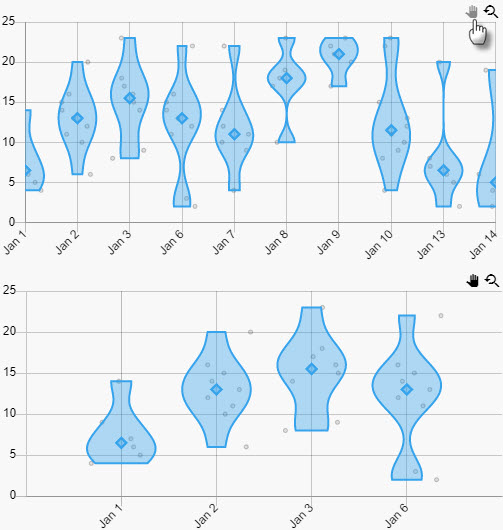
Zoom & Pan
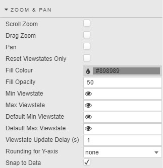
- Scroll Zoom
- Drag Zoom
- Pan
-
Check to enable respective behaviors. Pan and Drag Zoom are both triggered by mouse movement, therefore icons in the top right corner of the chart appear allowing you to toggle between the two. Scroll zoom is activates with mouse wheel movement.
Zoom and pan
A pan is typically done after a zoom when there is data ‘off screen’ to see. To pan, click on the hand icon in the top-right of the chart.
- Reset Viewstates Only
- Check to reset only Min/Max Viewstates this prevents the values of the viewstates being passed into the chart. This can be used for server side zooming, where additional aggregation occurs on the server to return the correct resolution of data.
- Fill color
- Fill Opacity
- Color and opacity of highlight zoom region
- Min Viewstate
- Max Viewstate
- View State Parameters for range values made on adjustment in the chart
- Default Min Viewstate
- Default Max Viewstate
- Default View State Parameters min and max range for when a chart loads.
- Viewstate Update Delay
- Length of time (in seconds) between when an adjustment in chart viewable area is then passed to Min/Max Viewstates. This only occurs for panning and scroll zooming, drag zoom's values are passed to the viewstates instantaneously .
- Snap to Data
- Selection will move to nearest valid data point
- Rounding for Y-axis
- Select
none,niceormin/max. Best fits y-axis scale according to data range of zoomed data.
Legend
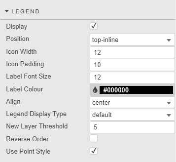
Defines the data legend labels
- Display
- Toggle to display chart labels.
- Position
- Define where Legends are set:
bottom,top,left,rightortop-inline. - Icon Width
- Icon Padding
- Set parameters of the area used to display Legends; width controls point size.
- Label color
- Label Font Size
- Define Style of Legend text.
- Align
- Set position of Legends, choose between
start,centerorend. - Legend Display Type
- Select between
default,scroll,layer grouporlayer new line; layer groups and lines will aggregate legends where wild card is used in the layer. - New Layer Threshold
- Define the number of items to display per
layer new lineof Legend Display Type. - Reverse Order
- Reverses order of labels from left-to-right to right-to-left.
- Use Point Style
- Enable use of chart points or use block color.
Legends toggle display
Users can click on legends to toggle display of the corresponding chart data. Hidden data is marked with strikethrough on its legend/s.