Treeview
An interactive tree used for navigation, integrated with view state parameters
Basics
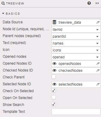
- Data Source
- The TreeView data source should include integer data columns for Node Id and Parent node, and a text label column.
- Data sources
- Node ID
- The data source column of unique integer values for each folder and item in the TreeView. Node IDs are used to define which items are checked, opened or selected. This is a required column
- Parent nodes
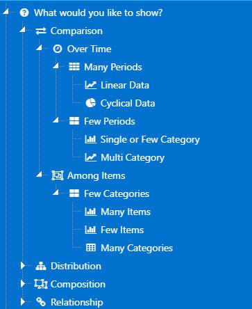
- A data source column which defines the TreeView layout. Start by defining which nodes are to be part of the top level directory; these are assigned a null value based on the kdb type used. Each node sharing a value will be part of same level; for example, the top level of an integer based hierarchy treeview must have a
Parent nodesvalue of0Ni; the next level in the TreeView would use aParent nodevalue of1ietc. Nested items in a tree should all be assigned the sameParent nodevalues. This is a required column. - For example, Parent Nodes defined by
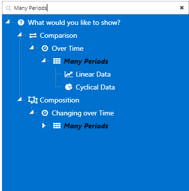
parentId(null values are underlined, with an alternative date type hierarchy given inparentId2) in the following query: ([] id:(1;2;3;4;5;6;7;8;9;10;11;12;13;14;15;16;17;18;19;20;21;22;23;24;25;26;27;28;29;30;31;32;33;34;35;36;37;38;39;40;41;42;43;44;45;46;47;48;49;50;51;52;53;54;55;56;57;58;59;60;62); parent:(0n;1;1;1;1;2;2;6;6;7;8;8;9;9;10;10;3;3;3;3;17;17;4;4;23;23;23;24;24;28;28;29;29;5;5;5;0n;37;37;37;37;37;37;37;37;37;37;0n;48;49;49;49;49;49;48;55;48;57;10;37;37); level:(1 2 2 2 2 3 3 4 4 4 5 5 5 5 5 5 3 3 3 3 4 5 3 3 4 4 4 4 4 5 5 5 5 3 3 3 1 2 2 2 2 2 2 2 2 2 2 1 2 3 3 3 3 3 2 3 2 3 5 2 2); name:( "What would you like to show?";"Comparison";"Distribution";"Composition";"Relationship";"Over Time";"Among Items";"Many Periods";"Few Periods";"Few Categories";"Linear Data";"Cyclical Data";"Single or Few Category";"Multi Category";"Many Items";"Few Items";"Single Variable";"Two Variables";"Three Variables";"Four Variables";"Few Data Points";"Many Data Points";"Static";"Changing over Time";"Simple Share of Total";"Simple Share Grouped";"Accumulation or substraction to total";"Few Periods";"Many Periods";"Only Relative Differences Matter";"Relative and Absolute Differences Matter";"Only Relative Differences Matter";"Relative and Absolute Differences Matter";"Two Variable";"Three Variables";"Four Variables";"Visual by Components";"Canvas Chart";"Chart GL";"3D Charts";"Vega Charts";"Contour Charts";"Sunburst";"BiPartite Chart";"Graph";"Radial";"Treemap";"Features";"Interactive Features";"Pivot Queries";"Viewstates";"Zoom";"Hover";"Tooltips";"Regex";"Wildcard Columns";"Customisation";"Highlight Rules"; "Many Categories";"Financial Chart";"Sparklines Grid"); icon:("fa fa-question-circle";"fa fa-exchange";"fa fa-sitemap";"fa fa-object-ungroup";"fa fa-link";"fa fa-clock-o";"fa fa-object-group";"fa fa-th";"fa fa-th-large";"fa fa-th-large";"fa fa-line-chart";"fa fa-pie-chart";"fa fa-bar-chart";"fa fa-line-chart";"fa fa-bar-chart";"fa fa-bar-chart";"fa fa-circle";"fa fa-ellipsis-h";"fa fa-area-chart";"fa fa-cubes";"fa fa-bar-chart";"fa fa-line-chart";"fa fa-bolt";"fa fa-clock-o";"fa fa-pie-chart";"fa fa-th";"fa fa-sitemap";"fa fa-th-large";"fa fa-th";"fa fa-bar-chart";"fa fa-bar-chart";"fa fa-area-chart";"fa fa-area-chart";"fa fa-ellipsis-h";"fa fa-circle";"fa fa-cubes";"fa fa-tachometer";"fa fa-bar-chart";"fa fa-ellipsis-h";"fa fa-cubes";"fa fa-line-chart";"fa fa-globe";"fa fa-sun-o";"fa fa-area-chart";"fa fa-sitemap";"fa fa-pie-chart";"fa fa-tree";"fa fa-hand-pointer-o";"fa fa-cogs";"fa fa-table";"fa fa-eye";"fa fa-search-plus";"fa fa-mouse-pointer";"fa fa-tag";"fa fa-asterisk";"fa fa-bar-chart";"fa fa-cog";"fa fa-lightbulb-o";"fa fa-table";"fa fa-usd"; "fa fa-table") )-
generates this layout:
-
- Text
- The data source column containing the label for each folder and item. This is a required column
- Icon
-
If an icon marker is to be used in place of the standard folder icon, then define the data source column containing the list of Fontawesome (
fa fa-imageorfas fa-imageformats), 64-bit or image URL links.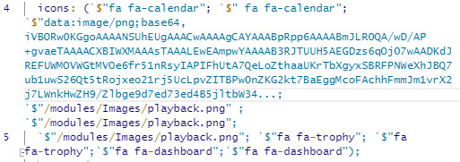
- Opened nodes
- Define which set of Nodes will be open on load.
- Opened Nodes ID
-
A view state parameter of Node IDs, type symbol, bound to expanded parent folders. Expanded nodes will display all child items.
Default values
Default Opened Nodes ID values, if set, will be superseded by Opened Nodes ID values assigned by the data source. If Opened Nodes has no corresponding data source column, then default Open Nodes ID values will be used if assigned.
- Checked Nodes ID
-
A view state parameter of Node IDs, type symbol, bound to all checked items in the tree - including parent folder node ID/s.
Default values
Default Checked Nodes ID values, if set, will be superseded by Checked Nodes values assigned by the data source.
- Check Parent
- Parent node (box) is checked on load.
- Selected Node ID
-
A view state parameter of a single Node ID, type symbol, bound to an individually selected item, either a parent folder or child item.
Selected vs Checked
The Selected Node ID is a single Node ID of the currently selected item in the tree view, which may or may not be checked - only one item can be selected at any one time (parent or child). Checked items are tracked by Checked Nodes ID.
Default values
Default Selected Node ID value, if set, will be superseded by a value assigned by the data source.
- Check on Selected
- Check (box) when selecting nodes.
- Open on Selected
- Selecting the node name will expand child elements.
- Show Search
- Show/hide search input.
- Entering a search string would display the matched node and all ancestors and child nodes of the matched node.
- Template Text
-
Formats tree labels
Text-append example
Interactive tree nodes with a
parentIdvalue of 1, precede node text with "Grand Prix Season:"{{#lt parentId 1}} Grand Prix Season: {{names}}{{/lt}}{{#gte parentId 1}}{{names}}{{/gte}}
Action
Style, Margins and Format
The treenode Node Id must be referenced when applying CSS styles to icons in the treeview. For example, this is the CSS for the earlier Treeview using fontawesome icons:
[data-widgetid="xxxx-xxxx-xxxx-xxxx"]
    div.treeview-container .treenode-id-x.jstree-leaf
    > .jstree-anchor
    > i.jstree-icon.jstree-themeicon.fa.jstree-themeicon-custom
    {color: brown; }
where xin .treenode-id-x.jstree-leaf is the corresponding Node Id integer value, and data-widgetid is the TreeView component widget id.
Hide Checkboxes
Property is disabled by default and hides checkboxes when enabled.
Show Tooltip
Property is enabled by default and shows node Text value as a tooltip.
Tooltip Text Template
Property allows to define tooltip template text. If not defined will default to the node Text.