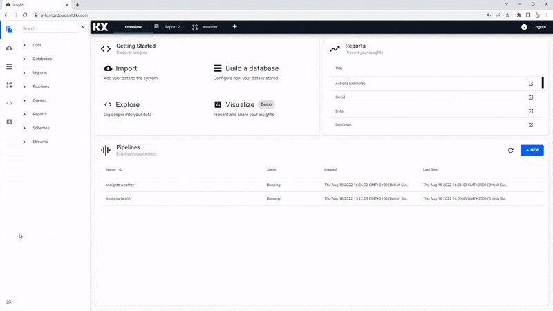
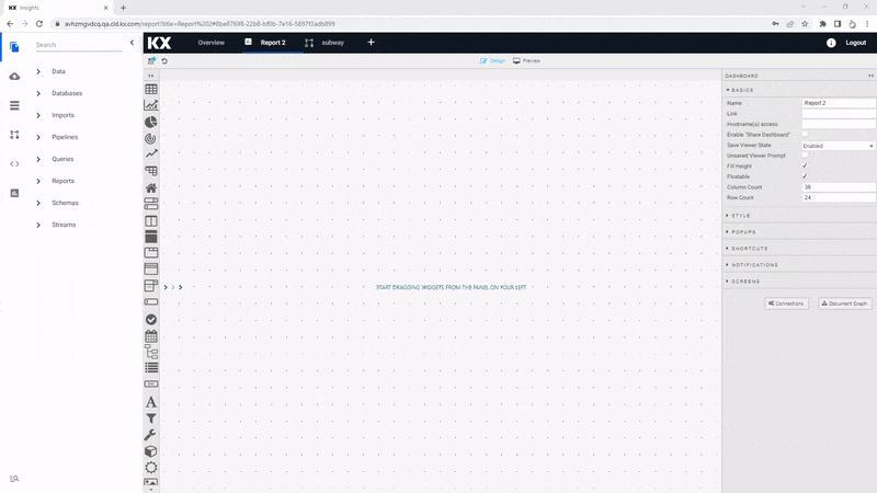
Build a View
Views
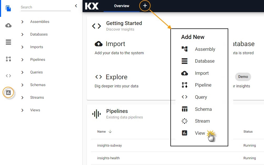
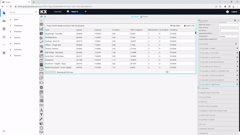
Reports are the visualization element of kdb Insights Enterprise. There are over 40 components available to present your data, including tables, maps, charts and more. Creating a report is simple; click the [+] in the Document bar and open Report or click  in the icon menu or Overview page.
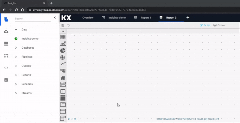
When a View opens, click the slider menu to show the list of component names (you can close it again when you are familiar with the icons), then click-and-drag a component into the workspace. We are going to start with a Data Grid component.
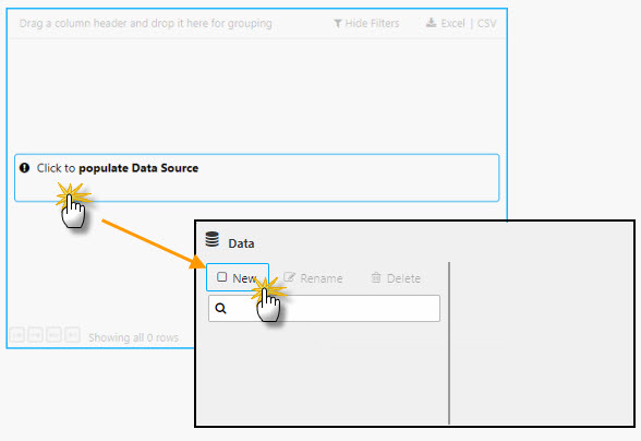
To add a data source, click the component where it says "Click to populate Data Source", then select New to add a new data source. Follow the steps in the Data Grid for adding and customizing the view for each of the four data sets.
I want to learn more about Views (Dashboards) components
Data Grid
The most common component to add to a View is a Data Grid, it's the top component listed in the menu and will be the first one we use. Data Grids tabulate data in your Views and have different formatting options including range colors, highlight rules and custom templates.
Typically, the first property set in the data grid is the data source. The data source can be accessed by the "Click to populate Data Source" in the component from the workspace or by selecting Data Source under Basics properties after selecting the component in the workspace; a selected component in the workspace will show a light-blue border.
Defining table in the query editor
When creating a new data source, the table is the name of the data table as hosted on the database, it's not the Output variable as defined when exploring the data.
From the tab menu, select the data set to configure:
Basics
Create a new data source and name it "Weather", then set the following Parameters in the query editor:
| value | setting |
|---|---|
| table | weather |
| startTS | yyyy-mm-dd 00:00:00.000000000 |
| endTS | yyyy-mm-dd(+1) 00:00:00.000000000 |
startTS and endTS
Set from midnight of the day the running pipeline was deployed for startTS, typically T, and running pipeline deployment T+1 for endTS; it may be necessary to check in the console of the Explore tab to find what date is used.
Execute, Apply then Select Item to apply the data to the Data Grid. This step will close the query editor.
Aside from the data source we have other Basic properties to set. We can do some general configuration of our data grid. As we have nearly 7,000 rows of data it would be best to include some filtering options.
| value | setting |
|---|---|
| Filtering | Column Filters |
Another quick and easy option to enable is Custom Layout; this allows users determine which columns of data they want to show in their View.
Custom Filters
With Column Filters, we can include some additional customization on the type of filters used; we may want to search by time, sensor, name and/or borough, and may also want to filter for certain air temperature ranges. In Data Grid properties is a CUSTOM FILTERS option, add the following filter types
| name | type |
|---|---|
| timestamp | DateTime |
| sensor | Selection |
| airtemp | Number |
| name | Selection |
| borough | Selection |
I want to learn more about filtering
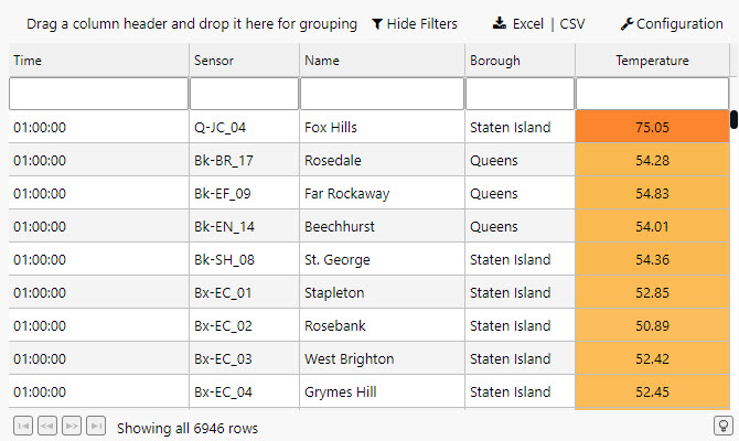
Columns
Column configurations are used to style content and define required widths to ensure data is displayed appropriately in a table.
| column | Display Name | Min Width | Text Align | Format | Precision | Date Format | Time Format | Range Color | Template | Hidden |
|---|---|---|---|---|---|---|---|---|---|---|
| timestamp | Time | 100 | Left | Time | - | - | HH:mm:ss |
- | - | - |
| sensor | Sensor | 100 | Left | General | - | - | - | - | - | - |
| airtemp | Temperature | 100 | Center | Formatted Number | 2 | - | - | - | - | - |
| name | Name | 150 | Left | General | - | - | - | - | - | - |
| borough | Borough | 150 | Left | General | - | - | - | - | - | - |
| longitude | longitude | - | - | - | - | - | - | - | - | Yes |
| latitude | latitude | - | - | - | - | - | - | - | - | Yes |
| color | color | - | - | - | - | - | - | - | - | Yes |
We can also re-arrange the order using a click-and-drag to move columns; select the Temperature column in the Data Grid properties and moveit below the Borough Column
Hightlight Rules
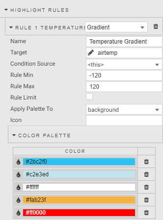
We can use the Data Grid highlight rule to create a color gradient for our temperature column. To give the temperature definition we will use a Gradient highlight rule.
| value | setting |
|---|---|
| Name | Temperature Gradient |
| Target | airtemp |
| Rule Min | -120 |
| Rule Max | 120 |
| Apply Palette To | background |
| COLOR PALETTE | #2bc2f0, #c2e3ed, #ffffff, #fab23f, #ff0000 |
I want to learn more about highlight rules
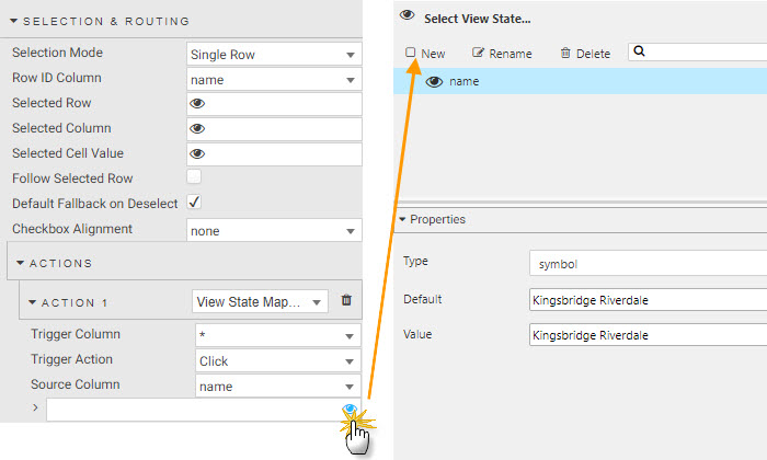
Selection & Routing
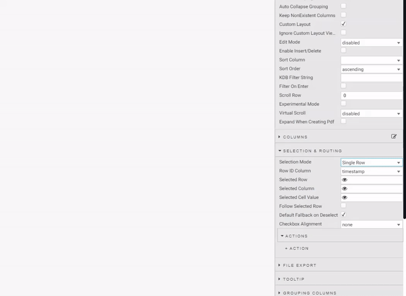
This step is optional. There may be situations where you want to use the table to pick out variables from your table. This is done with Selection & Routing and view state parameters; a view state parameter is stored value accessible to all components in a View.
To enable in Data Grid, we change Selection Mode to a Single Row select before defining an action. Actions can be used to map cell values from their respective columns to view state parameters. When we create an Action in this manner we want the trigger action to occur wherever we click inside the data grid, so we set the Trigger Column to use the wildcard, *.
Create actions to map:
| source column | view state parameter | type | default | value |
|---|---|---|---|---|
| sensor | sensor | symbol | Q-JC_04 | Q-JC_04 |
| borough | borough | symbol | - | - |
| name | name | symbol | - | - |
I want to learn more about actions
Basics
Create a new data source and name it "Subway", then set the following Parameters in the query editor:
| value | setting |
|---|---|
| table | subway |
| startTS | yyyy-mm-dd 00:00:00.000000000 |
| endTS | yyyy-mm-dd(+1) 00:00:00.000000000 |
startTS and endTS
Set from midnight of the day the running pipeline was deployed for startTS, typically T, and running pipeline deployment T+1 for endTS; it may be necessary to check in the console{ of the Explore tab to find what date is used.
Execute, Apply then Select Item to apply the data to the Data Grid. This step will close the query editor.
The Data Grid isn't as important component to include for this View as many of the columns will be hidden, but here are some of the settings you can use in a table.
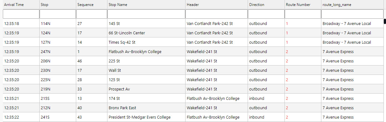
Aside from the data source we have other Basic properties to set. The data grid for subway is more informational, so we can remove some of the interactive options
| value | setting |
|---|---|
| Filtering | Column Filters |
| Enable Grouping | Uncheck |
Custom Filters
We can use the custom filters to help find additional information for given routes. Columns which do not use a pre-defined custom filter will instead use the default text search.
| name | type |
|---|---|
| route_short_name | Selection |
| trip_headsign | Selection |
| route_long_name | Selection |
| direction_id | Selection |
| arrival_time | DateTime |
I want to learn more about filtering
Columns
Column configurations are used to style content and define required widths to ensure data is displayed appropriately in a table.
| column | Display Name | Min Width | Text Align | Format | Precision | Date Format | Time Format | Range Color | Template | Hidden |
|---|---|---|---|---|---|---|---|---|---|---|
| trip_id | Trip | - | - | - | - | - | - | - | - | Yes |
| arrival_time | Arrival Time | 100 | Left | Time | - | - | HH:mm:ss |
- | - | - |
| stop_id | Stop | 100 | Left | General | - | - | - | - | - | - |
| stop_sequence | Sequence | 100 | Left | General | - | - | - | - | - | - |
| stop_name | Stop Name | 250 | Left | General | - | - | - | - | - | - |
| stop_lat | Stop longitude | - | - | - | - | - | - | - | - | Yes |
| stop_lon | Stop latitude | - | - | - | - | - | - | - | - | Yes |
| route_id | Route ID | - | - | - | - | - | - | - | - | Yes |
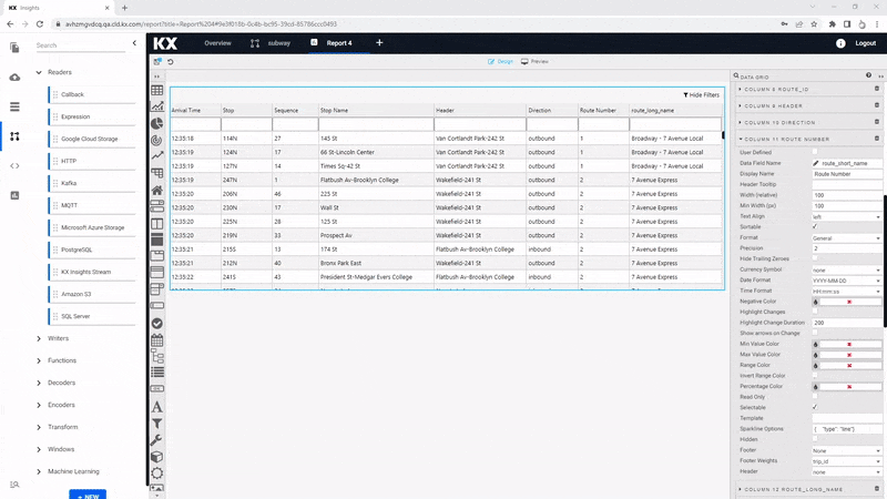
| trip_headsign | Route Header | 200 | General | - | - | - | - | - | - | |
| direction_id | Direction | 100 | - | General | - | - | - | - | - | - |
| route_short_name | Route Number | 100 | - | Number | - | - | - | - | see below | - |
| route_long_name | Route Name | 200 | - | General | - | - | - | - | - | - |
| route_desc | Description | - | - | - | - | - | - | - | - | Yes |
| route_type | Type | - | - | - | - | - | - | - | - | Yes |
| route_url | Route URL link | - | - | - | - | - | - | - | - | Yes |
| route_color | Route color | - | - | - | - | - | - | - | - | Yes |
One of the features of COLUMNS is the custom Template. If you can't find what you need from existing properties you can add your own using a template. In this case, we do have to do a little coding to get the most out of it. Custom template uses Handlebars to apply column formats. In our example, we will use the existing route_color column to apply color to the text of the route_short_name column. To do this, apply the following code to the Advanced mode of Template
<font color="{{route_color}}">{{route_short_name}}</font>
I want to learn more about custom templating
File Export
We can hide the export options by unchecking the boxes for Show Export CSV button and Show Export Excel Button
Basics
Create a new data source and name it "Health", then set the following Parameters in the query editor:
| value | setting |
|---|---|
| table | health |
| startTS | yyyy-mm-dd 00:00:00.000000000 |
| endTS | yyyy-mm-dd(+1) 00:00:00.000000000 |
startTS and endTS
Set from midnight of the day the running pipeline was deployed for startTS, typically T, and running pipeline deployment T+1 for endTS; it may be necessary to check in the console of the Explore tab to find what date is used.
Execute, Apply then Select Item to apply the data to the Data Grid. This step will close the query editor.
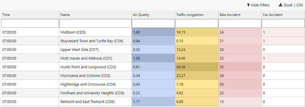
Aside from the data source we have other Basic properties to set. The health data set has a time series column, a category column in name, and a series of numeric dependent data columns - all of which can use a custom filter. We don't need to use grouping because there is only a single category column, so we can disable this control
| value | setting |
|---|---|
| Filtering | Column Filters |
| Enable Grouping | Uncheck |
Custom Filters
The custom filter settings make use of the number filter; users can filter these columns using >, < or > < for a range
| name | type |
|---|---|
| timestamp | DateTime |
| name | Selection |
| airquality | Number |
| trafficcongestion | Number |
| bikeacccnt | Number |
| caracccnt | Number |

I want to learn more about filtering
Columns
Column configurations are used to style content and define required widths to ensure data is displayed appropriately in a table. With the numeric columns we can look to add a little color with the Range Color property for airquality and trafficcongestion; as part of this, we will check the Invert Range Color so that high values have a darker shade.
| column | Display Name | Min Width | Text Align | Format | Precision | Date Format | Time Format | Range Color | Template | Hidden |
|---|---|---|---|---|---|---|---|---|---|---|
| name | Name | 250 | Left | General | - | - | - | - | - | - |
| lat | Latitude | - | - | Number | - | - | - | - | - | Yes |
| long | Longitude | - | - | Number | - | - | - | - | - | Yes |
| neighborhood | Neighborhood | 250 | Left | General | - | - | - | - | - | Yes |
| airquality | Air Quality | 250 | Left | Number | 2 | - | - | #d1e3ff | - | - |
| trafficcongestion | Traffic Congestion | 100 | Left | Number | 2 | - | - | #ffe999 | - | - |
| bikeacccnt | Bike Accidents | 100 | Left | Number | 0 | - | - | - | - | - |
| caracccnt | Car Accidents | 100 | Left | Number | 0 | - | - | - | - | - |
| timestamp | Time | 100 | Left | Time | - | - | HH:mm:ss |
- | - | - |
The order of the columns can be changed using a click-and-drag in Data Grid Column properties; move the Timestamp column to the top.
Highlight Rules
We can more specific for highlights in bike and car accidents by using highlight rules; for each, we will use a Gradient highlight rule.
| value | bikeacccnt | caracccnt |
|---|---|---|
| Name | Bike Accidents | Car Accidents |
| Target | bikeacccnt | caracccnt |
| Rule Min | 0 | 0 |
| Rule Max | 120 | 12 |
| Apply Palette To | background | background |
| COLOR PALETTE | #ffffff, #b71c1c | #ffffff, #b71c1c |

I want to learn more about highlight rules
Selection & Routing
This step is optional for the Walkthrough. One of the features you may want to use from Data Grid is studying the accident rate, traffic congestion and airquality for a particular neighborhood displayed in another component, such as a chart. To do this, we need to create a parameter to store the name of the neighborhood which we can use in queries used by other components. In Views, we use view state parameters; a view state parameter is stored value accessible to all components in a View.
To enable in Data Grid, we change Selection Mode to a Single Row select before defining an action. Actions can be used to map cell values from their respective columns to view state parameters. When we create an Action in this manner we want the trigger action to occur wherever we click inside the data grid, so we set the Trigger Column to use the wildcard, *.
| value | setting |
|---|---|
| Selection Mode | Single Row |
ACTIONS
| value | setting |
|---|---|
| Trigger Column | * |
| Trigger Action | Click |
| Source Column | name |
| > | view state parameter: name |
I want to learn more about actions
Basics
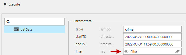
Create a new data source and name it "Crime", then set the following Parameters in the query editor:
Use the following Parameters in the data editor
| value | setting |
|---|---|
| table | crime |
| startTS | 2022-03-31 00:00:00.000000000 |
| endTS | 2022-03-31 23:59:00.000000000 |
Execute, Apply then Select Item to apply the data to the Data Grid. This step will close the query editor.
Aside from the data source we have other Basic properties to set. This data set will work well for grouped category columns as defined by the user, so we shall keep the default options, and enable the Custom Layout so Users can determine which columns they wish to view.
| value | setting |
|---|---|
| Filtering | Column Filters |
| Enable Grouping | Check |
| Custom Layout | Check |
Custom Filters
Apply the following custom filter options to the columns; Selection filtering is used for descriptive columns and DateTime for timestamp ones.
| value | setting |
|---|---|
| incident_time | DateTime |
| nypd_precinct | Selection |
| borough | Selection |
| patrol_borough | Selection |
| radio_code | Selection |
| crime_in_progress | Selection |
| call_timestamp | DateTime |
| displatch_timestamp | DateTime |
| arrival_timestamp | DateTime |
| closing_timestamp | DateTime |
I want to learn more about filtering
Columns
The crime data set records incidents of crime in New York on the 31st March 2022. The data set includes a descriptive element of the crime - including details of the borough and precinct in which the crime occurred, so we want to ensure the table gives sufficient space to these columns.
| column | Display Name | Min Width | Text Align | Format | Precision | Date Format | Time Format | Range Color | Template | Hidden |
|---|---|---|---|---|---|---|---|---|---|---|
| event_id | Event | 80 | Left | General | - | - | - | - | - | - |
| incident_time | Time of Incident | 100 | Left | Time | - | - | `HH ss ss |
- | - | - |
| nypd_precinct | Precinct | 60 | Left | Number | 0 | - | - | - | - | - |
| borough | Borough | 100 | Left | General | - | - | - | - | - | - |
| patrol_borough | Patrol Borough | 200 | Left | Number | - | - | - | - | - | - |
| call_x_geo | Call x-cord. | - | - | Number | - | - | - | - | Yes | |
| call_y_geo | Call y-cord. | - | - | Number | - | - | - | - | - | Yes |
| radio_code | Radio Code | 80 | Left | Number | - | - | - | - | - | - |
| description | Crime Description | 300 | Left | General | - | - | - | - | - | - |
| crime_in_progress | Crime in Progress? | 100 | Left | General | - | - | - | - | - | |
| call_timestamp | Call Time | 100 | Left | Time | - | - | HH:mm:ss |
- | - | - |
| dispatch_timestamp | Displatch Time | 100 | Left | Time | - | - | HH:mm:ss |
- | - | - |
| arrival_timestamp | Arrival Time | 100 | Left | Time | - | - | HH:mm:ss |
- | - | - |
| closing_timestamp | Close Time | 100 | Left | Time | - | - | HH:mm:ss |
- | - | - |
| latitude | Latitude | - | - | Number | - | - | - | - | - | Yes |
| longitude | Longitude | - | - | Number | - | - | - | - | - | Yes |
Highlight Rules
While the data in the table is descriptive in nature, we can still use highlight rules to provide context to the data. For example, the crime_in_progress column is a good one to use as we can highlight active crimes, while using a color gradient to mark the degree of seriousness for the reported crime. As part of this, we will use a wildcard, *, to apply the color highlight to the whole row, not just the crime in progress column.
| value | critical | serious | non-critical |
|---|---|---|---|
| Name | Critical | Serious | Non Critical |
| Target | * | * | * |
| Condition Source | crime_in_progress | crime_in_progress | crime_in_progress |
| Condition Operator | == | == | == |
| Condition Value | Critical | Serious | Non Critical |
| Background Color | #ffa1a1 | #ffd27d | #fcefd6 |
I want to learn more about highlight rules

I want to learn more about Data Grids
Data Form
The Data Form allows users filter their data using view state parameters; a view state parameter is a piece of information stored by the View and available for use by components. For our data sets, we will use the data from to select dates and/or times for startTS and endTS parameters, and may also use a filter parameter.
Click-and-drag a Data Form into the View.
Viewstate Parameters
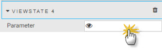
To create a view state parameter, click on the Parameter property under Viewstate Parameters- this will open the view state parameter dialog.
We will create the following view states for our Data Form:
startTS and endTS
Click New to create a new view state and name it Start Time. The time Type will be timestamp. Note, for data sets with no pre-determined date, the startTS and endTS will inherit the deployment date of the pipeline used to import the data; it may be necessary to check in the console of the Explore tab to find what date is used.
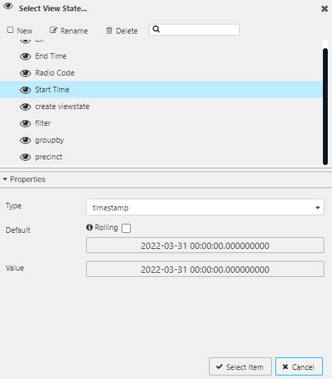
Start Time
| value | setting |
|---|---|
| Type | timestamp |
| Default | yyyy-mm-dd 00:00:00.000000000 |
| Value | yyyy-mm-dd 00:00:00.000000000 |
Default and Value yyyy-mm-dd will inherit the deployment date of the pipeline. Use the Explore tab if necessary to find the date.
| value | setting |
|---|---|
| Type | timestamp |
| Default | 2022-03-31 00:00:00.000000000 |
| Value | 2022-03-31 00:00:00.000000000 |
End Time
Next, create a second Viewstate and name it End Time; End Time can be Start Time +1 day or is 23:59 of the Start Time day.
| value | setting |
|---|---|
| Type | timestamp |
| Default | yyyy-mm-dd 00:00:00.000000000 |
| Value | yyyy-mm-dd 00:00:00.000000000 |
Default and Value yyyy-mm-dd will be the Start Time + 1 day of the pipeline deployment date.
| value | setting |
|---|---|
| Type | timestamp |
| Default | 2022-03-31 23:59:00.000000000 |
| Value | 2022-03-31 23:59:00.000000000 |
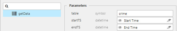
With the viewstates created, map them to the startTS and endTS parameters of the different data sets in the query editor; remember, you will find the query editor by clicking on the assigned Data Source listed under Basics of your visualization component - which in our case, is the data grid.
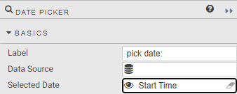
Date Picker
There is a second component which can be used for startTS and endTS called Date Picker. With Date Picker it's necessary to map the Start Time or End Time view state to the Selected Date property under the list of Basics options.
:fontawesome-solid-hand-point-right: [I want to learn more about Date Pickers](https://code.kx.com/insights/microservices/dashboards/datepicker.html)
Filter
The filter property can be used as a dropdown menu and works similar to column filters in data grid. To enable a filter column, it has to be added to the query editor. Create a view state of type List for the selection column, and assign it to the filter property.
In the Data Form component, we need to map the newly create filter view state parameter to the Parameter property. Then switch the Parameter Type property to Dropdown. Add Items for each of the selection options in the dropdown. There is a special case for defining the Value for Items which uses the following structure as determined by the getData API.
=;column_name;value
The = is used to match numeric values, but use like for text values. The column_name is the data column name as referenced in the database. The value is the value within the data column to filter by.
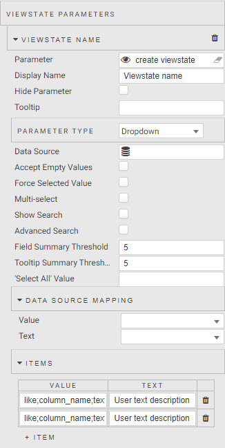
Because of the need to manually assign items to your dropdown this is best done for data columns which have few options; for example, the weather data set does not have a data column which lends itself easily to a dropdown filter.
| value | settings |
|---|---|
| Parameter | Direction view state parameter |
| Display Name | Direction |
ITEMS
| value | text |
|---|---|
| like;direction_id;inbound | Inbound |
| like;direction_id;outbound | Outbound |
| value | settings |
|---|---|
| Parameter | CIP view state parameter |
| Display Name | Crime In Progress |
ITEMS
| value | text |
|---|---|
| like;crime_in_progress;Critical | Critical |
| like;crime_in_progress;Non CIP | Not in Progress |
| like;crime_in_progress;Non Critical | Not Critical |
| like;crime_in_progress;Serious | Serious |
| value | settings |
|---|---|
| Parameter | Car Accident view state parameter |
| Display Name | Number of Car Accidents |
ITEMS
| value | text |
|---|---|
| =;caracccnt;0 | None |
| =;caracccnt;1 | One |
| =;caracccnt;2 | Two |
| =;caracccnt;3 | Three |
| =;caracccnt;4 | Four |
| =;caracccnt;5 | Five |
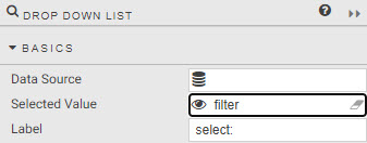
Drop Down List
There is another component which can also be used for filtering called Drop Down List. Configuration is similar to a dropdown in the data form, although it's necessary to assign the view state parameter for the filter to the Selected Value property listed under Basics of the dropdown component. The definition for Items is as for data form.
:fontawesome-solid-hand-point-right: [I want to learn more about Drop downs](https://code.kx.com/insights/microservices/dashboards/dropdownlist.html)