ChartGL
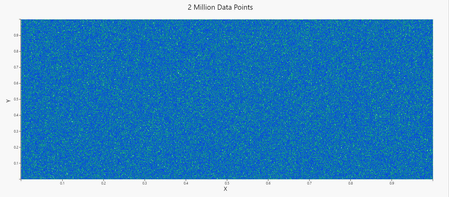
ChartGL leverages hardware acceleration to enable the visualization of very large datasets.
WebGL is used to access the graphics hardware on the local computer accelerating the rendering process by a factor of many thousand. In WebGL2 a combination of vertex shaders (position) and fragment shaders (color) are used to render data points providing the capability to display millions of data points in milliseconds.
Multiple large data sources can be plotted on the same chart with high speed and performance using layers.
Set up
-
Select a data source, available in Layers. ChartGL will best fit your data to the chart using a wild card selector in Y-Axis Data. Otherwise, select your data to plot for X-Axis Data and Y-Axis Data.
Basics
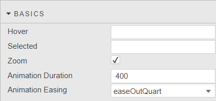
- Hover
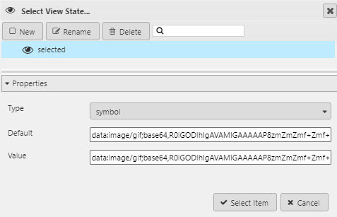
- A View State Parameter which stores the X-axis value contingent on where the hover bar is on the chart; e.g. time or date.
- Selected
- A View State Parameter to store the X-axis value at the selected position; e.g time or date.
- Zoom
- Check to enable/disable zoom.
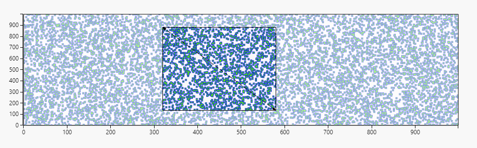
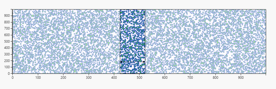
- The Zoom feature enables the ability to zoom on a region within both x and y axis, or individually on each x or y axis. Double-Clicking the chart resets the chart to its initial state.
-
Mouse scroll can be used for x-axis zoom, with mouse scroll + shift key for y-axis zoom
-
If zoom is disabled, Range Selection is enabled. Click and drag on chart as normal, but instead of zooming, it stores the x-axis range values. The values can be accessed by assigning viewstates to the Selection Min & Selection Max properties on the x-axes.
- Animation Duration
- Animation Easing
- Define zoom animation and length of time in milliseconds to complete.
The Pan feature enables the ability to pan along one axis at a time. To pan, click and drag from anywhere on the axis. Double-Clicking the chart resets the chart to its initial state.
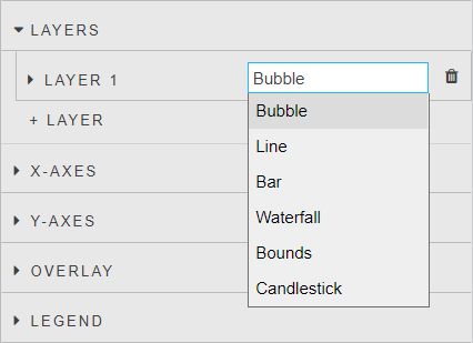
Layers
Ability to display multiple different data sources on the same chart.
- Bubble/Line/Bar/Waterfall/Bounds/Candlestick
-
Select either the "Bubble", "Line", "Bar", "Waterfall", "Bounds" or "Candlestick" option for each layer.
-
The "Bubble" option displays data as individual points, the "Line" option connects each data point resulting in a continuous line, the "Bar" option displays data as bars, and the "Candlestick" option displays data as candlesticks. The "Waterfall" option displays data as increase and decrease bars, and the "Bounds" option will draw a bounding area between two points.
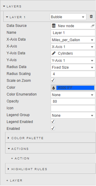
- Data Source
- Data sources
- Name
- Name used as the chart legend label.
- X-Axis Data
- Y Axis Data
- Select data columns to plot from the data source.
- Y Axis includes a wildcard selection for multiple columns. Wildcard selection will use columns of the most common, single kdb type; for example, if a data set has one
datetype column, threeintegertype columns, and fivefloattype columns - only the fivefloatcolumns will be plotted using the wildcard, theintegeranddatecolumns will be ignored. - Regular expressions can also be used to define the y-axis.
-
When a wildcard or regular expression is used, the Color Palette defines point color for each added column.
Data Types
Only scalar data types can be used for X-Axis and Y-Axis.
- X-Axis
- Select from defined Axes.
- Y-Axis
- Select from defined Axes.
- Open
- High
- Low
- Close
- Used only by Candlestick charts; select data columns which correspond to each.
- Color
- Select color for single plot (non-wildcard/regex) data sets.
- Color Data
- Select a data column to apply color. When a column is selected, the Color Palette defines point color for each unique value in the column.
- Opacity
- Define the opacity of the points from a value between 0 (transparent) and 100 (opaque).
- Radius Data
- Radius Scaling
- If the layer type is
Bubble, select from Data Source the variable to define which attribute to use for bubble scaling, then adjust the scaling variable to define bubble size. - Scale on Zoom
- If the layer type is
Bubble, increase bubble size on zoom. - Color
- Select color for single plot (non-wildcard/regex) data sets.
- Color Enumeration
- Select a data column to apply color. When a column is selected, the Color Palette defines point color for each unique value in the column.
- Opacity
- Define the opacity of the points from a value between 0 (transparent) and 100 (opaque).
- Icon
-
The icon selector allows for the choice of icons from a predetermined list if the layer type is
Bubble.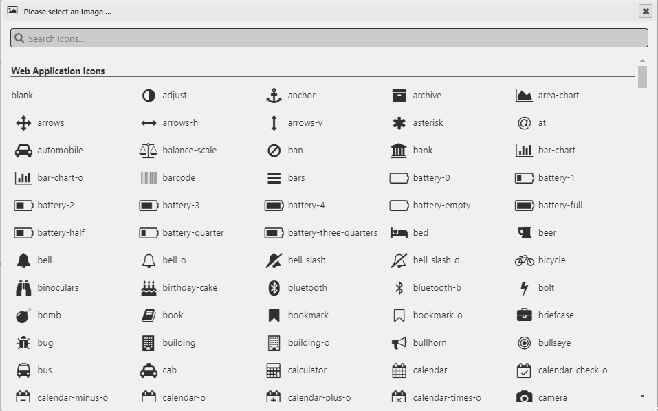
-
The icons are then displayed in the position of the data points on the chart.
-
Icons also support a base64 image in a view state parameter.
- Bar Percentage
- Defines bar width as a percentage of its range when
Bar Percentageis selected under Bar Width Type. - Bar Fixed Width
- Defines bar width as a fixed value when
Fixed Widthis selected under Bar Width Type. - Bar Width Type
- Dropdown select between
Bar PercentageandFixed Width. - Bar Orientation
- Dropdown select between
VerticalandHorizontal. - Bar Increase Color
- Bar Decrease Color
- Used when layer type is
Waterfall. Define visual style of the Waterfall bar increase and decrease colors based on the previous bar value. - x1
- x2
- Used when layer type is
Bounds. Define the x1 and x2 coordinates of the bounding region. - Legend Group
- Dropdown to assign the layer legend to a Legend Group
- Legend Enabled
- Toggles display of data legend.
- Enabled
- Toggles display of the data layer on the chart. Can be tied to a view state parameter.
Candlestick Format
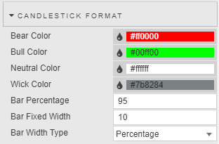
- Bear Color
- Set color for down day candles
- Bull Color
- Set color for up day candles
- Neutral Color
- Set color for flat days
- Wick Color
- Set color for candlestick wicks
- Bar Percentage
- Defines candlestick body width as a percentage of its range when
Bar Percentageis selected under Bar Width Type. - Bar Fixed Width
- Defines candlestick body width as a fixed value when
Fixed Widthis selected under Bar Width Type. - Bar Width Type
- Dropdown select between
Bar PercentageandFixed Width.
Line
- Used if the layer type is
Line
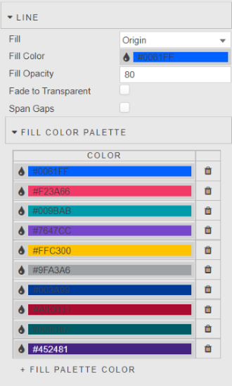
Fill
fill      | description
--------- | -------------------------------------------------------------------------------
`nofill`  | No color fill
`Layer n` | For color fill between charted line and selected layer
`origin`  | For color fill between chart line and X-axis
- Fill Color
- The color used for line fill for single plot (non-wildcard/regex) data sets.
- Fill Opacity
- The opacity used for line fill
- Fade to Transparent
- Where a line fill color is employed, a transparency gradient will be applied to the layer
- Fill Palette
- Sets line fill colors for wildcard/regex y-axis or color enumeration.
Color Palette
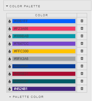
Sets plot point colors for wildcard/regex y-axis or color enumeration.
Actions
Highlight rules
Labels
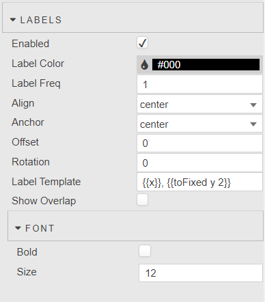
-
Data labels can be added to any layers and will place labels next to datapoints/bars as desired. The options for this are as follows.
- Enabled
- Turns on or off data labels, can be tied to viewstate.
- Label Color
- Color of Label Text
- Label Frequency
- Label will be applied to every nth data point where n is the label frequency.
- Align
- Position label to the
top,bottom,left,right, orcenterof the data point. - Offset
- The offset represents the distance (in pixels) to pull the label away from the data point. This can be specified as a single number (e.g. 4) or an x,y coordinate (e.g. 4,10).
- Label Rotation
- This option controls the clockwise rotation angle (in degrees) of the label, the rotation center point being the label center. The default value is 0 (no rotation)
- Max Label Quantity
- Max number of labels to draw. The default value is 10.
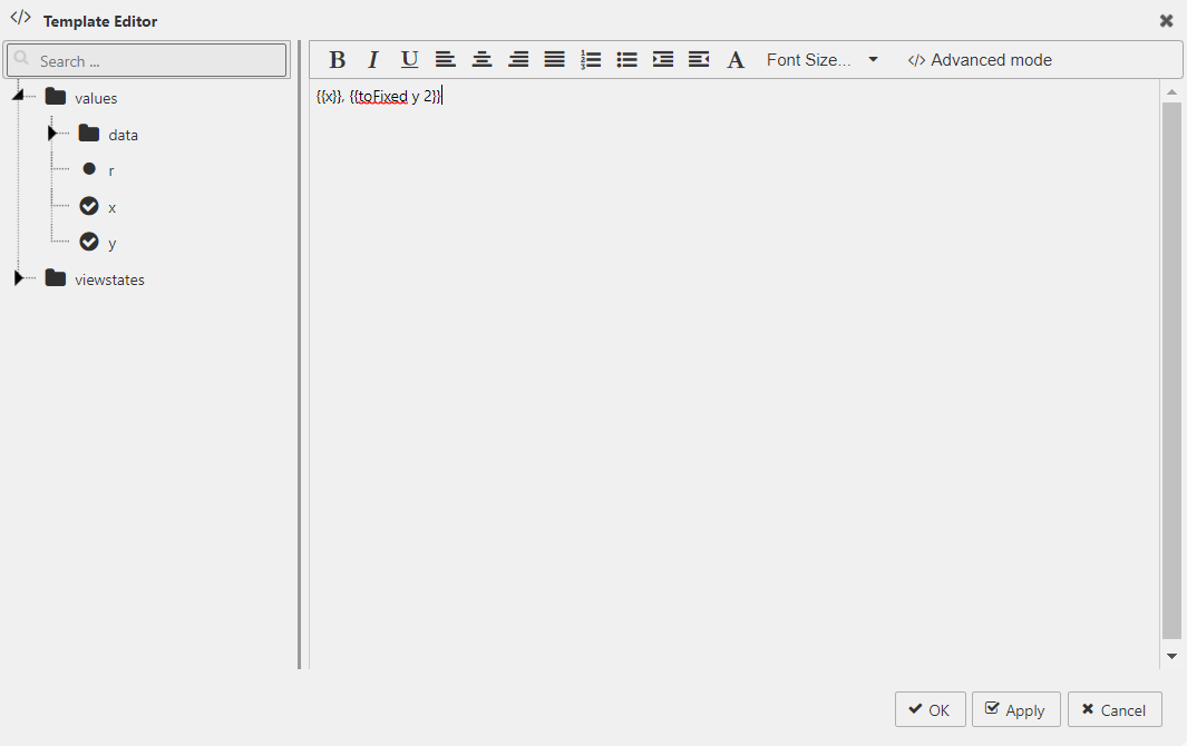
- Label Template
- Define data to display
Must return a string, HTML not supported.
Select data to display with the Template Editor - Basic or Advanced mode. Existing data and view states can be displayed. Handlebar helpers can be used for formats.
- Font -> Bold
- Makes Label bold
- Font -> Size
- Adjust font size in px.
X axes
X-Axis n
Add multiple x-axes.
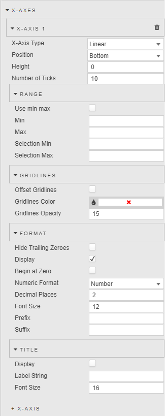
- X-Axis Type
- Choose between
LinearorCategorydata. - Position
- Position axis to the
toporbottomof the chart. - Height
- Height of the tick area of the x-axis in pixels.
- Number of Ticks
- Sets the number of ticks to display in the axis.
- Stacked
- When using a
Barchart, bars will be stacked.
Range
- Use Min/Max
- Toggle use of Min and Max to build x-axis.
- Min
- Max
-
Define minimum and maximum values for x-axis.
Hard range
Charted data outside of the set Min and Max range will not be displayed. If all data falls outside the set range, the chart will be blank.
- Selection Min
- Selection Max
- Pulls min and max x-axis values on a zoom select into assigned view state parameters.
Gridlines
- OffsetGridLines
- Check to align x-axis grid lines to mid-point between tick values.
- GridLinesColor
- GridLinesOpacity
- Define visual style of x-axis grid lines; opacity has a value between 0 (transparent) and 100 (opaque).
Format
- Hide Trailing Zeroes
- Hide display of trailing zeroes in x-axis tick values.
- Display
- Toggle display of x-axis labels.
- Begin at Zero
- Axis data starts at zero.
- Numeric Format
- Select x-axis format between
Number,Smart Number,Formatted Number. - Decimal Places
- Set precision point for x-axis numeric label.
- Font Size
- Set tick font size in pixels.
- Prefix
- Suffix
- Add text to the tick label; e.g. currency or percentage symbol.
Title
- Display
- Toggle display of x-axis label.
- Label String
- Define x-axes label text.
- Font Size
- Set label font size in pixels.
Y axes
Y-Axis n
Add multiple y-axes.
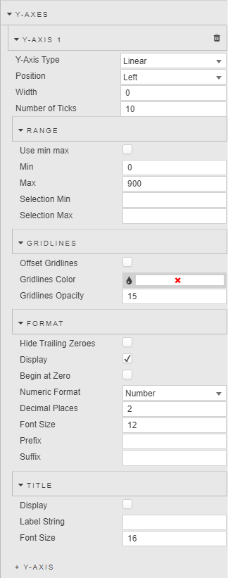
- Y-Axis Type
- Choose between
LinearorCategorydata. - Position
- Position axis to the
leftorrightof the chart. - Width
- Width of the tick area of the y-axis in pixels.
- Number of Ticks
- Sets the number of ticks to display in the axis.
- Stacked
- When using a
Barchart, bars will be stacked.
Range
- Use Min/Max
- Toggle use of Min and Max to build y-axis.
- Min
- Max
-
Define minimum and maximum values for y-axis
Hard range
Charted data outside of the set Min and Max range will not be displayed. If all data falls outside the set range, the chart will be blank.
- Selection Min
- Selection Max
- Pulls min and max y-axis values on a zoom select into assigned view state parameters.
Gridlines
- OffsetGridLines
- Check to align y-axis grid lines to mid-point between tick values.
- GridLinesColor
- GridLinesOpacity
- Define visual style of y-axis grid lines; opacity has a value between 0 (transparent) and 100 (opaque).
Format
- Hide Trailing Zeroes
- Hide display of trailing zeroes in y-axis tick values.
- Display
- Toggle display of y-axis labels.
- Begin at Zero
- Axis data starts at zero.
- Numeric Format
- Select y-axis format between
Number,Smart Number,Formatted Number. - Decimal Places
- Set precision point for y-axis numeric label.
- Font Size
- Set tick font size in pixels.
- Prefix
- Suffix
- Add text to the tick label; e.g. currency or percentage symbol.
Title
- Display
- Toggle display of y-axis label.
- Label String
- Define y-axis label text.
- Font Size
- Set label font size in pixels.
Overlay
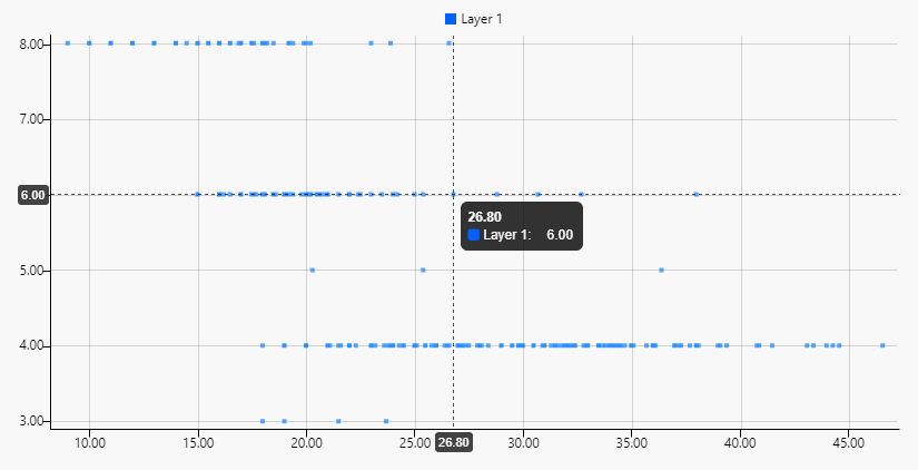
- Show Crosshairs
- Check to show crosshair on chart.
- Show Coordinates
- Check to show coordinates on chart.
- Snap Crosshair to Data
- If selected, crosshairs and coordinates will move to the nearest valid point on hover.
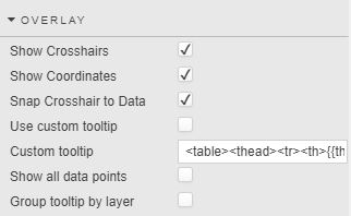
- Use custom tooltip
- Enable custom tooltip.
- Custom tooltip
- Define tooltip; simple example:
<table>
    <thead>
        <tr>
            <th>{{this.0.xAxis}}</th>
            <th></th>
        </tr>
    </thead>
    {{#each this}}
    <tbody>
        <tr>
            <td width="{{width}}">
                <i class="{{icon}}" style="color:{{color}}; {{image}};"></i> {{name}}:
            </td>
            <td>{{yAxis}}</td>
        </tr>
        {{/each}}
    </tbody>
</table>
- Show all data points
- Displays all y-axis values for selected point on the x-axis.
- Group tooltip by layer
- Use when Show all data points is enabled; displays data points in a distinct column for each Layer instead of a continuous list.
Legend
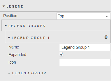
- Position
- Position can be defined as
bottom,top,left, orright;leftorrightwhen legend grouping is used.
Legend Groups
Add new Legend Group. To enable, add a Legend Group item here and update the Legend Group value in at least one Layer
- Name
- Define name for Legend Group
- Expanded
- Checkbox for expanding/collapsing Legend Group
- Icon
- Define icon for Legend Group
Annotations
Annotations are user-defined shapes or markings that provide more information about the chart.
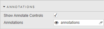
- Show Annotate Controls
- When checked, displays the Annotate controls
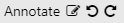 within the component. The Annotate controls consist of a toggle button
  , an Edit button
  , an Undo button
  , and a Redo button
  .
. - Annotations
- This field stores any changes to the default annotation type and color, and information describing the annotations. When set to a view state parameter of type
string, this information will persist when saved by the user.
Creating annotations
-
Clicking on the Annotate button
will toggle Annotation mode. When Annotation mode is on, the Overlay and Zoom features are disabled, and an icon will appear to the left of the control to indicate the current annotation type and color. The following is a list of the different annotation types and how the Annotate toggle button will appear for each type:Annotation type Control Text note 
Rectangle 
Horizontal line 
Vertical line 
Trend line 
By default, the annotation type is set to a text note. To create an annotation, click and hold the left mouse button from a desired area in the chart, drag the mouse to an endpoint for the annotation, and release the button.
The following types of annotations can be created:
- Text Note
-
A text note is text that can be added directly to the chart. Upon creation of the text note, the text note dialog is launched so users can edit the text and styling of the text note. To edit, double-click on the text note to bring up the text note dialog. The text note resizes automatically based on the text and styling. The font size of the text note does not scale when the chart is zoomed in or out. To move the text note, hover over the text note until the mouse pointer changes to the multidirectional cursor, then click and drag the text note to the new position.
- Rectangle
-
A rectangle is a 4 sided polygon having all right angles. To move the rectangle, hover over the rectangle until the mouse pointer changes to the multidirectional cursor, then click and drag the rectangle to the new position. To resize the rectangle, hover over any endpoint until the color of the square anchor changes to red
 and then click and drag the endpoint to its new position.
 - Horizontal Line
-
A horizontal line is a line that extends the width of the chart. Horizontal lines can only be moved up or down. To move the horizontal line, hover over the line until the mouse pointer changes to a bidirectional cursor, then click and drag the line to its new position.
- Vertical Line
-
A vertical line is a line extends the height of the chart. Vertical lines can only be moved left or right. To move the vertical line, hover over the line until the mouse pointer changes to a bidirectional cursor, then click and drag the line to its new position.
- Trend Line
-
A trend line is a straight line connected by two points. To move the trend line, hover over the trend line until the mouse pointer changes to the multidirectional cursor, then click and drag the line to the new position. To resize the trend line, hover over either end of the line until the color of the square anchor changes to red
and then click and drag that endpoint to its new position.
Text Note dialog
The text note dialog is used to update the text and styling of the text note. Changes made to the annotation properties will appear on the chart in real-time.
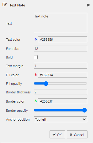
- Text
- The text of the text note - click in the field to edit
- Text color
- The color of the text - click on the field to bring up the color picker
- Font size
- The font size of the text
- Bold
- When checked, makes the text bold
- Text margin
- The space between the text note border and the text
- Fill color
- The fill color of the text note area - click on the field to bring up the color picker
- Fill opacity
- The fill opacity of the text note area - slide to the left for more transparency and to the right for more opacity
- Border thickness
- The thickness of the text note border
- Border color
- The border color of the text note - click on the field to bring up the color picker
- Border opacity
- The border opacity of the text note - slide to the left for more transparency and to the right for more opacity
- Anchor position
-
Anchor position identifies which corner of the text note remains fixed on the chart. This property is particularly useful when you want the/ text note to always be positioned above or below an element when zooming in or out. Select
top leftwhen you want the text note to be precisely positioned underneath an element (i.e. a line, bar, or point). Selectbottom leftwhen you want the text note to be precisely positioned above an element.
Annotations dialog
Clicking on the Edit button will bring up the annotations dialog.
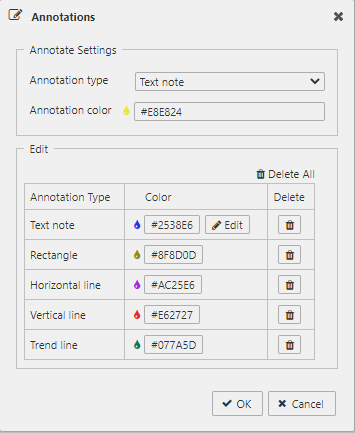
The Annotation Settings section is where the user can view and change the default annotation type and color.
- Annotation type
- The available annotation types are
Text note,Rectangle,Horizontal line,Vertical line, andTrend line - Annotation color
- The color of the annotation to be created - click on the field to bring up the color picker
The Edit section contains a table of existing annotations each with a color button to change its color and a delete button to delete the specified annotation. The text note has an additional Edit button which brings up the text note dialog to update the text and styling of the text note. Changes made here will appear on the chart in real-time.
- Delete All
- Deletes all annotations
- OK
- Commits all changes in the dialog
- Cancel
- Reverts all annotations to their previous state.
Undo and Redo
The Undo and Redo buttons allow the user to navigate through the chronology of user actions affecting any and all annotations.
Clicking on the Undo button reverses a user action affecting annotations. This includes changes made on the chart directly, or by way of the annotation dialogs. Continuing to press the Undo button will reverse these user actions up to the beginning of their dashboard session.
Clicking on the Redo button restores annotations affected by a user clicking the Undo button. If the user performs an action affecting annotations after an Undo button press, the Redo button will be disabled.
File export
Style, Margins, Format
Style for common settings