Explore Dashboard Components
This page provides an introduction to the components that can be added to your Dashboards.
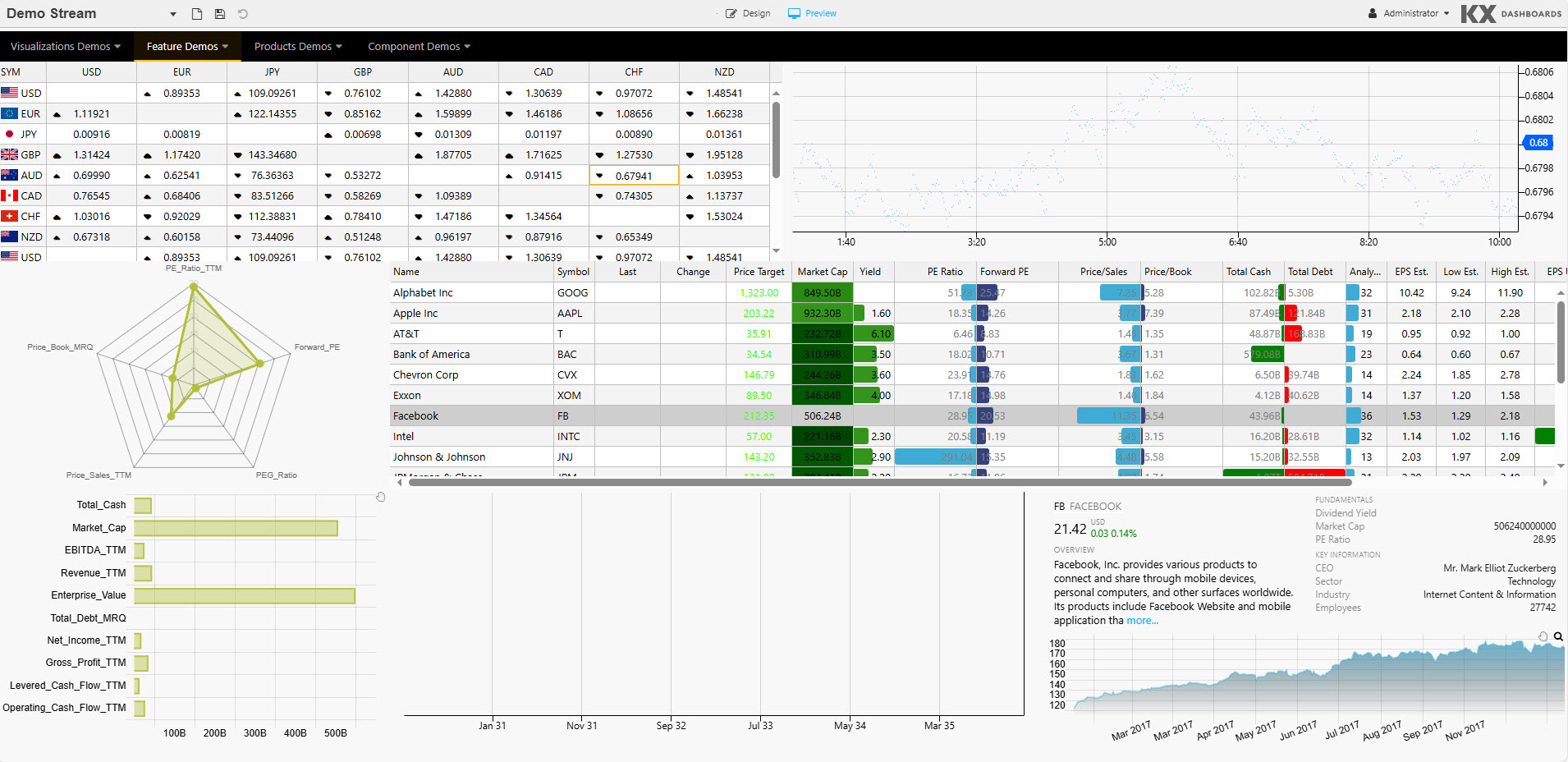
KX Dashboards supports over 40 components, which can be added to your dashboards. When you start KX Dashboards you are greeted with sample dashboards showcasing many of these components. For example, the following example includes a Navigation Menu, Data Grid, ChartGL, Radar Chart, Canvas Chart, Text.
Components
KX Dashboards provides pre-installed components providing out-of-the-box functionality while custom components allow for complete extensibility. These components are organised into categories described in the following sections.
Charts & Visualization
A suite of charting and visualization components spanning 2D and 3D data, financial time-series, networks, hierarchies, and flows.
| Component | Description | When to Use |
|---|---|---|
| ChartGL | High-performance 2D charting component (line, bar, area, scatter, heatmap, candlestick, and more) powered by WebGL. Designed to render 2 million+ points. | Your primary chart component for time-series, OHLC, multi-series, and real-time streaming data. Use when performance matters. |
| Canvas Chart | Basic line, bar, bubble, candlestick, violin, boxplot, and waterfall charts. | Lightweight 2D charting where WebGL acceleration is not required. |
| 3D Chart | Three-dimensional charting (with highlight rule support for 4D); dot, surface, bar, grid, and line charts. | When data has a third dimension to visualize — for example, surface plots, 3D scatter, volumetric data. |
| Pie Chart | Pie and donut chart component. | Proportional breakdowns and share-of-total visualizations. |
| Radar Chart | Radar / spider chart. | Comparing multiple attributes across categories — for example, performance profiles, risk scoring. |
| Financial Chart | International financial charting component; OHLC, Line, Candlestick, Mountain, Heikin Ashi, Kagi, and over 20 technical indicators and user annotation support. | Market data analysis requiring technical indicators — price history, OHLC, and trading signals. |
| Treemap | Treemap or heatmap data graphic. | Visualizing hierarchical proportions — for example, sector exposure, portfolio breakdown by size. |
| Sunburst | Sunburst (ring/donut) chart for hierarchical data. | Displaying nested hierarchical proportions with interactive drill-down. |
| Sankey | A flow diagram. | Visualizing flow volumes between nodes — for example, fund flows, process stages. |
| Bipartite Chart | A chart of two independent data sets, with relationship connections between the data sets. | Showing relationships between two distinct sets of entities. |
| Graph | Node and edge network graph. | Visualizing relationships and dependencies — for example, network topology, flow graphs. |
| Vega Chart | Support for Visualization Grammar charts. | Custom or bespoke chart types not covered by built-in components. |
| Analyst Visual | Renders server-side visuals built in KX Developer. | When required to render very large numbers of points — for example, 20 million+. |
Data Grids & Tables
Grid components for structured tabular data, from flat real-time tables to OLAP-style pivot aggregations.
| Component | Description | When to Use |
|---|---|---|
| Data Grid | High-performance tabular data grid with sorting, filtering, and virtual scrolling. | Displaying large, real-time tabular datasets — trading blotter, order books, logs. |
| Pivot Grid | Pivot-style grid with breakdown and aggregation support. | Aggregated views across dimensions — for example, P&L by desk and instrument, breakdown reporting. |
Maps & Geo
Map components for geospatial data visualization, supporting both network-connected and air-gapped deployments.
| Component | Description | When to Use |
|---|---|---|
| Map | Geographic map component. Can function without internet access. Supports overlay of heatmap, image, and video layers across single or multiple layers. | Rendering geographic data in air-gapped or restricted network environments. |
| Map (External APIs) | Map component using external APIs including Google Maps. | When external map tile providers or API-driven features such as routing or geocoding are required. |
| QuadMap | Quad-tree based spatial map. | High-density geographic datasets requiring spatial partitioning and fast region queries. |
Filtering & Querying
Components for user-driven data filtering and query construction without writing code.
| Component | Description | When to Use |
|---|---|---|
| Data Filter | UI-driven filter panel for selecting and applying query criteria. | Letting users filter dashboard data interactively — date ranges, symbols, categories. |
| Visual Query Builder | Graph-based visual query builder; supports multi-data sources with update, group-by, join, filter, and custom functions. | When users need to build queries without writing q/SQL — analysts, non-technical users. |
| Range Slider | A data range selector; interval or time. | Filtering data by a continuous range — for example, price band, time window. |
| Pager | Custom paging to control the amount of data displayed in a component. | Controlling data volume in components displaying large datasets. |
Forms & Input
Input components for parameter entry, data submission, and record editing.
| Component | Description | When to Use |
|---|---|---|
| Data Form | Data entry and record editing form bound to a kdb+ data source. | Viewing and editing individual records — CRUD workflows, trade amendments. |
| Form Builder | Drag-and-drop form designer for creating custom input forms. | When you need to build bespoke forms dynamically without hardcoding the layout. |
| Text Input | Single-line text input field. | Free-text parameter entry, search boxes, inline data entry. |
| Text | WYSIWYG text editor with HTML support. | Adding formatted labels, instructions, or rich text content to a dashboard. |
| Drop Down List | Single or multi-select dropdown component. | Selecting a value from a predefined list — for example, symbol picker, environment selector. |
| Button | Clickable action trigger supporting multi-action select. | Submitting queries, triggering actions, navigating between views. |
| Selection Controls | Radio or check-box selection controls. | Multi-select options, boolean flags, grouped selections. |
| Date Picker | Calendar-based date and time input. | Selecting a specific date or timestamp for query parameters. |
| Date Range Picker | Date range input. | When users need to select both a start and end date as query parameters. |
| Text to Speech | Converts text to audio. | Accessibility use cases or audio alerts driven by dashboard data. |
Layout & Navigation
Components for structuring dashboard layout and enabling navigation across views and hierarchies.
| Component | Description | When to Use |
|---|---|---|
| Layout Panel | Container for grouping and laying out other components. | Structuring dashboard layout — wrapping related components into logical sections. |
| Flex Panel | Flexible, two-component container. | Dynamic layouts that need to adapt to different screen sizes or content volumes. |
| Tab Control | Tabbed component container. | Organizing multiple views or sections within a single dashboard panel. |
| Accordion | Collapsible component container. | Showing/hiding content progressively — reducing visual clutter in dense dashboards. |
| Overlay Panel | Container to overlay components. | Displaying secondary content or controls on top of a primary view. |
| Navigation Menu | Menu-driven navigation component. | Multi-page or multi-section dashboards requiring top-level navigation. |
| Breadcrumbs | Navigation element for OLAP data. | Drill-down navigation — showing the user's current position within a data hierarchy. |
Specialist Components
| Component | Description | When to Use |
|---|---|---|
| Gauge | Dial or progress-style metric indicator. | Displaying a single KPI against a target or threshold — for example, utilisation, risk level. |
| Playback | A multi-control stream player for time-series and interval data playback. | Replaying historical event sequences or animating data over time. |
| Editable List | A user-editable list component. | Managing ordered collections of items — watchlists, configurable parameter sets. |
| Tree View | A tree-view navigation selection component. | Navigating nested data — folder structures, org charts, hierarchical breakdowns. |
| Trade | Forex trade panel with TWAP and VWAP support and tick updates. | Trade capture, trade history, and order management workflows. |
| Action Tracker | A self-contained alerting and management component. (KX Dashboards on Platform only) | Audit trails, workflow tracking, task monitoring. |
| Bitmap | Renders bitmap image data. | Displaying image data returned from kdb+ — heatmaps as images, custom renders. |
Other
Utility and platform-specific components for media, reporting, file handling, and advanced integrations.
| Component | Description | When to Use |
|---|---|---|
| Contour | Contour graphic; plotting 3D data in 2D. | Visualizing terrain, density, or gradient data in two dimensions. |
| Blob Download | Download files from byte array in database. | Enabling users to download binary data or files stored in kdb+. |
| Upload | Upload a file to, or download from, a server. | Allowing users to load external data files into the dashboard session. |
| Video | Add video content to a dashboard. | Embedding instructional or contextual video alongside data views. |
| Code Editor | Embeddable code editor with support for json, plaintext, handlebars, html, java, javascript, markdown, python, r, sql, typescript, xml, and q. |
In-dashboard scripting, query editing, or displaying formatted code. |
| Report Manager | Build custom reports and report templates, set permissions, and run reports. (KX Dashboards on Platform only) | Scheduled or on-demand reporting with permission-controlled distribution. |
| Config Manager | Custom alert parameter management. (KX Dashboards on Platform only) | Centralized management of alert thresholds and configuration parameters. |
| Server Status | Displays connectivity status of a server in the dashboard. (KX Dashboards on Platform only) | Monitoring live connection health within a dashboard. |
| ChartIQ | Integration of ChartIQ financial charts. Requires a separate license. | Advanced financial charting requiring ChartIQ's full feature set. |
Custom
You can also create custom components. Refer to Dashboards SDK for details.