Pivot Grid
This page describes how to set up and configure the Pivot Grid component which displays a Pivot/OLAP control data set.
The Pivot Grid component has two types of columns:
- Breakdown columns: These columns contain the key data points used to further define the aggregate data.
- Aggregate columns: These columns produce cumulative values using predetermined functions or custom analytics.
Drilldown
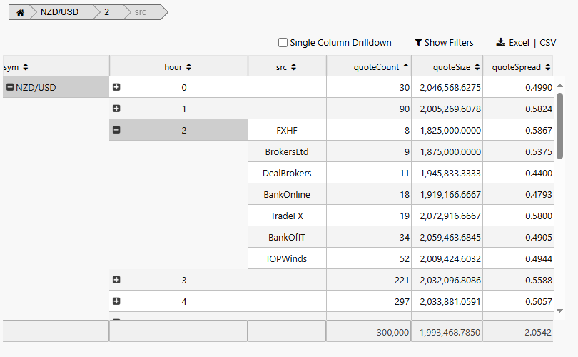
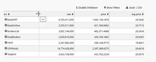
Drilldown refers to an action taken by the user to pursue more information about a given value. A drilldown is performed when the user clicks on the plus sign (+) that appears in front of the breakdown value. The additional information comes from the presentation of more breakdown columns.
The following screenshot shows a Breadcrumbs component and a Pivot Grid with the optional Pivot Grid tools.
This page provides details on how to set up a Pivot Grid, configure Pivot Grid properties, and adjust the Pivot Grid column layout.
Set Up a Pivot Grid
To set up a Pivot Grid component, click-and-drag the component into the workspace and configure the following:
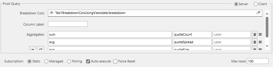
- Define the data source, and ensure the Pivot checkbox is checked to complete the Pivot Query section in the dialog.
- Set the Focus property to align with a Breadcrumbs component (optional).
- Configure breakdown and aggregate column formats.
Refer to Pivot Grid properties described in the next section for details on additional properties.
Pivot Grid Properties
The following sections provide details on how to configure the properties of the Pivot Grid component.
Basics
Open the Basics properties on the right and configure the properties described in the following table.
| Field | Description |
|---|---|
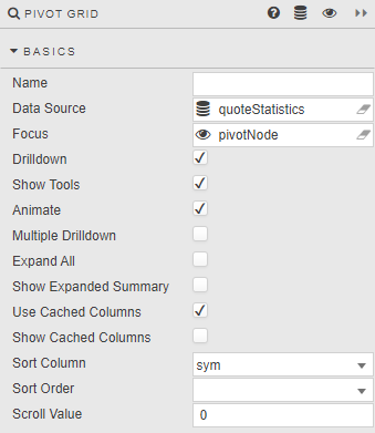
| Name | A name for the component provided by the user. |
| Data Source | Define the source data for the grid. Ensure that the Pivot checkbox is checked and the Pivot Query section is filled in. |
| Focus | A View State Parameter used for linking components. |
| Single Column Drilldown | Limits the number of displayed breakdown columns to one. When unchecked, expanding a breakdown value adds the next breakdown column to the grid. When checked, drilling down uses and shows a single column to display breakdown values.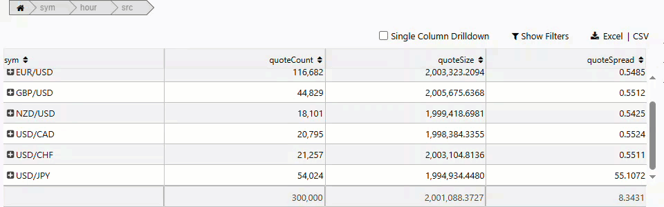 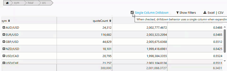 |
| Allow Multiple Paths | When checked, allows multiple breakdown values from the same column to be selected (for example, OLAP drilldown). Using this feature disables Single Column Drilldown mode. |
| Drilldown Input Area | Specifies the area within a breakdown cell that serves as the input control to perform a drilldown. Breakdown Cell: the entire cell is used. +/-: the + or - serves as the input control, and all other areas within the cell can be used to process Click/Double Click trigger Actions or perform Row/Cell Selections.Note: The Selection and Click/Double Click Trigger Action features are not available for subtotal summary data. Breakdown values with the preceding - are subtotal summary data and cannot be selected or processed by Click/Double Click Trigger Actions. |
| Show Tools | When selected, displays user controls for Single Column Drilldown, Filters and File Export options. The Filter feature has limited support for regular expressions.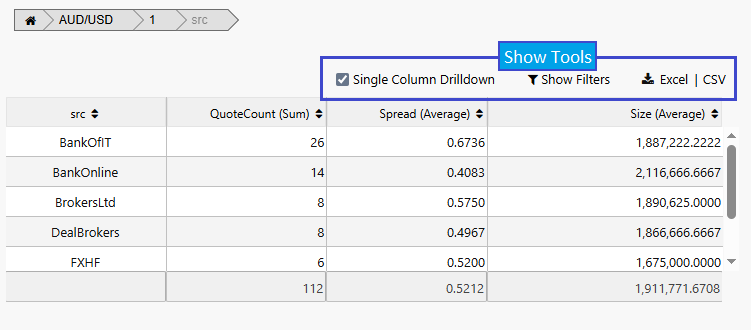 |
| Animate | Offers smoothing animation on drilldown versus a hard drilldown. |
| Show Expand All Button | When checked, the plus or minus sign appears in the header of breakdown columns, allowing users to expand or collapse all breakdown values in a column. When all values in a column are expanded, the button changes to a minus sign.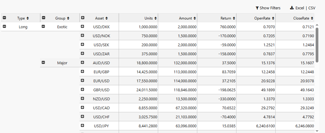 |
| Show Expanded Summary | For a drilldown row, when checked the parent summary values are included; otherwise only the child drilldown values are shown.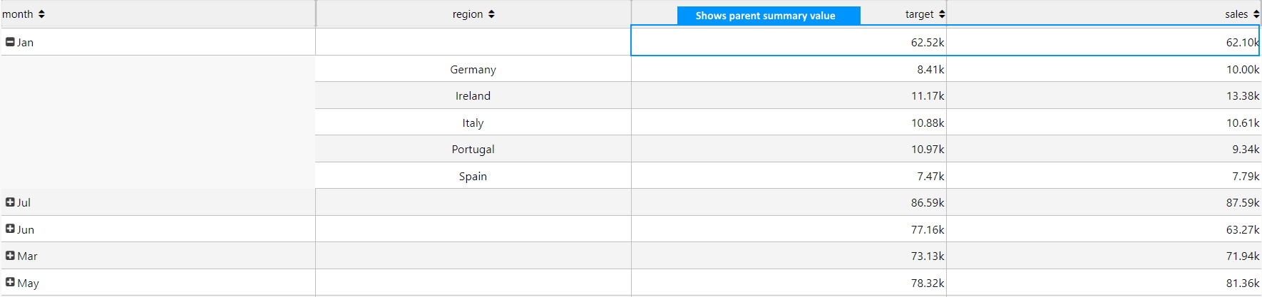 |
| Aggregate Function Tooltip | When checked, a tooltip identifying the aggregate function appears on hover. If a custom function is specified, the tooltip displays Analytic.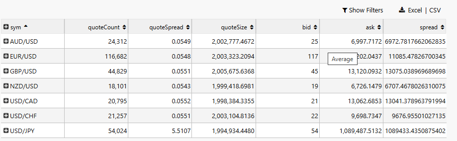 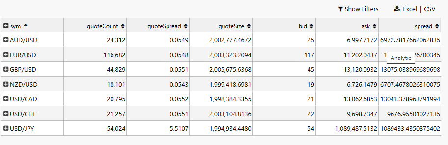 |
| Use Cached Columns | If checked, for new aggregated or breakdown columns it takes the column data from the column cache if present. |
| Show Cached Columns | When checked, the Cached Columns properties are displayed. |
| Sort Column / Sort Order | Define the default sort order (ascending or descending) for the selected data source column on load. |
| Scroll Value | A number representing the distance in pixels from the top of the pivot grid to the currently visible scroll position. |
| Keep User Customizations | When checked, changes to a column size or column position are automatically saved for the end-user and applied when the Dashboard reloads. When the Breakdown Cols value is specified using a view state, the end-user must click Save View State to preserve changes. The Reset View State button can be used to restore original column widths and positions. |
| Column Width Mode | Select the method for calculating column widths. Relative: dynamic sizing based on the size of the Pivot Grid (default). Fixed: column widths do not change when the grid or window resizes. Fixed for User resized columns, otherwise Relative (Mixed Mode): columns are relative unless the end-user resizes them, at which point they become fixed.Note: If the Column Width Mode is changed after an end-user has saved column widths, the Dashboard author's settings supersede the saved end-user data. |
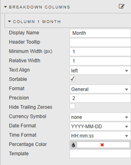
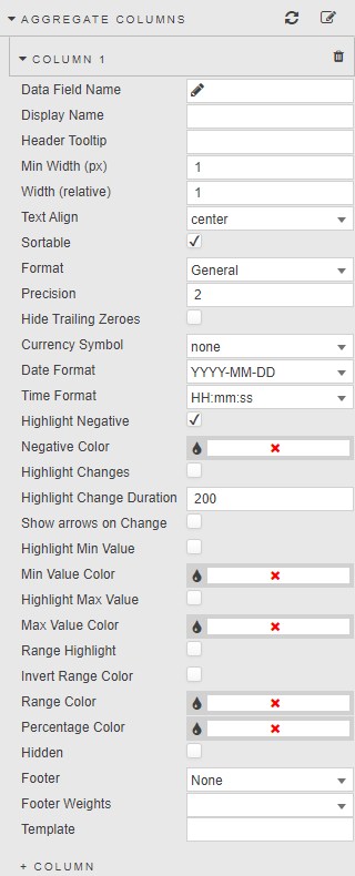
Breakdown Columns
Breakdown columns define how the data is grouped and organized in the pivot grid. They determine the categories over which aggregate columns compute summary values.
| Field | Description |
|---|---|
| Display Name | Enter a name for the column. |
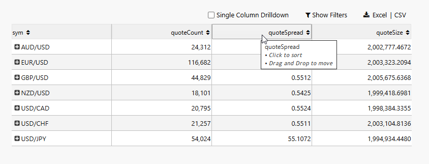
| Header Tooltip | Text description that appears when the mouse hovers over a column header. If blank, the default tooltip specifies the column name and available features.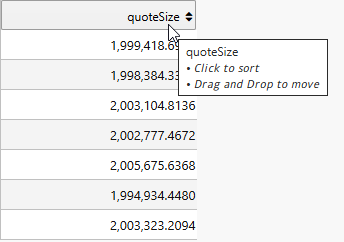 |
| Minimum Width (px) | Specifies the minimum width of the column in pixels. |
| Fixed Width / Relative Width | Set the column width as a fixed pixel value or relative to the grid. Determined by the Column Width Mode setting. |
| Text Align | Sets the text alignment to center, left, or right. |
| Sortable | When checked, a sort indicator (triangle) appears in the column header and the user can toggle between Ascending, Descending, and No Sorting. When unchecked, sorting is disabled. |
| Format | Formatting for the column data.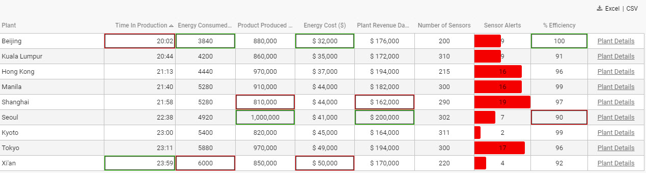 |
| Precision / Hide Trailing Zeroes | Number of decimal places for numeric data, and whether to show trailing zeroes. |
| Currency Symbol | Text representation of currency symbol; select from $, £ or €.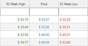 |
| Date Format / Time Format | Set the date and time format. |
| Percentage Color | A color: where Format is Percentage, displays a mini bar in the range 0–100%.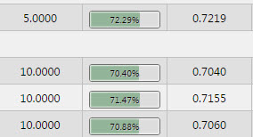 Tip: Percentage Color can be a View State Parameter: roll over the end of the input bar until the eye icon appears, then click to assign the view state. |
| Template | Apply HTML customizations with Handlebar helpers. For example: <font color="blue">{{column name}}</font>. Refer to Templates for further details. |
Aggregate Columns
Aggregate columns present the numeric or quantitative values resulting from an aggregation function (SUM, AVG, COUNT).
| Field | Description |
|---|---|
| Data Field Name | A Data Source column. |
| Display Name | Column name. |
| Header Tooltip | Text description on column header hover. If blank, defaults to column name and available features. |
| Minimum Width (px) | Specifies the minimum width of the column in pixels. |
| Relative Width / Fixed Width | Set the column width as relative or fixed. Determined by the Column Width Mode setting. |
| Text Align | Alignment of values: left, center, right. |
| Sortable | When checked, enables sort indicator in column header. When unchecked, sorting is disabled. |
| Format | Formatting for the data in the column. |
| Precision | Where data are numeric, the number of decimal places to display. |
| Hide Trailing Zeroes | Removes trailing zeroes from displayed values. |
| Currency Symbol | Set the currency symbol to be used. |
| Date Format / Time Format | Where Format is Date, Time, or DateTime, the display format is combined from Date Format and Time Format.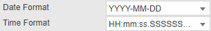 |
| Highlighting negatives | When Highlight Negative is checked, negative values are shown in Negative Color.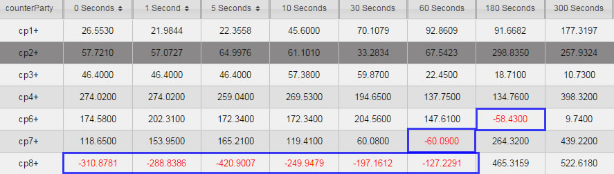 |
| Highlighting changes | When Highlight Changes is checked, cells are highlighted green (higher than previous) or red (lower than previous). Used for streaming or polling data. Persistence is controlled by Highlight Change Duration. |
| Show arrows on Change | When checked, up and down arrows appear when the value is greater or less than the previous value. Used for streaming or polling data. |
| Highlighting highs, lows and ranges | Highlight Min Value, Highlight Max Value, and Range Highlight apply colors to highlight values.  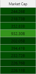 |
| Invert Range Color | Flip range color usage: dark shade for high values, light shade for low values. |
| Percentage Color | A color used for mini-bars when Format is Percentage.Tip: Min Value Color, Max Value Color, Range Color, and Percentage Color can be View State Parameters. |
| Footer | Displays a column total for weighted average, average, count, sum or none in the footer row. When filters are in use, totals are calculated using filtered results.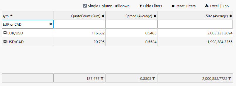 |
| Footer Weight | Applies a weighting to the current column by selected data source variable. Requires Footer to be set to weighted average. |
Selection and Routing
Configure the properties described in the following table.
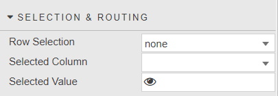
With Row Selection, values from the selected grid row or cell are mapped to a View State Parameter. Refer to Viewstate routing for further details.
Action
Refer to Actions for details.
Highlight Rules
Refer to Highlight Rules for details.
File Export
Refer to Export for details about common settings.
| Field | Description |
|---|---|
| Full Export Override | Overrides the pivot query dataset with an alternative dataset. |
Cached Breakdown/Aggregate Columns
When Show Cached Columns is set in the Basics properties, you can configure the properties described in the following table.
| Field | Description |
|---|---|
| Cached Breakdown Columns / Cached Aggregate Columns | A list of dependent and appearance columns that can be defined by the pivot query or a user. For dynamic pivot queries where the column data can change, the cached columns can be used to populate the breakdown and aggregate column list. |
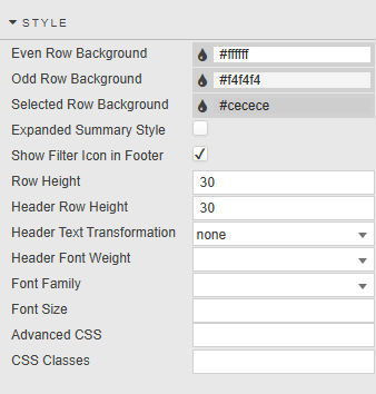
Style
Refer to Style for common settings.
| Field | Description |
|---|---|
| Even Row Background / Odd Row Background | Background colors of the even and odd rows. |
| Selected Row Background | When Enable Row Selection is checked, the background color of the selected row. |
| Expanded Summary Style | When enabled, sets a background color, underline and bold text for the expanded summary. |
| Show Filter Icon in Footer | When checked, a filter icon is presented as a suffix to the footer total if filters are in use. Checked by default. |
| Row Height / Header Row Height | Set the height for headers and table rows.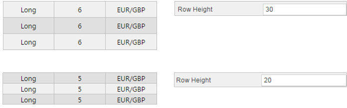 |
| Header Text Transformation | Text transformation for column headers. |
| Header Font Weight | Font weight for column header. |
| Font Family | Font family for column headers and rows. |
| Font size | Font size for rows (CSS format), e.g. 18px, 0.8em, 80%, larger. |
| Advanced CSS / CSS Classes | Refer to Advanced CSS for details. |
Adjusting the Column Layout
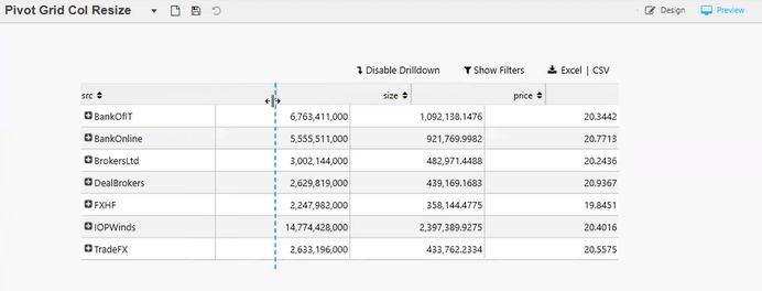
Resize Columns in a Pivot Grid
Dashboard authors can manually specify the column width by typing the size value into the Breakdown and Aggregate column properties.
To visually resize a column in Preview mode or as an end user:
-
Position the mouse over the right-hand border of a column's header. The border changes to the highlight color and the cursor changes to a column resize cursor.
-
Click and drag left or right. A visual guideline spanning the full height of the component becomes visible.
-
Release the mouse button once the desired width is visualized.
When columns are resized visually by the Dashboard author, the Relative Width/Fixed Width column property is automatically updated.
To preserve column width changes made by the end-user, check the Keep User Customizations checkbox in the Basics properties.
Reorder Pivot Grid Columns
-
Position the mouse over a column's header. The default tooltip specifies the column name and available features.
-
Left click and hold the mouse button. A label with the column name appears and moves with the pointer. The cursor changes to a move cursor if the destination is valid, or a not-allowed cursor if invalid. The other column type (breakdown/aggregate) shows a strikethrough appearance to indicate it cannot receive the moved column.
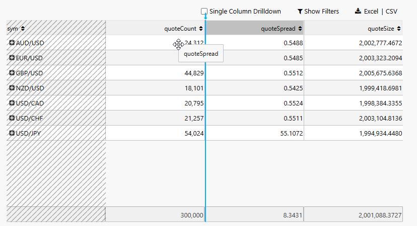
A visual marker (arrow and vertical line) appears to show the intended destination. If the grid has a horizontal scrollbar, moving the mouse within 15% of the grid's visible width triggers automatic scrolling.
-
Release the mouse button to move the column to the indicated location.
To preserve column position changes made by the end-user, check the Keep User Customizations checkbox in the Basics properties.
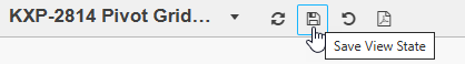
Note
When the Breakdown Cols value in the Pivot Grid's data source is specified using a view state, the end-user must click Save View State to preserve any reordering of breakdown columns.