ChartGL
This page describes the configuration and use of the ChartGL component, which enables you to visualize very large datasets.
ChartGL uses WebGL to access the graphics hardware on the local computer accelerating the rendering process by a factor of many thousand. In WebGL2 a combination of vertex shaders (position) and fragment shaders (color) are used to render data points providing the capability to display millions of data points in milliseconds.
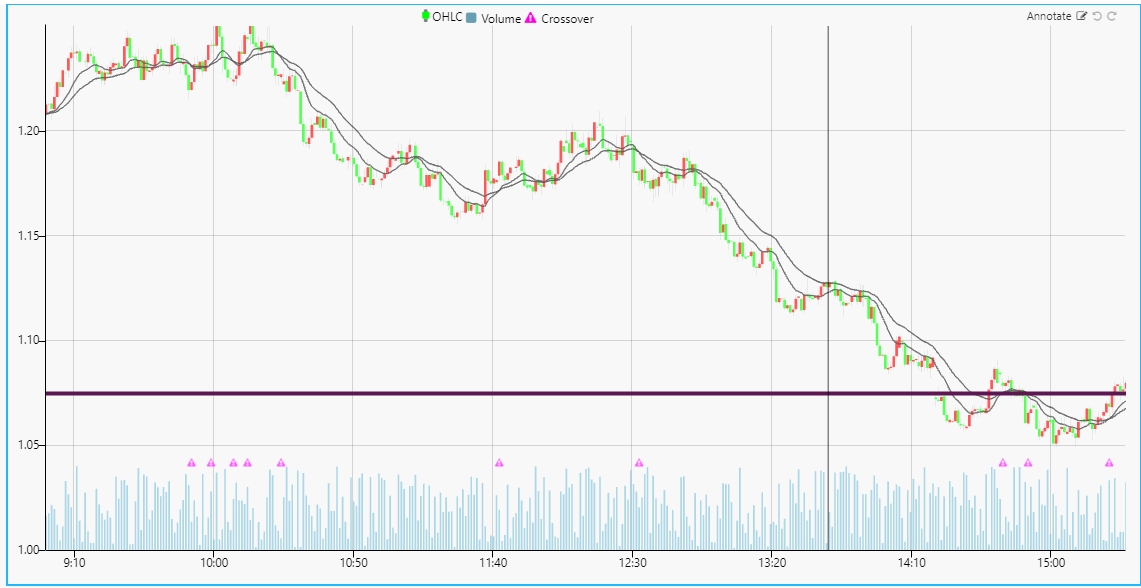
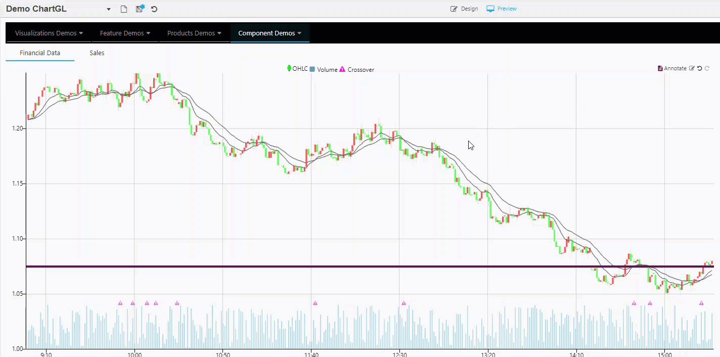
Multiple large data sources can be plotted on the same chart with high speed and performance using layers. The following screenshot shows an example of historic FX data plotted using four layers.
Overcoming browser WebGL limits
Each ChartGL uses its own WebGL context. Browsers limit the number of active WebGL contexts, so when this limit is reached, charts can fail to load. To combat this issue we recommend adding ChartGL components to the Layout Panel component and setting Enable WebGL Context for the layout panel. When this is enabled, every ChartGL that is added directly to the Layout Panel shares a single WebGL context, meaning the user can have an unlimited number of charts.
This page provides information on the following:
Set Up a ChartGL Component
To set up a ChartGL component, click and drag the component into the workspace and configure the following:
-
Click to populate Data Source or select a Data Source from the Layers properties to open the Data dialog. Click New and proceed with configuring the Data Source.
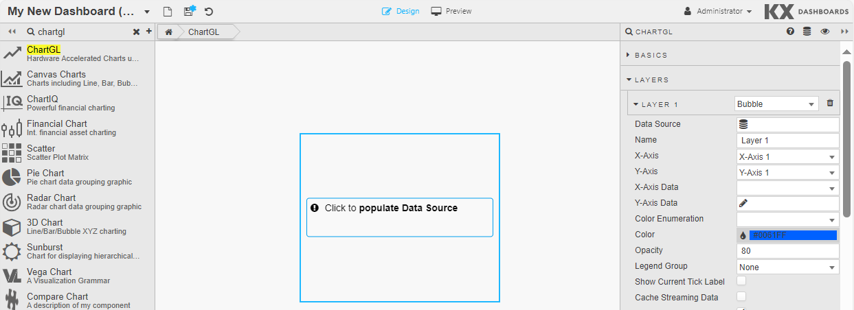
ChartGL best fits your data to the chart using a wild card selector in Y-Axis Data. Otherwise, select your data to plot for X-Axis Data and Y-Axis Data in the Layers properties. Alternatively, format your axes in the relevant properties for each; x-axis and y-axis.
-
Next define the properties as defined in the following sections.
ChartGL Properties
The following sections provides details on how to configure the properties of the ChartGL component.
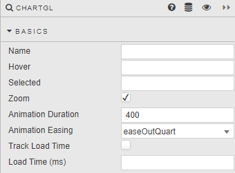
Basics
Open the Basics properties on the right and configure the properties described in the following table.
| Property | Description |
|---|---|
| Name | Enter a name for the component. |
| Hover | Enter a View State Parameter which stores the x-axis value contingent on where the hover bar is on the chart. For example time or date. |
| Selected | Enter a View State Parameter to store the x-axis value at the selected position. For example time or date. |
| Selected First Point | Use this option to allow for the first time in the first layer to be selected when the chart loads. - When checked, and when the Selected property is set to a viewstate, it sets the Selected viewstate value to be the first point in the first layer on initial chart load. - This is unchecked by default. |
| Range Selection | When this is enabled the user can click and drag on a chart as normal, but instead of zooming, it stores the x-axis range values. The values can be accessed by assigning view states to the Selection Min & Selection Max properties on the x-axes. It turns the chart into a selector that stores the values in the x-axis Selection Min and Selection Max view state properties.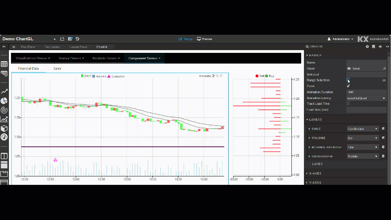 When this is enabled, it overrides the Zoom checkbox. If both are left unchecked, the chart does not zoom or use the range selection. |
| Zoom | Check to enable/disable zoom. This feature makes it possible to zoom on a region within both x and y axis, or individually on each x or y axis. Double-Clicking the chart resets the chart to its initial state.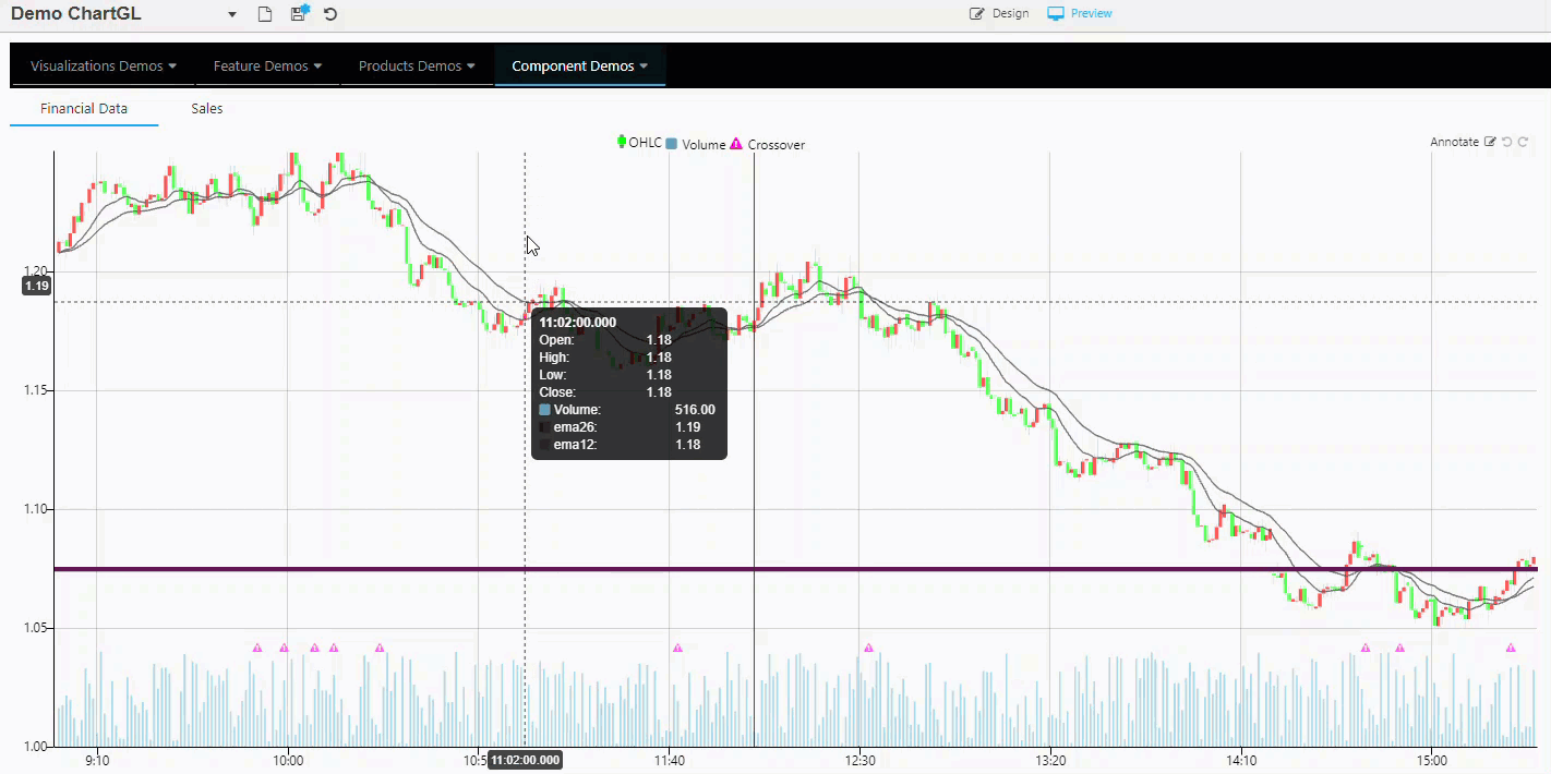 Mouse scroll can be used for x-axis zoom, with mouse scroll + shift key for y-axis zoom. |
| Animation Duration | Define the zoom animation and length of time in milliseconds to complete. |
| Animation Easing | This drop-down list of options are used to control how the zoom animation transitions. For example bounce creates a spring like effect. The Pan feature lets you pan along one axis at a time. To pan, click and drag from anywhere on the axis. Double-clicking the chart resets the chart to its initial state. 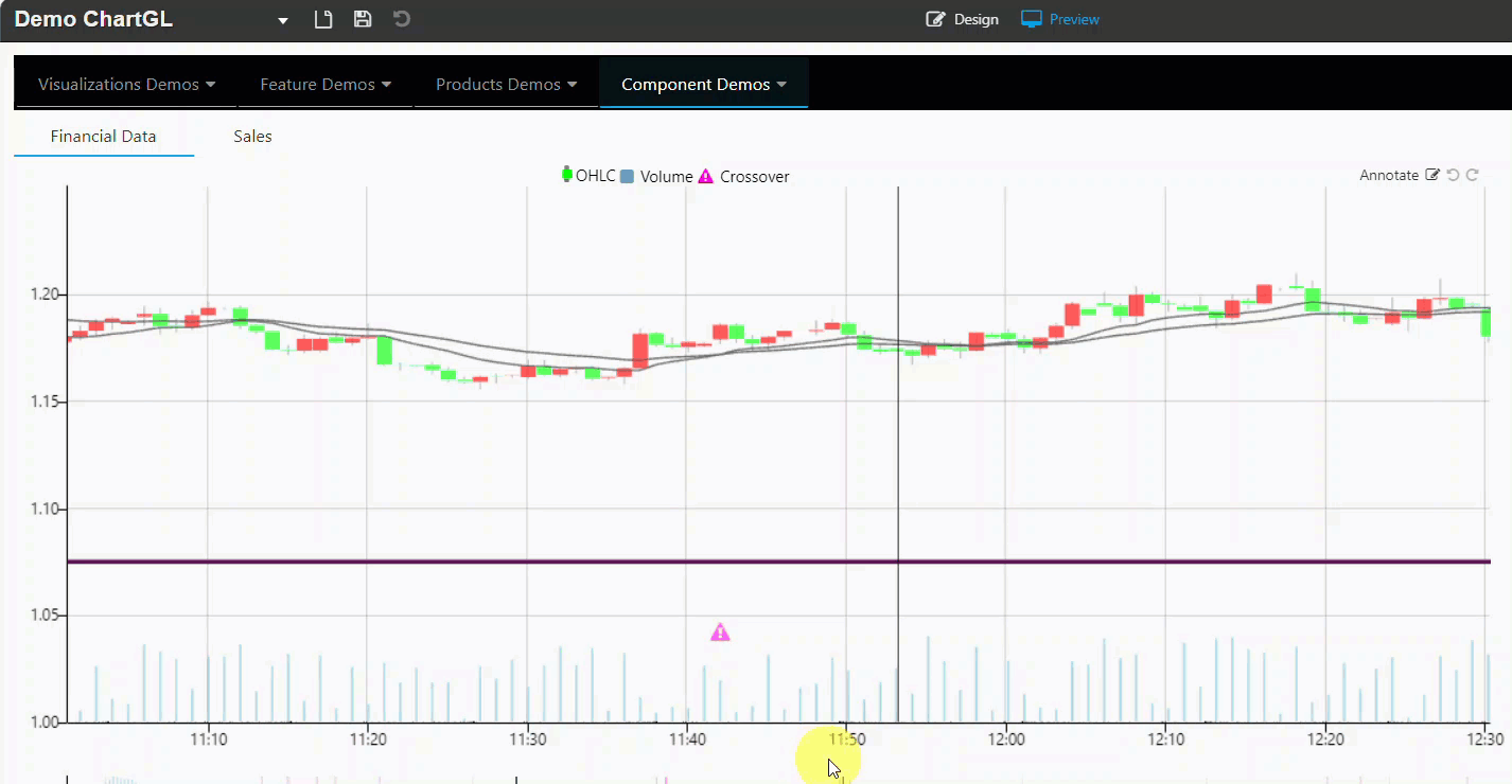 |
| Track Load Time | Enable this to set the Load Time (ms) value. |
| Load Time (ms) | Use this to set a View State Parameter used to track the load time of the chart, in milliseconds, on each update of the data. This is useful for tracking the performance of the chart to see how long it takes to load. When Track Load Time is enabled, and Load Time (ms) has a view state set, it writes the time in ms into the view state. This view state value can then be displayed in a text component.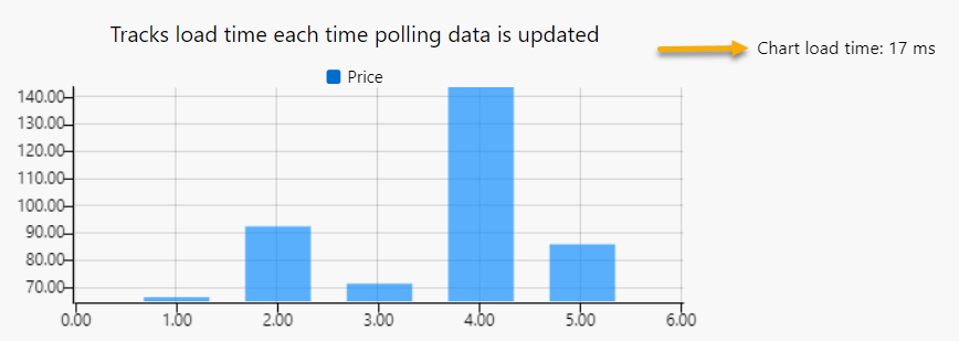 |
| Add Patterns to Bars | Adds patterns to bars for accessibility and visual differentiation. |
| Inherit Hierarchical Rules | When this is checked the ChartGL component inherits Hierarchical Rules set for the Dashboard. However when set, the chart's Override Rules override any Dashboard level Hierarchical Rules. |
Layers
Layers provide the ability to display multiple different data sources on the same chart. In the following example four layers have been defined; Candlestick, Bar, Line, and Bubble.
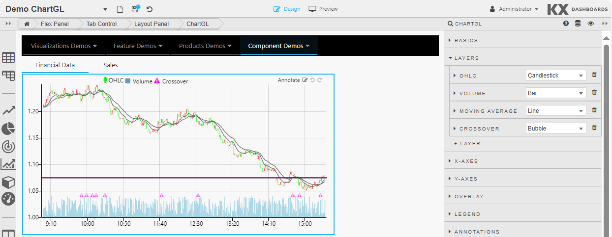
To add a Layer, click Layers and Layer 1 to open the properties for the first layer.
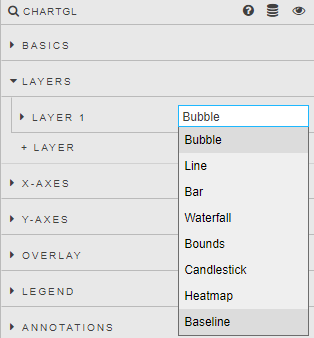
Select a layer type from the dropdown. The properties displayed vary depending on the option selected.
Bubble layers display data as individual points.
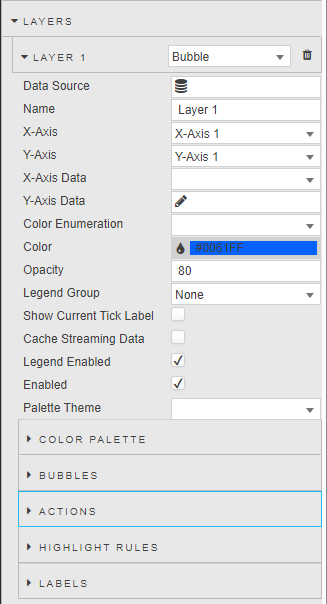
Define the following:
Line layers connect each data point resulting in a continuous line.

Define the following properties:
Bar layers display data as bars.
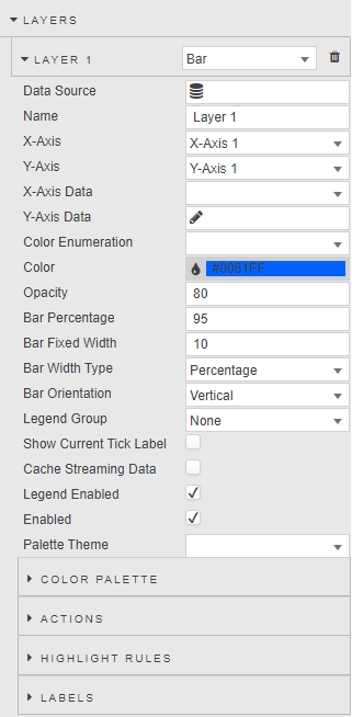
Define the following properties:
Waterfall layers display data as increase and decrease bars.
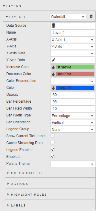
Define the following properties:
Bounds layers draw a bounding area between two points.
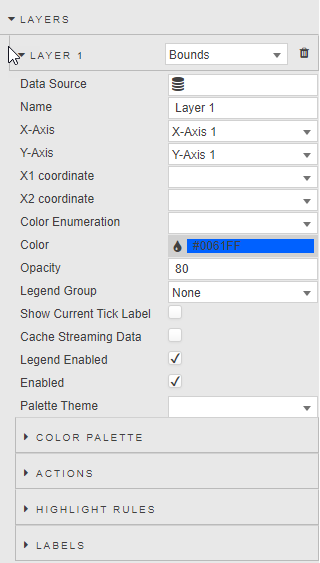
Define the following properties:
Candlestick layers display data as candlesticks.
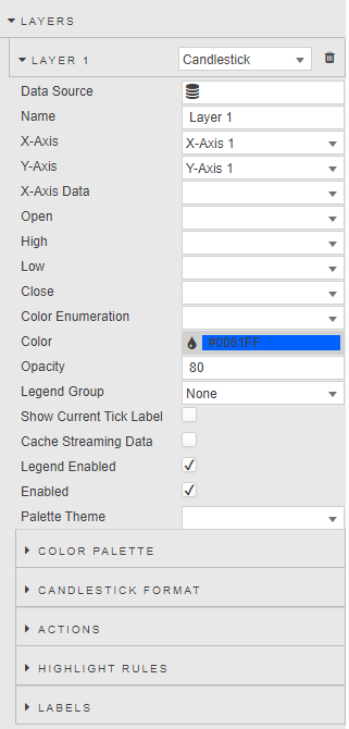
Define the following properties:
Heatmap layers draw a heatmap chart.
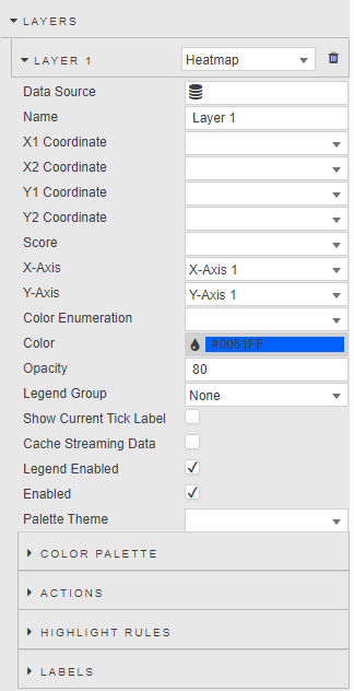
Define the following properties:
Baseline layers draw a line at a single point.
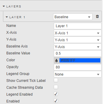
Define the following properties:
General Layer Properties
The following properties are relevant to all layer types, unless otherwise stated.
| Property | Description |
|---|---|
| Data Source | Specify the Data sources to be used for the layer. This is not relevant to Baseline layers as they use Baseline Value/Baseline Axis to specify where the Baseline is drawn. |
| Name | Enter a name for the chart legend label. |
| X-Axis | Select the x-axis from the defined Axes. |
| Y-Axis | Select the y-axis from the defined Axes. |
| X-Axis Data | Select data columns to plot X-Axis data from the data source. |
| Y Axis Data | Select data columns to plot Y Axis data from the data source. Y Axis includes a wildcard selection (*) for multiple columns. Wildcard selection uses columns of the most common, single kdb type. For example, if a data set has one date type column, three integer type columns, and five float type columns, only the five float columns are plotted using the wildcard. The integer and date columns are ignored.Regular expressions can also be used to define the y-axis. When a wildcard or regular expression is used, the Color Palette defines point color for each added column. The following kdb data types are supported; byte, char, date, datetime, float, int, long, minute, month, real, second, short, string, symbol, time, timespan, and timestamp. |
| Multi X-Axis | Add multiple x-axis groups by selecting one or more columns to populate the multiple x-axes, without affecting the datapoints shown. Each column is a separate x-axis, grouping values together. You can format the axis settings on the layer's linked x-axis under Multi Axis Format.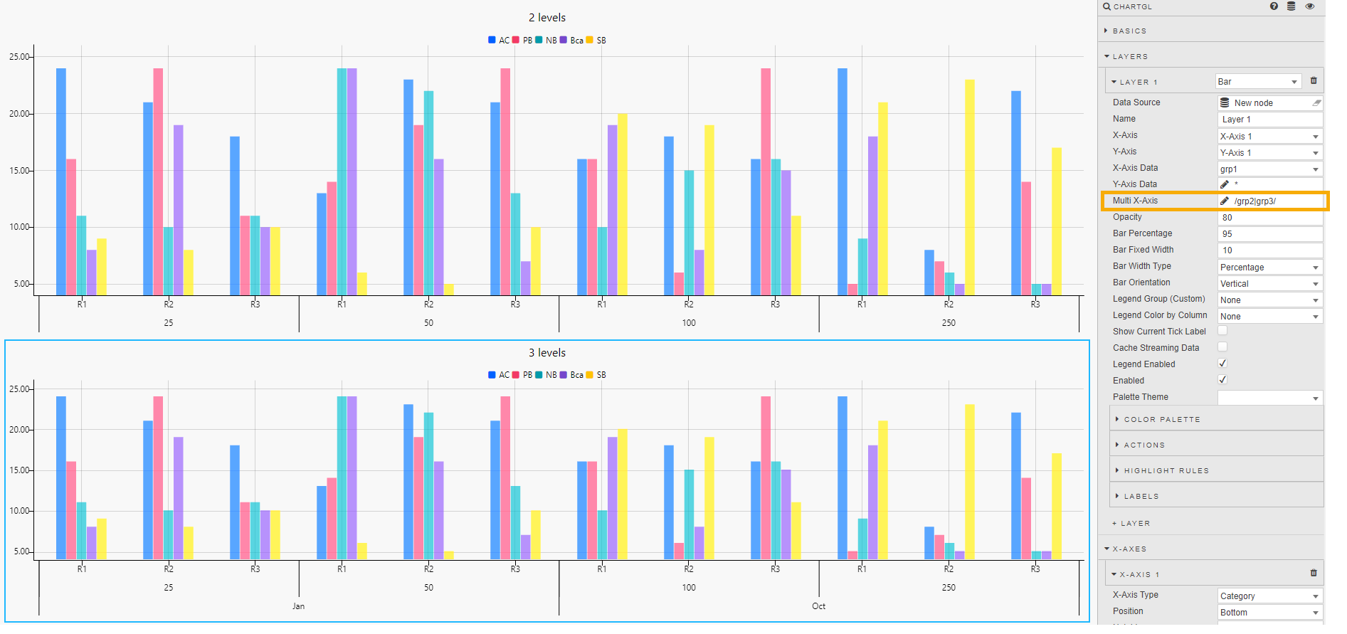  |
| Open / High / Low / Close | These properties apply only to Candlestick layers. Select the data columns that correspond to the open, high, low, and close price points. |
| X1 Coordinate | This is only relevant for Heatmap layers. Select the data column that corresponds to the X1 coordinate. |
| X2 Coordinate | This is only relevant for Heatmap layers. Select the data column that corresponds to the X2 coordinate. |
| Y1 Coordinate | This is only relevant for Heatmap layers. Select the data column that corresponds to the Y1 coordinate. |
| Y2 Coordinate | This is only relevant for Heatmap layers. Select the data column that corresponds to the Y2 coordinate. |
| Score | This is only relevant for Heatmap layers. Select the data columns that correspond to each. Colors are defined by the Score column, which uses the Color Palette. |
| Color | Select color for single plot (non-wildcard/regex) data sets. |
| Opacity | Define the opacity of the points from a value between 0 (transparent) and 100 (opaque). |
| Bar Percentage | This is only relevant for Bar layers and defines the bar width as a percentage of its range when Bar Percentage is selected from Bar Width Type. |
| Bar Fixed Width | This is only relevant for Bar layers. It defines the bar width as a fixed value when Fixed Width is selected from Bar Width Type. |
| Bar Width Type | This is only relevant for Bar layers. Use the dropdown to select either Bar Percentage or Fixed Width. |
| Bar Orientation | This is only relevant for Bar layers. Use the dropdown to select either Vertical or Horizontal. |
| Bar Increase Color | This is only relevant for Bar layers and is used when the layer type is Waterfall to define the visual style of the Waterfall bar increase colors based on the previous bar value. |
| Bar Decrease Color | This is only relevant for Bar layers and is used when the layer type is Waterfall to define the visual style of the Waterfall bar decrease colors based on the previous bar value. |
| x1 | This is used when the layer type is Bounds, to define the x1 coordinates of the bounding region. |
| x2 | This is used when the layer type is Bounds, to define the x2 coordinates of the bounding region. |
| Baseline Axis | This is used when the layer type is Baseline, to define the axis at which to draw the baseline, based on the Baseline Value. |
| Baseline Value | This is used when the layer type is Baseline, to define the value at which to draw the baseline. The axis on which this is drawn is set in Baseline Axis. This is used in place of a Data Source.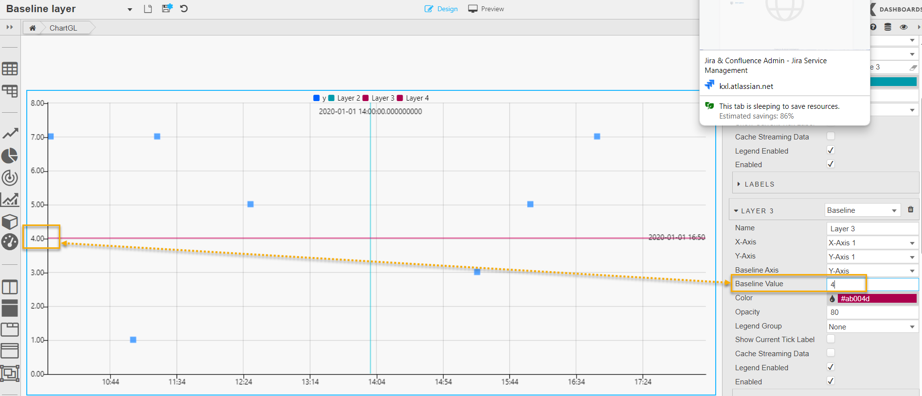 |
| Legend Group (Custom) | Use this dropdown to assign the layer legend to a Legend Group. |
| Legend Color by Column | Select a data column to apply color. When a column is selected, the Color Palette defines point color for each unique value in the column. This is not applicable to Baseline layers. |
| Show Current Tick Label | Enable this to display the last tick in the series on the y-axis. |
| Cache Streaming Data | Enable this when using streaming data to improve performance by caching data. |
| Legend Enabled | Use this to toggle the display of the data legend. |
| Enabled | Use this to toggle the display of the data layer on the chart and can be tied to a view state parameter. |
Bubbles
The following additional properties are configurable when the layer type is Bubble or Line.
| Property | Description |
|---|---|
| Radius Data | This dropdown gives options to set the variable point size for the bubbles. Select either Fixed Size or one of the columns from the associated data source. |
| Radius Scaling | Define the bubble size. |
| Scale on Zoom | Increase the bubble size on zoom. |
| Set Icon from Data | Check this to assign different icons and colors to bubbles based on their data source. This visual differentiation allows viewers to quickly identify and distinguish between multiple data layers or origins within the same chart. It is particularly useful when overlaying several datasets for comparison or correlation. When Set Icon from Data is enabled, the Icon property changes to a dropdown and the Icon Color property is displayed. When icons are taken from the data source they must be specified as shown in the following example: - icon:("fa-caret-up";"fa-caret-down";"fa-caret-up"); — where fa-xxx indicates a font awesome icon. Alternatively you can use a base-64 encoded image string.- iconColor:("green";"red";"green")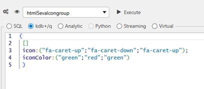 |
| Icon | Use the icon selector to choose an icon to be displayed in the position of the data points on the chart. When Set Icon from Data is unchecked, the following dialog appears allowing you to select the icon image manually.  Icons also support a base64 image in a view state parameter.  When Set Icon from Data is enabled, this property changes to a dropdown with a list of columns from your datasource. Select the column representing the icon to be used. Note: Since ChartGL does not support point styles, you must use either Font Awesome icons or base64-encoded images for point customization. |
| Icon Color | Set the color of bubbles when using a Line or Bubble layer that has Set Icon from Data enabled. Select the data source column to be used for the color of the icon. |
| Color | Set the color of bubbles when using a Line layer. When Set Icon from Data is enabled, empty values in the Icon Color are filled with the color specified here. |
| Opacity | Set opacity of bubbles when using a Line layer. |
Candlestick
The following additional properties are configurable when the layer type is Candlestick.
| Property | Description |
|---|---|
| Bear Color | Set the color for down day candles. |
| Bull Color | Set the color for up day candles. |
| Neutral Color | Set the color for flat days. |
| Bar Percentage | Define the candlestick body width as a percentage of its range when Bar Percentage is selected under Bar Width Type. |
| Bar Fixed Width | Define the candlestick body width as a fixed value when Fixed Width is selected under Bar Width Type. |
| Bar Width Type | Use the dropdown to select either Bar Percentage or Fixed Width. |
| Bar Orientation | Use the dropdown to select either Vertical or Horizontal. |
Line
The following additional properties are configurable when the layer type is Line.
| Property | Description |
|---|---|
| Line Width | Set the thickness of the line. |
| Line Style | Choose between None, Dashed, Dotted. |
| Dash Gap | When Line Style is Dotted or Dashed, set the size of the gaps. |
| Dash Width | When Line Style is Dashed, set the width of the dashes. |
| Fill | Select a fill option: No Fill — No color fill. Layer n — For color fill between the charted line and the selected layer (only shown if there is more than one layer). Origin — For color fill between the chart line and X-axis. |
| Fill Color | The color to be used for line fill for single plot (non-wildcard/regex) data sets. |
| Fill Opacity | The opacity used for line fill. |
| Fade to Transparent | Where a line fill color is employed, a transparency gradient is applied to the layer. |
| Span Gaps | Where there is missing data, check this to connect isolated points. |
| Palette Theme | Define the Palette Theme for the Fill Palette. |
Fill Palette
This sets the line fill colors for wildcard/regex y-axis or Legend Color by Column. See Palette for further details.
Interpolation
Interpolation lets you estimate a value between two known values explicitly stated in a line graph. You can specify the following interpolation properties.
| Property | Description |
|---|---|
| Interpolation | Choose between the following types: - Linear — connects data points with straight lines.- Stepped — assumes that the function remains constant between adjacent data points. It creates a step-like curve where the value jumps from one data point to the next without any intermediate values.- Monotone — the interpolated curve maintains monotonicity between data points. Monotone Interpolation comes with a performance caveat, so isn't suitable for streaming. |
| Stepped Line | Use this to switch between stepped line chart types; Before and After. |
| Curvature | Set the level of curve to use for Monotone line charts. |
Color Palette
The Color Palette sets plot point colors for wildcard/regex y-axis or Legend Color by Column. See Palettes for further details.
Bars
The following additional properties are configurable when the layer type is Bar or Waterfall.
| Property | Description |
|---|---|
| Bar Percentage | Defines the bar width as a percentage of its range when Bar Percentage is selected from Bar Width Type. |
| Bar Fixed Width | Defines the bar width as a fixed value when Fixed Width is selected from Bar Width Type. |
| Bar Width Type | Use the dropdown to select either Bar Percentage or Fixed Width. |
| Bar Orientation | Use the dropdown to select either Vertical or Horizontal. |
| Border Width / Border Opacity / Border Color | Setting Border Width to a value greater than zero enables borders on bars. You can also set the opacity and color of these borders. These properties improve visual clarity by helping distinguish adjacent bars.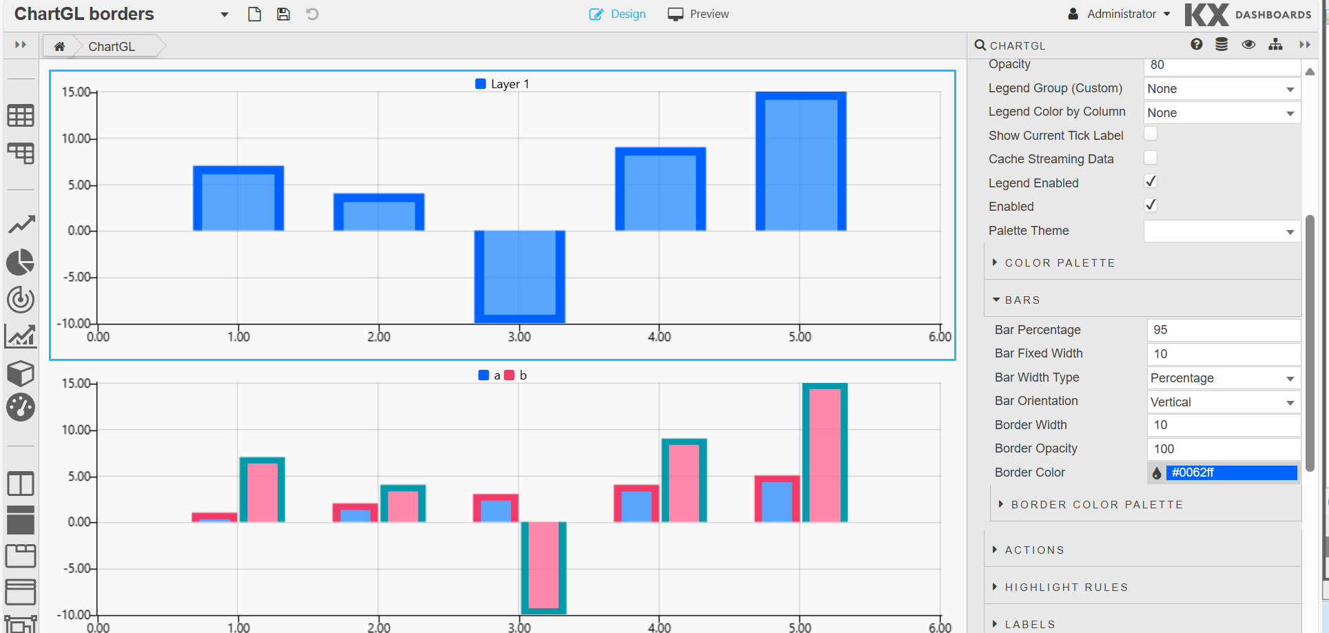 |
Actions
See Actions for full details.
Highlight Rules
See Highlight Rules for full details.
Labels
Data labels can be added to any layers. They are placed next to datapoints/bars as desired.
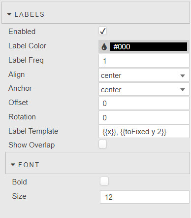
| Property | Description |
|---|---|
| Enabled | Turn on or off data labels. This can be tied to a view state. |
| Label Color | Set the color of the Label text. |
| Label Freq | Labels are applied to every nth data point where n is value set here. |
| Align | Choose the position label; top, bottom, left, right, or center of the data point. |
| Offset | The offset represents the distance (in pixels) to pull the label away from the data point. This can be specified as a single number (for example 4) or an x,y coordinate (for example 4,10). |
| Rotation | Set the clockwise rotation angle (in degrees) of the label with the rotation center point being the label center. The default value is 0 (no rotation). |
| Max Label Quantity | The max number of labels to draw. The default value is 10. |
| Label Template | Define the data to display. This must return a string; HTML is not supported. Select the data to display with the Template Editor in either Basic or Advanced mode. Existing data and view states can be displayed. Handlebar helpers can be used for formats.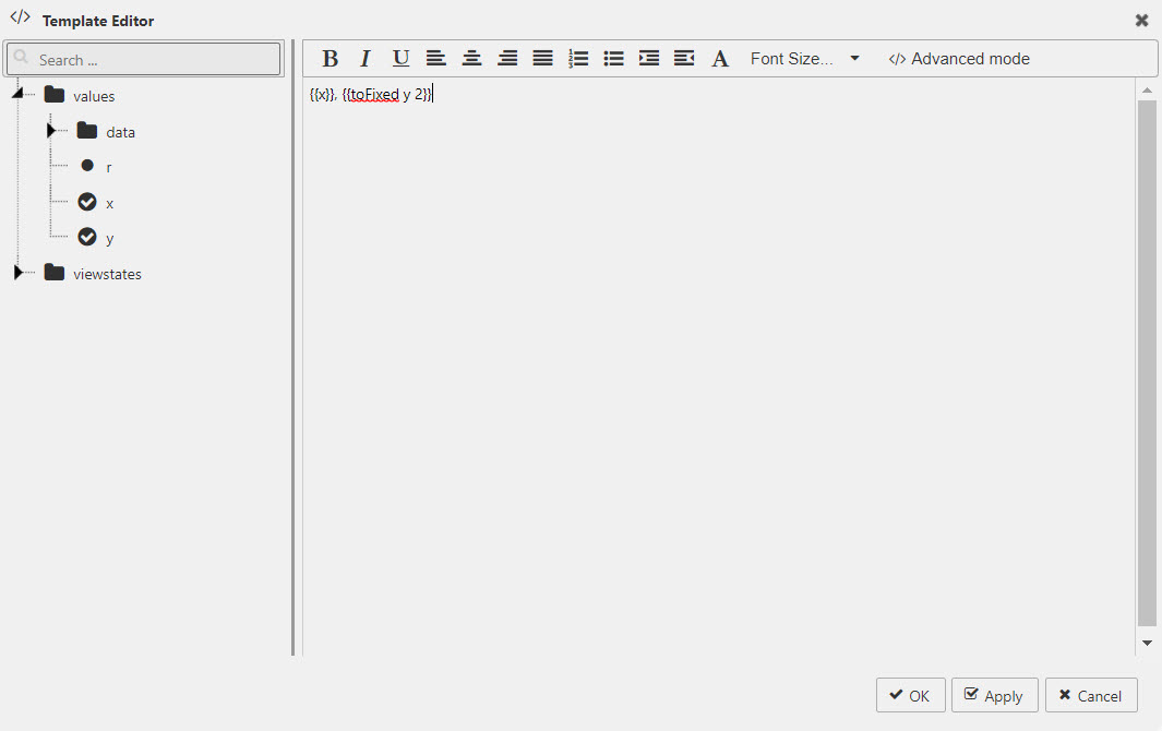 |
| Font | Set the font settings: Bold — check to make the label bold. Size — adjust the font size in pixels. |
X-Axes
ChartGL supports multiple X-axes. This is useful if you want, for example, to compare different scales, overlay data series, represent different time zones or different geographic coordinates. There is no limit on the number of x-axes that can be added.
The following screenshot shows a ChartGL with 3 x-axes defined; 2 on the bottom of the chart and one on top.
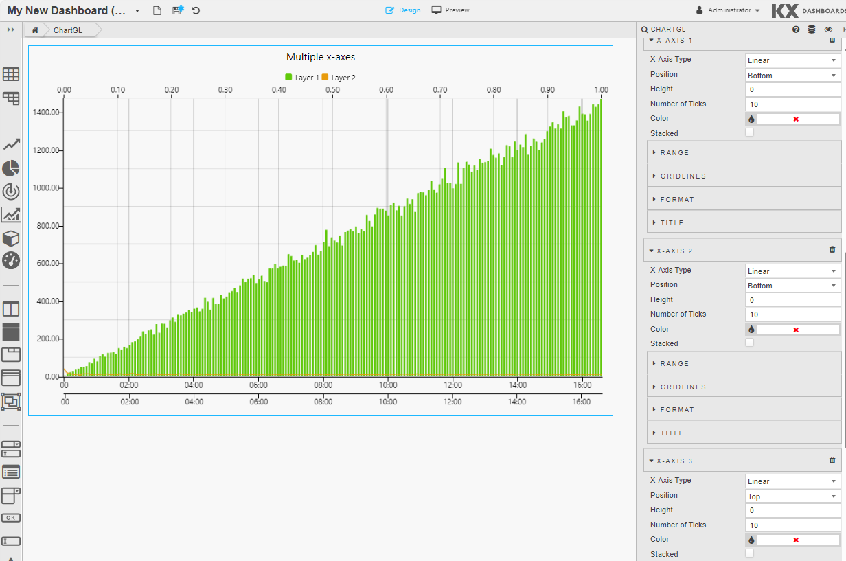
For each x-axis you can define the following properties: General x-axis properties, Range properties, Gridlines properties, Format properties, Title properties.
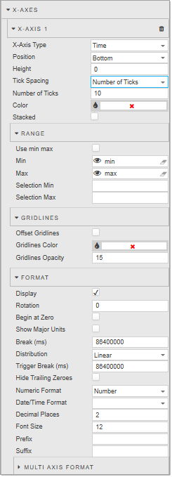
X-Axis General Properties
| Property | Description |
|---|---|
| X-Axis Type | Choose between Line, Linear, Category, Time or Logarithmic data. |
| Position | Select whether you want to position the axis to the top or bottom of the chart. |
| Height | Set the height of the tick area of the x-axis in pixels. |
| Tick Spacing | When the X-Axis Type is set to Time, you can specify the type of tick spacing as either: Number of Ticks or Fixed Tick Interval (ms). The next field displayed depends on the option selected. |
| Number of Ticks | Set the number of ticks to display in the axis. The default is 10. |
| Fixed Tick Interval (ms) | Set the interval between ticks in milliseconds. For example an interval of 1800000 results in 30 min tick intervals on the x-axis.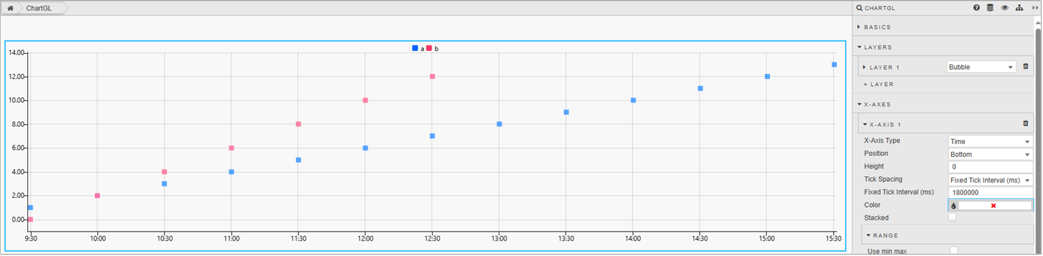 |
| Color | Select the color of the axis. |
| Filter Unique | Displayed when the Axis Type is set to Category. When using non-linear data (string/symbol), some values may be the same. Filter unique is used for grouping same values together.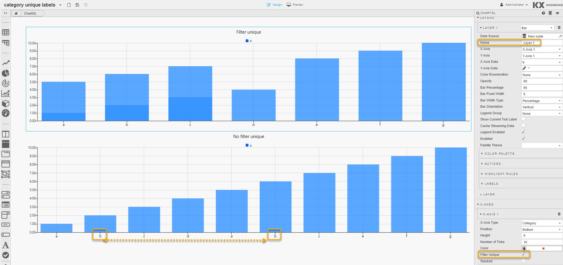 |
| Sort | Displayed when the Axis Type is set to Category. When checked, the axis data is sorted. Strings are sorted alphabetically. This is unchecked by default. |
| Stacked | When using a Bar Chart, check this to have the bars stacked. |
X-Axis Range
| Property | Description |
|---|---|
| Use Min/Max | Enable the use of Min and Max to build the x-axis. If these are unchecked the Min and Max values set below are ignored. |
| Min | Define the minimum value for the x-axis. |
| Max | Define the maximum values for the x-axis. Charted data outside of the set Min and Max range is not displayed. If all data falls outside the set range, the chart is blank. |
| Selection Min | Pull min x-axis values on a zoom select into the assigned view state parameters. |
| Selection Max | Pull max x-axis values on a zoom select into the assigned view state parameters. |
X-Axis Gridlines
| Property | Description |
|---|---|
| Offset GridLines | Enable to align x-axis grid lines to the mid-point between tick values. |
| GridLines Color | Define the color of x-axis grid lines. |
| GridLines Opacity | Define the opacity (0 (transparent) to 100 (opaque)) of x-axis grid lines. |
X-Axis Format
| Property | Description |
|---|---|
| Display | Toggles the display of x-axis. |
| Rotation | Set the clockwise rotation angle (in degrees) of the label. The default value is 0 (no rotation). |
| Begin at Zero | When enabled, the axis data starts at zero. |
| Hide Trailing Zeroes | Hides the display of trailing zeroes in x-axis tick values. |
| Numeric Format | Sets the x-axis format as either Number, Smart Number, Formatted Number. For example 1000, 1K, 1,000. |
| Date/Time Format | Select the x-axis date/time format from the options in the drop-down list, including; YYYY-MM-DD, YYYY-MMM-DD, YYYY-MM, YYYY-MM-DD HH:mm:ss and more. |
| Decimal Places | Sets the precision point for x-axis numeric labels. |
| Font Size | Sets the tick font size in pixels. |
| Prefix | Adds text to the start of tick label; for example currency or percentage symbol. |
| Suffix | Adds text to the end tick label; for example currency or percentage symbol. |
| Distribution | Distribution, Break, and Trigger Break fields are all related and are only displayed when the X-Axis Type is set to Time. They are used when a chart, with time related data, has a break in the data, for example over a weekend when no new data comes in. Options are Linear (remains as is) or Smart (uses the following two properties). |
| Break | When Distribution is set to Smart, use this to define the duration of time in milliseconds at which to break. That is, the space in ms between the two data points you want to shorten: pointB - pointA. |
| TriggerBreak | When Distribution is set to Smart, use this to define the new duration, in milliseconds from the start point; newPointB = pointA + Trigger Break (ms). |
| Show Major Units | Used when the X-Axis Type is set to Time. When enabled, major ticks are generated. Each major tick represents a new parent time (based on the child minor ticks). Minor ticks are shown by default. |
| Multi Axis Format | If the layer has Multi X-Axis set, customize the Rotation, Font Size, Prefix and Suffix for each axis. |
X-Axis Title
| Property | Description |
|---|---|
| Display | Enables the display of the x-axis label. |
| Label String | Defines x-axes label text. |
| Font Size | Sets the label font size in pixels. |
Y-Axes
ChartGL supports multiple Y-axes. This is useful when you are dealing with data that varies significantly in value ranges. Multi-axes charts allow you to plot multiple data sets with different units. There is no limit on the number of y-axes that can be added.
The following screenshot shows a ChartGL with 2 y-axes defined; one on the left and one on the right.
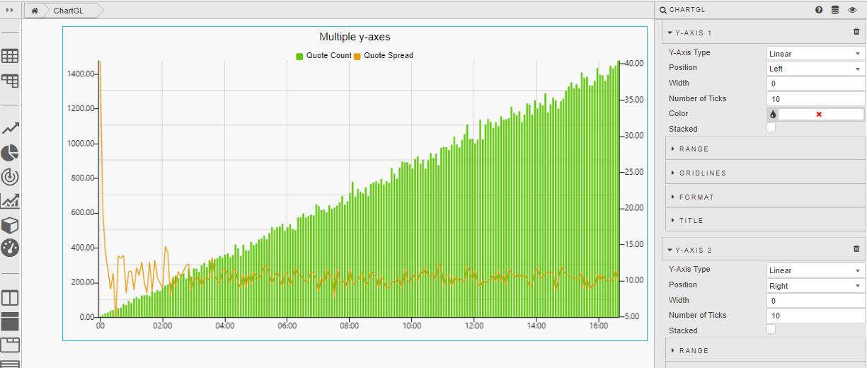
For each y-axis you can define the following properties: General y-axes properties, Range properties, Gridlines properties, Format properties, Title properties.
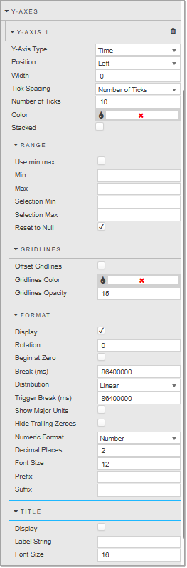
Y-Axis General Properties
| Property | Description |
|---|---|
| Y-Axis Type | Choose between Linear, Category, Time, or Logarithmic data. |
| Position | Set the position of the axis to the Left or Right of the chart. |
| Height | Sets the width of the tick area of the y-axis in pixels. |
| Tick Spacing | When the Y-Axis Type is set to Time, you can specify the type of tick spacing as either: Number of Ticks or Fixed Tick Interval (ms). The next field displayed depends on the option selected. |
| Number of Ticks | Set the number of ticks to display in the axis. The default is 10. |
| Fixed Tick Interval (ms) | Set the interval between ticks in milliseconds. For example an interval of 1800000 results in 30 min tick intervals on the y-axis.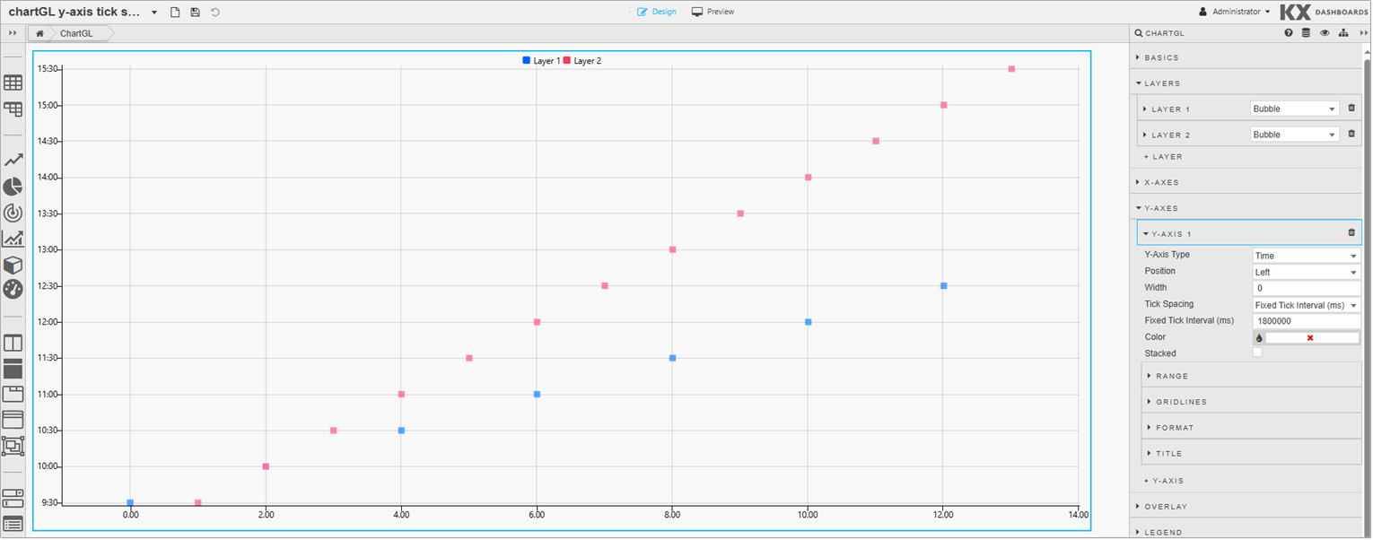 |
| Color | Select the color of the axis. |
| Filter Unique | Displayed when the Axis Type is set to Category. When using non-linear data (string/symbol), some values may be the same. Filter unique is used for grouping same values together.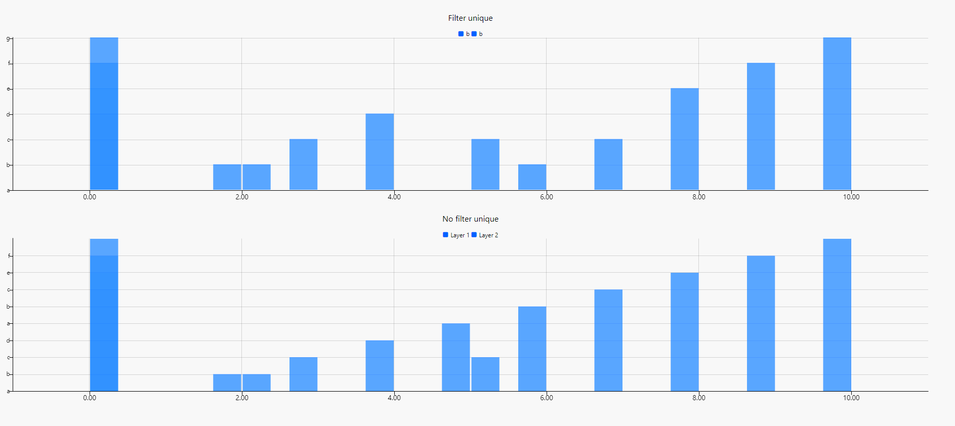 |
| Sort | Displayed when the Axis Type is set to Category. When enabled, sorts the data. If using strings, sort alphabetically. |
| Stacked | When using a Bar chart, check this to have the bars stacked. |
Y-Axis Range
| Property | Description |
|---|---|
| Use Min/Max | Enables the use of Min and Max to build y-axis. |
| Min | Defines the minimum value for the y-axis. |
| Max | Defines the maximum values for the y-axis. Charted data outside of the set Min and Max range is not displayed. If all data falls outside the set range, the chart is blank. |
| Selection Min | Pulls min y-axis values on a zoom select into assigned view state parameters. |
| Selection Max | Pulls max y-axis values on a zoom select into assigned view state parameters. |
Y-Axis Gridlines
| Property | Description |
|---|---|
| Offset GridLines | Enables the alignment of y-axis grid lines to the mid-point between tick values. |
| GridLines Color | Defines the color of y-axis grid lines. |
| GridLines Opacity | Defines the opacity for y-axis grid lines. The range is between 0 (transparent) and 100 (opaque). |
Y-Axis Format
| Property | Description |
|---|---|
| Display | Toggles the display of y-axis. |
| Rotation | Set the clockwise rotation angle (in degrees) of the label. The default value is 0 (no rotation). |
| Begin at Zero | When enabled, the axis data starts at zero. |
| Hide Trailing Zeroes | Hides the display of trailing zeroes in y-axis tick values. |
| Numeric Format | Sets the y-axis format as either Number, Smart Number, or Formatted Number. For example 1000, 1K, 1,000. |
| Decimal Places | Sets the precision point for y-axis numeric labels. |
| Font Size | Sets the tick font size in pixels. |
| Prefix | Adds text to the start of tick label; for example currency or percentage symbol. |
| Suffix | Adds text to the end tick label; for example currency or percentage symbol. |
| Distribution | Distribution, Break, and Trigger Break are all related and are only displayed when the Y-Axis Type is set to Time. Options are Linear (remains as is) or Smart (uses the following two properties). |
| Break | Defines the duration of time in milliseconds at which to break. That is, the space in ms between the two data points you want to shorten: pointB - pointA. |
| TriggerBreak | Defines the new duration, in milliseconds from the start point; newPointB = pointA + Trigger Break (ms). |
| Show Major Units | Used when the Y-Axis Type is set to Time. When enabled, major ticks are generated. Each major tick represents a new parent time (based on the child minor ticks). Minor ticks are shown by default. |
Y-Axis Title
| Property | Description |
|---|---|
| Display | Check to enable the display of y-axis label. |
| Label String | Defines the y-axis label text. |
| Font Size | Sets the label font size in pixels. |
Overlay
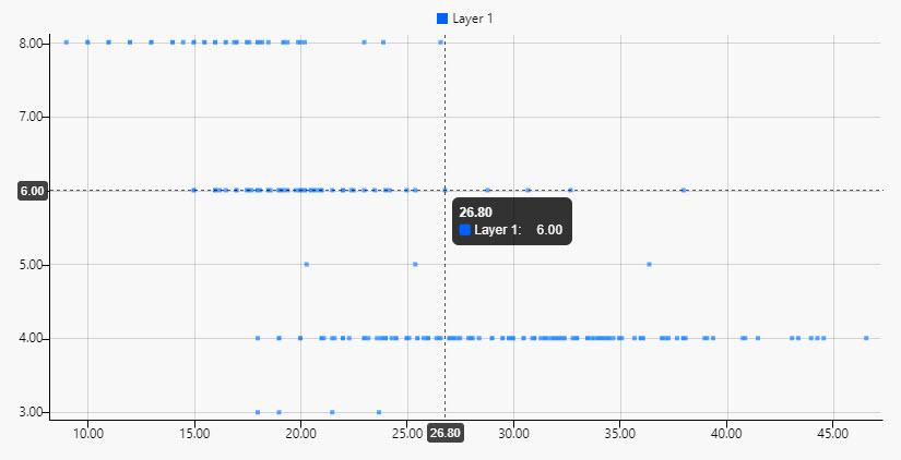
The Overlay properties define elements that are drawn on top of the chart on hover. This includes tooltips, crosshairs, and coordinates. In the following example, the mouse is hovering on the chart and shows all 3 of these elements.
- The tooltip contains the x and y data from the hovered point.
- The crosshair shows a horizontal and vertical dashed line on the current data position.
- The coordinates are on the x and y axes, showing the respective current hovered value at its position on the axis.
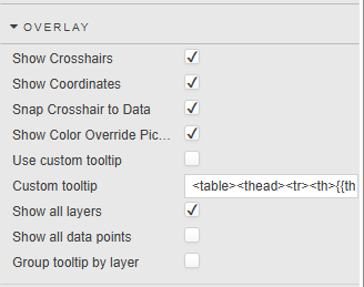
| Property | Description |
|---|---|
| Show Crosshairs | When this is enabled crosshairs are shown on the chart. |
| Show Coordinates | When this is enabled coordinates are shown on chart. |
| Snap Crosshair to Data | When this is enabled crosshairs and coordinates move to the nearest valid point on hover. |
| Show Color Override Picker | The Color Override feature allows you to personalize the appearance of chart components by defining custom colors directly within the Dashboard. How to use: 1. Right click on the chart. 2. Click the layer legend color. 3. Pick a default color. 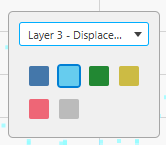 This allows you to define your own custom color per layer. |
| Use custom tooltip | When this is enabled the Custom tooltip is enabled. |
| Custom tooltip | Defines a custom tooltip. See Custom tooltips for details. |
| Show all layers | When checked, shows all layers in the tooltip. Otherwise, only shows the hovered layer. |
| Show all data points | Displays all y-axis values for selected point on the x-axis. |
| Group tooltip by layer | When Show all data points is enabled this displays data points in a distinct column for each Layer instead of a continuous list. |
Legend
You can add legends to represent different data series or categories within the chart. These can be grouped into legend groups which are collections of legend entries that share common properties or characteristics.

| Property | Description |
|---|---|
| Position | The chart legend position can be defined as Top, Bottom, Left, or Right. When legend grouping is used the position can be either Left or Right. The legend is auto generated. If you are using wildcard, the legend uses the wildcard column names. If you are using single y-axis value, the legend is defined as the value set in Name property for the layer. |
| Use Custom Legend | When enabled, the chart renders the legend using the content defined in the Custom Legend property instead of the default built-in legend rendering. |
| Custom Legend | Defines a Handlebars-based template that replaces the default ChartGL legend. This allows users to fully customize the legend's appearance and behavior based on the chart's data context. |
Legend Groups
These properties are used to define legend groups.
| Property | Description |
|---|---|
| Name | Defines a name for the Legend Group. This value is added to the list displayed under Legend Group in the general layer properties. |
| Expanded | Expands/collapses the Legend Group. |
| Icon | Defines the icon used for the Legend Group. |
| Regex grouping | Use this property to define a custom regular expression that dynamically groups legend items by matching patterns in their series names. This is particularly useful when visualizing large datasets with structured naming conventions, such as metrics tagged with dates, categories, or regions. By using a capturing group in the regex, for example to extract a date or category, users can simplify the legend by collapsing related metrics under a common, readable group name. For example, the following regex can be used to match a string followed by a date, separated by a space such as test2025.05.29:<br>/(.+?)\s(\d{4}-\d{2}-\d{2})/<br>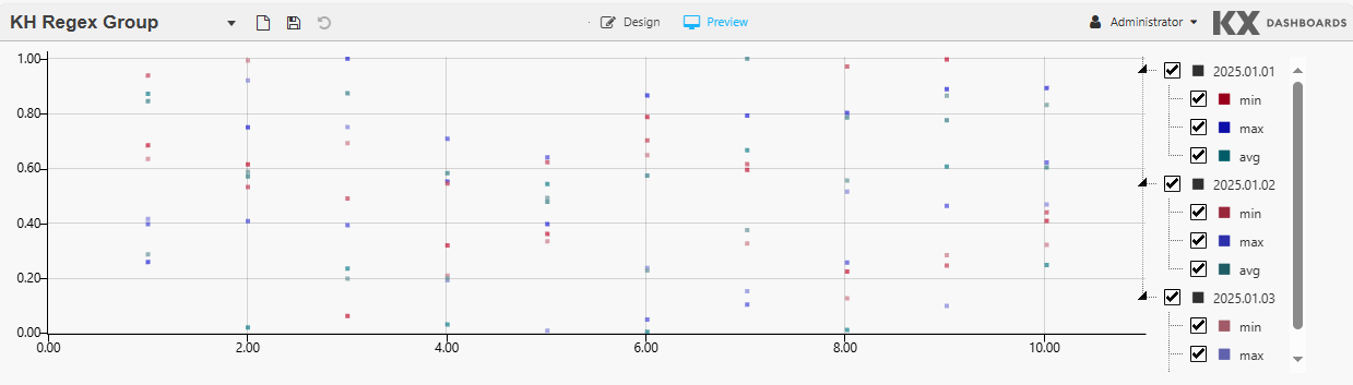 This example uses the following regex: <br>/^nEngine(?<date>\d{4}\.\d{2}\.\d{2})_(?<stat>min\|max\|avg)$/<br>- This regex matches strings like nEngineYYYY.MM.DD_stat, extracting date and stat as named groups.- Strings starting with nEngine are considered valid matches.- The series are then organized by date in the legend, and then by stat (min/max/avg). - This gives users the ability to filter the data granularly. |
Annotations
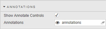
When enabled, Annotations allow users to define shapes or markings that provide additional information about specific data points or trends to help clarify or emphasize their significance.
| Property | Description |
|---|---|
| Show Annotate Controls | Check this to display the Annotate controls on the component 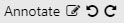 . These controls consist of: . These controls consist of: Turn the ability to create annotations on/off. Turn the ability to create annotations on/off. Edit annotations. Edit annotations. Undo annotations. Undo annotations. Redo annotations. Redo annotations. |
| Annotations | This field stores any changes to the default annotation type and color, and information describing the annotations. When set to a view state parameter of type string, this information persists when saved by the user. |
Annotations Dialog
Click Edit to bring up the annotations dialog.
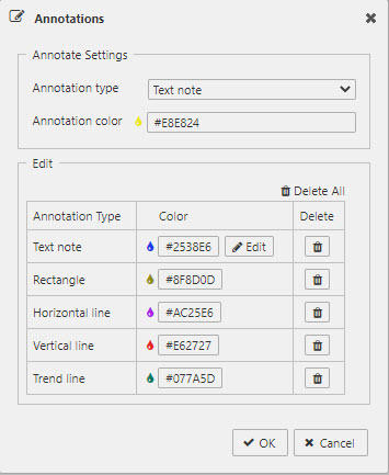
The Annotation Settings section is where the user can view and change the default annotation type and color.
| Property | Description |
|---|---|
| Annotation type | Sets the type of annotation. |
| Annotation color | Sets the color of the annotation to be created. Click on the field to bring up the color picker. The Edit section contains a table of existing annotations each with a color button to change its color and a delete button to delete the specified annotation. The text note has an additional Edit button which brings up the text note dialog to update the text and styling of the text note. Changes made here appear on the chart in real-time. |
| Delete All | Deletes all annotations. |
| OK | Commits all changes in the dialog. |
| Cancel | Reverts all annotations to their previous state. |
Annotation Types
The following table lists the different annotation types, available in the annotations dialog and how the Annotate toggle button appears for each type.
| Annotation Type | Button | Description |
|---|---|---|
| Text note |  |
This is the default type. A text note is text that can be added directly to the chart. Upon creation the text note dialog is launched so users can edit the text and styling. To edit, double-click on the text note to bring up the dialog. The text note resizes automatically based on the text and styling. The font size does not scale when the chart is zoomed. To move the text note, hover over it until the mouse pointer changes to the multidirectional cursor, then click and drag it to the new position. |
| Rectangle |  |
A rectangle is a 4-sided polygon having all right angles. To move, hover over the rectangle until the mouse pointer changes to the multidirectional cursor, then click and drag. To resize, hover over any endpoint until the color of the square anchor changes to red  and then click and drag the endpoint to its new position. and then click and drag the endpoint to its new position. |
| Horizontal line |  |
A horizontal line extends the width of the chart. Horizontal lines can only be moved up or down. To move, hover over the line until the mouse pointer changes to a bidirectional cursor, then click and drag. |
| Vertical line |  |
A vertical line extends the height of the chart. Vertical lines can only be moved left or right. To move, hover over the line until the mouse pointer changes to a bidirectional cursor, then click and drag. |
| Trend line |  |
A trend line is a straight line connected by two points. To move, hover over the trend line until the mouse pointer changes to the multidirectional cursor, then click and drag. To resize, hover over either end until the color of the square anchor changes to red and then click and drag that endpoint to its new position. |
Text Note Dialog
When the Annotation Type is set to Text Note the Text Note dialog is used to update the text and styling of the text note. Changes made appear on the chart in real-time.
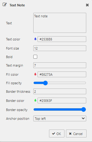
| Property | Description |
|---|---|
| Text | The text to be displayed in the note. |
| Text color | A color picker used to set the color for the text. |
| Font size | The font size of the text. |
| Bold | When checked, the text is bold. |
| Text margin | Sets the space between the text note border and the text. |
| Fill color | Sets the fill color of the text note area. Click on the field to bring up the color picker. |
| Fill opacity | Sets the fill opacity of the text note area. Slide to the left for more transparency and to the right for more opacity. |
| Border thickness | Sets the thickness of the text note border. |
| Border color | Sets the border color of the text note. Click on the field to bring up the color picker. |
| Border opacity | Sets the border opacity of the text note. Slide to the left for more transparency and to the right for more opacity. |
| Anchor position | Sets the anchor position which identifies the corner of the text note that remains fixed on the chart. Select Top Left when you want the text note to be precisely positioned underneath an element. Select Bottom Left when you want the text note to be precisely positioned above an element. |
Creating Annotations
Clicking Annotate on a chart toggles the Annotation mode. When Annotation mode is on, the Overlay and Zoom features are disabled, and an icon appears to the left of the control to indicate the current annotation type and color.
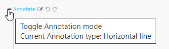
To create an annotation, click and hold the left mouse button on a desired area in the chart, drag the mouse to an endpoint for the annotation, and release the button.
Undo and Redo
The Undo and Redo buttons allow the user to navigate through the chronology of user actions affecting all annotations.
Clicking Undo reverses a user action affecting annotations. This includes changes made on the chart directly, or by way of the annotation dialogs. Continuing to press the Undo button reverses these user actions up to the beginning of their dashboard session.
Clicking Redo restores annotations affected by a user clicking the Undo button. If the user performs an action affecting annotations after an Undo button press, the Redo button is disabled.
File Export
See Export for full details of common settings.
Override Rules
Override rules enable you to define custom logic that is applied consistently across all layers. By using text matching or regular expressions (regex), you can set visual styling or behaviors without needing to configure each layer individually. This makes it easy to visually distinguish layers based on names or other text.
There are three Override Rules, described below. The properties displayed vary depending on the rule you select.
- Rules are evaluated at render-time.
- If multiple rules apply to a layer, the last one is applied.
The Column Color rule targets a specified column, and applies a specified color to the column if the rule matches the specified text string or regex pattern. Rule properties are defined in the following table.
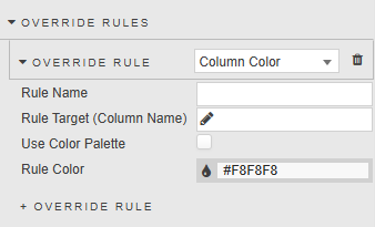
| Property | Description |
|---|---|
| Rule Name | Enter a name for the rule. |
| Rule Target (Column Name) | Select the column that the rule targets, or enter a regular expression or wildcard in the data entry field, then click Add Custom Column.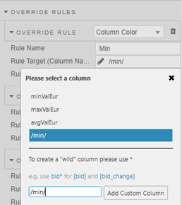 In the example above the regex /min/ is used to match the string min. If the target column contains this string the Rule Color is applied. |
| Use Color Palette | When unchecked, you can use the Rule Color to define a single color for the rule. When checked, a Palette Theme and Color Palette selector are displayed instead of the Rule Color property. 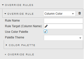 - For any rule that appears multiple times in the chart, each instance is assigned a color from the selected palette. - Palette colors are used in order of occurrence: the first match uses color 1, the second match gets color 2, and so on. - If there are more occurrences than colors in the palette, the palette loops or falls back to a default strategy. |
| Rule Color | The color to be applied to the matching column when Use Color Palette is unchecked. |
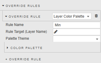
The Layer Color Palette rule targets a specified layer, and applies a specified color palette to the layer if the rule matches the specified text string or regex pattern. The rule properties are defined in the following table.
| Property | Description |
|---|---|
| Rule Name | Enter a name for the rule. |
| Rule Target (Layer Name) | Select the layer that the rule targets, or enter a regular expression or wildcard in the data entry field, then click Add Custom Layer.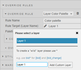 In the example above Layer 1 is selected as the layer to which the Palette Theme is applied. |
| Palette Theme | Optionally, select the palette theme to apply to the matching layer. |
The Axis Formatting rule targets a specified axis property (prefix, suffix, or decimal places) and applies a specific string to the matching axis if the rule matches the specified text string or regex pattern. The rule properties are defined in the following table.
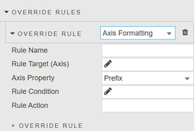
| Property | Description |
|---|---|
| Rule Name | Enter a name for the rule. |
| Rule Target (Axis) | Select the axis that the rule targets, or enter a regular expression or wildcard in the data entry field, then click Add Custom Axis.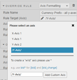 In the example above the axis Y-Axis 1 is selected, which means the rule is applied to that axis. |
| Axis Property | The axis property that the rule targets. This can be set to: Prefix, Suffix or Decimal Places. |
| Rule Condition | Click to specify the rule condition. Select a column or enter a regex or wildcard in the data entry field and click Add Custom Column. The rule is only applied to the axis if the axis is linked to a layer containing a column matching or containing this string.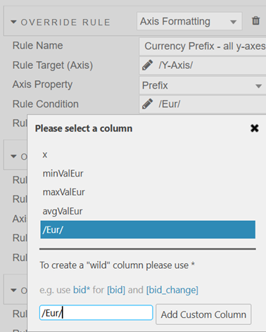 In the example above the regex /Eur/ is specified, meaning it checks for layers that have columns containing the string Eur. |
| Rule Action | Apply a specific string to the matching axis.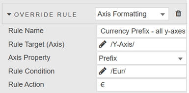 In the example above € is applied as a prefix to the axis labels when the Y-Axis is linked to a layer that has a column containing the string Eur. |
Style, Margins, Format
See Style for full details of common settings.