Editable List
This page describes how to set up and configure the Editable List component.
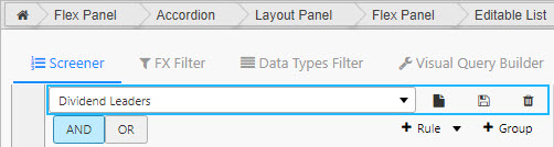
This component displays an editable list of string key/value pairs in a table format or dropdown menu. Pair it with other components such as Data Filter or Visual Query Builder to easily manipulate those components' JSON string states.
Set Up an Editable List
To set up an Editable List component, click-and-drag the component into the workspace and configure the following:
- Define the data source used to store the key/value pairs in the editable list. An update query must be used on a keyed table.
- Set the Selected Key to a view state to map the currently selected key from the editable list.
- Set the Selected Value to a
stringview state to map the currently selected string value from the editable list.
Refer to Editable List properties described in the next section for details on additional properties.
Editable List Properties
The following sections provides details on how to configure the properties of the Editable List component.
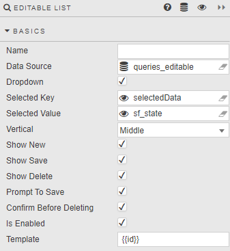
Basics
Open the Basics properties on the right and configure the properties described in the following table.
| Field | Description |
|---|---|
| Name | A name for the component provided by the user. |
| Data Source | This must be set to an update query on a keyed table, used for storing the editable list of key/value pairs.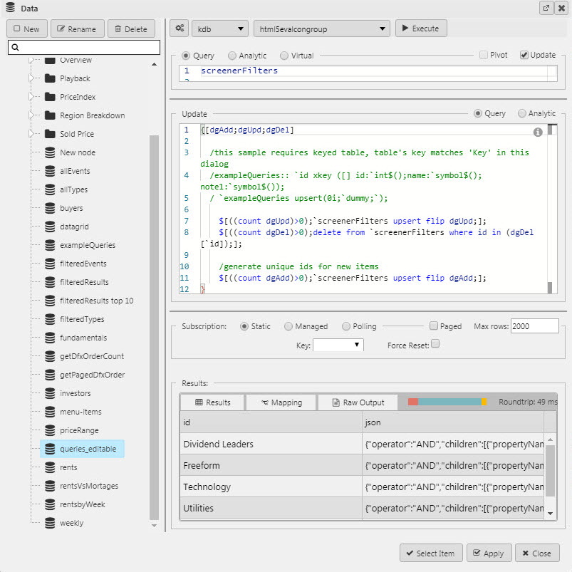 Update query: q<br>{[dgAdd;dgUpd;dgDel]<br><br>/this sample requires keyed table:<br>/ table's key matches 'Key' in this dialog<br>/exampleQueries:: `id xkey ([] id:`int$();name:`symbol$();note1:`symbol$());<br>/ `exampleQueries upsert(0i;`dummy;`);<br><br> if[count[dgUpd]>0;`screenerFilters upsert flip dgUpd];<br> if[count[dgDel]>0;<br> delete from `screenerFilters where id in (dgDel[`id])];<br><br> /generate unique ids for new items<br> if[count[dgAdd]>0;`screenerFilters upsert flip dgAdd];<br>}<br>Refer to Data sources for further details. |
| Dropdown | Displays JSON options in a dropdown. |
| Selected Key | A view state parameter assigned to the dropdown, determines which JSON list is selected. |
| Selected Value | A second view state parameter, of type string, which stores the Selected Key JSON.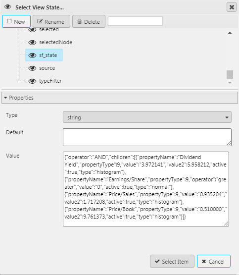 |
| Vertical | Positions the Editable list within the component. |
| Show New | When enabled, the user can create new key/value pairs in the editable list. The user also has the option to validate new keys by defining additional properties in the Validation section of the properties panel. |
| Show Save | User can save new key/value pairs that have been added to the editable list. |
| Show Delete | User can remove unwanted key/value pairs from the editable list. |
| Prompt to Save | When enabled, any changes made by a user will prompt a save request. |
| Confirm Before Deleting | When enabled, any deleted list will require confirmation from the user. |
| Is Enabled | Control whether a list and associated buttons are active or inactive; can be associated with a boolean Type View State Parameter. |
| Template | For building a custom layout of an Editable list.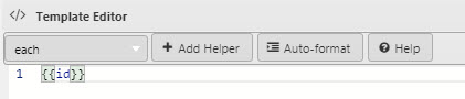 |
Validation
Users can optionally validate new entries to be added to the editable list. Validation requires the Show New property in Basics to be enabled.
| Field | Description |
|---|---|
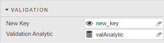
| New Key | A view state parameter which holds the new key entered by the user. |
| Validation Analytic | A query, analytic or virtual data source that validates the new key provided by the user. The analytic should accept the New Key view state parameter as input and return an empty string (valid) or a string containing an error message. If not accepted, an error message is presented to the user.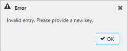 Sample query: 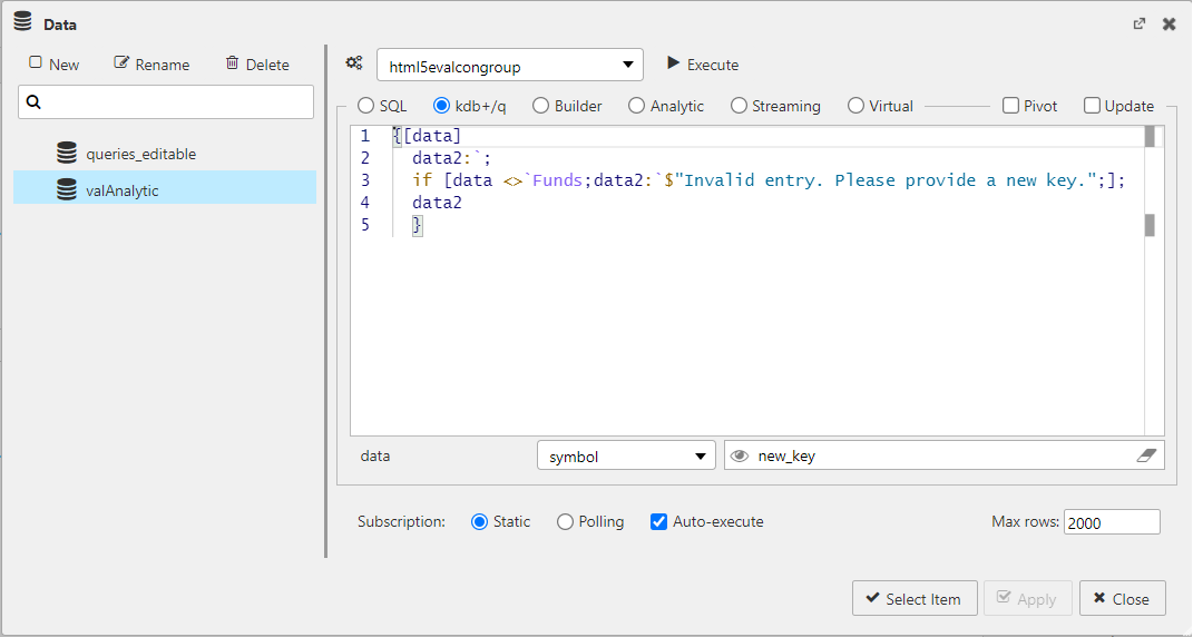 q<br>{[data]<br> data2:`;<br> if [data <>`Funds;data2:`$"Invalid entry. Please provide a new key.";];<br> data2<br> }<br> |
Tooltip
You can optionally add tooltip text to the New, Save and Delete buttons.
Format, Margins
Refer to Style for common style settings.