Date Picker
This page describes how to set up and configure the Date Picker component which is used to assign a date input to View State Parameters.
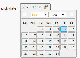
The following example shows how the Date Picker highlights dates found in the Data Source.
Set Up a Date Picker
To set up a Date Picker component, click-and-drag the component into the workspace and configure the following:
- Assign a view state with a data type containing a date to the Selected Date property.
- Optionally set a data source with
Datedata.
Refer to Date Picker properties described in the next section for details on additional properties.
Date Picker Properties
The following sections provides details on how to configure the properties of the Date Picker component.
Basics
Open the Basics properties on the right and configure the properties described in the following table.
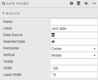
| Field | Description |
|---|---|
| Name | Enter a name for the component. |
| Label | A text label presented with the component in the Dashboard. |
| Data Source | Refer to Data sources for details. Optionally set a list of valid dates that can be chosen by the user. When set, the list of dates in the data source identifies the range of dates presented by the date picker component. !!! note "Resulting data" The date picker data source must return values of kdb type date. |
| Selected Date | A View State Parameter with a data type containing a date. |
| Horizontal | Horizontal alignment (left, center or right) of date selector inside the component boundaries. |
| Vertical | Vertical alignment (top, middle, bottom) of date selector inside the component boundaries. |
| Tooltip | Enter a text description which appears when user mouses over the Date Picker. |
| Width | Set the pixel width of the dropdown. |
| Label Width | Set the pixel width of the dropdown Label. !!! tip If the assigned Label Width is narrower than the Label description, text in the Label will wrap. |
Validation
The date picker verifies its value to ensure that it is suitable for use and presents an error label if it is not. This inherent validation occurs as the user is typing, when navigating to a different area of the Dashboard, and upon initialization. If the value is not valid, the Selected Date property is not updated, and one of the following error labels appears.
| Error | Description |
|---|---|
| Invalid date/time | 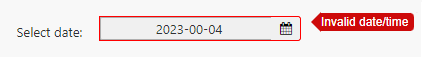 This appears when the value does not represent an actual calendar day (for example, 00 for the day) or its time component does not represent an actual time (for example, 99 for the hour). If the value is not corrected by the user, the date picker uses the previously held value if possible. |
| Date out of scope | 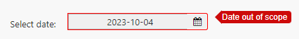 This error is visible when the date value is not in the list of available dates provided by the date picker data source. This error remains visible until the user provides a valid value. |
Date Picker Validation within a Data Form Component
When using a Date Picker component within a Data Form, date picker validation errors such as "Invalid date/time" or "Date out of scope" must be resolved before the data form validation analytic executes or the data form can be submitted.
Action
Refer to Actions for details.
Style
Refer to Style for common settings.