Tree Map
This page describes how to set up and configure the Treemap component.
Treemaps are particularly useful for visualizing large amounts of data in a compact space. For example, they can be used to visualize financial data, such as the market share of different companies within an industry.
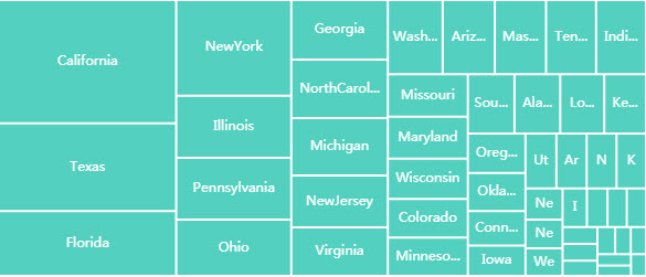
Tree Maps are best used in conjunction with Pivot Queries. The screenshot below is an example of a treemap.
This section provides information on the following: How to set up a treemap, Basic properties, Column data, Color palette, Node properties, Tooltip, Group by option, Animation, File export, Style, Format, Margins.
Set Up a Tree Map
- Click to populate Data Source or define a Data Source from the Basics properties. Click New and proceed with configuring the Data Source.
- Assign Category and box size from the data source with Column and Size.
-
From the Color Palette, choose a color format. Options go from single color, color gradient to iterative.
Note
In a treemap, data is grouped in nodes/boxes, and each node/box represents a part of the dataset.
Refer to Treemap properties described in the next section for details on additional properties.
Treemap Properties
The following sections provides details on how to configure the properties of the Treemap component.
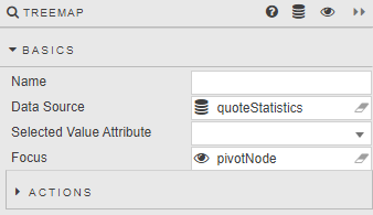
Basics
Open the Basics properties on the right and configure the properties described in the following table.
| Property | Description |
|---|---|
| Name | Enter a name for the component. |
| Data Source | Set up a data source. |
| Focus | Select a View State Parameter for linking components. |
| Selected Value | Set a View State Parameter to store the last (most recent) selected interaction. |
Action
Actions are a common property set used to configure a view state, run a query, or open a URL. For more information see Actions.
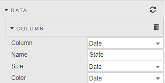
Data
Open the Data properties to configure your columns by setting the properties described in the table below.
Adding more than one data series
The treemap displays nested rectangles, where each level of the hierarchy is represented by a larger rectangle containing smaller rectangles. This helps in visualizing the relationship between different data series.
| Property | Description |
|---|---|
| Column | Sets the Data source variable for node labels. Defines how nodes are categorized into groups. Set to {breakdownId} for Pivot queries. |
| Name | The title name for Column. Set to {breakdownId} for Pivot queries. |
| Size | The Data source variable used for scaling the node size. The size of each node is proportional to its value. |
| Color | The Data source variable used to define color shading. Represents the numeric values that can determine the color of each node. |
Highlight Rules
Expand the Highlight Rules property, add a rule and expand it to set the following properties.
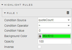
| Property | Description |
|---|---|
| Opacity | Strength of highlight rule color. 0 is transparent (retaining underlying treemap color palette), 100 is opaque, and 50 offers a hybrid shading of half Background Color and half of the base treemap color palette. |
| Inverse | Inverse application of color palette and highlight color. |
For more information and the description of the remaining properties, see Highlight Rules.
Color Palette
From the Color Palette property, select the color options for your treemap.
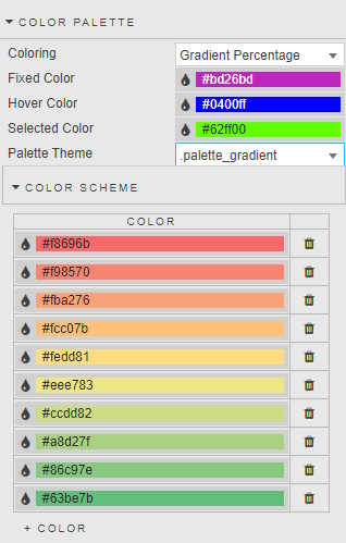
| Property | Description |
|---|---|
| Coloring | Fixed — A single, static color for all elements. Iterative — Assigns different colors to each element in sequence. Iterative Children — Applies colors to child elements within a parent category. Scaled — A range of colors based on data values. Gradient — A smooth transition between two or more colors across the data range. Gradient Percentage — Maps colors to percentage values (typically 0–100%).Note: Gradient Percentage requires a Size range of between 0 and 1. |
| Fixed Color | Used when Coloring is set to Fixed. |
| Selected Color | The color of the Treemap area on click-selection. |
| Hover Color | The color of the Treemap area on mouse hover. |
| Palette Theme | See Palette Theme for more information. |
Color Scheme
For more information on the Color Scheme, see Palettes.
Node
In a treemap, a node represents a rectangle that visualizes a specific category or subcategory within the hierarchical structure of the data.
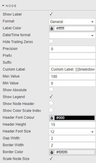
| Property | Description |
|---|---|
| Show Label | When checked, displays the Treemap data labels. |
| Format | General — Displays data as-is. Number — For numerical data. Smart Number — Automatically adjusts number display based on size. Formatted Number — Advanced formatting with prefixes/suffixes, decimal places, and custom formats. Datetime — For date and time data. |
| Label Color | Set the font color for the label. |
| Date/Time Format | Use when Datetime is selected for Format. |
| Hide Trailing Zeros | Remove extra zeros at the end of a digit. |
| Precision | The number of decimal places used when Format is set to Number, Smart Number or Formatted Number. |
| Suffix / Prefix | Add a symbol before or after the Node label. |
| Custom Label | Add a custom label for additional information displayed on Treemap.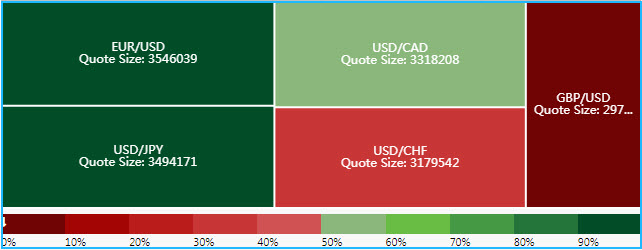 Sample configuration: 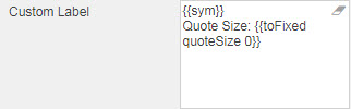 |
| Min Value / Max Value | Defined from Size value range. |
| Show Legend | Toggle display of gradient or Name legend. |
| Border Color / Border Width / Gap Width | Set pixel width and color of border. |
| Show Node Header / Header Font Color / Header Height / Header Font Size | Display Name as header and define Header style. |
| Show Color Scale Index | Display the color scale index text. |
| Scale Node Size | When enabled, nodes are scaled by the Size variable. |
Tooltip
Tooltips show data values associated with the cursor position. For common settings and more information on how to define a Tooltip, see Template.
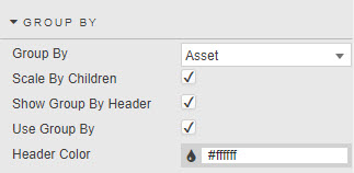
Group By
Define the following properties.
| Property | Description |
|---|---|
| Use Group By / Group By | Select the Data Source column to group Data. |
| Show Group By Header | Displays group header name (from Data Source). |
| Scale By Children | Scale Node by Group By variable. |
Animation
Expand Animation and define the following properties.
| Property | Description |
|---|---|
| Duration | Set duration in milliseconds to change Treemap animation. |
| Animation Effect | Select animation from: easeInQuad, easeOutQuad, easeInOutQuad, easeInCubic, easeOutCubic, easeInOutCubic, easeInQuart, easeOutQuart, easeInOutQuart, easeInQuint, easeOutQuint, easeInOutQuint, easeInSine, easeOutSine, easeInOutSine, easeInExpo, easeOutExpo, easeInOutExpo, easeInCirc, easeOutCirc, easeInOutCirc, easeInElastic, easeOutElastic, easeInOutElastic, easeInBack, easeOutBack, easeInOutBack, easeInBounce, easeOutBounce, and easeInOutBounce. |
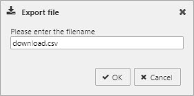
File Export
You can export display values as CSV files, XLS files, or image snapshots. Check the options described below to show the export buttons.
| Selection | Export |
|---|---|
| Show Export CSV Button | Export display values as CSV file. |
| Show Export Excel Button | Export display values as an XLS file. |
| Show Screenshot Button | Take an image snapshot (.png) of your treemap. |
You can also set the following properties:
| Property | Description |
|---|---|
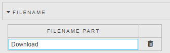
| Filename | Includes variable as part of file save name. |
| Filename Part | A filename for the exported file, or a View State Parameter which can be linked to a Text Input for user-defined file names. |
Style
For common settings, see Style and Template.
Format
See Format on the Style page for common settings.
Margins
Refer to Margins on the Style page for common settings.