Data Grid
This page describes the Data Grid component and how it can be set up and configured to help you interact with data in a structured grid format.
Set Up a Data Grid
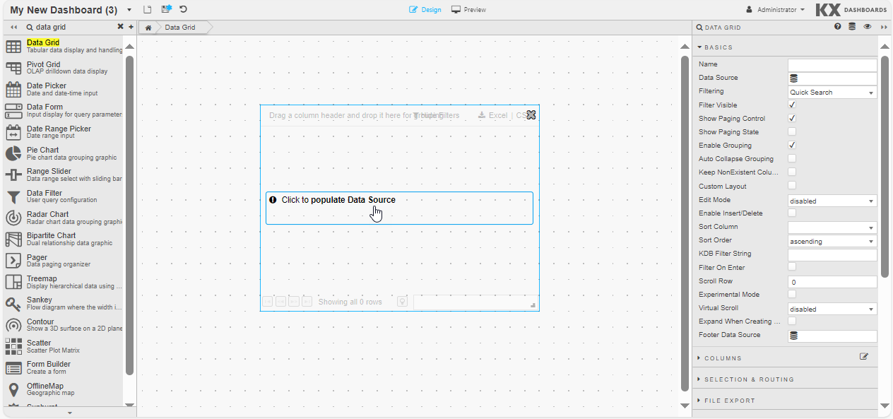
To set up a Data Grid component, click and drag the component into the workspace and configure the following:
- Click to populate Data Source or select a Data Source from the Basics properties to open the Data dialog.
-
Click New and proceed with configuring the Data Source.
-
Refer to Data Grid properties described in the next section for details on additional properties.
Data Grid Properties
The following sections provides details on how to configure the properties of the Data Grid component.
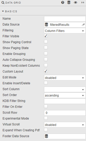
Basics
Open the Basics properties on the right and configure the properties described in the following table.
| Property | Description |
|---|---|
| Name | Enter a name for the component. |
| Data Source | Define the query or analytic to be used to retrieve data. See Data Sources for further details. |
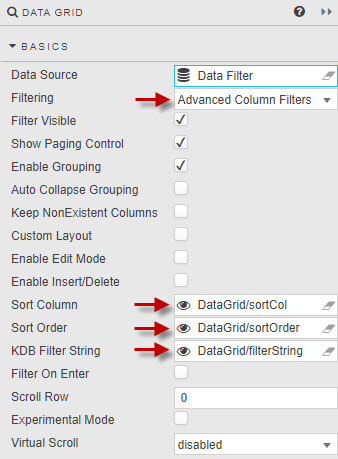
| Filtering | Select one of the filtering options: - Quick Search — A global search of all data columns. For example, for selected text, number, date, or time.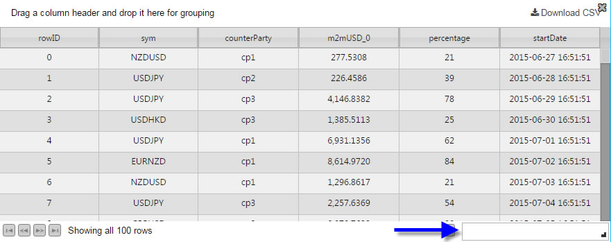 - Column Filters — Searches on the selected column. Additional filter options are available with Custom Filters. - Advanced Column Filters — Searches on the selected column with support for boolean operators. Not available for columns using Custom Filters. Must be selected if server-side filtering is employed. Supported options: Wildcard (*) returns everything; J AND M returns Jim but not John or Mary; J OR M returns Jim, John, and Mary; * -Jim -John returns all bar Jim and John.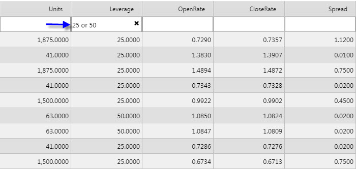 - Disabled — No filters. |
| Filter Visible | Check this to display the Filter field. Users can use Hide Filter to remove this field.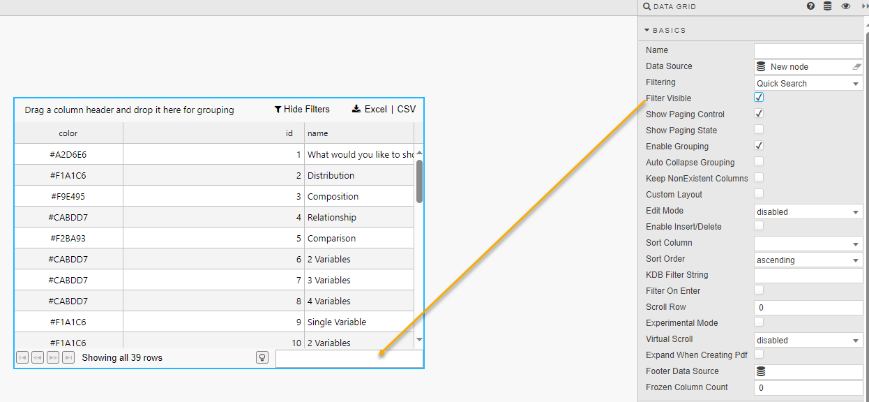 |
| Show Paging Control / Show Paging State | When these two options are checked, you can see pagination controls, which are used for large data sets. |
| Enable Grouping | When checked, users can group data together. Subtotals can be applied with Summary Row For Groupings. |
| Auto Collapse Grouping | When checked, the dashboard is loaded with Data Grid groupings in collapsed form. Grid groupings are configured in Grouping Columns. |
| Keep NonExistent Columns | Non-existent columns are employed when working with many queries. If a Data Source is changed, the prior column configurations from the original is kept if this control is checked. Dynamic queries which don't have fixed column definitions can set Keep NonExistent Columns to retain configuration options such as column formatting. In this scenario, the * wildcard would be used in the Data Field Name. Hybrid wildcard usage is also supported; for example Data\* returns all columns with Data. |
| Custom Layout | When checked, the Data Grid has a button to summon the Configuration dialog.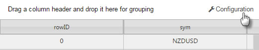 The Configuration dialog lets users change the display of columns in the Data Grid.  All columns are available to users — Hidden columns are visible in the Available Columns list. This may not be desirable if a hidden column stores a calculation or highlight rule operator. In such instances it may be necessary to disable Custom Layout. User configuration is saved on exiting the dashboard and is available on next login.Retain Relative Column Widths on Reload — Check this to continue with relative width on display columns (relative widths are applied only when columns fit allocated horizontal space, that is when the horizontal scrollbar is not visible). |
| Edit Mode | Select one of the options: - Enabled — A user can edit data by clicking the Edit button in the top-right corner, making each cell editable.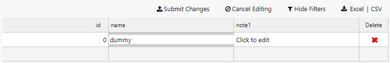 - Disabled — Users cannot edit cell contents.- Instant — Boolean values in the table are rendered as checkboxes that users can toggle to instantly edit cell contents. In both cases, an update query must be used. |
| Enable Insert/Delete | This is only used with an update query. |
| Sort Column | Defines the column to sort data when the Data Grid is loaded. |
| Sort Order | Defines the direction to sort data when the Data Grid is loaded. |
| KDB Filter String | Used in server-side filtering. |
| Filter on Enter | When checked, the user must press ENTER to return a filter result. Default behavior is to smart filter on typing. |
| Scroll Row | Stores a scroll value required for PDF Creation. |
| Experimental Mode | Improved data handling efficiency and performance with high volume data. |
| Virtual Scroll | Disabled — Default; all data is loaded to the dashboard from the Data Source. Uncached — Viewed data is loaded as required. Recommended for streaming or frequently changing data and update queries. Cached — Enables backend data management. |
| Expand When Creating Pdf | When checked, Data Grids are printed on multiple pages. Data Grids must be placed inside Tab Control. If a header is present, it is printed on each page. Grouping is not supported. |
| Footer Data Source | This Data Source property can be used to provide customized values in the footer section of the Data Grid.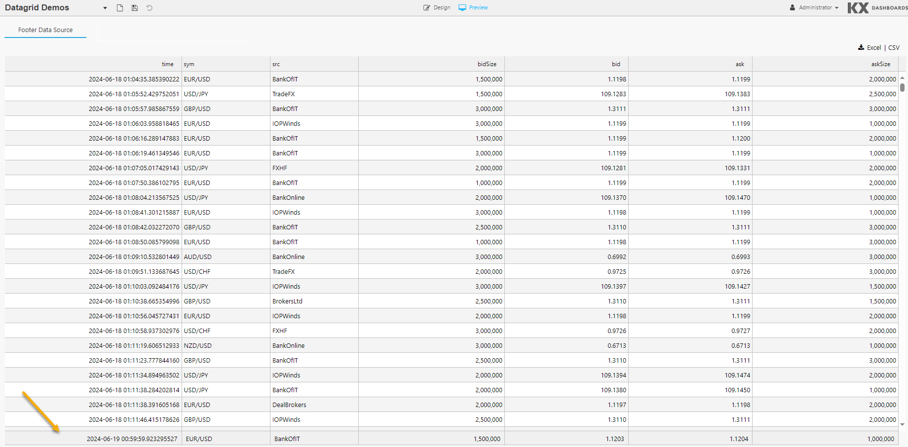 Each column name returned by this data source becomes an additional option in the dropdown list of available footers. Only the first row of values is presented in the footer section. |
| Frozen Column Count | You can freeze one or more columns in the Data Grid, allowing horizontal scrolling while keeping important columns visible. This property defines the number of columns frozen starting from the leftmost column. |
| Autosave | Specifies whether to retain column filters when a dashboard is reloaded. enabled — Filters are saved and retained on reload. disable filter — Column filters are not saved and the dashboard reloads without them. |
Server-Side Filtering
Server-side filtering is not used in KX Insights Platform Views
To use server-side filtering, set the value of Filtering to Advanced Column Filter in the Basics properties.
The following steps outline an example of setting up server-side filtering.
-
Create the following three view state parameters and group them in the view state parameter menu.
- Sort Column — This can be either string or symbol.
- Sort Order — This can be either string or symbol.
- KDB Filter String — This must be of type string.
-
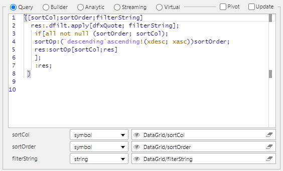
Define a data source to be filtered. The following code snippet uses
dfxQuoteas the target data set; replace as appropriate:
{[sortCol;sortOrder;filterString]
    res:.dfilt.apply[dfxQuote; filterString];
     if[all not null (sortOrder; sortCol);
     sortOp:(`descending`ascending!(xdesc; xasc))sortOrder;
     res:sortOp[sortCol;res]
     ];
     :res;
   }
Edit Mode Dropdown Lists
When Edit Mode is set to Enabled in the Basics properties, you can configure a dropdown list for individual columns instead of the default free-text input box. This restricts the values a user can enter to a predefined set of options, improving data consistency and reducing input errors.
There are two configuration types available: Static items and Datasource.
Static Items
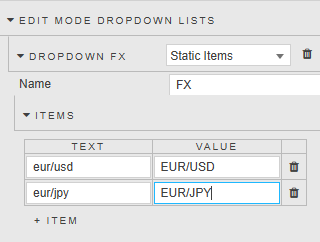
Use Static Items when the set of valid values is known and fixed. Options are defined directly within the Property editor without requiring a data source query.
| Property | Description |
|---|---|
| Name | A name to identify this dropdown configuration. |
| Items | A set of Text and Value pairs to populate the editable cell dropdown. The Text is the label displayed to the user; the Value is the underlying value written to the cell on selection. |
Datasource
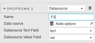
Use Datasource when dropdown options should be driven by a query, allowing the list to reflect data from a live or configurable source.
| Property | Description |
|---|---|
| Name | A name to identify this dropdown configuration. |
| Data source | The data source used to retrieve the list of values for the editable cell dropdown. See Data Sources for further details. |
| Datasource Text Field | The column from the data source used as the display label in the editable cell dropdown. |
| Datasource Value Field | The column from the data source used as the underlying value written to the cell on selection. |
Columns
Through the Columns properties you can configure properties for individual columns and define properties for multiple columns.
Column
For each individual column in your Data Grid there is a section defining how its data is formatted.
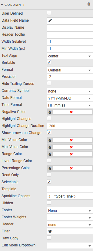
| Property | Description |
|---|---|
| User Defined | When checked, the selected column remains in the Data Grid if the selected column variable is removed from the query. This column shows as empty if the variable is missing. |
| Data Field Name | A column or dynamic column from the Data Source. Dynamic column syntax uses \* or regex. For example: CPUCore\*, FXpair\*EUR, /symbol\|sym/i. |
| Display Name | The display name for the column header. Display Name is set to wildcard when Data Field Name uses wildcard. Hybrid names are also supported; for example Data Field Name Data\* with Display Name Result \* returns columns including 'Data' with 'Result' in the header. |
| Header Tooltip | Provides a rollover text description for the column. Useful if the column title is clipped on browser resize. |
| Width (relative) | Column width relative to other columns. For example, columns with widths of 20, 10, 5, 1 scale to 55%, 28%, 14% and 3% respectively. Columns resize with the browser window. |
| Min Width (px) | The minimum width for a column in pixels. Priority rules: if a scrollbar appears, Width (relative) is disabled and only Min Width (px) is used; if Width (relative) is zero, only Min Width (px) is applied. Use the bulk parameter adjuster (CTRL + Select columns) to apply to multiple columns.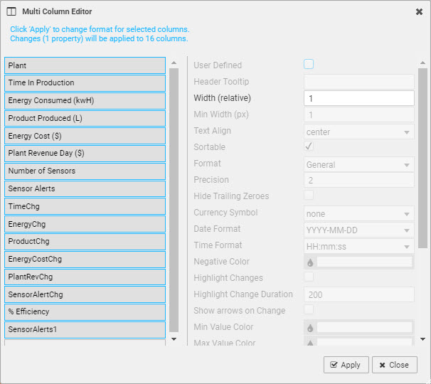 |
| Text Align | Horizontal alignment of values in their cells. |
| Sortable | When checked, clicking a column header toggles between ascending and descending sorts. |
| Format | Set the format for the column data. Options: General, Number, Formatted Number, Smart Number, Date, Time, DateTime, Percentage, Boolean, Sparkline. |
| Precision | The number of decimal places shown for numeric data. |
| Hide Trailing Zeroes | When checked, suppresses trailing zeroes for numeric data. |
| Currency Symbol | Set the currency symbol. |
| Data Format / Time Format | Where Format is Date, Time, or DateTime the data is formatted with these two settings.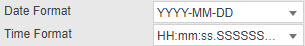 |
| Negative Color | Set the color for negative values in the column. |
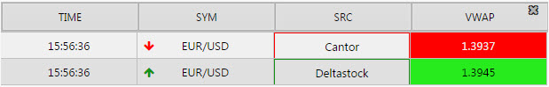
| Highlight Changes | When enabled, higher than previous value changes are highlighted in green and lower values in red. |
| Highlight Min Value / Highlight Max Value / Range Highlight | These checkboxes set highlighting colors for minimum and maximum values and ranges.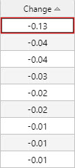  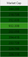 |
| Invert Range Color | Flip range color usage; dark shade for high values, light shade for low values. |
| Percentage Color | A color used for mini-bars when Format is Percentage.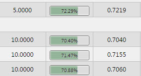 Note: Min Value Color, Max Value Color, Range Color, and Percentage Color can be View state parameters. |
| Read Only | When checked, the column cannot be edited. |
| Selectable | Checked by default. Column cells cannot be selected when unchecked. |
| Template | Apply HTML customizations with Handlebar helpers. For example: {{column name}} where {{column name}} is the reference name for the column from the data source. |
| Sparkline Options | Configuration for Sparklines. |
| Hidden | When checked the data column is hidden. If Full Excel Export is enabled, all hidden columns are downloaded. Hidden columns are also available under Custom Layout. |
| Footer | Specifies what values are displayed in the footer section. Options: None, Average, Count, Sum, Weighted Average.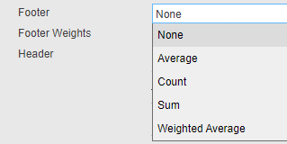 If at least one column has a Footer set to a value other than None, the footer section appears as the last row. Footer values inherit the format of their column.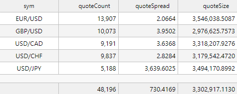 When a Footer data source is defined, its columns are appended as additional options to the Footer dropdown. 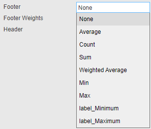 |
| Footer Weight | Applies a weighting to the current column by selected data source variable. Footer must be set to Weighted Average for this to be enabled. |
| Header | Applies a column grouped header. Auto size applied on grouped header when user resizes columns. Column reorder restricted within its group.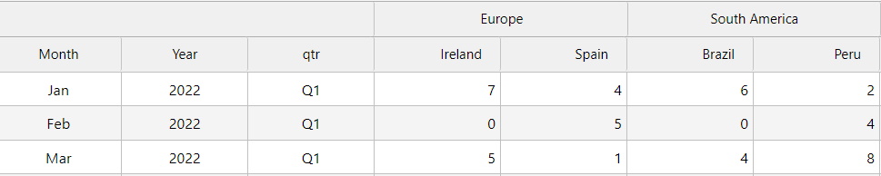 |
| Filter | Use this to save the current filter value for this column as a view state for use elsewhere. |
| Raw Copy | Controls the format of data copied from datagrid cells. When checked the raw value is copied; when unchecked the display value is copied.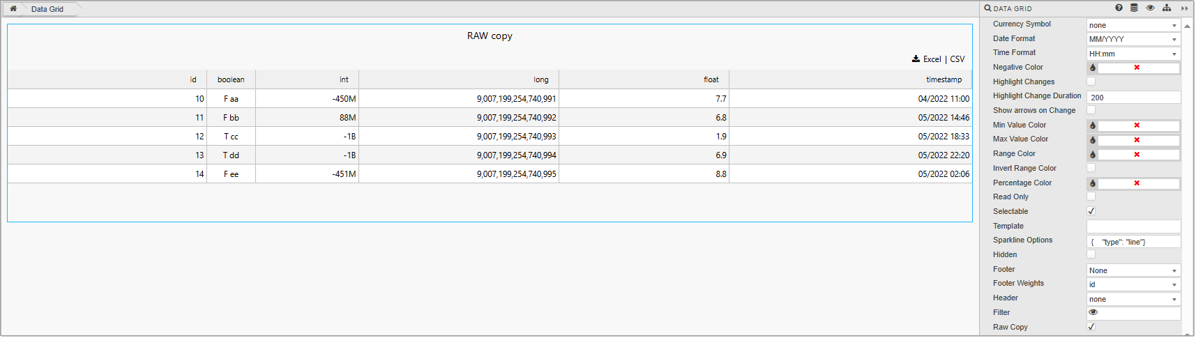 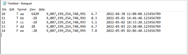 |
| Edit Mode Dropdown | Assigns one of the configured Edit Mode Dropdown Lists to this column. When a user edits a cell, only the values defined in the selected dropdown list are available. |
Multi Column Editor
In addition to the individual column settings, you can define settings for all columns in the Multi Column Editor.
-
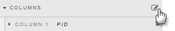
Click the edit column properties icon as shown below.
-
Select columns on the left using Ctrl-click.
-
Select properties on the right to be applied across the selected columns.

-
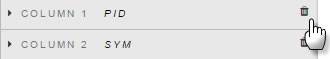
Columns can be removed from a Data Grid by clicking the trashcan icon.
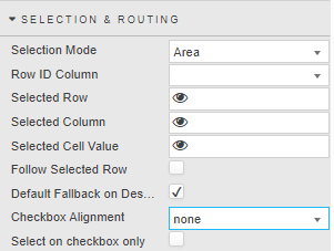
Selection & Routing
The Selection & Routing properties are used to define what happens when areas of the Data Grid are selected.
| Property | Description |
|---|---|
| Selection Mode | Once a selection mode is set, the user can select and highlight a specific region in the grid for bulk action like copy and paste. Options: - Area — Allows for selecting a contiguous rectangular area of cells. Keyboard shortcuts: Shift+End (to end of column), Shift+Home (to top of column), Shift+Page Up/Down, Shift+Click (cell to cell), Drag-select-rows.- Single Row — Enables the selection of only one row at a time.- Multi Row — Permits the selection of multiple rows simultaneously.- Cell — Allows for selecting an individual cell within the grid. |
| Row ID Column | For a given selected row, specifies the column used in the selected row. Defined from the Data Sources. |
| Selected Row | Sets the value in the specified column ID for a selected row. Assigned by a view state parameter when Cell is selected. |
| Selected Column | Sets the value of the column header value for any selected cell. Assigned by a View State parameter when Cell is selected. |
| Selected Cell Value | Sets the value of selected cell, independent of column ID. Assigned by a view state parameter when Cell is selected. |
| Follow Selected Value | When checked, row selection highlight retains the view on screen during a scroll event. |
| Default Fallback on Deselect | When checked, the default View State Parameter values are used (if set) in the absence of a row select. |
| Checkbox Alignment | Position of data row selection checkboxes; select either none, left or right. |
| Select on checkbox only | Toggle whether the whole row can be selected or just the checkbox. |
Action
See Actions for full details.
File Export
See Export for full details.
Tooltip
Specify the following tooltip properties.
| Property | Description |
|---|---|
| Position | Set the tooltip position to either none, right, left, or cursor. |
| Template | See Templates for details. |
| Use Formatted Cell Value | When checked the tooltip uses the formatted value from column template, otherwise it uses the raw cell value. |
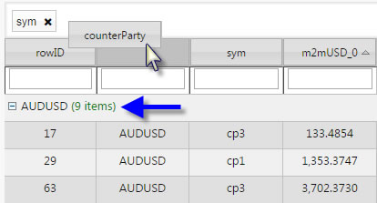
Grouping Columns
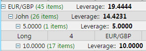
The Grouping Columns properties are used to group Data Grid rows by their values in that column. Specifying further grouping columns repeats this within each group.
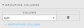
The following screenshot shows grouping by sym and counterparty.
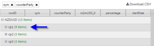
Dashboard users can also create groupings on the fly by dragging a column header into the space directly above the column headers.
Summary Row for Groupings
Grouping Columns reorganize the Data Grid layout. Summary Row for Groupings works with the grouping columns by applying simple mathematical calculations to the groups.
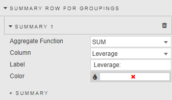
| Property | Description |
|---|---|
| Aggregate Function | The mathematical function to apply to the group. Supported: AVG, SUM, MIN, MAX, or WAVG. When you select WAVG (weighted average), an additional Column property is displayed. |
| Column | The column on which the calculations are made. |
| Label | The text label to use for the calculation. |
| Color | The font color for the grouping. |
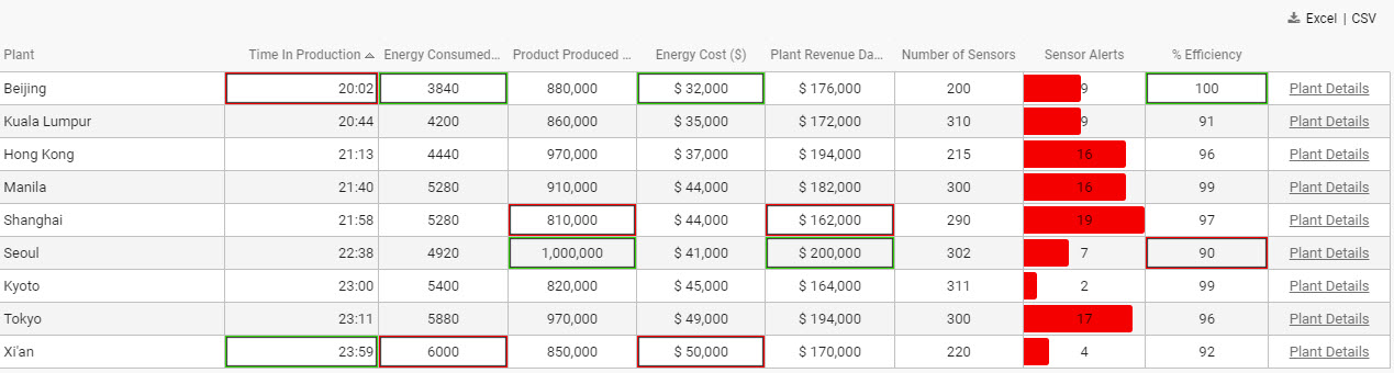
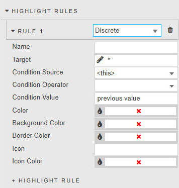
Highlight Rules
Highlight rules use colors to emphasize changes in data grid values.
For each rule select either Gradient or monotone Discrete colors.
| Property | Description |
|---|---|
| Name | The name of the rule. |
| Target | The column on which the rule acts. This can be any column in the Data Grid. It does not have to be the column using the operator. |
| Condition Source | See Highlight Rules for details. |
| Condition Operator | See Highlight Rules for details. |
| Condition Value | See Highlight Rules for details. |
| Color | The text color when the rule is true. |
| Background Color | The background cell color when the rule is true. |
| Border Color | The cell border color when the rule is true. |
| Icon | The icon to appear when the rule is true. |
| Icon Color | The color for the icon (if used) when the rule is true. |
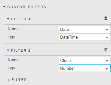
Custom Filters
Custom Filters introduce client-side advanced filters for columns covering text, numeric and datetime formats.
Note
Custom Filters are available only when Filtering is set to Column Filters or Advanced Column Filters.
Filtering is only applied to viewable data. Paging limits the results to the current page.
| Property | Description |
|---|---|
| Name | Select a column to use for filtering. When you click this field, a dialog opens. |
| Type | Set the type of filtering. Options: Selection (filter dropdown); Server Selection (see Server selection filtering); Number (supports <, >, >=, <=, =, ==, !=); DateTime (date or time with standard operators); Disabled (no filtering). |
| Datasource | Used if Type is set to Server Selection. |
Data Grid Filtering Examples
| Filter | Description |
|---|---|
| Symbol starts with | EUR or USD: 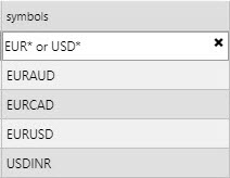 EUR without EURAUD: 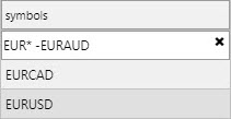 EUR without EURAUD and EURCAD: 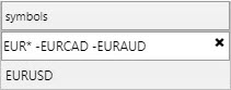 |
| Symbol ends with | CAD:  |
| Selected numbers/symbols | 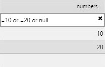 Selecting four symbols:  |
| Range between | 10000 and 20000000:  25 and 75: 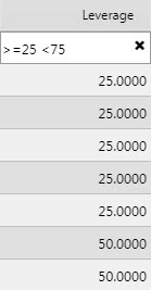 Outside 25 and 50: 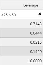 Return 25 and 50 only: 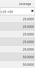 Ignore null values: 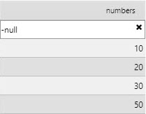 |
| Equals case insensitive | Prefix a string with ~ to perform an exact, case-insensitive match. For example, ~EURUSD matches EURUSD, eurusd, or EurUsd. Partial matches are not supported (~EUR will not match EURUSD). |
Filtering variables with !=
When the exclusion function != is used, all values, including column cells with null data, are returned except for the value defined by !=.
Server Selection Filtering
Server selection filtering allows users to dynamically filter and interact with large datasets directly from the server. This approach is especially useful in scenarios involving real-time data analytics, financial data monitoring, and other data-intensive applications.
Server selection must be used when data is not fully loaded to the client, for example when using server-side paging or Server-side Filtering via the KDB Filter String.
To define a server-side custom filter:
-
Add a custom filter and set Type to
Server Selection.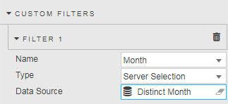
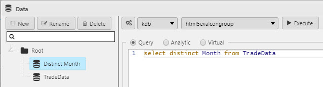
-
Define the server-side filter query, as illustrated in the following example.
select distinct Month from TradeData
-
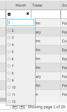
View the results — the filter options in the column header now use the server-side filter query. The following screenshot shows the distinct months being shown.
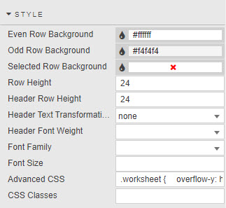
Style
The Style properties are described in the following table.
| Property | Description |
|---|---|
| Even Row Background / Odd Row Background | Set the background colors of the even and odd rows. |
| Selected Row Background | When Selection Mode is set to Single Row or Double Row selection routing properties, this sets the background for the selected row. |
| Row Height | Sets the height of each row.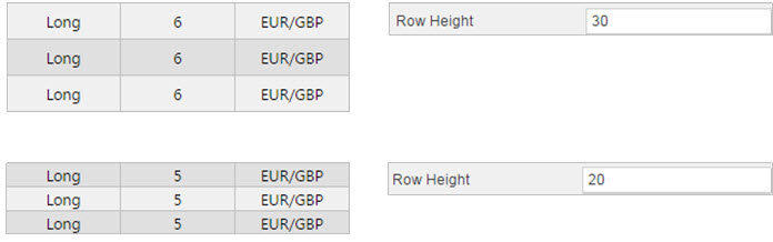 |
| Header Row Height | Sets the height of the header row. |
| Header Text Transformation | Specifies the text transformation for column headers. Options: none, uppercase, lowercase, capitalize. |
| Header Font Weight | The font weight for column headers. |
| Font Family | The font family to be used for column headers and rows. |
| Font size | The font size to be used for rows (CSS format). For example, 18px, 0.8em, 80%, larger. |
See Style for details about common style settings.
Advanced CSS
See Advanced CSS for details about using advanced CSS.
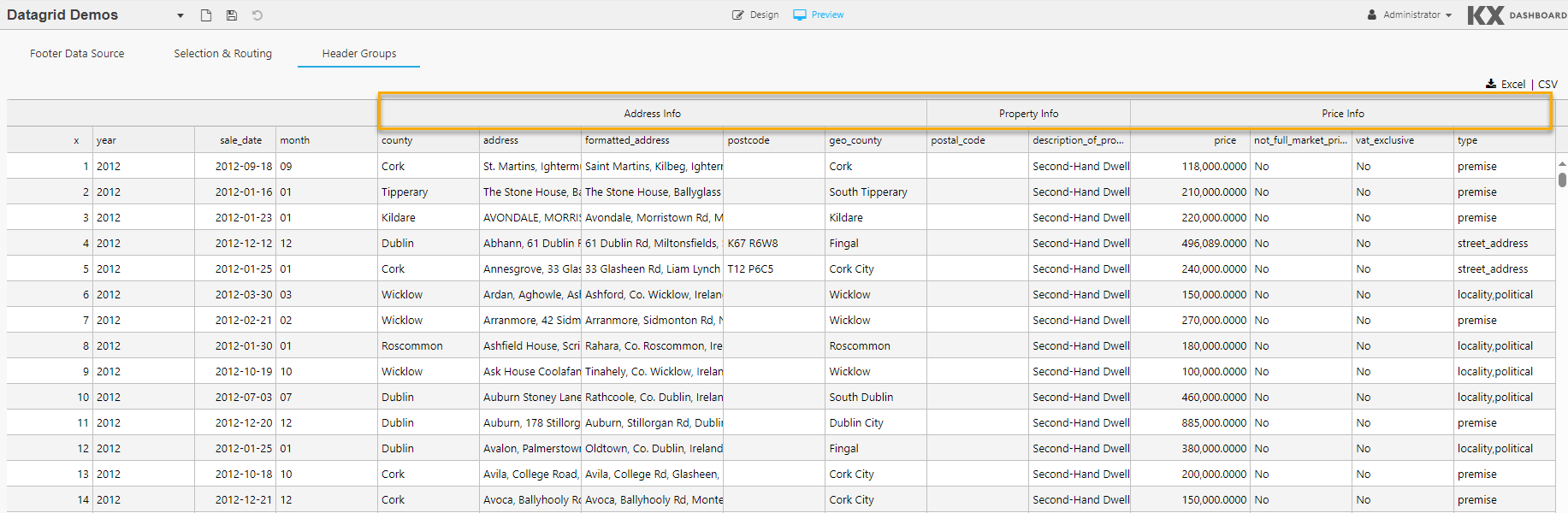
Header Groups
Header Groups are a set of custom column names that can be defined by the user and added to the column header.
In the following example the columns Address Info, Property Info and Price Info are added to a Header Group.
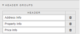
These are displayed in the Data Grid shown below.
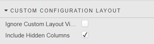
Custom Configuration Layout
| Property | Description |
|---|---|
| Ignore Custom Layout Viewstate | When checked, if there is a viewstate defined in the column properties then it ignores this value when applying user defined custom layouts. |
| Include Hidden Columns | When checked, any hidden columns (columns with the Hidden property checked in Column properties) are included in the list of columns that can be added when applying user defined custom layouts. Custom layouts are applied by clicking Configuration in preview mode. |
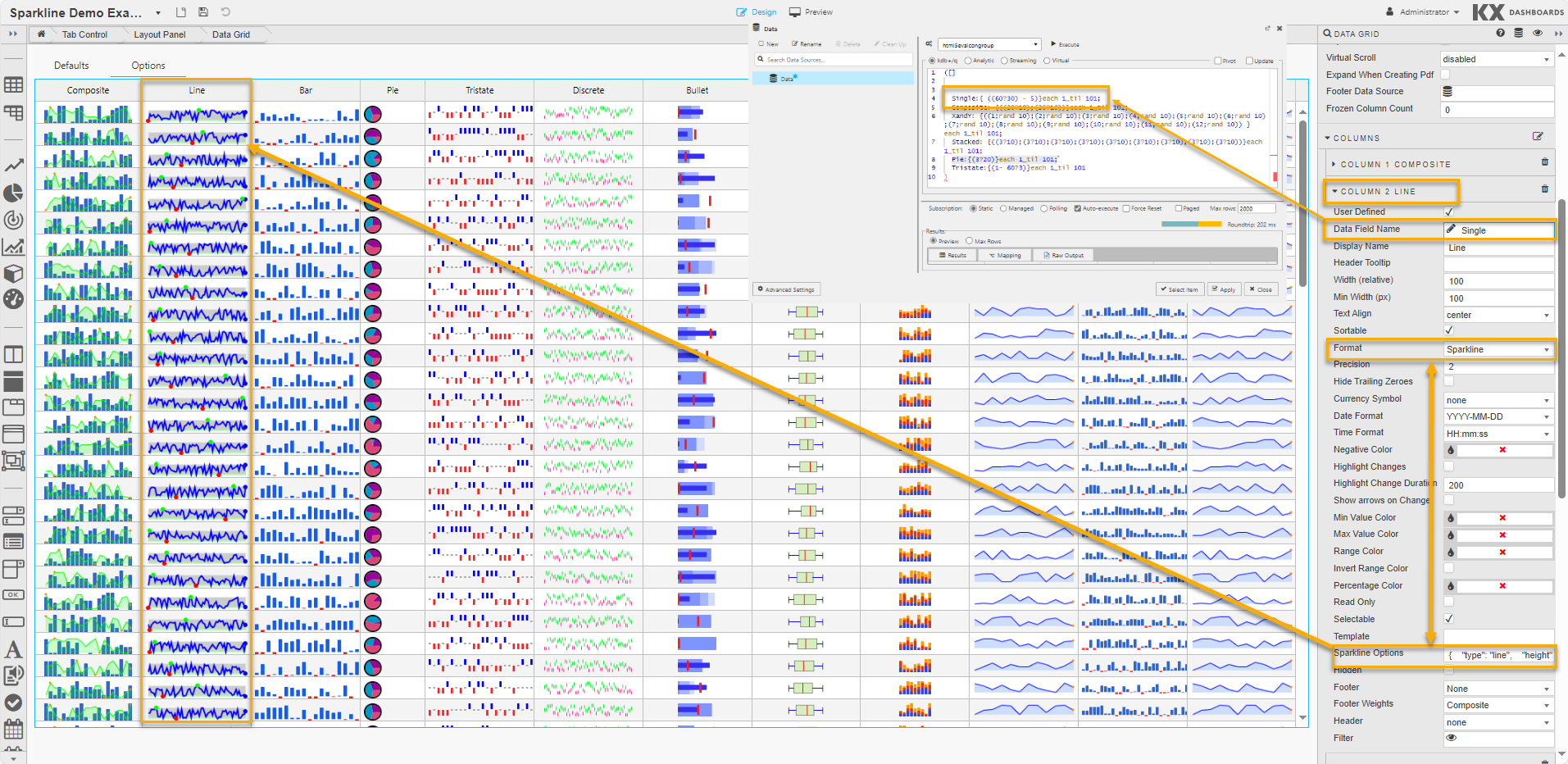
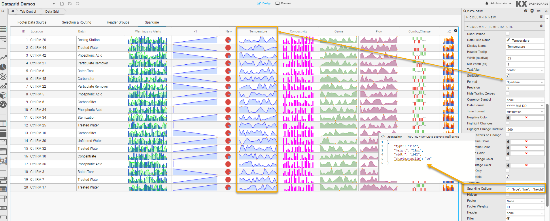
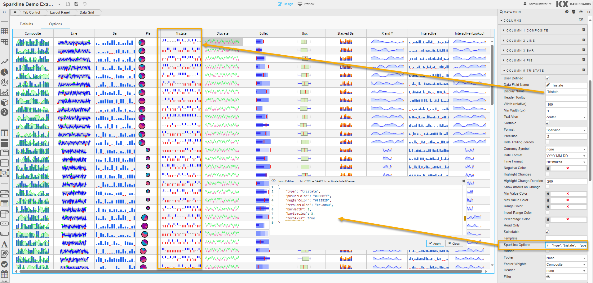
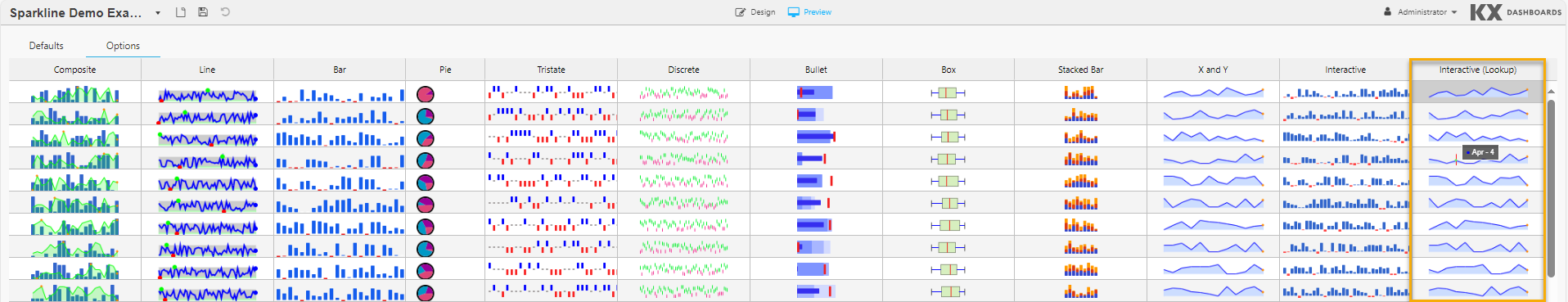
Sparklines
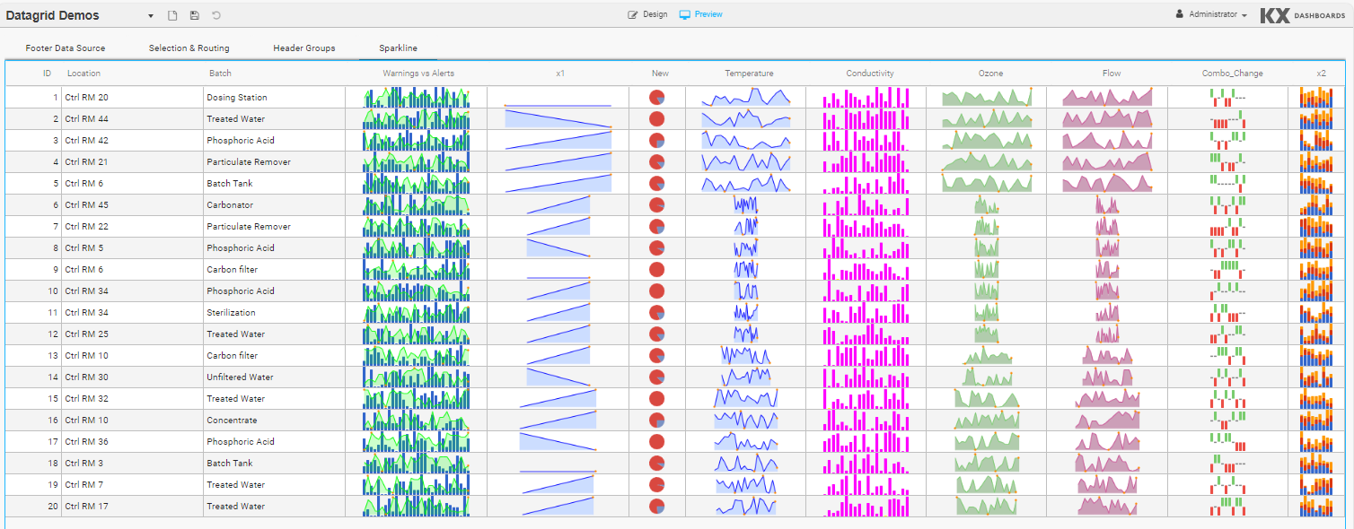
Sparklines are small, lightweight charts used to show trends or variations in data. Composite sparklines provide a way of combining sparklines. The following types are supported: line, bar, stacked bar, pie, tristate, discrete charts, bullet graphs, and box plots.
To display Sparklines:
- In the Basics properties ensure the Data Source format is correct.
-
In the Column properties:
- Ensure the Data Field Name points to the correct data in the data source.
- Set Format to
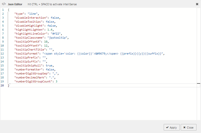
Sparkline. - Modify the Sparkline Options using the JSON editor, as displayed below.
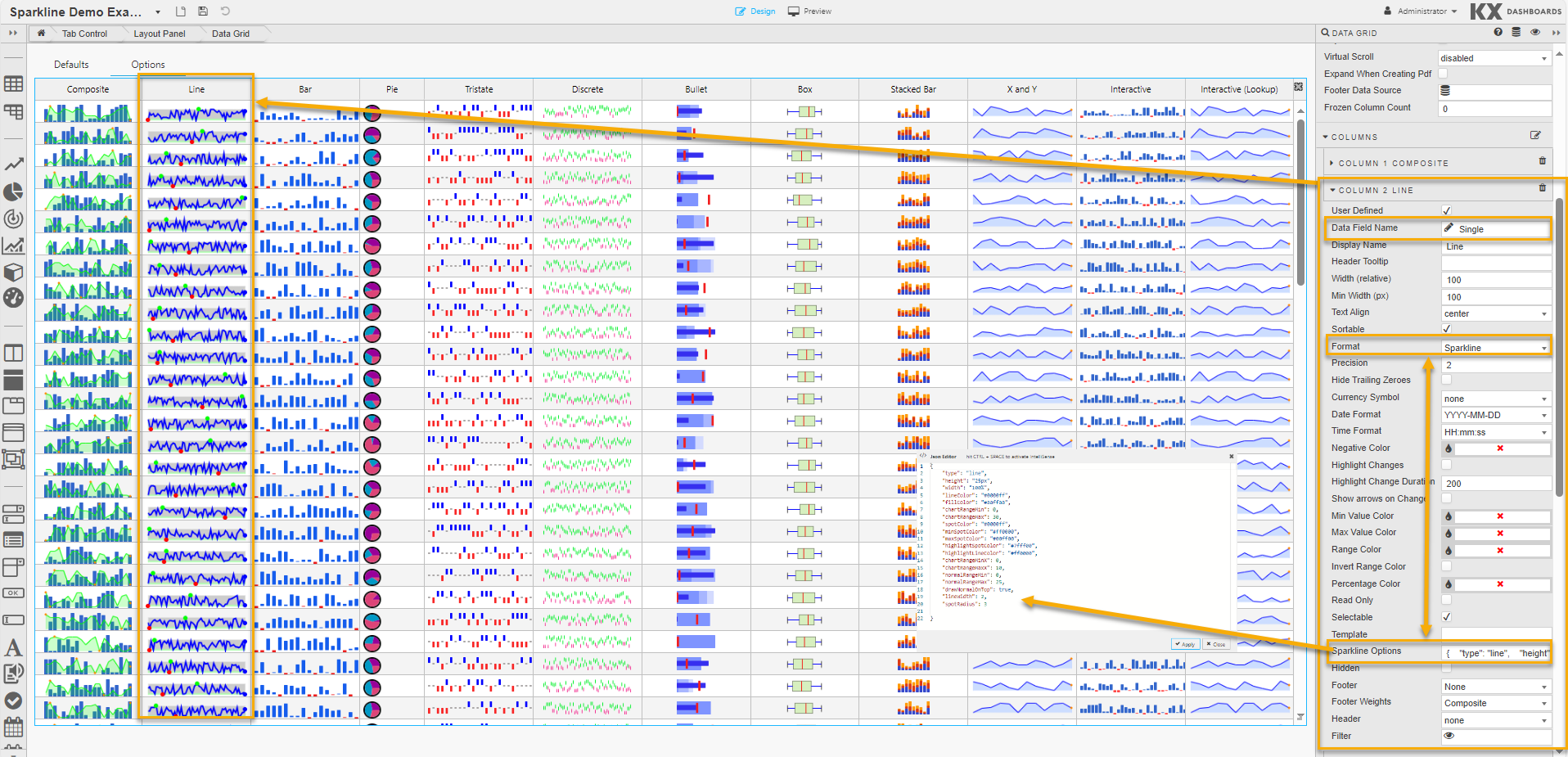
The common sparkline options section describes the options used by each chart type, with chart-specific options in the sections that follow.
Sparkline Data Format
Data for Data Grids using Sparklines must be formatted correctly. The examples in this section use a data source called Data, shown in the following screenshot.
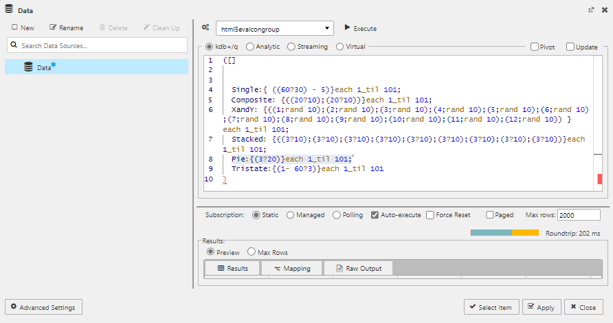
You can copy the following kdb+/q query to create this data source:
([]
Single:{ ((60?30) - 5)}each 1_til 101;
Composite: {((20?10);(20?10))}each 1_til 101;
XandY: {((1;rand 10);(2;rand 10);(3;rand 10);(4;rand 10);(5;rand 10);(6;rand 10);(7;rand 10);(8;rand 10);(9;rand 10);(10;rand 10);(11;rand 10);(12;rand 10)) }each 1_til 101;
Stacked: {((3?10);(3?10);(3?10);(3?10);(3?10);(3?10);(3?10);(3?10);(3?10))}each 1_til 101;
Pie:{(3?20)}each 1_til 101;
Tristate:{(1- 60?3)}each 1_til 101
``)
Data format requirements by chart type:
- For Line, Bar, Discrete charts, Bullet graphs, and Box plots: a sequence of numbers separated by semicolons. For example:
10; 8; 9; 3; 5; 8; 5. These useSingleas their Data Field Name. - For Tristate charts: a sequence of three-value numbers (1, -1, 0) representing win, lose, draw. For example:
1; 1; 0; 1; -1; -1; 1; -1; 0; 0; 1; 1. UsesTristateas Data Field Name. - For Pie charts: sets of number sequences. For example:
(1; 1; 2)(20; 50; 80). UsesPieas Data Field Name. - For stacked Bar charts: an array of arrays. For example:
((1; 4); (2; 3); (3; 2); (4; 1)). - For Composite sparklines: sets of number sequences in square brackets. For example:
[3, 7, 1, 9, 5, 2, 8, 4, 0, 6, ...], [9, 1, 4, 7, 3, 2, 6, 0, 8, 5, ...]. UsesCompositeas Data Field Name.
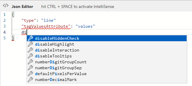
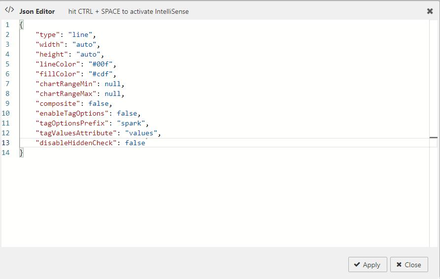
Common Sparkline Options
These options can be set for most of the supported chart types. They are specified in the JSON editor accessed by clicking Sparkline Options in column properties. The JSON editor auto-completes names and default values.
| Option | Description | Default |
|---|---|---|
type |
Chart type: line, bar, pie, tristate, discrete, bullet, box.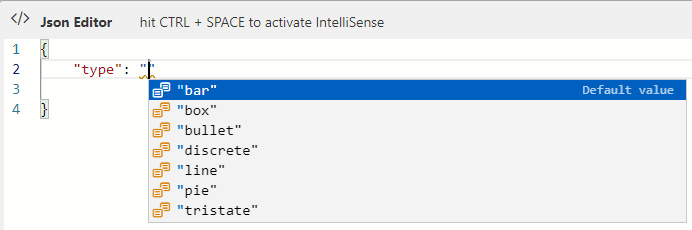 |
"line" |
width |
The width of the chart (any valid CSS width, e.g. 1.5em, 20px). Does nothing for bar and tristate charts. |
"auto" |
height |
The line height of the containing tag. | "auto" |
lineColor |
Color of the line for Line and Discrete charts (CSS string). | "#00f" |
fillColor |
Color used to fill the area under the graph (CSS value). Set to false to disable fill. |
"#cdf" |
chartRangeMin |
Minimum value for the Y range. Defaults to the minimum value supplied. | null |
chartRangeMax |
Maximum value for the Y range. Defaults to the maximum value supplied. | null |
composite |
When true, any existing chart on the tag remains and a new chart is drawn over it. Lock axis on both charts using chartRangeMin and chartRangeMax. |
false |
enableTagOptions |
Set to true to allow options as tag attributes. See also tagOptionPrefix. |
false |
tagOptionPrefix |
The string each tag attribute option must begin with. | "spark" |
tagValuesAttribute |
The name of the tag attribute to fetch values from. | "values" |
disableHiddenCheck |
Set to true to disable checking for hidden sparklines, improving render performance. |
false |
Click Apply to save the Sparkline Options.
Range Maps
Several parameters, such as colorMap in Line charts and tooltipValueLookups in interactive sparklines, accept a range map. It maps ranges of numbers to values. For example:
{
  1: "red",
  "2:9": "yellow",
  "10:": "red"
}
This maps 1 to red, values 2–9 to yellow, and values 10 and higher to red.
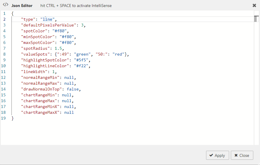
Line Charts
A line chart provides a visual representation of data using connected points along a straight line.
In addition to the common options the following options apply when type is line.
| Option | Description | Default |
|---|---|---|
defaultPixelsPerValue |
The number of pixels of width for each value in the chart. | 3 |
spotColor |
CSS color of the final value marker. Set to false or empty string to hide. |
"#f80" |
minSpotColor |
CSS color of the marker for the minimum value. Set to false to hide. |
"#f80" |
maxSpotColor |
CSS color of the marker for the maximum value. Set to false to hide. |
"#f80" |
spotRadius |
Radius of all spot markers in pixels. | 1.5 |
valueSpots |
Specifies which points to draw spots on and with which color. Accepts a range. For example: {":49": "green", "50:": "red"}. |
|
highlightSpotColor |
Color for the spot that appears on mouseover. Set to null to disable. |
"#f5f" |
highlightLineColor |
Color for the vertical line on mouseover. Set to null to disable. |
"#f22" |
lineWidth |
Width of the line in pixels. | 1 |
normalRangeMin / normalRangeMax |
Threshold values for drawing a normal range bar. | "null" |
drawNormalOnTop |
When true, the normal range is drawn over the fill area. |
false |
xvalues |
Supply both X and Y values as an array of arrays: ((1; 3); (2; 4); (5; 3)). |
|
chartRangeClip |
When true, Y values are clipped to chartRangeMin/chartRangeMax. |
|
chartRangeMinX |
Minimum X value of the chart. | null |
chartRangeMaxX |
Maximum X value of the chart. | null |
Bar Charts
A bar chart provides a visual representation of data using rectangular bars. Values can be omitted using null.
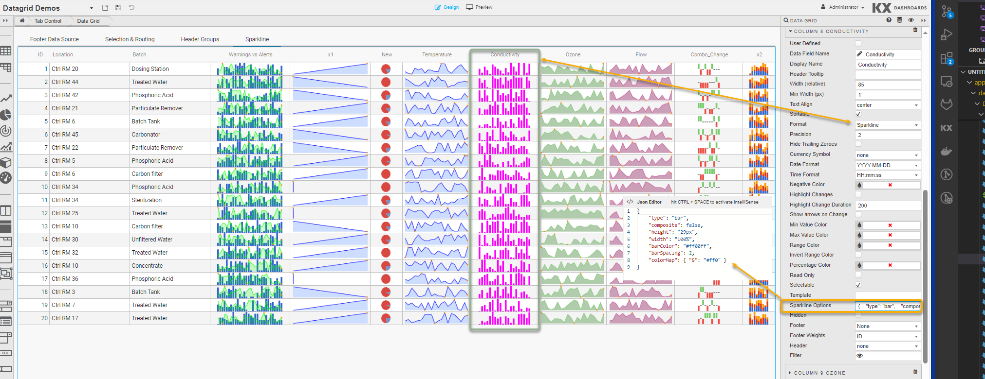
In addition to the common options the following options apply when type is bar.
| Option | Description | Default |
|---|---|---|
barColor |
CSS color for positive values. | "#3366cc" |
negBarColor |
CSS color for negative values. | "#f44" |
zeroColor |
CSS color for zero values. | null |
nullColor |
CSS color for null values. Adds a thin marker; useful for sparse data. | null |
barWidth |
Width of each bar in pixels. | 4 |
barSpacing |
Space between bars in pixels. | 1 |
zeroAxis |
Centers the Y-axis at zero when true. | true |
colorMap |
A range map to map values to colors. Can also be an array to specify a color per bar. | |
stackedBarColor |
Array of colors for stacked bar charts. | "#3366cc", "#dc3912", "#ff9900", "#109618", "#66aa00", "#dd4477", "#0099c6", "#990099" |
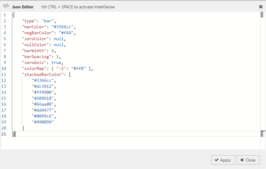
To create stacked bar charts: ((1; 4); (2; 3); (3; 2); (4; 1))
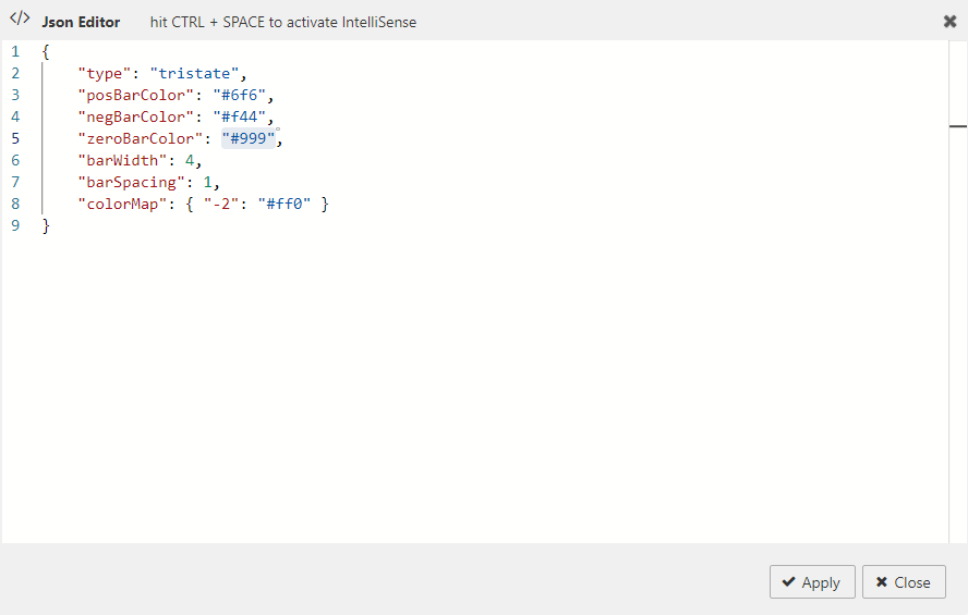
Tristate Charts
Tristate charts are useful to show win-lose-draw information. You can also use colorMap to use different colors for different values.
In addition to the common options the following options apply when type is tristate.
| Option | Description | Default |
|---|---|---|
posBarColor |
CSS color for positive (win) values. | "#6f6" |
negBarColor |
CSS color for negative (lose) values. | "#f44" |
zeroBarColor |
CSS color for zero (draw) values. | "#999" |
barWidth |
Width of each bar in pixels. | 4 |
barSpacing |
Space between bars in pixels. | 1 |
colorMap |
A range map to map values to colors. Can also be an array to specify a color per bar. |
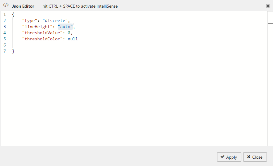
Discrete Charts
Discrete charts provide a separated thin vertical line for each value.
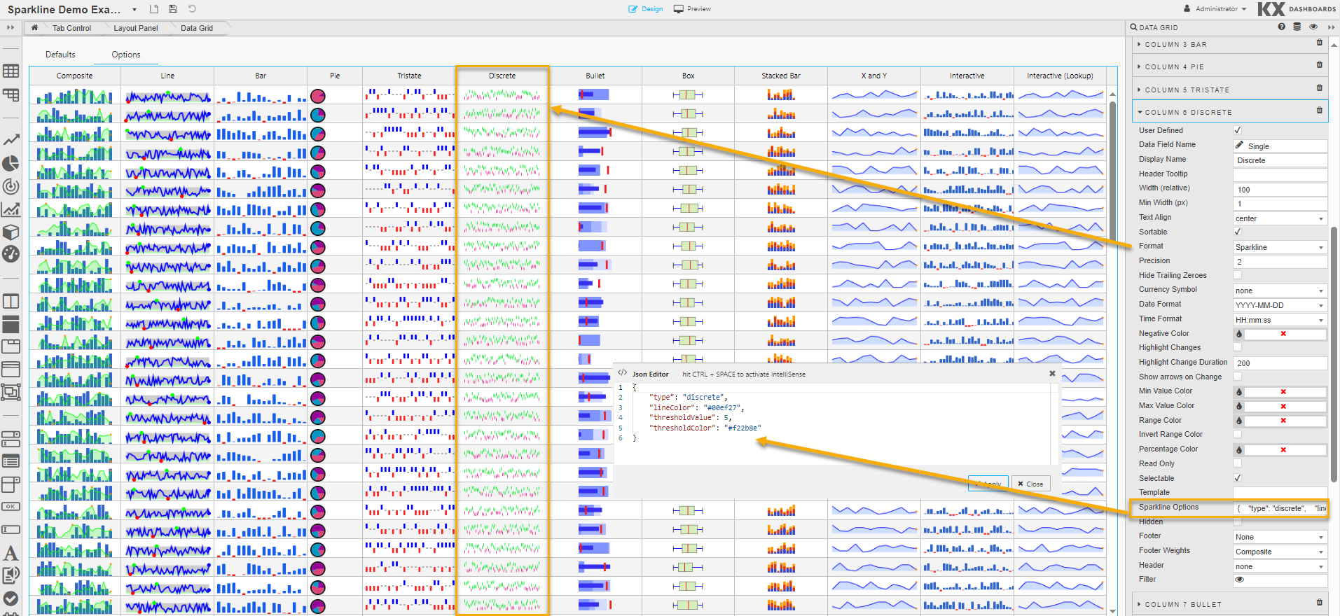
In addition to the common options the following options apply when type is discrete.
| Option | Description | Default |
|---|---|---|
lineHeight |
The height of each line in pixels. | "auto" = 30% of graph height |
thresholdValue |
Values less than this are drawn using thresholdColor instead of lineColor. |
0 |
thresholdColor |
The color to use in combination with thresholdValue. |
null |
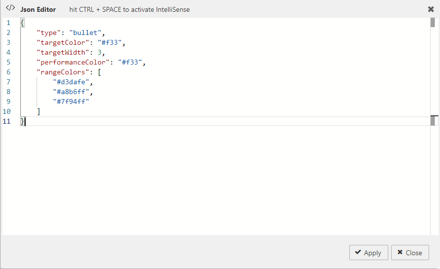
Bullet Graphs
A bullet graph is a variation of a bar graph that serves as a replacement for dashboard gauges and meters.
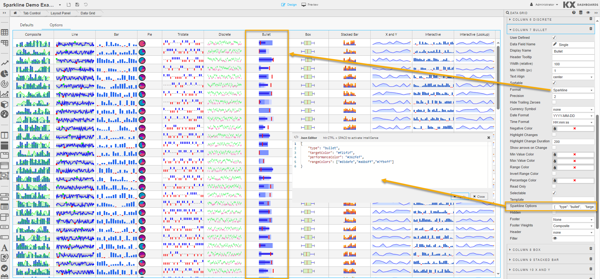
In addition to the common options the following options apply when type is bullet. Supplied values must be in this order: target, performance, range 1, range 2, range 3, …
| Option | Description | Default |
|---|---|---|
targetColor |
CSS color of the vertical target marker. | "#f33" |
targetWidth |
Width of the target marker in pixels. | 3 |
performanceColor |
CSS color of the performance measure horizontal bar. | #f33 |
rangeColors |
Colors for each qualitative range background. Must be a JavaScript array. For example ["red","green", "#22f"]. |
"#d3dafe", "#a8b6ff", "#7f94ff" |
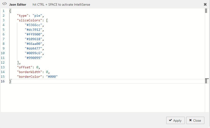
Pie Charts
A pie chart is a circular statistical graphic divided into slices to illustrate numerical proportion.
Tip
When using pie charts as sparklines, they tend only to be useful with 2 or 3 values at most.
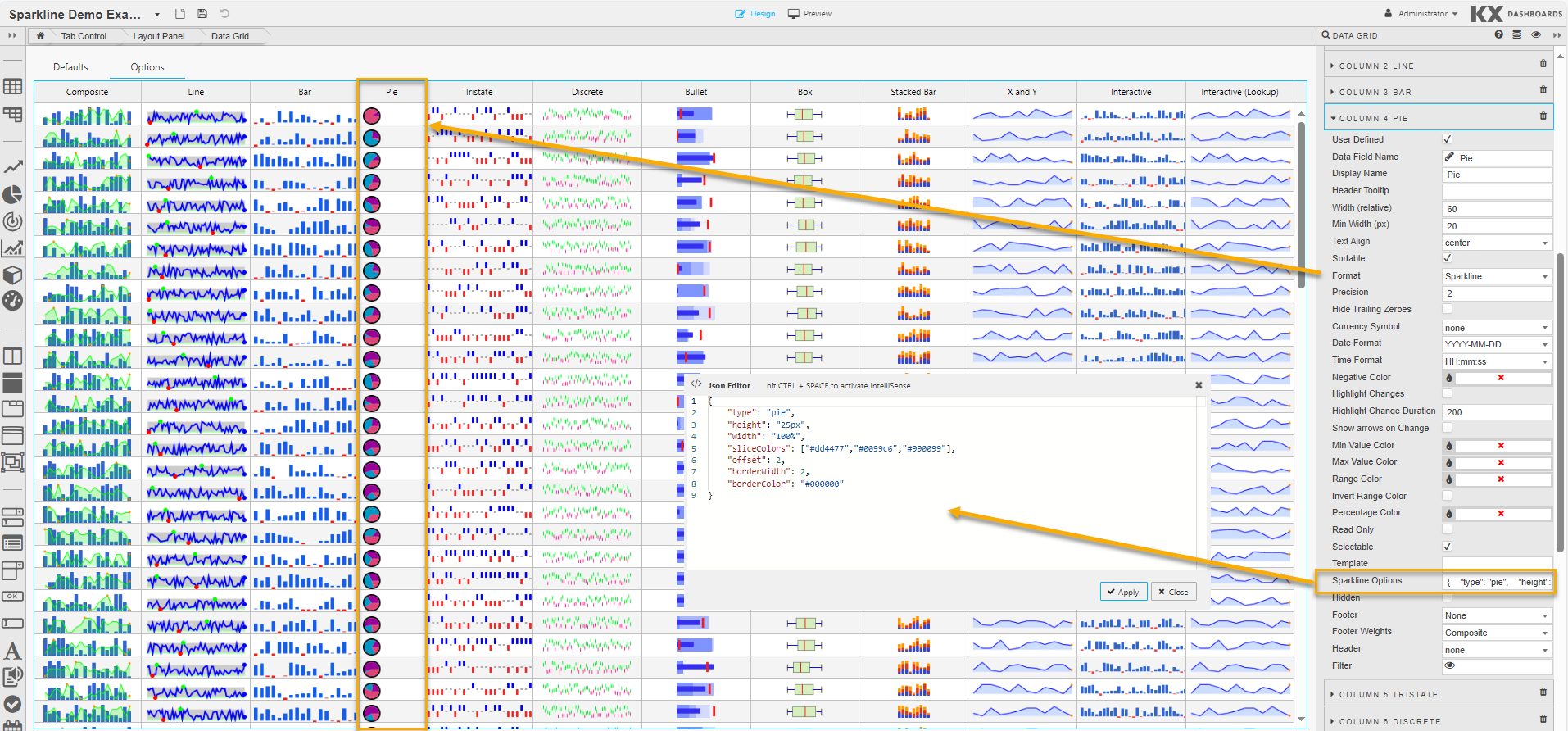
In addition to the common options the following options apply when type is pie.
| Option | Description | Default |
|---|---|---|
sliceColors |
An array of CSS colors to use for pie slices. | "#3366cc", "#dc3912", "#ff9900", "#109618", "#66aa00", "#dd4477", "#0099c6", "#990099" |
offset |
Angle in degrees to offset the first slice. Try -90 or +90. | 0 |
borderWidth |
Width of the border around the whole chart in pixels. | 0 |
borderColor |
CSS color for the pie border. | "#000" |
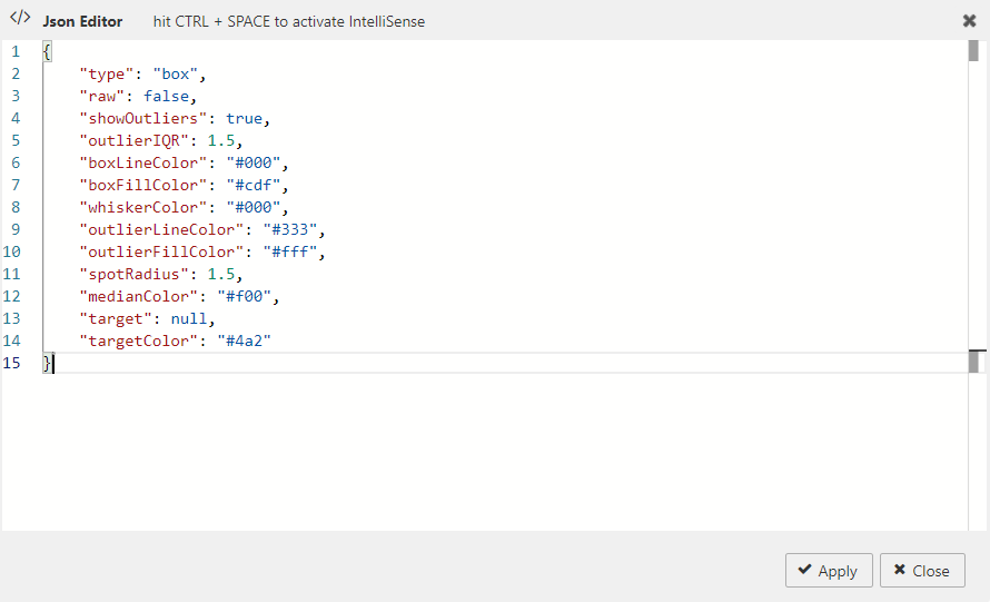
Box Plots
A box plot demonstrates graphically the locality, spread and skewness of numerical data through their quartiles.
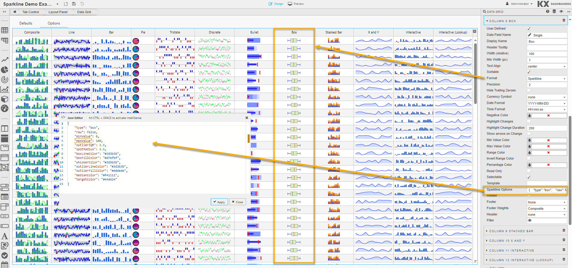
In addition to the common options the following options apply when type is box.
| Option | Description | Default |
|---|---|---|
raw |
False — values are used to calculate box data points automatically. True — pre-computed values are passed in. If showing outliers, supply: low_outlier, low_whisker, q1, median, q3, high_whisker, high_outlier. |
false |
showOutliers |
When true, outliers (values > 1.5 × IQR) are marked with circles and whiskers are placed at Q1 and Q3. |
true |
outlierIQR |
Sets the inter-quartile range multiplier for outlier calculation. | 1.5 |
boxLineColor |
CSS line color used to outline the box. | "#000" |
boxFillColor |
CSS fill color for the box. | "#cdf" |
whiskerColor |
CSS color for the whiskers. | "#000" |
outlierLineColor |
CSS color for the outlier circles. | "#333" |
outlierFillColor |
CSS fill color for the outlier circles. | "#fff" |
spotRadius |
Radius in pixels for the outlier circles. | 1.5 |
medianColor |
CSS color for the median line. | "#f00" |
target |
If set, a small crosshair is drawn at that point. | null |
targetColor |
CSS color for the target crosshair. | null |
minValue / maxValue |
If both are set, the scale of the plot is fixed. |
Composite Sparklines
A composite sparkline combines multiple individual sparklines into a single chart.
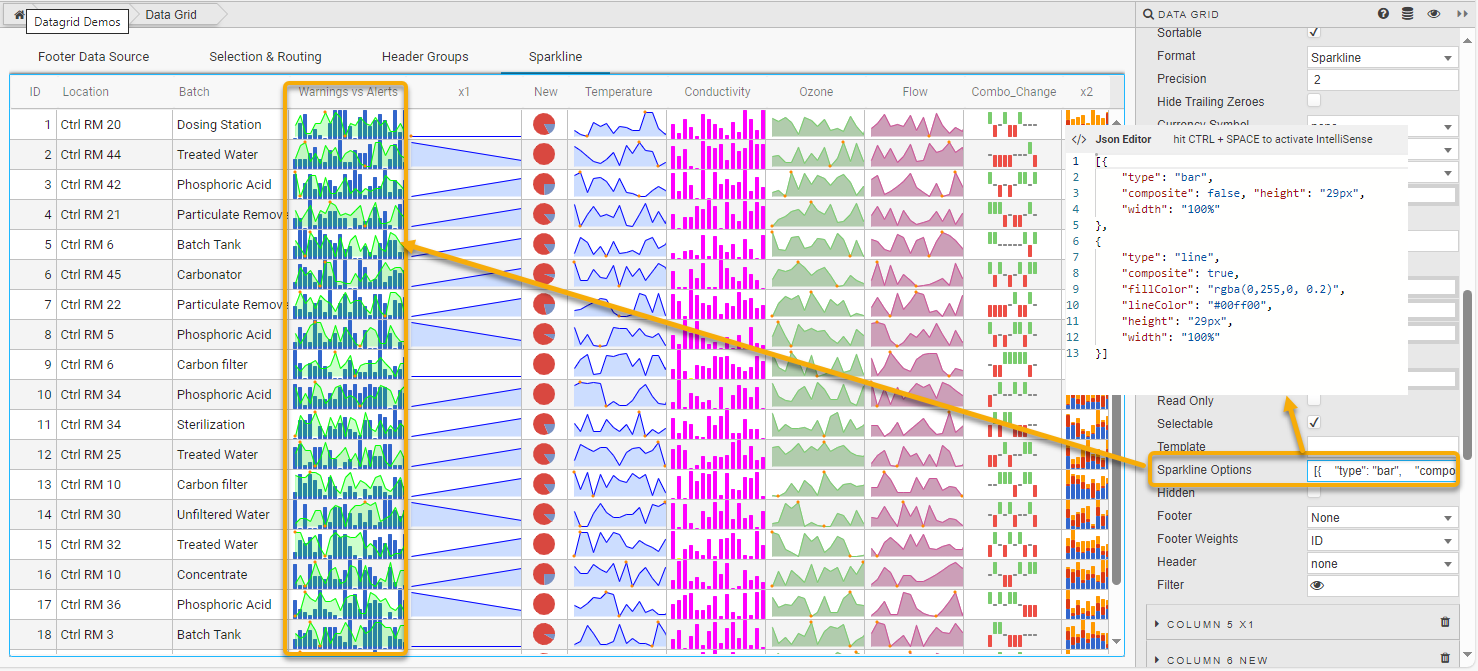
The screenshot above uses the following JSON to display the data as a bar and a line chart:
[{
  "type": "bar",
  "composite": false,
  "height": "29px",
  "width": "100%"
},
{
  "type": "line",
  "composite": true,
  "fillColor": "rgba(0,255,0, 0.2)",
  "lineColor": "#00ff00",
  "height": "29px",
  "width": "100%"
}]
Interactive Sparklines
Interactive sparklines in the form of tooltips, mouseover highlighting, and click interaction are supported for all types of sparkline.
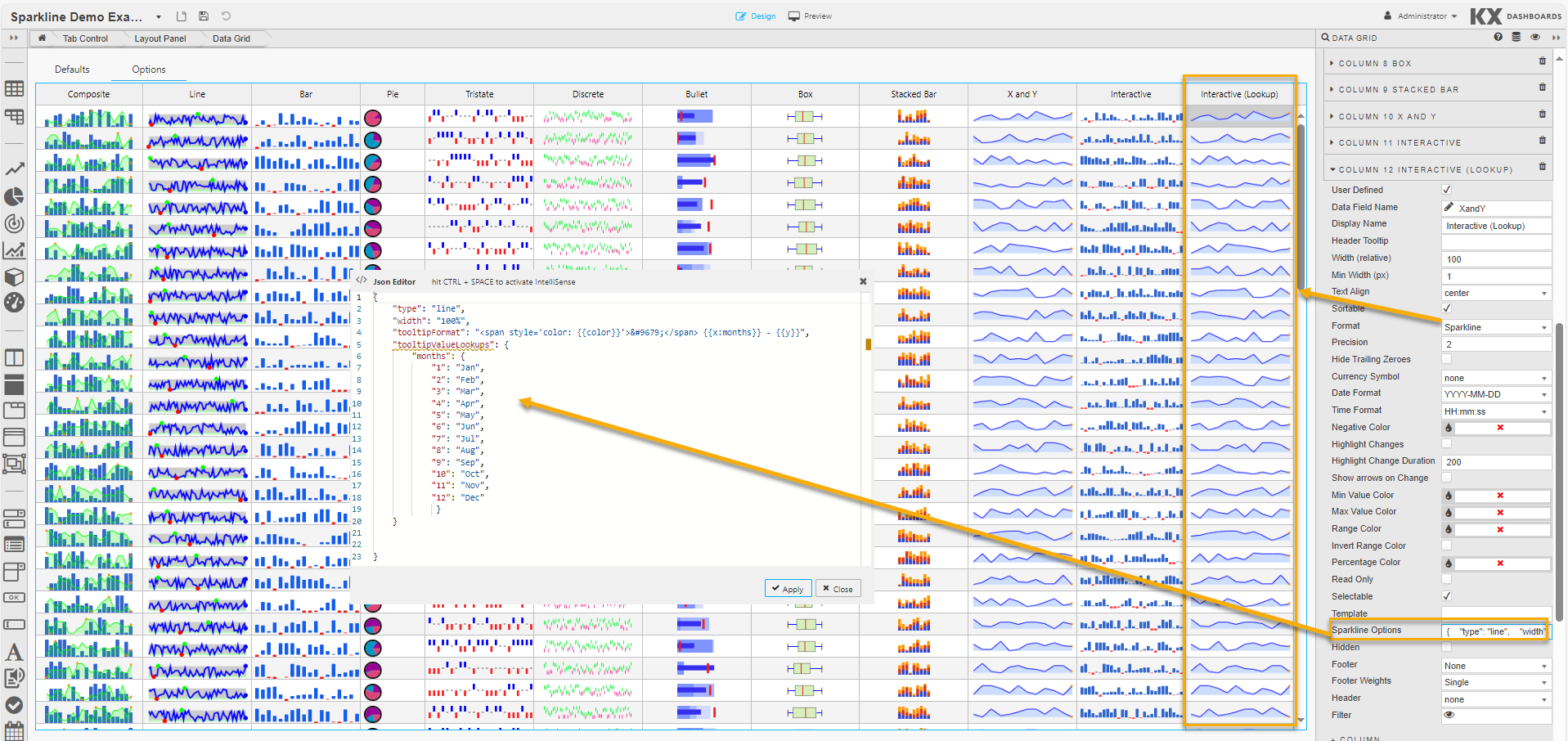
In Preview mode, the example above maps numerical values to months. So a value of 4-4 is displayed as Apr 4.
Note
If you're happy with the default look and feel of the tooltips, you can skip this entire section.
The following options control sparkline interactions, specified in the JSON editor for Sparkline Option when Format is set to Sparkline in Column properties.
| Option | Description | Default |
|---|---|---|
disableInteraction |
Set to true to disable all sparkline interactivity. |
false |
disableTooltips |
Set to true to disable mouseover tooltips. |
false |
disableHighlight |
Set to true to disable highlighting of individual values on mouseover. |
false |
highlightLighten |
Controls the amount to lighten or darken a value on mouseover. 1.5 lightens by 50%, 0.5 darkens by 50%. | 1.4 |
highlightlineColor |
If specified, moused-over values change to this color instead of being lightened. | "#f22" |
tooltipClassname |
CSS class name to apply to tooltips to override the default style. | "jqstooltip" |
tooltipOffsetX |
Pixels from the mouse pointer to render the tooltip on the X axis. | 10 |
tooltipOffsetY |
Pixels from the mouse pointer to render the tooltip on the Y axis. | 12 |
tooltipChartTitle |
If specified, the tooltip uses this string as a title. | |
tooltipFormat |
A format string to control the tooltip format. See formatting tooltips. | "● {{prefix}}{{y}}{{suffix}}" |
tooltipPrefix |
A string to prepend to each field in a tooltip. | |
tooltipSuffix |
A string to append to each field in a tooltip. | |
tooltipSkipNull |
When true, null values don't have a tooltip displayed. |
true |
tooltipValueLookups |
An object or range map to map field values to tooltip strings. See formatting tooltips. | |
tooltipFormatFieldlist |
An array of values specifying which fields to display in a tooltip and in what order. Currently only useful for Box plots. | |
tooltipFormatFieldlistKey |
Specifies which key holds the field name. For Box plots this must be field. |
|
numberFormatter |
When true, passes a JavaScript function to format numbers in tooltips. |
false |
numberDigitGroupSep |
Character to use for group separator in numbers (1,234) for L10n purposes. |
"," |
numberDecimalMark |
Character to use for the decimal point for L10n purposes. | "." |
numberDigitGroupCount |
Number of digits between group separators for L10n purposes. | 3 |
Formatting Tooltips
The tooltipFormat and tooltipValueLookups options provide the main methods of formatting tooltip text. The tooltipFormat is applied whenever the mouse moves over a value. For example, the default format string for line charts is:
coloris derived from the color of the line being drawn.prefixandsuffixare set bytooltipPrefixandtooltipSuffix.yrepresents the Y value of the point under the mouse.xcan also be used if useful.
The supported fields for different sparkline types:
| Sparkline | Supported Fields |
|---|---|
| All types | prefix, suffix as set by tooltipPrefix and tooltipSuffix options |
| Line | color, fillColor, x, y, isNull |
| Bar | value, color, isNull |
| Tristate | value, color, isNull |
| Discrete | value, isNull |
| Pie | value, percent, color |
| Bullet | value, fieldkey, isNull |
| Box | field and value. Field may be lq, med, uq, lo, ro, lw, rw. |
Refer to Style for common Style, Format and Margin settings.
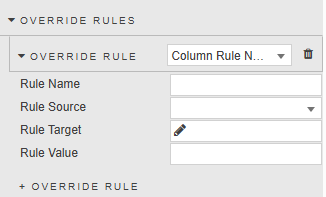
Override Rules
Override Rules enable you to define custom logic that is applied consistently across all columns. By using text matching or regular expressions (regex), you can set visual styling or behaviors without needing to configure each column individually.
There are four Override Rules, described below. The properties displayed vary depending on the rule you select.
- Rules are evaluated at render-time.
- If multiple rules apply to a column, the last one is applied.
The Boolean Rule enables conditional styling based on text or categorical values in a column.
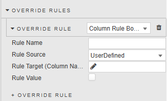
| Property | Description |
|---|---|
| Rule Name | Enter a name for the rule. |
| Rule Source | Select the name of the column property source. Options: UserDefined, Sortable, HideTrailingZeroes, HighlightChanges, IsReadonly, IsSelectable, ShowArrowsOnChange, IsRangeHighlightColorInverted, Hidden, Filter. |
| Rule Target (Column Name) | Select the column that the rule targets, or enter a regular expression or wildcard, then click Add Custom Column. |
| Rule Value | The value to be applied to the source. |
The String Rule enables conditional styling based on text or categorical values in a column.
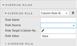
| Property | Description |
|---|---|
| Rule Name | Enter a name for the rule. |
| Rule Source | Select the name of the column property source. Options: DisplayName, Tooltip, TextAlign, Format, HideTrailingZeroes, Currency, DateFormat, TimeFormat, Template, SparklineOptions, Footer, FooterWeights, Header. |
| Rule Target (Column Name) | Select the column that the rule targets, or enter a regular expression or wildcard, then click Add Custom Layer. |
| Rule Value | The value to be applied to the source. |
The Number Rule enables conditional styling based on text or categorical values in a column.
| Property | Description |
|---|---|
| Rule Name | Enter a name for the rule. |
| Rule Source | Select the name of the column property source. Options: WidthWeight, MinWidthAbsolute, Precision. |
| Rule Target (Column Name) | Select the column that the rule targets, or enter a regular expression or wildcard, then click Add Custom Layer. |
| Rule Value | The value to be applied to the source. |
The Color Rule enables conditional styling based on text or categorical values in a column.
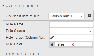
| Property | Description |
|---|---|
| Rule Name | Enter a name for the rule. |
| Rule Source | Select the name of the column property source. Options: HighlightNegativeColor, HighlightMinValueColor, HighlightMaxValueColor, RangeHighlightColor, PercentageColorOverride. |
| Rule Target (Column Name) | Select the column that the rule targets, or enter a regular expression or wildcard, then click Add Custom Layer. |
| Rule Value | The value to be applied to the source. |