Button
This page describes how to set up and configure the Button component.
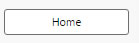
This component allows you to add buttons to your dashboards.
Set Up a Button
To set up a Button component, click-and-drag the component into the workspace and configure the following:
- Create a Label for your button.
- Create the action or actions you want the button to control on click.
Button Properties
The following sections provides details on how to configure the properties of the Button component.
Basics
Open the Basics properties on the right and configure the properties described in the following table.
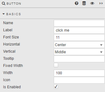
| Field | Description |
|---|---|
| Name | A name for the component. |
| Label | Text to appear on the button. |
| Font Size | Size of button font in pixels. |
| Horizontal | Alignment of text inside the button. |
| Vertical | Alignment of text inside the button. |
| Tooltip | Descriptive tooltip to appear on button rollover. |
| Button width | When Fixed Width is checked, the button is Width pixels wide, otherwise button fills width of the Button component. |
| Icon | Select from list of icons to include in the button. |
| Is Enabled | Control whether a button is active or inactive; can be associated with a boolean Type View State Parameter. |
Action
Refer to Actions for details.
Style, Margins, Format
Configure the properties, described in the following table.
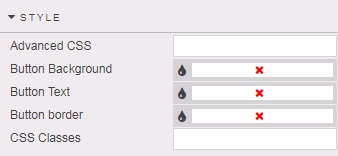
| Field | Description |
|---|---|
| Button Background | Select color for button background. |
| Button Text | Select color for button text. |
| Button Border | Select color for button border. |
Refer to Style for common settings.