Tab Control
This page describes how to set up and configure the Tab Control component.
A Tab Control is a container of displays selected by a tab menu. A tab can hold a single component or a Layout panel with multiple components.
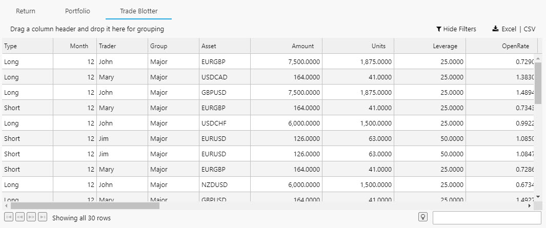
The following example shows a Tab Control with five tabs. The first Tab, Trade Performance, is selected and visible.
Set Up a Tab Control
To set up a Tab Control component, click-and-drag the component into the workspace and configure the following:
- Define the number of tabs you require.
- Within each tab element, add a single component, layout panel, or flex panel for multiple components.
Refer to Tab Control properties described in the next section for details on additional properties.
Tab Control Properties
The following sections provides details on how to configure the properties of the Tab Control component.
Basics
Open the Basics properties on the right and configure the property described in the following table.
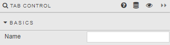
| Field | Description |
|---|---|
| Name | Enter a name for the component. |
View State
Configure the properties described in the following table.
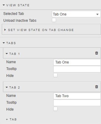
| Field | Description |
|---|---|
| Selected Tab | The Tab visible at launch. !!! tip "Linking Tab controls" To link Tabs in two separate Tab Controls (so that clicking Tab 1 of Tab Control 1 opens Tab 1 of Tab Control 2), create a View State Parameter and assign it to Selected Tab of both Tab Controls. 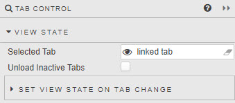 |
| Unload Inactive Tabs | When enabled, uploaded tab content will be removed on tab switch. |
| Set View State on Tab Change | In addition to linking different tab components, switching tabs can be used to assign a value to a View State Parameter. For example, to reset a default value on tab switch.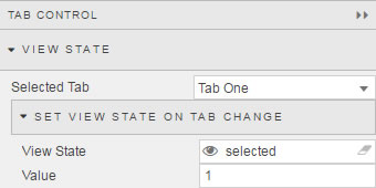 |
Tabs
Configure the properties described in the following table.
| Field | Description |
|---|---|
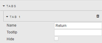
| Name | Name displayed in tab. |
| Tooltip | Description of tab on mouse rollover. |
| Hide | A Tab can be hidden by checking this checkbox. Hiding a Tab does not remove it, it only disables the ability to click on it. Navigation to the hidden tab content can be achieved using a Button. |
Style
Refer to Style for common settings.