Map (Quad Tile)
This page describes how to set up and configure the Map (Quad Tile) component in KX Dashboards. This component provides a geographic map visualization designed to work with quad-based tile services that use longitude/latitude coordinate systems.
Overview
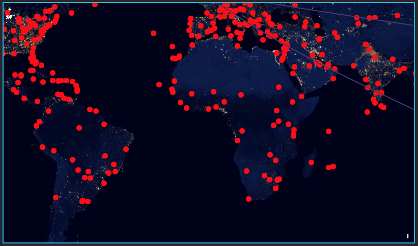
The Map (Quad Tile) component introduces native support for CRS:84 Quad Maps. It enables KX Dashboards to consume quad-based tile services that use longitude/latitude ordering (CRS:84), rather than just Web Mercator. This allows accurate rendering of both global and regional datasets published in geographic coordinates.
CRS:84 quad maps are commonly used by WMTS and custom tile services where tiles are indexed using a quadtree scheme but expressed in EPSG:4326 (CRS:84 axis order: lon/lat) instead of EPSG:3857.
What is CRS:84?
CRS:84 is a geographic coordinate reference system equivalent to EPSG:4326 but with an explicit longitude, latitude axis order. Unlike EPSG:3857 (Web Mercator), CRS:84 preserves true geographic coordinates and avoids projection distortion at high latitudes.
Set Up a Map (Quad Tile) Component
To set up a Map (Quad Tile) component, click and drag the component into the workspace and define its properties as explained in the following sections.
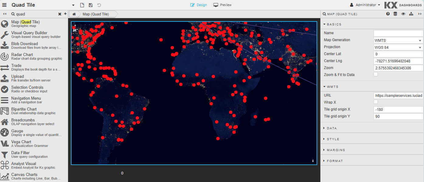
Map (Quad Tile) Properties
The following sections provide details on how to configure the properties of the Map (Quad Tile) component.
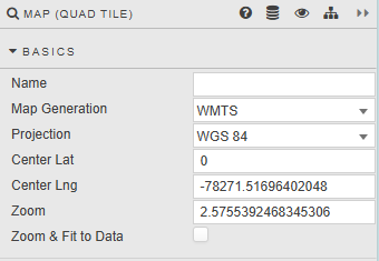
Basics
Open the Basics tab on the right and configure the properties described in the following table.
| Property | Description |
|---|---|
| Name | A user-defined name for the map component. Used for identification within the dashboard configuration and does not affect rendering. |
| Map Generation | Specifies the map configuration type used to render the map. Determines how layers, projections, and tile sources are interpreted. Currently can only be set to WMTS. |
| Projection | Defines the coordinate reference system (CRS) used by the map. Currently can only be set to WGS 84. |
| Center Lat | The latitude value used to set the initial vertical center point of the map view. |
| Center Lng | The longitude value used to set the initial horizontal center point of the map view. |
| Zoom | Sets the initial zoom level of the map. Higher values zoom in closer; lower values show a wider geographic area. |
| Zoom & Fit to Data | When enabled, the map automatically adjusts its center and zoom level to fit the extent of the loaded data layers. Overrides the manual center and zoom settings on initial load. |
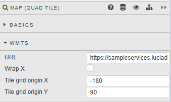
WMTS
Open the WMTS tab on the right and configure the properties described in the following table.
| Property | Description |
|---|---|
| URL | The endpoint of the WMTS tile service, used to request map tiles based on the configured tile grid, projection, and zoom level. |
| Wrap X | Controls horizontal world wrapping. When enabled, the map repeats tiles horizontally beyond the -180 to 180 longitude range, allowing continuous panning across the international date line. |
| Tile Grid X | Defines the X origin of the tile grid, typically the top-left corner of the grid. |
| Tile Grid Y | Defines the Y origin of the tile grid, typically the top-left corner of the grid. |
Data Layers
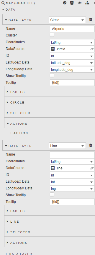
Data layers represent the visualization of data points or geometries on the map. Each data layer has a specific rendering type:
- Circle: Renders data points as circles, commonly used for point-based datasets.
- Line: Renders data as connected line segments, suitable for paths, routes, or trajectories.
- Icon: Renders data points using custom icons or images.
Open the Data tab on the right to add a data layer and configure the properties described in the following tables.
Common Properties
| Property | Description |
|---|---|
| Name | The display name of the data layer, used for identification within the map configuration. |
| Coordinates | Defines how coordinate data is interpreted for the layer, based on the selected projection and data source structure. |
| Data source | Specifies the underlying data source that provides the data for this layer. |
| ID | A unique identifier for each data item within the layer. Used for selection, interaction, and actions. |
| Latitude / X Data | Specifies the data field containing the latitude (or X coordinate, depending on projection) for each data point. |
| Longitude / Y Data | Specifies the data field containing the longitude (or Y coordinate, depending on projection) for each data point. |
| Show tooltip | Enables or disables tooltips for the data layer. When enabled, tooltips appear on hover or selection. |
| Tooltip | Defines the content displayed in the tooltip. Can include dynamic values from the data source. |
| Selected | Enables the user to select a data point and set to a viewstate. |
| Actions | Defines the actions that can be triggered when a data feature is interacted with. |
Circle Specific Properties
| Property | Description |
|---|---|
| Radius | Defines the size of each circle marker in pixels. Larger values produce larger markers. |
| Fill Color | Specifies the interior color of the circle marker. Can be fixed or data-driven. |
| Stroke Color | Defines the color of the circle outline, useful for improving contrast or distinguishing overlapping points. |
| Stroke Width | Controls the thickness of the circle outline in pixels. A value of zero disables the stroke entirely. |
Line Specific Properties
| Property | Description |
|---|---|
| Width | Defines the thickness of the line in pixels. |
| Color | Specifies the color of the line. Can be static or data-driven. |
| Simplify | When enabled, simplifies the geometry to improve rendering performance for large or complex datasets. |
| Tolerance | Defines the simplification tolerance when simplification is enabled. Higher values result in more aggressive simplification, trading visual detail for performance. |
Icon Specific Properties
| Property | Description |
|---|---|
| Image Src | Specifies the source URL or reference for the icon image used to represent each data point. |
| Fill Color | Applies a color overlay to the icon, if supported. Useful for dynamically styling monochrome icons based on data values. |
| Opacity | Controls the transparency of the icon. 1 is fully opaque, 0 is fully transparent. |
| Position | Defines how the icon is anchored relative to its geographic coordinate. |
Export
This allows you to export Quad Maps as PNG images.
Open the Export tab on the right and configure the properties described in the following table.
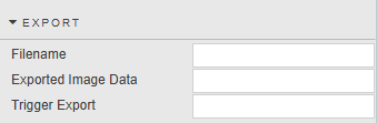
| Property | Description |
|---|---|
| Filename | Specifies the name of the PNG file generated when the Quad Map is exported. |
| Exported Image Data | Stores the generated PNG image data after the export is triggered. |
| Trigger Export | Initiates the export process and generates the PNG image using the current Quad Map configuration and data. |
Annotations
The Annotations feature allows you to draw shapes on the map and interact with underlying data based on those shapes.
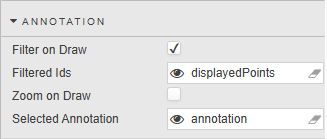
| Property | Description |
|---|---|
| Filter on Draw | When enabled, the map automatically applies a data filter as soon as an annotation is drawn or modified. Only data points that intersect with the drawn annotation are included. The filter updates dynamically whenever the annotation changes. |
| Filtered IDs | Contains the list of data record IDs that fall within the currently drawn annotation. Populated automatically when Filter on Draw is enabled. Can be used by other widgets or queries to reference the filtered dataset. |
| Zoom on Draw | When enabled, the map automatically zooms and pans to fit the annotation when it is drawn. Ensures the entire annotation is visible on screen. |
| Selected Annotation | Represents the currently selected annotation on the map. Updates when a user clicks or selects an existing annotation. Can be used to drive conditional logic or interactions elsewhere in the dashboard. Cleared when no annotation is selected. |
Style, Margins, Format
See Style for full details of common settings.