Form Builder
This page describes how to set up and configure the Form Builder component which provides a way to create a flexible form in KX Dashboards.
With FormBuilder, it is easy to manage the rules governing field visibility, dropdown options, and form validation. This can be done by either:
- Configuring the FormBuilder component properties from the front-end.
- Adding an external kdb function from the back-end.
In either case, it is possible to monitor the form state and react to a user's current input, for example, by showing/hiding certain fields, changing dropdown options or updating validation rules.
Set Up a Form Builder
To set up a Form Builder, click-and-drag the component into the workspace. Before set-up, choose whether you want to build and manage the form using the component properties panel or with an external kdb function.
Set Up Using the Properties Panel
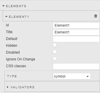
- Click "+Element" under Elements to add an element to the form schema.
-
Set its id, title, and type.
-
Add any desired validators.
-
Repeat as necessary for each additional form field.
-
Create an empty dictionary view state to keep track of the form state as a user interacts with the form, and add it under either Basics > Form Values or as the output of a State Output "Change" action. See Form State Management for more details.
Set Up Using an External Kdb Function
-
Set the Kdb Schema property to a new empty view state parameter of type "dictionary". Repeat for the Form Values property (or use a State Output action instead).
-
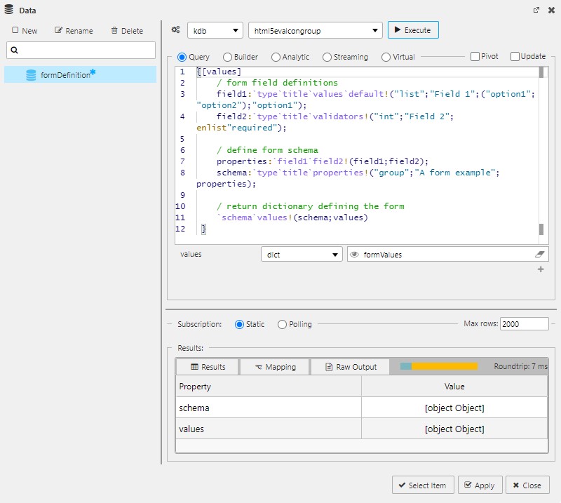
Create a query data source returning a function that takes at least one argument named "values" and returns a dictionary with two properties, "schema" and "values". More parameters may be added as desired.
{[values] / form field definitions field1:`type`title`values`default!("list";"Field 1";("option1";"option2");"option1"); field2:`type`title`validators!("int";"Field 2";enlist"required"); / define form schema properties:`field1`field2!(field1;field2); schema:`type`title`properties!("group";"A form example";properties); / update values with any missing properties and set them to null values:@[values;(key properties) except (key values);:;`]; / return dictionary defining the form `schema`values!(schema;values) } -
In the Data Dialog, set the
valuesargument to the same view state used for the Form Values property (or the same view state used in the State Output on "change" action). -
Execute the data source to display results.
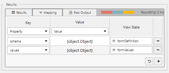
-
Click on the Mapping tab in the Results table and add two rows:
- In the first row map
schemato the Kdb Schema view state created in step 1. - In the second row map
valuesto the Form Values view state created in step 1.
- In the first row map
Once these steps are complete, you have a data source that automatically executes in response to user input. When the user interacts with the form, the Form Values view state changes, triggering execution of the data source. You can customize the data source to return different schema depending on the state of values.
Form Structure
Forms are composed of a nested collection of form groups and form fields. Each form field belongs to some form group containing it. Form groups may also be nested in higher-level groups to create more complex forms. A form's top-level group is called its schema.
Form Fields
Form Fields Definition
All form fields have the following properties available from the property panel (if configuring from the front-end), or defined manually in an external kdb function (if configuring from the back-end).
title(required) — The label text used in the form.type(required) — Must be set to a valid kdb type. For dropdowns use "list". For form sub-groups, use "group".default(optional) — The default value of the field.hidden(optional) — If true, the field is hidden on the form.disabled(optional) — If true, the field is disabled.ignoreOnChange(optional) — If true, the field will not trigger a "change" state output action.classes(optional) — Adds the CSS class or classes (separated by spaces) to the field for custom styling.validators(optional) — Adds form field validation.
For fields of type "symbol":
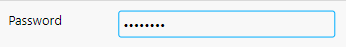
password(optional) — If true, the "password" html input type is used, which obscures text characters with a dot.
For dropdown fields of type "list", you can set the dropdown values in an external kdb function using:
values(optional) — A kdb list corresponding to the desired dropdown values, or a kdb dictionary with "Value" and "Text" properties.forceSelect(optional) — If true, force selection of the first dropdown value.multiSelect(optional) — If true, allows the user to select multiple values in the dropdown.
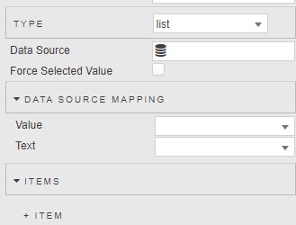
Alternatively, from the front-end you can create specific list items or add a data source to generate them:
Form Fields Examples
A date field with default value "2020-01-31":
Property panel example:
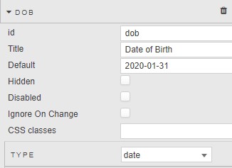
Kdb definition:
dob:`type`title`default!("date";"Date of birth";"2020-01-31");
An int field that is required and must be between 1 and 10 (inclusive):
Property panel example:
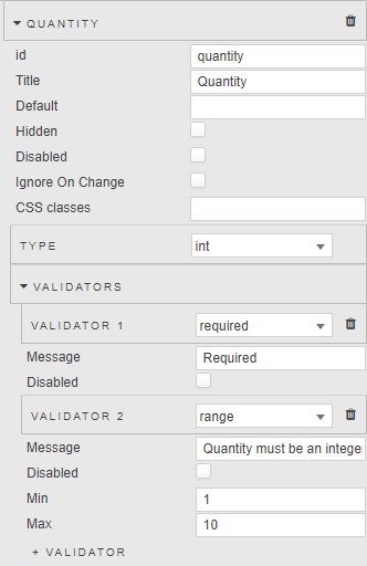
Kdb definition:
e:"Quantity must be an integer between 1 and 10 (inclusive)";
qv:`v1`v2!("required";`type`min`max`message!("range";1i;10i;e));
quantity:`type`title`validators!("int";"Quantity";qv);
A dropdown list with multiple value options:
Property panel example:
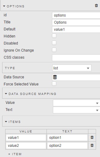
Kdb definition:
options:`type`title`values`default!("list";"Options";(`Value`Text!(`value1`value2;`option1`option2));`option1);
Alternatively, a single list can be used:
options:`type`title`values`default!("list";"Options";(`option1`option2);`option1);
A symbol field that checks for alphanumeric characters only:
Property panel example:
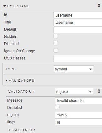
Kdb definition:
uv:`type`regexp`flags`message!("regexp";"^\\w+$";"ig";"Invalid character");
username:`type`title`validators!("symbol";"Username";uv);
Form Groups
Form Groups Definition
All form groups have the following properties:
type(required) — Must be set to "group".title(required) — A string equal to the title of the group.layout(optional) — If "Row" ("Column") is selected, elements are arranged in a row (column). The default is "Column".properties— A dictionary whose keys are the ids of any form fields and sub-groups contained in the group, and whose values are those objects.
Set top-level group to value of schema property
The top-level group in the form must be set to the value of the schema property in the kdb form definition function.
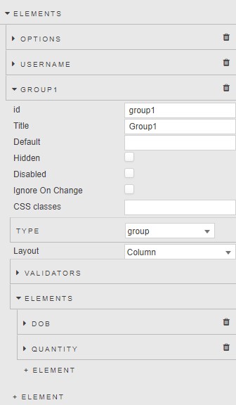
From the properties panel, simply click "+ Element" to add an element inside the group.
Form Groups Examples
A form group defined in kdb with the example fields defined above:
properties:`dob`quantity`options`username!(dob;quantity;options;username);
group1:`type`title`properties!("group";"Group1";properties);
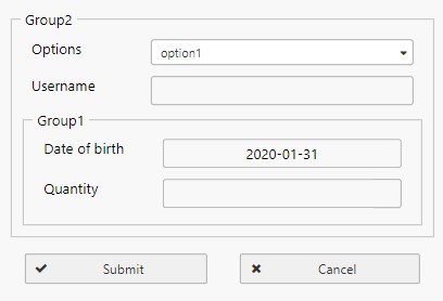
A form with two nested groups:
props1:`dob`quantity!(dob;quantity);
props2:`options`username!(options;username);
group1:`type`title`properties!("group";"Group1";props1);
group2:`type`title`properties!("group";"Group2";@[props2;`group1;:;group1]);
This produces the following nested form when group2 is set as the schema:
From the properties panel, the same configuration is illustrated below:
Form State Management
There are two ways to manage the form state as the user interacts with the form.
- Basics > Form Values: This view state property stores the current form values as a dictionary, regardless of whether the user has clicked "Submit" or if a particular field has the
ignoreOnChangeproperty set to true. - State Output: State Output actions output the current form values as a dictionary in response to specific triggers — output on "Change", output on "Submit", output on "Cancel". If any field has
ignoreOnChangeset to true, then it does not trigger the "Change" action.
The current form state can be used to update the form schema via an external kdb function or virtual query.
Form Validation
When the user clicks the submit button, the form checks for any input errors. If found, they are shown to the user and submission is halted. The form performs two types of validation: built-in validation depending on the kdb type of the field, and custom validation added to the field's properties.
Built-in Validation
Built-in validation checks that the user's input matches the correct kdb type as specified in the form field's definition. For example, a form field of type int will automatically throw an error if the user inputs a floating point number.

Custom Validation
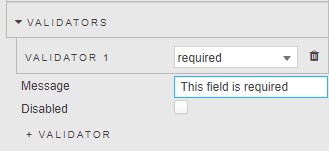
There are several types of custom validators that can be added to a form field. Multiple validators may be used together. If using kdb, validators should be defined in the form field's validators property as a dictionary. Validators also have a disabled property that disables the validator if set to true.
| Field | Description |
|---|---|
required |
Cannot be null. Usage: "required" |
range |
Must be a number in the range specified by min and max properties. Usage:q<br>`type`min`max`message!("range";min;max;message)<br>where min, max specify the range and message is a custom error message. |
email |
Must match a valid email format. Usage: "email" |
url |
Must match a valid URL. Usage: "url" |
regexp |
Must match the provided regexp. Usage:q<br>`type`regexp`flags`message!("regexp";regexp;flags;message)<br>where regexp is a string regular expression, flags is a string storing optional JavaScript regexp flags (such as "i" for case insensitive), and message is a custom error message. |
function |
The provided condition property must be false. Usage:q<br>`type`condition`message!("function";condition;message)<br>where condition is a boolean. If true, validation fails and the custom error message is thrown. |
Form Validation Examples
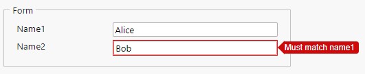
A form field name2 that is both required and must match another field with id name1:
name1:`type`title!("symbol";"Name1");
validators:`v1`v2!("required";`type`condition`message!("function";values[`name1]<>values[`name2];"Must match name1"));
name2:`type`title`validators!("symbol";"Name2";validators);
Form Builder Properties
The following sections provides details on how to configure the properties of the Form Builder component.
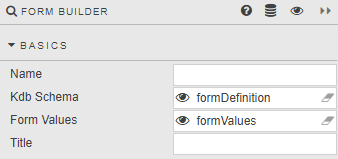
Basics
Open the Basics properties on the right and configure the properties described in the following table.
| Field | Description |
|---|---|
| Name | Enter a name for the component. |
| Kdb Schema | An empty type dictionary view state parameter. Used in setup with an external Kdb Function. |
| Form Values | An empty type dictionary view state parameter. Used in setup with an external Kdb Function. |
| Title | Title for the assigned form. |
Actions
| Field | Description |
|---|---|
| Trigger Action | Can be set on form Submit, Cancel, or Change. |
Refer to Actions for further details.
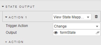
State Output
An optional action, set to a view state parameter to track the interaction state of the user with the form; define as an empty dictionary view state parameter.
See Actions for details.
Elements
Element(n)
Define Form inputs.
| Field | Description |
|---|---|
| id | Referenced in the kdb definition. |
| Title | Text description for the form. |
| Default | Define default value of the form. |
| Hidden | Hide form element. |
| Disabled | Locks form to user input. |
| Ignore on Change | Will not trigger a State Output action on change. |
| CSS Classes | Apply style from named CSS class. |
Type
Set kdb type for Form element.
Validators
Select from email, range, required, regexp or url.
| Field | Description |
|---|---|
| Message | Define message when incorrect input is entered for Form element. |
| Disabled | Disable validation check. |
| Min / Max | Define required numeric range min and max input values. |
| regexp / flags | Define regexp string regular expression. Flags stores optional JavaScript regular expression flags. |
| url | Requires a valid url. |
Style, Margins, Format
Refer to Style for common settings.
| Field | Description |
|---|---|
| Hide Fieldset Borders / Hide Group Tiles / Hide Submit / Hide Cancel | Use these fields to selectively remove Form details and buttons. |
| Horizontal / Vertical | Alignment of the form within the component. |
| Layout | Configure orientation of the form. |
| Max Form Width | Define percentage width occupied by the form within the Form component; between 1 and 100%. |
| Label Widths | Set label widths in pixels. |
| Submit Button Text / Cancel Button Text | Set text description for Form buttons. |