Pie Chart
This page describes how to set up and configure the Pie Chart component.
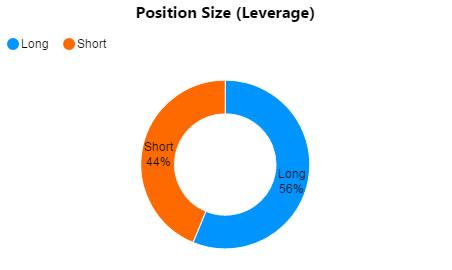
The following screenshot shows a pie chart in donut style.
Set Up a Pie Chart
To set up a Pie Chart component, click-and-drag the component into the workspace and configure the following:
- Define a data source.
- Select Series Key for category data.
- Add a Layer, and define the Series Data to plot.
Refer to Pie Chart properties described in the next section for details on additional properties.
Pie Chart Properties
The following sections provides details on how to configure the properties of the Pie Chart component.
Basics
Open the Basics properties on the right and configure the properties described in the following table.
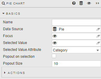
| Field | Description |
|---|---|
| Name | Enter a name for the component. |
| Data Source | A data source. |
| Focus | A View State Parameter for linking components. |
| Selected Value / Selected Value Attribute | A View State Parameter/s and data-source column/s that map to a chart data point when a chart segment is clicked by the user. See Viewstate routing. |
| Popout onSelected / Popout Size | Slide out pie selection. |
Action
Refer to Actions for details.
Data
Configure the properties described in the following table.
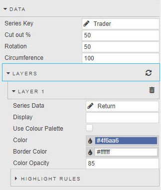
| Field | Description |
|---|---|
| Series Key | Category from Data Source. |
| Cut out % | Size of donut hole. |
| Rotation | Rotation of Series Key labels. |
| Circumference | 100% is a full circle, 50% is a half-circle. |
Layers
Configure the properties described in the following table.
| Field | Description |
|---|---|
| Series Data | Data to define pie sections from Data Source. |
| Display | Title of pie chart. |
| Use color Palette | Check to replace the standard single color per segment with a Color Palette option. |
| Color / Border Color / Color Opacity | If not using a Color Palette, set the single color and opacity (0–100) to be used for all segments. |
Highlight Rules
Rules for color-coding charts: best used with real-time streaming or polling data.
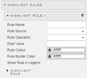
| Field | Description |
|---|---|
| Rule Name | A name for the rule. |
| Rule Source | The Data Source column to which the rule will apply. All is an option. |
| Condition | See Highlight Rules. |
| Rule Color / Rule Border Color | The color to display when the condition is true. |
| Show in Legend | When checked, the highlight rule legend will appear in the chart. |
Legend
Configure the properties described in the following table.
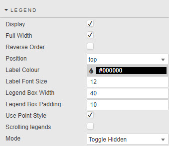
| Field | Description |
|---|---|
| Display | Check to use a legend. |
| Reverse Order | Change direction of pie-chart labels. |
| Position | Location of the legend. |
| Label Color | Color of the text label. |
| Label Font Size | Font size of the text label. |
| Full Width | Width of label. |
| Legend Box Width / Legend Box Padding | Set the dimensions of the text legend. |
| Use Point Style | Switch between block- and point-style legends. |
| Scrolling Legends | If the pie chart is smaller than the space required to display the legend, adds a scroll bar for the legend. |
| Mode | With Toggle Hidden enabled, selecting a legend item removes the selected datapoint from the pie chart. Select Only means it acts only as a data selector (data remains visible). |
Padding
| Field | Description |
|---|---|
| Left / Right / Top / Padding | Set the pixel size adjustments relative to the component/label. |
Labels
Configure the properties described in the following table.
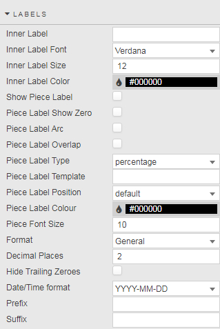
| Field | Description |
|---|---|
| Inner Label / Inner Label Font / Inner Label Size / Inner Label Color | Set values for text or icon display for the center of the pie chart. |
| Show Piece Label / Piece Label Show Zero / Piece Label Arc / Piece Label Overlap / Piece Label Type / Piece Label Position / Piece Label Color / Piece Font Size | These properties set formats for pie-chart labels. For example, whether they follow the curve of the pie-chart circle (Piece Label Arc) or sit outside the pie chart (Piece Label Position). |
| Format | Sets format for label. |
| Decimal Places | If a numeric Format is used, sets the number of decimal places to display in the label. |
| Hide Trailing Zeroes | Remove excess zeroes from label. |
| Date/Time Format | If a time Format is used, sets the format for time-based labels. |
| Prefix | Adds a text label before the display label. For example, £, %, €. |
| Suffix | Adds a text label after the display label. For example, £, %, €. |
Animations
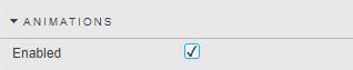
| Field | Description |
|---|---|
| Enabled | When checked, offers smoothing render animation. |
File Export
Refer to Export for settings.
Style, Margin & Format
Refer to Style and Custom tooltips for common settings.