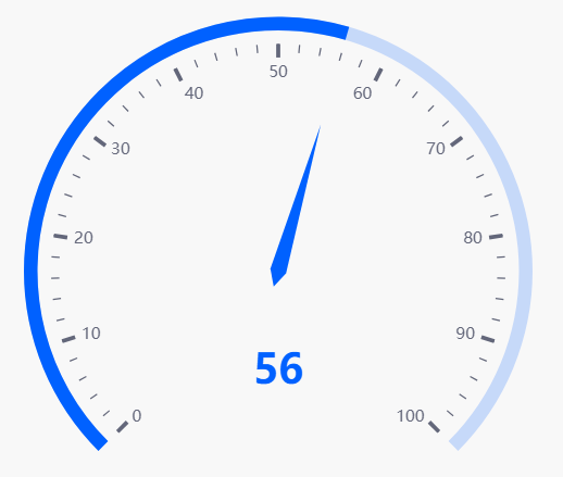
Gauge
This page describes how to set up and configure the Gauge component which is used to display a single value of quantitative data.
Set Up a Gauge
To set up a Gauge component, click-and-drag the component into the workspace and configure the following:
- Select a Data Source.
- Select a Data Column.
- Set your Min and Max.
Refer to Gauge properties described in the next section for details on additional properties.
Gauge Properties
The following sections provides details on how to configure the properties of the Gauge component.
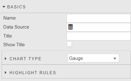
Basics
Open the Basics properties on the right and configure the properties described in the following table.
| Field | Description |
|---|---|
| Name | A name for the component provided by the user. |
| Data Source | Refer to Data sources for details. |
| Title | Set a title label to be displayed on the Tooltip. |
| Show Title | Toggle Show Title to control visibility on Gauge chart type. |
Chart Type
Choose the chart type from the options:
Gauge— refer to Gauge properties for configuration details.Bullet— refer to Bullet properties for configuration details.
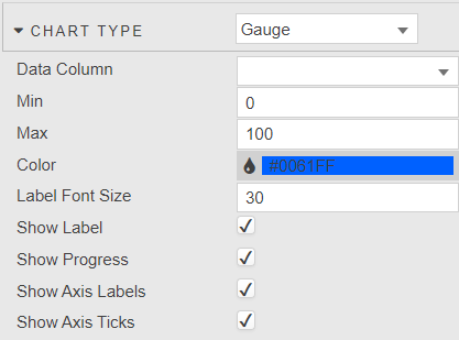
Gauge
Configure the properties, described in the following table.
| Field | Description |
|---|---|
| Data Column | Select data column to plot from the data source. |
| Min | Set min of the chart. |
| Max | Set max of the chart. |
| Color | Default color used when Progress is enabled or when highlight rules are not set. |
| Label Font Size | Define font size of data label. |
| Show Label | Toggle display of data label. |
| Show Progress | Show the Progress bar. When enabled, toggles off the highlight rules and uses default color. |
| Show Axis Labels | Toggle display of axis labels. |
| Show Axis Ticks | Toggle display of axis ticks. |
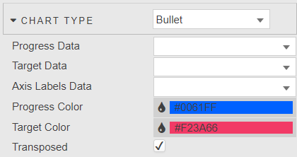
Bullet
Configure the properties, described in the following table.
| Field | Description |
|---|---|
| Progress Data | Define data column for progress bar. |
| Target Data | Define data column for target bar. |
| Axis Labels Data | Define data column for axis labels. |
| Progress Color / Target Color | Define color of progress and target bars. |
| Transposed | Toggle between vertical and horizontal chart. |
Highlight Rules
Refer to Highlight Rules for details.
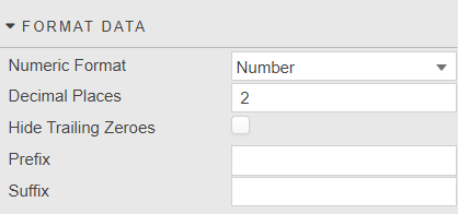
Format Data
Configure the properties, described in the following table.
| Field | Description |
|---|---|
| Numeric Format | Select format between Number, Smart Number, Formatted Number. |
| Decimal Places | Set precision point for numeric label. |
| Hide Trailing Zeroes | Hide display of trailing zeroes in tick values. |
| Prefix | Add prefix text to the data label; e.g. currency or percentage symbol. |
| Suffix | Add suffix text to the data label; e.g. currency or percentage symbol. |
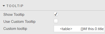
Tooltip
Configure the properties, described in the following table.
| Field | Description |
|---|---|
| Show Tooltip | Toggle display of tooltip. |
| Use custom tooltip | Enable custom tooltip. |
| Custom tooltip | Define a custom tooltip. The following code provides a simple example.html<br><table><br> {{#if this.0.title}}<thead><tr><th>{{this.0.title}}</thead><th></tr>{{/if}}<br> <tbody>{{#each this}}<br> <tr><br> <td>{{dataCol}}: </td><br> <td>{{dataVal}}</td><br> </tr><br> {{/each}}<br> </tbody><br></table><br> |
Style, Margins, Format
Refer to Style for common settings.