Text Input
This page describes how to set up and configure the Text Input component.
The Text Input component offers a means to make the user's input available to dashboard components. The input can be text, dates, hex colors, etc.
Any dashboard component setting showing an eye icon  can be set to a View State Parameter connected to a Text Input.
Set Up Text Input
To set up a Text Input component, click-and-drag the component into the workspace and configure the following:
- Assign a view state parameter to text for entering a value.
Refer to Text Input properties described in the next section for details on additional properties.
Text Input Properties
The following sections provides details on how to configure the properties of the Text Input component.
Basics
Open the Basics properties on the right and configure the properties described in the following table.
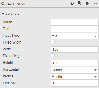
| Field | Description |
|---|---|
| Name | Enter a name for the component. |
| Text | Text typed by the user. !!! warning "Validating user input" There is no provision for a callback to validate the content of this field. Consider using a Text component to advise the user what to type. |
| Input Type | Select from text, search or multiline. |
| Fixed Width / Width / Fixed Height / Height | When Fixed Width is checked, the component width is set in Width (pixels). When Fixed Height is checked, the component height is set in Height (pixels). |
| Horizontal / Vertical | Set the respective alignments of the text within the component. |
| Font Size | Set the font size in pixels. |
Action
Refer to Actions for details.
Style, Margins, Format
Refer to Style for common styling parameters.