Navigation Menu
This page explains how to set up the Navigation Menu component, enabling you to incorporate drop-down menus to your KX Dashboards.
A navigation menu can connect users to a variety of resources, including other KX Dashboards, external websites, support pages, help resources, user guides, and more.
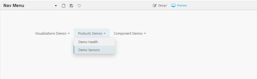
The following screenshot shows an example menu with links to other KX Dashboards.
Tip
Two levels of menu are supported.
Set Up a Navigation Menu
-
Click and drag the component into the workspace.
-
Define the following properties:
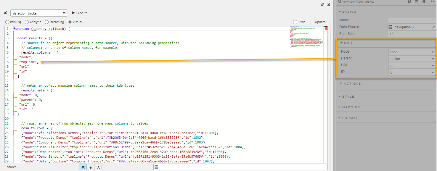
Property Description Name Enter a name for the component. Data Source Configure the data source, which defines the menu structure. Font Size Select a font size for the menu items. Node Configure the Nodes to map each of the menu elements to the columns in your data source. This is only required if your column names differ from the default columns: Node, Parent, URL, and ID. Actions You can configure Actions to manage view states, run queries, or open URLs. Style/Format/Margins Configure the Style, Margins and Format for the menu.
Data Source
The Data Source defines the menu structure for the component. For static data, such as navigation menu generation, we recommend using JavaScript in the Virtual tab. This approach is faster and operates independently of the backend process.
-
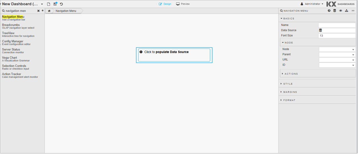
In the component, Click to populate Data Source or click Data Source in the Basics properties to open the Data dialog. Click New to proceed.
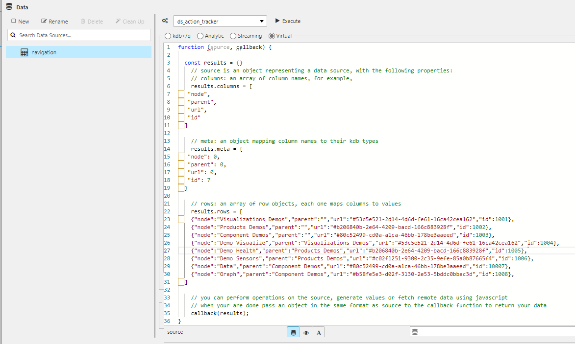
The data source for the Navigation Menu requires 4 columns:
Column Name Description Node The name of an individual menu item. It can be a top level or drop-down menu item. Each node can be associated with a URL and has a parent (node) defined. If the node is a top-level item, enter a blank value as its parent. Parent A parent is a node that has one or more child nodes. In a hierarchical navigation menu, a parent node can be expanded to reveal its child nodes. For example, the Product Demos parent node has the child nodes Demo Health and Demo Sensors. URL The URL or UUID linked to each node/menu option. The UUID of a Dashboard is the part after edit/in the Dashboard URL. For example, inhttps://ui-dash.kx.com/dash-main/edit/#f856763f-d4c6-8c6d-6c62-991b299a1a16, the UUID is#f856763f-d4c6-8c6d-6c62-991b299a1a16.
When using this component in kdb Insights Enterprise Views, prependviewto the UUID. For example,view#53c5e521-2d14-4d6d-fe61-16ca42cea162. To add a shared view link, prependview/shareto the UUID.
You can avoid manually adding these prefixes by using the following code before thecallbackfunction in the Virtual tab:javascript<br>_.each(results.rows, r => {<br> if (r.url.indexOf("#") === 0) {<br> r.url = ($("kx-report-editor").length ? "view" : $("kx-report-viewer").length ? "view/share" : "") + r.url;<br> }<br>});<br>
This is shown in the Views example below.ID A unique identifier assigned to each node/menu item. Helps in distinguishing between different nodes, especially when manipulating the menu programmatically. You can use different column names in the data source definition, but you must map them to the correct elements using the Node properties.
-
Once you have configured the data source, click Apply and Select Item.
-
Next, map the columns defined in your data source to the Nodes.
Examples
The following sections provide examples of setting up the Navigation Menu in KX Dashboards and kdb Insights Enterprise Views.
Dashboards Example
The following JavaScript code creates the example shown in the screenshot at the top of this page.
function (source, callback) {
    const results = {};

    results.columns = [
      "node",
      "parent",
      "url",
      "id"
    ];

    results.meta = {
      "node": 0,
      "parent": 0,
      "url": 0,
      "id": 7
    };

    results.rows = [
      {"node":"Visualizations Demos","parent":"","url":"#53c5e521-2d14-4d6d-fe61-16ca42cea162","id":1001},
      {"node":"Products Demos","parent":"","url":"#b206840b-2e64-4209-bacd-166c883928f","id":1002},
      {"node":"Component Demos","parent":"","url":"#80c52499-cd0a-a1ca-46bb-178be3aaeed","id":1003},
      {"node":"Demo Visualize","parent":"Visualizations Demos","url":"#53c5e521-2d14-4d6d-fe61-16ca42cea162","id":1004},
      {"node":"Demo Health","parent":"Products Demos","url":"#b206840b-2e64-4209-bacd-166c883928f","id":1005},
      {"node":"Demo Sensors","parent":"Products Demos","url":"#c02f1251-9300-2c35-9efe-85a0b87665f4","id":1006},
      {"node":"Data","parent":"Component Demos","url":"#80c52499-cd0a-a1ca-46bb-178be3aaeed","id":1007},
      {"node":"Graph","parent":"Component Demos","url":"#b58fe5e3-d02f-3130-2e53-5bddc0bbac3d","id":1008}
    ];

    callback(results);
    }
This example contains the following elements:
| Element | Description |
|---|---|
function (source, callback) |
Defines an anonymous function that takes two parameters: source and callback. |
const results = {} |
An empty object called results is created to store the processed data. |
results.columns |
Defines the required columns: node, parent, url, and id. |
results.meta |
Maps the columns to their types. |
results.rows |
Set to an array of objects, each representing a row of data with values for the columns defined earlier. |
callback(results) |
The callback function is called with the results object as its argument, passing the processed data back. |
This creates the following menu structure:
| Node | Parent | URL | ID |
|---|---|---|---|
| Visualizations Demos | #53c5e521-2d14-4d6d-fe61-16ca42cea162 | 1001 | |
| Products Demos | #b206840b-2e64-4209-bacd-166c883928f | 1002 | |
| Component Demos | #80c52499-cd0a-a1ca-46bb-178be3aaeed | 1003 | |
| Demo Visualize | Visualizations Demos | #53c5e521-2d14-4d6d-fe61-16ca42cea162 | 1004 |
| Demo Health | Products Demos | #b206840b-2e64-4209-bacd-166c883928f | 1005 |
| Demo Sensors | Products Demos | #c02f1251-9300-2c35-9efe-85a0b87665f4 | 1006 |
| Data | Component Demos | #80c52499-cd0a-a1ca-46bb-178be3aaeed | 1007 |
| Graph | Component Demos | #b58fe5e3-d02f-3130-2e53-5bddc0bbac3d | 1008 |
The first three Node values are Visualizations Demos, Products Demos, and Component Demos. These are main menu items because their corresponding Parent column is empty. The drop-down menu for any main menu item has that main menu as their parent. For example, Component Demos has two items in its drop-down menu: Data and Graph.
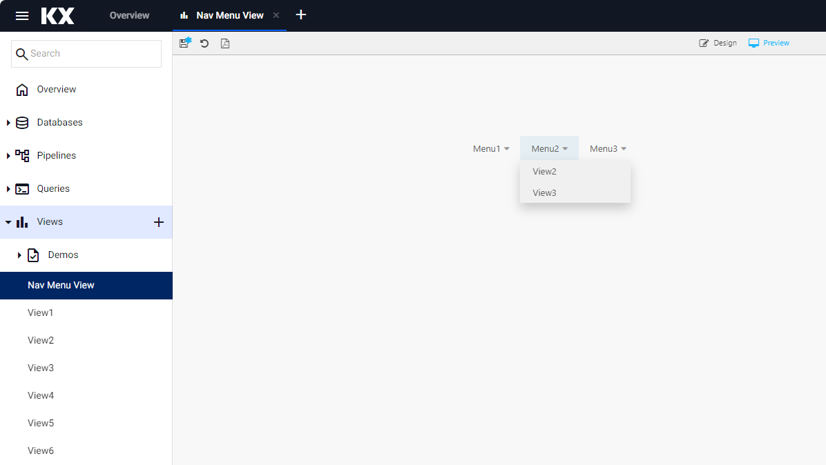
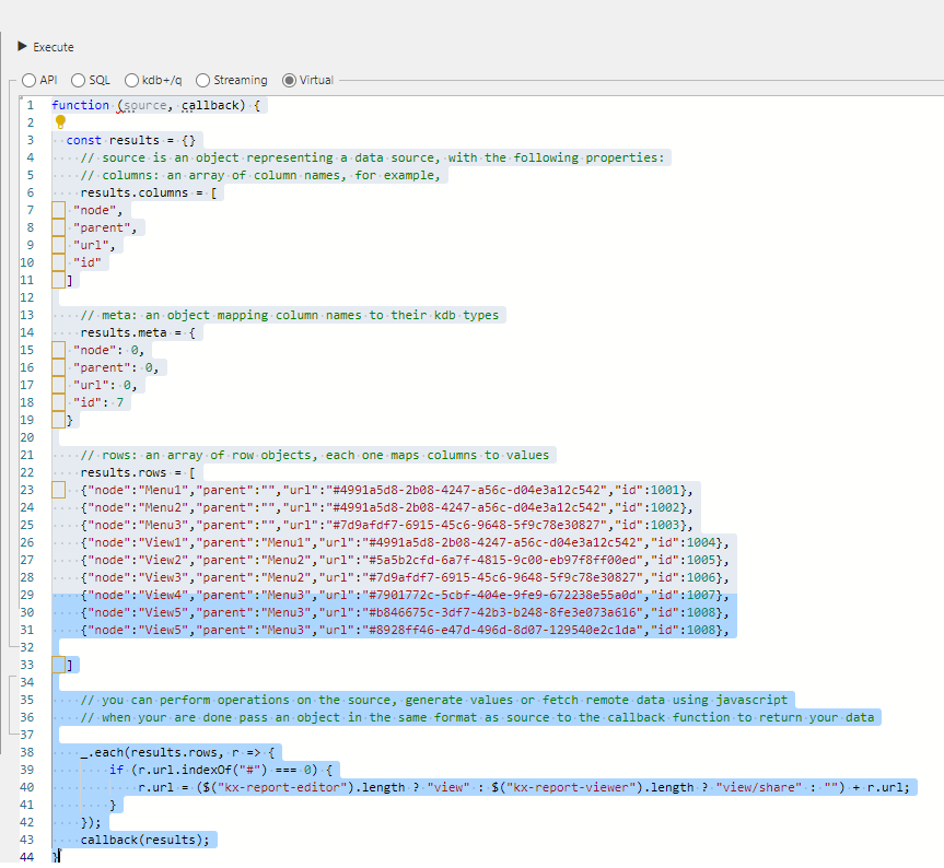
Views Example
The example below shows a navigation menu in kdb Insights Enterprise Views.
function (source, callback) {
    const results = {};

    results.columns = [
        "node",
        "parent",
        "url",
        "id"
    ];

    results.meta = {
        "node": 0,
        "parent": 0,
        "url": 0,
        "id": 7
    };

    results.rows = [
        {"node":"Menu1","parent":"", "url":"#4991a5d8-2b08-4247-a56c-d04e3a12c542","id":1001},
        {"node":"Menu2","parent":"","url":"#4991a5d8-2b08-4247-a56c-d04e3a12c542","id":1002},
        {"node":"Menu3","parent":"","url":"#7d9afdf7-6915-45c6-9648-5f9c78e30827","id":1003},
        {"node":"View1","parent":"Menu1","url":"#4991a5d8-2b08-4247-a56c-d04e3a12c542","id":1004},
        {"node":"View2","parent":"Menu2","url":"#5a5b2cfd-6a7f-4815-9c00-eb97f8ff00ed","id":1005},
        {"node":"View3","parent":"Menu2","url":"#7d9afdf7-6915-45c6-9648-5f9c78e30827","id":1006},
        {"node":"View4","parent":"Menu3","url":"#7901772c-5cbf-404e-9fe9-672238e55a0d","id":1007},
        {"node":"View5","parent":"Menu3","url":"#b846675c-3df7-42b3-b248-8fe3e073a616","id":1008},
        {"node":"View5","parent":"Menu3","url":"#8928ff46-e47d-496d-8d07-129540e2c1da","id":1008}
    ];

    _.each(results.rows, r => {
        if (r.url.indexOf("#") === 0) {
            r.url = ($("kx-report-editor").length ? "view" : $("kx-report-viewer").length ? "view/share" : "") + r.url;
        }
    });
    callback(results);
    }
This example contains the following elements:
| Element | Description |
|---|---|
function (source, callback) |
Defines an anonymous function that takes two parameters: source and callback. |
const results = {} |
An empty object called results is created to store the processed data. |
results.columns |
Defines the required columns: node, parent, url, and id. |
results.meta |
Maps the columns to their types. |
results.rows |
Set to an array of objects, each representing a row of data. |
callback(results) |
The callback function is called with the results object as its argument. |
_.each(results.rows ... |
Checks each row, and if the URL starts with "#", it adds "view" or "view/share" to the beginning of the URL based on whether certain elements are present in the page. |
This creates the following menu structure (URLs shown with view prefix applied at runtime):
| Node | Parent | URL | ID |
|---|---|---|---|
| Menu1 | view#4991a5d8-... | 1001 | |
| Menu2 | view#4991a5d8-... | 1002 | |
| Menu3 | view#7d9afdf7-... | 1003 | |
| View1 | Menu1 | view#4991a5d8-... | 1004 |
| View2 | Menu2 | view#5a5b2cfd-... | 1005 |
| View3 | Menu2 | view#7d9afdf7-... | 1006 |
| View4 | Menu3 | view#7901772c-... | 1007 |
| View5 | Menu3 | view#b846675c-... | 1008 |
| View5 | Menu3 | view#8928ff46-... | 1008 |
Menu1, Menu2, Menu3 are main menu items because their Parent column is empty. For example, Menu2 has two items in its drop-down menu: View2 and View3.
Navigation Menu Properties
Basics
| Property | Description |
|---|---|
| Name | Enter a name for the component. |
| Data Source | Configure the data source, which defines the menu structure. |
| Font Size | Select a font size for the menu items. |
Node
These properties map your data source columns to the elements of the navigation menu. This is only required if your column names differ from the default columns: Node, Parent, URL, and ID.
| Property | Description |
|---|---|
| Node / Parent / URL / ID | The default columns are Node, Parent, URL, and ID. If you use these column names in your data source, they are automatically mapped here. If you use alternative column names, map them here by selecting your column name and mapping it to a default value. Note: These drop-downs are populated after you set up the data source. |
For example, if you define TopLine as the top-level menu item in your data source, map it to Parent in the Node properties.
Actions
Refer to Actions documentation for common settings.
Style, Margins, Format
Refer to Style documentation for common settings.