3D Chart
This page describes how to set up and configure the 3D Chart component to chart data in three dimensions.
Set Up a 3D Chart
To set up a 3D Chart component, click-and-drag the component into the workspace and configure the following:
- Set up a data source, available in Layers.
- For each x-, y-, and z-axis, define data columns to plot with Data Description.
- Add Labels for each axis.
Refer to the 3D Chart properties described in the next section for details on additional properties that you can use to customize the component.
3D Chart Properties
The following sections provides details on how to configure the properties of the 3D Chart.
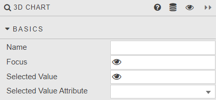
Basics
Open the Basics properties on the right and configure the properties described in the following table.
| Field | Description |
|---|---|
| Name | A name for the component provided by the user. |
| Focus | These are used for linking components and require a View State Parameter. |
| Selected Value and Selected Value Attribute | Refer to Selected values for details. |
Layers
Layers give you the ability to display multiple different data sources on the same chart.
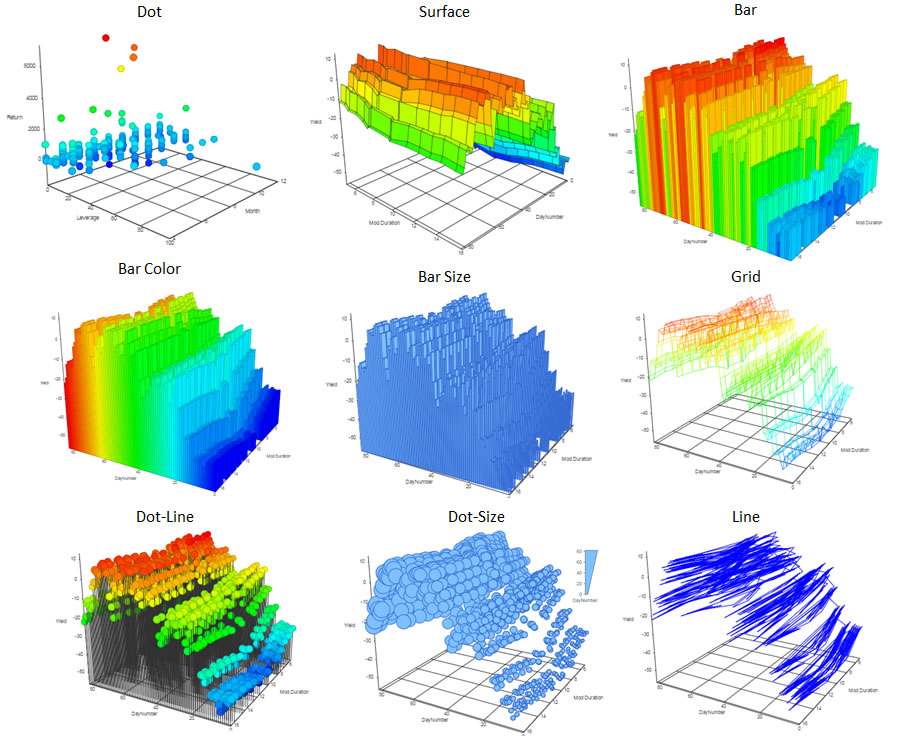
Select a layer type from the drop-down list. The options include dot, surface, bar, bar color, bar size, grid, dot line, dot-size, and line. Examples for each are shown below.
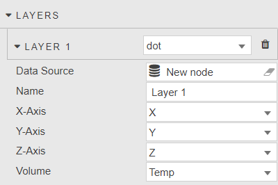
Configure the additional properties, described in the following table.
| Field | Description |
|---|---|
| Data Source | A query or analytic. |
| Name | Assign a name for each layer. |
| X-Axis | Select data columns to plot on the x-axis from the data source. |
| Y-Axis | Select data columns to plot on the y-axis, from the data source. |
| Z-Axis | Select data columns to plot on the z-axis from the data source. |
| Volume | Select data columns to plot from the data source. |
Axis Controls
These properties define controls for (each of) the X-, Y- and Z-axes. The following screenshot shows the X axis properties.
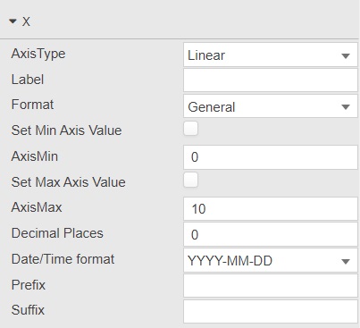
Configure the properties described in the following table.
| Field | Description |
|---|---|
| Axis Type | Axis scaling; select from linear or category. |
| Label | Descriptive label for the axis. |
| Format | Numeric or date format; select from General, Number, Smart Number, Formatted Number or Datetime. |
| Set Min Axis Value | When checked you can manually set the AxisMin value of the axis. When unchecked, the chart automatically calculates the minimum value based on the data range. |
| AxisMin | When Set Min Axis Value is checked you can enter the axis minimum value here. |
| Set Max Axis Value | When checked you can manually set the AxisMax value of the axis. When unchecked, the chart automatically calculates the maximum value based on the data range. |
| AxisMax | When Set Max Axis Value is checked you can enter the axis maximum value here. |
| Decimal Places | Where a numeric value is used in Format, define the number of decimal places to display. |
| Date/Time Format | Define the date and time format to use. |
| Prefix | The character added before the axis label. |
| Suffix | The character added after axis label. |
Volume
Configure the volume settings described in the following table.
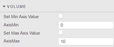
| Field | Description |
|---|---|
| Set Min Axis Value | When checked you can manually set the AxisMin value of the axis. When unchecked, the chart automatically calculates the minimum value based on the data range. |
| AxisMin | When Set Min Axis Value is checked you can enter the axis minimum value here. Define axis minimum. |
| Set Max Axis Value | When checked you can manually set the AxisMax value of the axis. When unchecked, the chart automatically calculates the maximum value based on the data range. |
| AxisMax | When Set Max Axis Value is checked you can enter the axis maximum value here. |
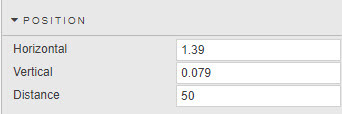
Position
Configure the position properties which define the orientation of the chart. You can use the sliders or select Preview mode and rotate the chart, using the mouse scroll wheel to zoom in and out.
Style
These properties define style settings for the chart.
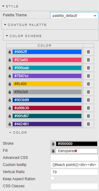
Configure the properties, described in the following table.
| Field | Description |
|---|---|
| Stroke | Defines the grid-line color. |
| Fill | Defines the background color for component. |
| Advanced CSS | See Advanced CSS for details. |
| Custom tooltip | See Custom tooltip for details. |
| Vertical Ratio | Extends the height of the chart. |
| Keep Aspect Ratio | Maintains the aspect ratio when interacting with the chart. |
| CSS Classes | Can be applied to style the component. |
Refer to Style for common style settings, which are not described in the table above.