Data Form
This page describes how to set up and configure the Data Form component to quickly convert view state parameter inputs from a Data Source query into user-configurable inputs for the dashboard. All that is required for the Data Form component is the Data Source.

Set Up a Data Form
To set up a Data Form component, click-and-drag the component into the workspace and configure the following:
- Ensure your data source is a parameterized function.
- Use either text inputs or dropdown menus for each parameter in your data form, defined by Parameter Type.
- If using a data source to build the contents of the dropdown, use data source mapping to assign value and text elements. Otherwise, use Items to add a selection option.
- Additional styling for the data form can be found in the style menu.
Refer to Data Form properties described in the next section for details on additional properties.
Data Form Properties
The following sections provides details on how to configure the properties of the Data Form component.
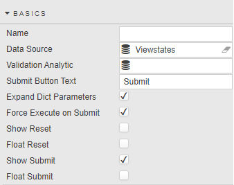
Basics
Open the Basics properties on the right and configure the properties described in the following table.
| Field | Description |
|---|---|
| Name | Enter a name for the component. |
| Data Source | Refer to Data sources for details. |
| Validation Analytic | Links to a query, analytic or virtual data source which determines valid input values. Data source accepts a dictionary of the inputted values and returns a dictionary of error messages, if applicable. Returning an empty dictionary indicates that the values are valid and can be set in the view states.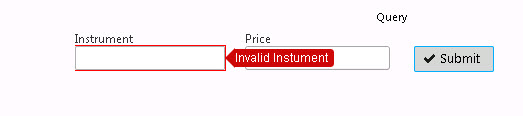 Sample Query: 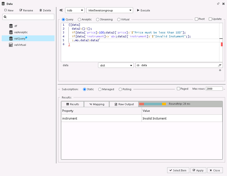 q<br>{[data]<br> data2:()!();<br> if[data[`price]>100;data2[`price]:`$"Price must be less than 100"];<br> if[data[`instrument]<>`abc;data2[`instrument]:`$"Invalid Instument";];<br> :.mo.data2:data2<br>}<br> |
| Submit Button Text | Enter a text description for the Submit button. |
| Expand Dict Parameters | When checked, a Data Source using dictionary-type view state parameter(s), expands out the dictionary inputs. |
| Force Execute on Submit | When checked, the Data Source query is always executed, even if the input parameters are unchanged. Tip: It can be used as a simple button control to run a query on the dashboard. For example, by hiding all the input parameters associated with the data source query so only the button appears in the UI. |
| Show Reset | Toggles display of the Reset button. |
| Float Reset | The Reset button returns View State Parameter to the default values. Float Reset positions the Reset button inline with the input variables.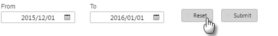 |
| Show Submit | When checked a Submit button is included. This allows a range of View State Parameters to be updated before applying the values to the connected Data Source. |
| Float Submit | When this is checked the position of the Submit button is independent of the input variables. Note: If there is no Submit button, each change of a View State Parameter will be applied to the connected Data Source. Use a Submit button if multiple inputs are required before sourcing from the database. Submit buttons should be used if connecting to very large data sets. |
Viewstate Parameters
The Viewstate parameters come under the Basics properties. Configure these properties described in the following table.
| Field | Description |
|---|---|
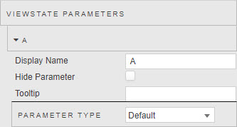
| Display Name | Enter a descriptive term for the input. |
| Hide Parameter | When checked, this hides the input, preventing user updates. |
| Tooltip | Enter a short text description for the Data Form input. |
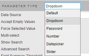
| Parameter Type | Select the type of the input for the data source view state parameters. The options are Dropdown, Password, Number, Datepicker, or Slider. The settings for each type are described in the following sections. |
| Filter Search Data | For dropdowns populated from large datasets, Filter Search Data enables server-side filtering of search results. The user's search term is stored in a viewstate and passed to the data source query, allowing filtering to be performed on the server. See Filter Search Data for details. |
Dropdown
Configure properties for a Dropdown parameter described in the following table.
| Field | Description |
|---|---|
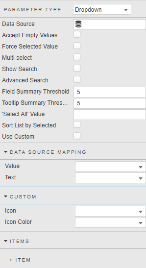
| Data Source | Define dropdown list using a data query. Example: ([]sym:asc exec distinct sym from database) |
| Accept Empty Values | Determines whether empty values are shown in the dropdown. |
| Force Selected Value | If no Submit button is shown then enabling this will set the dashboard view state to match the initial dropdown value on load, before any user input takes place. |
| Use Data Source | Check box to use aforementioned Data Source to populate the dropdown. |
| Multi Select | Multi Select supports multiple item select in dropdown; the total number of selected items is given in Show Row Count. |
| Show Search | Allow for search of dropdown items. |
| Field Summary Threshold | Number of multi-select items permitted before a numeric summary is presented.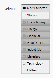 |
| Tooltip Summary | Number of multi-select items listed in tooltip before numeric summary of remainder is applied. |
| 'Select All' Value | The Select All Value is the value passed to the dropdown view state parameter when all items are selected in a multi-select. For example, set to All.Note: Ensure the backend is configured to expect the All value rather than the full list. The default view state parameter can also be set to All to ensure all items are selected on load. |
| Sort List by Selected | When checked and the dropdown is expanded to show the items available for selection, the selected values are displayed at the top of the list. |
| Use Custom | When checked, icons and icon colors can be defined as part of the dropdown options. |
Data Source Mapping
| Field | Description |
|---|---|
| Value | When a data source is used to populate a dropdown, Value is automatically assigned. |
| Text | When a data source is used to populate a dropdown, Text is automatically assigned. |
| Items | If a Data Source is not used, assign Value and Text entries for dropdown; add rows as required. |
Custom
| Field | Description |
|---|---|
| Icon | When a data source is used to populate a dropdown, Icon can be set in the dropdown options. For example, if the value is fa fa-book then the font awesome book icon is set in each of the dropdown options alongside the text value. |
| Icon Color | When a data source is used to populate a dropdown, Icon Color can be set in the dropdown options. |
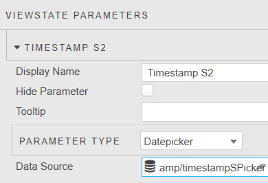
Datepicker
Configure properties for a Datepicker parameter described in the following table.
| Field | Description |
|---|---|
| Data Source | Defines a list of dates that are selectable from the datepicker. When set, the list of dates in the data source identifies the range of dates presented by the datepicker. For example: ([] select distinct dates from database)Refer to Date Picker Validation for further details. |
Slider
Configure properties for a Slider parameter described in the following table.
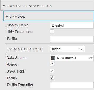
| Field | Description |
|---|---|
| Data Source | Define slider values using a data query. For example: ([]sym:asc exec distinct sym from database) |
| Range | This supports a min and max selection or single selection. |
| Ticks | Toggles the display of the slider ticks. |
| Tooltip | Toggles the display of the tooltip. The tooltip appears when hovering over the slider selectors. |
| Tooltip Format | Tooltip Format supports customizing the tooltip labels using handlebars. Tip: {{value}} can be used to get the current value in the Tooltip Format property. For example {{toFixed Value 2}} formats the value to 2 decimal places. |
Filter Search Data
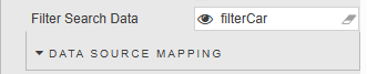
For dropdowns that are populated from large datasets, Filter Search Data enables server-side filtering of search results. Instead of loading and filtering all available values in the browser, the user's search term is stored in a viewstate and can be passed to the data source query, allowing filtering to be performed on the server.
This improves performance and reduces the amount of data transferred when working with large datasets.
Configuration:
- Create a String Viewstate.
- Set the Filter Search Data parameter to the created viewstate.
- Update the dropdown's Data Source query to use the viewstate value and apply server-side filtering.
Example:
If the viewstate stores the user's search text, it can be passed into the query using .dfilt.apply:
{[s]
  .dfilt.apply[
    select distinct Name from Table;
    s
  ]
}
How it works:
- The user enters text into the dropdown search box.
- The search value is written to the configured viewstate.
- The dropdown data source query is re-executed using the current viewstate value.
- The server filters the dataset and returns only matching results.
Benefits:
- Improved performance for large datasets
- Reduced browser memory consumption
- Faster search response times
- Minimizes the amount of data transferred between server and client
Action
Refer to Actions for details.
Style, Margins, Format
Configure the properties, described in the following table.
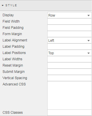
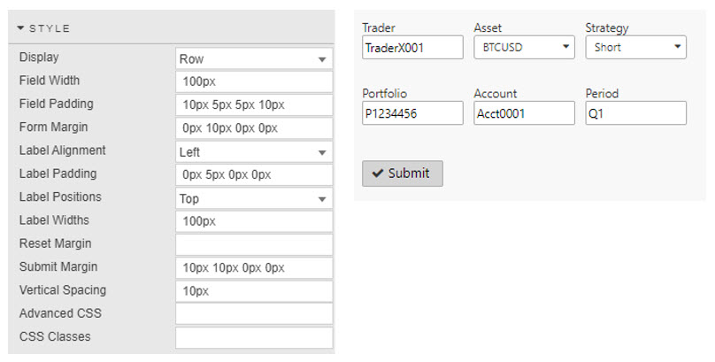
| Field | Description |
|---|---|
| Advanced CSS | Refer to Advanced CSS for details. |
| Display | Determines whether fields are displayed in rows or columns. |
| Field Width / Field Padding / Form Margin | These fields define style parameters for inputs. Values can be defined in pixels or percentages. For example, width 20% or margin 10px. |
| Label Alignment / Label Padding / Label Positions / Label Widths | These fields define the parameters of input box labels. Padding is defined in pixels. For example, 0px 10px 0px 0px. Label Width in pixels (10px) when Label Alignment is set to Left, and percentage (10%) when Label Alignment is set to Top. |
| Reset Margin | Styling and position of Reset button. Margin defined in pixels. For example, 0px 10px 0px 0px. |
| Submit Margin | Styling and position of Submit button. Margin defined in pixels. For example, 0px 10px 0px 0px. |
| Vertical Spacing | Vertical spacing of Data Form controls when stacked. Vertical spacing defined in pixels. For example, 20px. |
Refer to Style for common settings.