Graph
This page describes how to set up and configure the Graph component.
The Graph component presents an interactive display that can show the relationships between nodes. A node is an element in the graph that represents an object, such as a noun. An edge shows the relationship between two nodes in the graph. The Graph component can present these details as labelled nodes with connections or organized in hierarchical form.
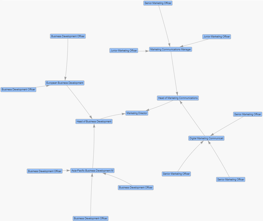
The following screenshot provides an example graph using physics to show to whom different positions in a company report to.
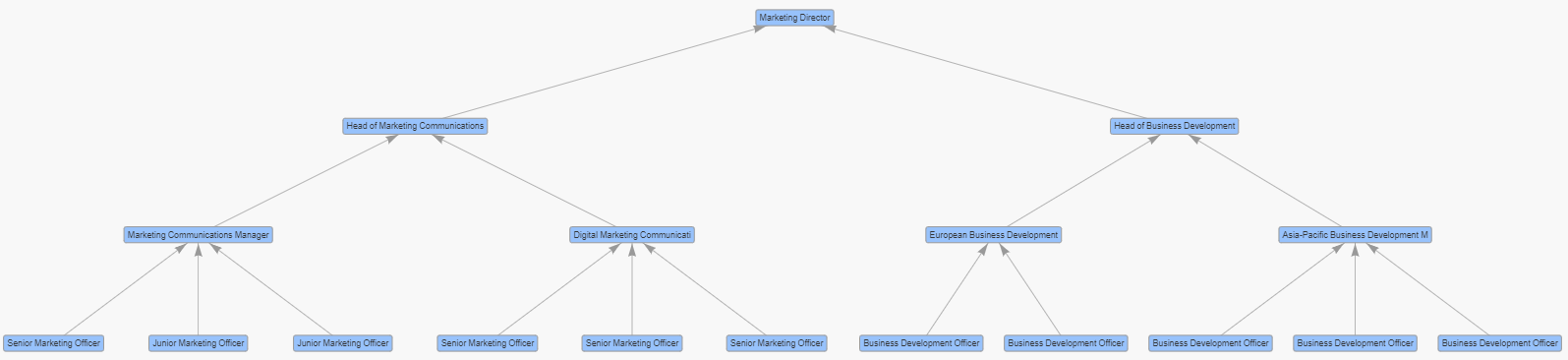
The next example shows a hierarchical graph showing direct managers for positions within a company.
This page provides information on the following: Setting up a Graph component, Basic properties, Applying a Data Source to the graph, Default Styling for the Nodes, Default Styling for the Edges, User Interaction, Physics, Tooltips, Actions, Layout, Style, Margins & Format.
Set Up a Graph
To set up a Graph component, click-and-drag the component into the workspace and configure the following:
-
In the Design View, click and drag the Graph component onto the workspace.
-
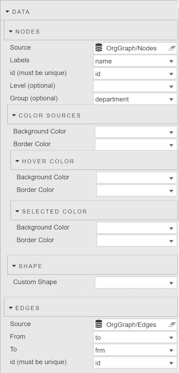
Within the Graph component, click on the label "Click to populate Nodes Data Source" or from the Properties Panel, expand the Data section, and click on the Source input field from the Nodes section to open the Data dialog.
-
Create or select a data source. This data source must have at least two columns to identify the node's text label and unique identifier. Optional properties, such as Level, Group, Mass or Custom Shape can be defined for each node.
-
Assign a column from the Nodes data source to the Label property.
-
Assign a column from the Nodes data source to the ID property.
-
Within the Graph component, click on the label "Click to populate Edges Data Source" or from the Properties Panel, expand the Data section, and click on the Source input field from the Edges section to open the Data dialog.
-
Create or select a data source. This data source specifies a connection between a pair of nodes using their unique identifier values.
-
Assign a column from the Edges data source to the From property.
-
Assign a column from the Edges data source to the To property.
Refer to Graph component properties described in the next section for details on additional properties.
Graph Component Properties
The following sections provides details on how to configure the properties of the Graph component.
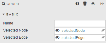
Basic
The Basic properties are shown in the following image.
| Property | Description |
|---|---|
| Name | Enter a name for the component. |
| Selected Node | Specify a View State Parameter to store the unique identifier of the selected node(s). This is optional. In Preview mode, click on a node to assign a value. Use the Control key to make multiple selections. |
| Selected Edge | Specify a View State Parameter to store the unique identifier of the selected edge(s). This is optional. In Preview mode, click on an edge to assign a value. Use the Control key to make multiple selections. |
Data
This section identifies data source attributes that are used to define the nodes and edges.
Nodes
| Property | Description |
|---|---|
| Source | The Data Source must have at least two columns to define the node's unique identifier (ID) and text label. Each row in the data source is used to define a node.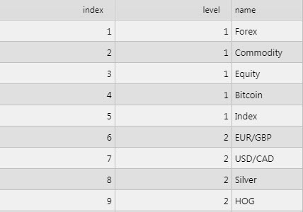 |
| Label | Data source column containing the text to be used for the nodes. |
| ID (must be unique) | Data source column containing the unique ID for the nodes. |
| Level (optional) | Data source column containing a numerical value that specifies the hierarchical position of the node.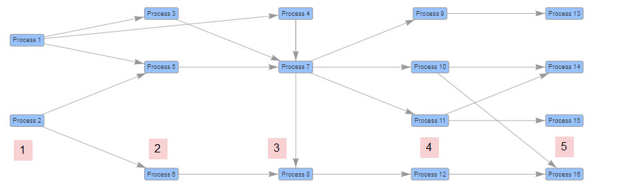 |
| Group (optional) | Data source column containing a group name to be associated with the node. As many as 21 superseding color sets are used to identify nodes in the same group.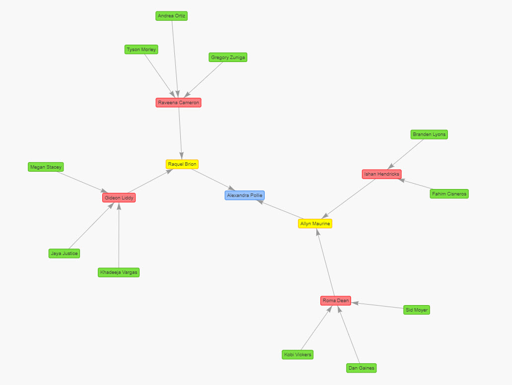 |
| Mass (optional) | Data source column used to specify the mass of the individual nodes. If no value is specified or the value is non-numeric, the minimum value of 1 is used. Larger values increase the repulsion effect for that specific node. Requires Physics to be enabled.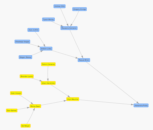 |
Node Color Sources
The data source for Nodes can specify the color attributes for each node. This method overrides the colors defined in the Default Node Style section.
| Property | Description |
|---|---|
| Background Color | Data source column containing the background color of the nodes. |
| Border Color | Data source column containing the border color of nodes. |
Selected Node Color
| Property | Description |
|---|---|
| Background Color | Data source column containing the background color of the selected nodes. |
| Border Color | Data source column containing the border color of the selected nodes. |
Node Hover Color
| Property | Description |
|---|---|
| Background Color | Data source column containing the background color of the nodes when the user mouses over them. |
| Border Color | Data source column containing the border color of the nodes when the user mouses over them. |
Shape
| Property | Description |
|---|---|
| Custom Shape | The data source column containing the form the nodes take. For example, circle, database, diamond, square, hexagon, triangle. |
Edges
The edges show connections between nodes.
| Property | Description |
|---|---|
| Source | This Data Source must return the columns to define the edge endpoints for the connection drawn between the From and To nodes.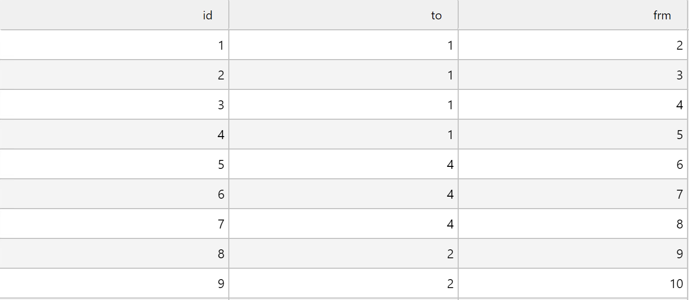 |
| From | Data source column containing the node ID for the start of the edge. |
| To | Data source column containing the node ID for the end of the edge. |
| ID (optional) | Data source column containing the unique ID for the edges. |
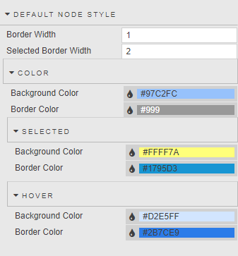
Default Node Style
The following properties are used to style the nodes.
| Property | Description |
|---|---|
| Border Width | Specifies the thickness of the node border. |
| Selected Border Width | Specifies the thickness of the selected node border. |
Color
The following are the color properties of a node. Any of these can be overridden if a data source column is used in the Node Color Sources section.
| Property | Description |
|---|---|
| Background Color | Specifies the background color of the nodes. |
| Border Color | Specifies the border color of the nodes. |
Selected Color
| Property | Description |
|---|---|
| Background Color | The background color of a node when it is selected. |
| Border Color | The border color of a node when it is selected. |
Hover Color
| Property | Description |
|---|---|
| Background Color | The background color of the nodes when the user mouses over them. |
| Border Color | The border color of the nodes when the user mouses over them. |
Default Edge Style
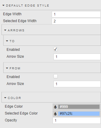
The following properties are used to style the edges.
| Property | Description |
|---|---|
| Edge Width | Specifies the thickness of the edge. |
| Selected Edge Width | Specifies the thickness of the selected edge. |
Arrows
Arrowheads can be added to the edge endpoints.
To
| Property | Description |
|---|---|
| Enabled | When checked, an arrowhead is added to the To side of the edge. |
| Arrow Size | Specifies the size of the To arrowhead. |
From
| Property | Description |
|---|---|
| Enabled | When checked, an arrowhead is added to the From side of the edge. |
| Arrow Size | Specifies the size of the From arrowhead. |
Color
| Property | Description |
|---|---|
| Edge Color | Specifies the color of the edge. |
| Selected Edge Color | Specifies the color of the selected edge. |
| Opacity | Defines the opacity of the edge with a value between 0 (transparent) and 1 (opaque). |
User Interaction
The User Interaction properties define how the user can interact with the graph.
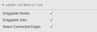
| Property | Description |
|---|---|
| Draggable Nodes | Allows the user to reposition nodes via click and drag.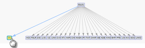 |
| Draggable View | Allows the user to pan the graph image in different directions by clicking and dragging on an empty space in the graph. |
| Select Connected Edges | Selects all edges for the selected node(s).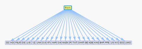 |
Physics
This section contains properties used to influence and define the physical behavior of objects in the graph.
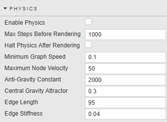
| Property | Description |
|---|---|
| Enable Physics | When enabled, a physics algorithm is used to create the graph by simulating the physical properties of nodes and edges while also being affected by gravity.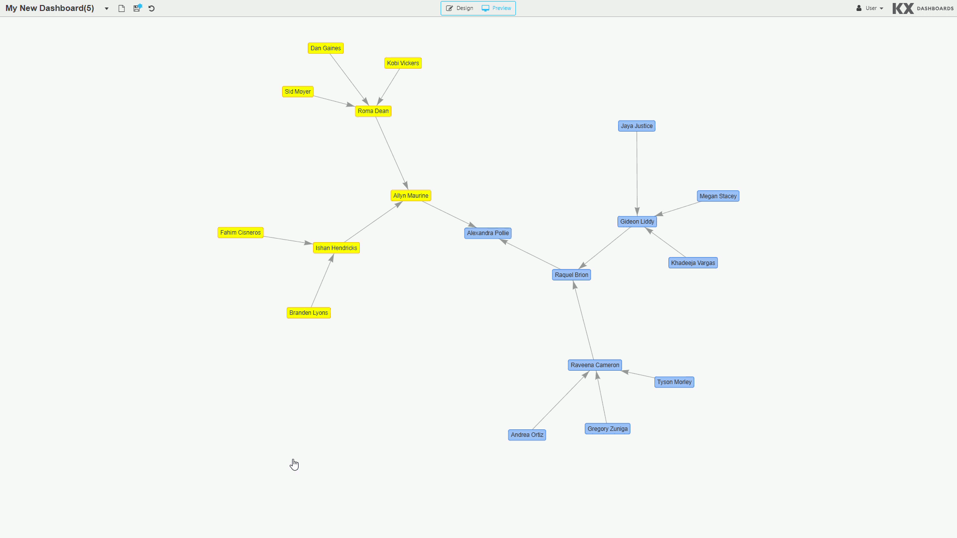 The image above shows graph behavior without physics, and the image below shows the graph with physics enabled. 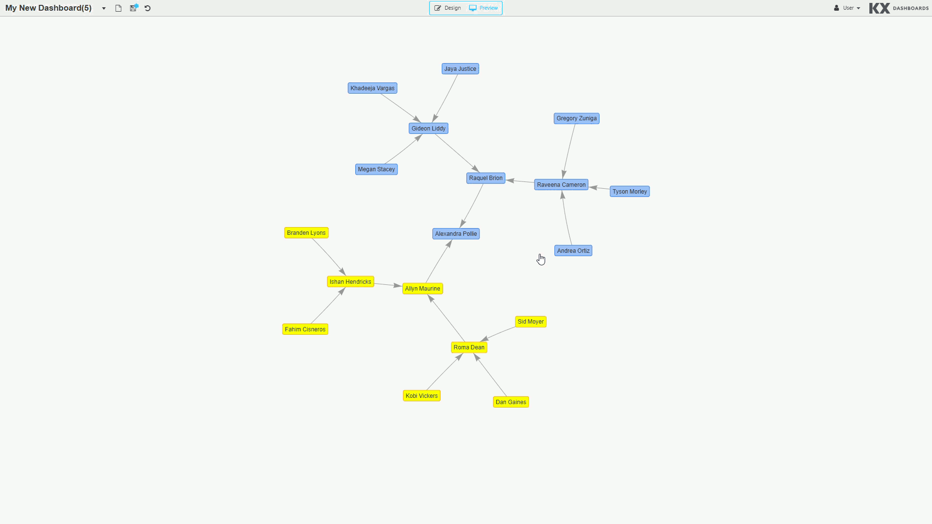 |
| Max Steps Before Rendering | The maximum number of simulated steps taken before the graph is visible. A step is a time duration where the position of one or more nodes may be affected by various forces. |
| Halt Physics After Rendering | When checked, after the initial rendering of the graph, the physics simulation is paused. When unchecked, physics continue to affect the layout until the Minimum Graph Speed has been reached for all nodes. When unchecked, nodes repositioned by the user also cause physics to continue until the minimum speed is reached. |
| Minimum Graph Speed | Once the speed of all nodes is less than or equal to this value, no further steps are taken to affect node positions. |
| Maximum Node Velocity | The maximum speed at which the nodes are allowed to move. |
| Anti-Gravity Constant | Quantifies the effect of gravity as a repelling force. Represented as a negative value. Higher values increase the repulsion effect; lower values approaching zero reduce it. |
| Central Gravity Attractor | A force pulling the entire network towards the center of the graph. Higher values produce a stronger pull; lower values produce a weaker attraction. |
| Edge Length | The edges are modelled as springs and this value determines their length at rest. |
| Edge Stiffness | A larger value increases the minimum force required to affect the length of the edge. |
Warning
When Physics and Hierarchical Layout are both enabled, the node behavior associated with the hierarchical layout overrides the physics simulation.
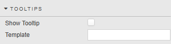
Tooltips
The nodes in the graph can have tooltips.
| Property | Description |
|---|---|
| Show Tooltip | When checked, a tooltip is presented to the user when the mouse hovers over a node. |
| Template | See Templates for full details. |
Actions
See Actions for full details.
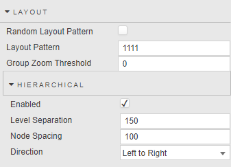
Layout
The Layout properties are used to affect the arrangement of nodes and edges in the graph.
| Property | Description |
|---|---|
| Random Layout Pattern | When checked, the initial position of the nodes and edges are different each time a new start position is required. Hierarchical layouts are not affected.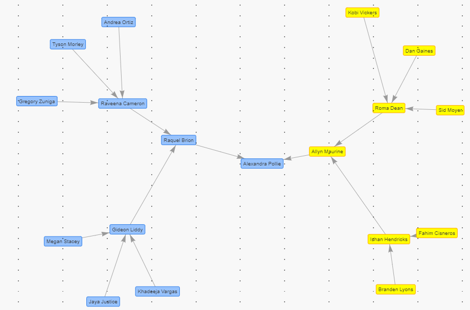 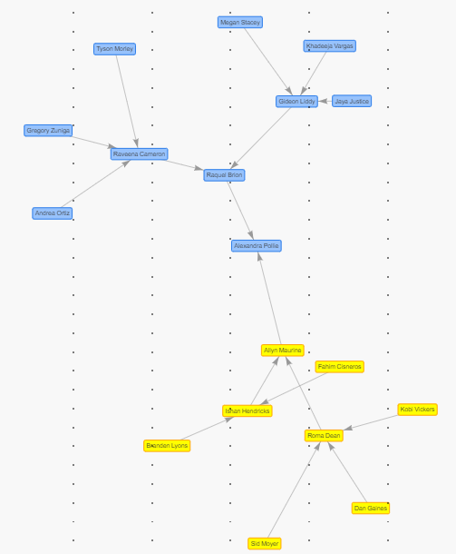 |
| Layout Pattern | A numerical value used to determine the initial layout of the graph. Results are consistent provided the data is unchanged. Does not apply to hierarchical layouts. |
| Group Zoom Threshold | A number between 0 and 100 identifying the zoom point at which the graph transitions between showing individual nodes versus individual groups (groups appear as a circle shape). If the graph's zoom level is greater than this value, individual nodes are shown; if less, individual groups are shown. Note: Use of the Group Zoom Threshold requires the Group property to be defined. 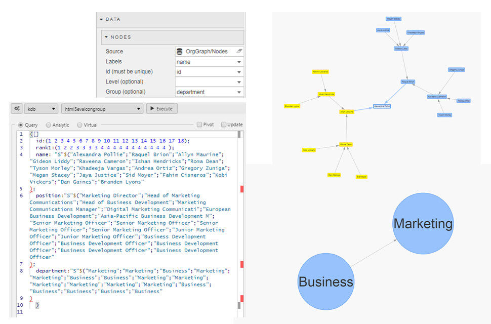 |
Hierarchical
The following properties can be configured when using a hierarchical layout.
| Property | Description |
|---|---|
| Enabled | When enabled, the nodes are arranged to show a parent-child relationship based on the node's Level attribute.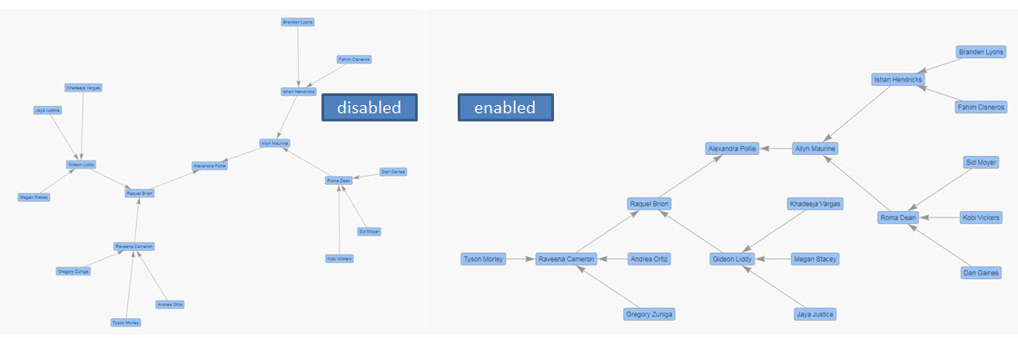 |
| Level Separation | Defines the height in pixels between levels. |
| Node Spacing | Defines the width in pixels between nodes. |
| Direction | The direction of the hierarchy from Top level to Bottom level. Options: Left to Right, Right to Left, Up to Down, Down to Up. |
Style, Margins, Format
See Style for full details of common settings.