Pager
This page describes how to set up and configure the Pager component, a data paging organizer.
Paging is built into Data Grids. Other components can use the Pager component to control the amount of data displayed. All that's required is for the Pager component to share the same Data Source as the other components requiring paging.
Server Paging
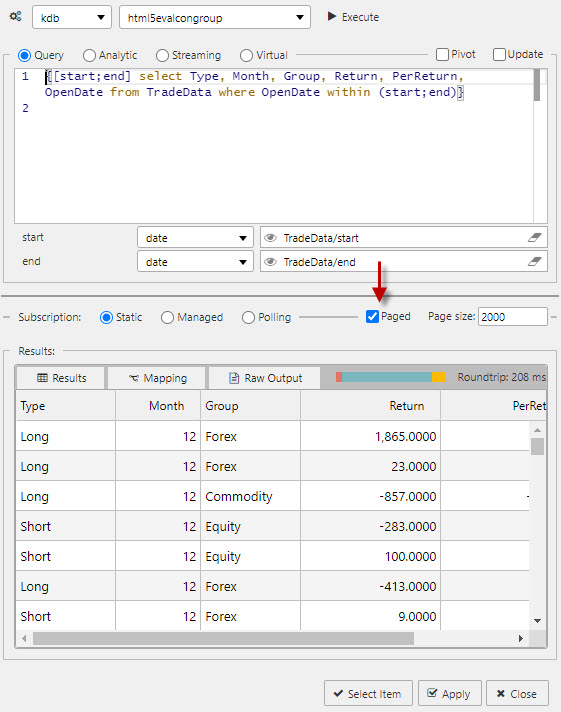
Ensure Paging is checked in the Data Editor of all components requiring paging control.
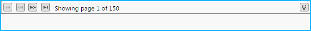
The following screenshot shows a Data Grid with Paging activated.
Pager Properties
The following sections provides details on how to configure the properties of the Pager component.
Basics
Open the Basics properties on the right and configure the properties described in the following table.
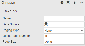
| Field | Description |
|---|---|
| Name | Enter a name for the component. |
| Data Source | Set up a data source. Refer to data source for details. |
| Paging Type | State of the paging. None — Server Paging switched off. Offset — Starts at the row specified in Offset/Page Number. Page Number — Starts at the page specified in Offset/Page Number. |
| Offset/Page Number | Starting point for paging. |
| Page Size | Number of rows in each page. |
Style, Format, Margins
Refer to Style for common settings.