Selection Controls
This page describes how to set up and configure the Selection Controls component which allows you to add radio, or checkbox input to your dashboards.
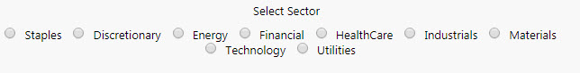
The following example shows some radio buttons added to a dashboard.
Set Up Selection Controls
To set up a Selection Controls component, click-and-drag the component into the workspace and configure the following:
- Use a data source to define the items in the selection control.
- In the mapping define which column represents the text labels in the selection control, and which column is the value passed to the view state on selection.
- Set the Selected Value as a view state parameter which carries the value of the selected item.
Refer to Selection Controls properties described in the next section for details on additional properties.
Selection Controls Properties
The following sections provides details on how to configure the properties of the Selection Controls component.
Basics
Open the Basics properties on the right and configure the properties described in the following table.
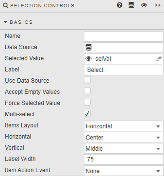
| Field | Description |
|---|---|
| Name | Enter a name for the component. |
| Data Source | A data source: include the list of values to pass into the linked View State Parameter and possibly a list of value names to display. The following example shows a query for a radio button data source.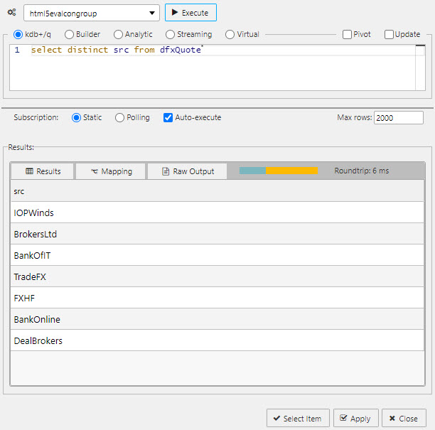 Tip: When using Data Source to create a set of radio buttons, ensure Use Data Source is checked and Data Source Mapping is defined. Sample query (connecting to htmlevalcongroup):q<br>select distinct src from dfxQuote<br> |
| Selected Value | The view state parameter populated on selection. See Selected values. |
| Label | Label description for the Radio Button. |
| Use Data Source | When checked, Data Source is used to build a Radio Button. |
| Accept Empty Values | When checked, a null value is available for selection. |
| Force Selected Value | When checked, the Radio Button always populates a Selected Value View State Parameter; either default or selected value (which may be null if not set). |
| Multi-select | When unchecked only a single radio button can be selected (default). When checked, multiple selections are supported and selected items passed to the Selected Value View State Parameter. Also displays the Double Click property. |
| Double Click | Displayed when Multi-select is enabled. When checked, allows users to quickly select-all or deselect-all. If no items are selected, the first double-click selects the clicked item; the next selects all. If all items are selected, a double-click deselects all except the clicked item. |
| Items Layout | Configure Radio Button layout: Horizontal or Vertical. |
| Horizontal | Radio button alignment: Left, Right or Center. |
| Vertical | Radio button alignment: Top, Middle or Bottom. |
| Label Width | The width of the main label. |
| Item Action Event | Sets the type of action event when useDataSource is set to false. None — No action on selection change (default). Always — Always runs actions on selection change. Index — Only runs actions when changing to the selected index. Value — Only runs actions when changing to the selected value. |
Data Source Mapping
Configure the properties described in the following table.
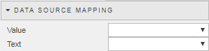
When a Data Source is used to populate Radio Buttons, labels must be assigned using Data Source Mapping otherwise the list is empty.
| Field | Description |
|---|---|
| Value | The column of the Data Source corresponding to the values to be passed into the Selected Value View State Parameter. |
| Text | The column of the Data Source corresponding to the text to be displayed as the options. |
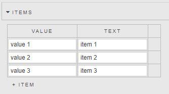
Items
If Data Source is not used to create Radio Buttons, individual values can be specified in the Items menu.
Action
Refer to Actions for details.
Style
| Field | Description |
|---|---|
| Label Template | Sets the label text for each selection item.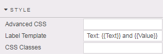 The parameters passed to the template depend on whether Use Data Source is enabled: if using a data source, parameters reflect the column names; if inputting items manually, Text and Value parameters are passed. |
Refer to Style for common settings.
Format, Margins
Refer to Style for common settings.