Date Range Picker
This page describes how to set up and configure the Date Range Picker component.
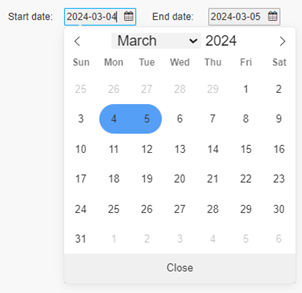
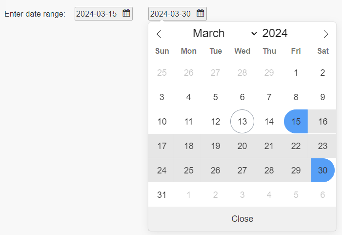
The Date Range Picker allows users to define a date range by specifying the start date and the end date. The dates can be selected by either clicking on the calendar or entering text. By default, the start and end dates are today and tomorrow. If the current date is outside of the date range, it is highlighted in the calendar.
This page describes how to:
- Set up the Date Range Picker
- Use the Date Range Picker
- Use the Date Range Picker to select a date range for another component
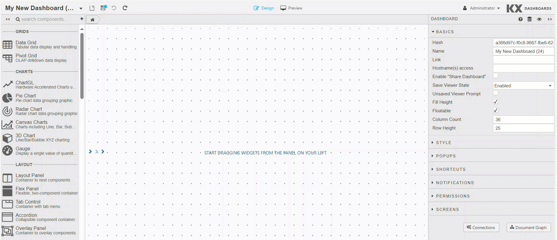
Set Up a Date Range Picker
-
In the Design view, click and drag the Date Range Picker onto your workspace.
-
Configure the following properties for this component: Basics, Style, Actions, Margins, Format.
Date Range Picker Properties
The following sections provides details on how to configure the properties of the Date Range Picker component.
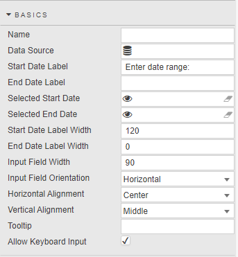
Basics
The Basics properties are illustrated in the following screenshot and described below.
| Field | Description |
|---|---|
| Name | Enter a name for the component. |
| Data Source | Optionally set a list of valid dates. When set, the list of dates in the data source sets the available dates presented by the date range component. Note: The data source for this component must return values of kdb+ type date.For example, the following kdb+/q syntax creates a data source with 365 sequential date values starting with March 1, 2024: q<br>([]<br> d: (2024.03.01 + til 365))<br>Click here to read more about data sources. |
| Start Date Label | Enter a text label to be displayed beside the first date. |
| End Date Label | Enter a text label to be displayed beside the second date. |
| Selected Start Date | Specify a view state parameter of type date, datetime, or timestamp for the start date. View States with time values are set to midnight. |
| Selected End Date | Specify a view state parameter of type date, datetime, or timestamp for the end date. View States with time values are set to midnight. |
| Start Date Label Width | Defines the width in pixels for the first field label. |
| End Date Label Width | Defines the width in pixels for the second field label. |
| Input Field Width | Defines the width in pixels for both input fields. |
| Input Field Orientation | Defines the layout (horizontal, vertical) for the input fields. |
| Horizontal Alignment | Defines the horizontal position (left, center or right) for the input fields and labels within the component boundary. |
| Vertical Alignment | Defines the vertical position (top, middle, bottom) for the input fields and labels within the component boundary. |
| Tooltip | The text description which appears when you mouse over the Date Range Picker. |
| Allow Keyboard Input | When checked, you can enter dates using the keyboard. |
Using the Date Range Picker
You can provide input for the Date Range Picker with the mouse or keyboard.
Mouse Input
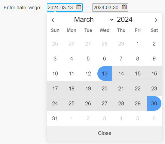
- In Preview mode or the End-User version of the Dashboard, click on the start field to open the calendar.
-
A calendar is displayed aligned with the start date input field. If the display includes days within the date range, those days are highlighted.
-
Click on the desired start date. The start date field is updated. A calendar then displays aligned with the end date input field.
-
Click on the desired end date. The end date field is updated and the calendar closes.
Keyboard Input
-
In Preview mode or the End-User version of the Dashboard, click on the start field to open the calendar and type in the desired date.
-
Click on the end field or press TAB to move to the end date field. A calendar is displayed aligned with the end date input field.
-
Type in the desired end date.
- Click outside of the component, or press TAB or Enter to complete the entry. The calendar closes.
Validation
This component verifies all values entered. If invalid data is entered, a label with a red border is displayed around the relevant input field.
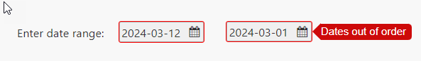
Validation occurs as you are typing, selecting a date from the calendar, navigating to a different area of the Dashboard, and upon initialization. If a value is not valid, the selected Start/End Date properties are not updated, and one of the following error labels appears:
| Label | Error details |
|---|---|
| Invalid date | Appears when the value does not represent an actual calendar day. For example, if 00 is entered for the day. If you don't correct the date, the previously held values are used. |
| Date out of scope | Displayed when the date value is not in the list of available dates provided by the data source. Remains visible until a valid value is provided. |
| Dates out of order | Displayed when the start date does not occur before the end date. Remains visible until the condition is corrected. When you enter dates that are out of order, both input fields have the red border. When mouse-click causes this error, you are directed to the opposite end of the date range and prompted to enter its value. |
Using Date Range Picker with View States
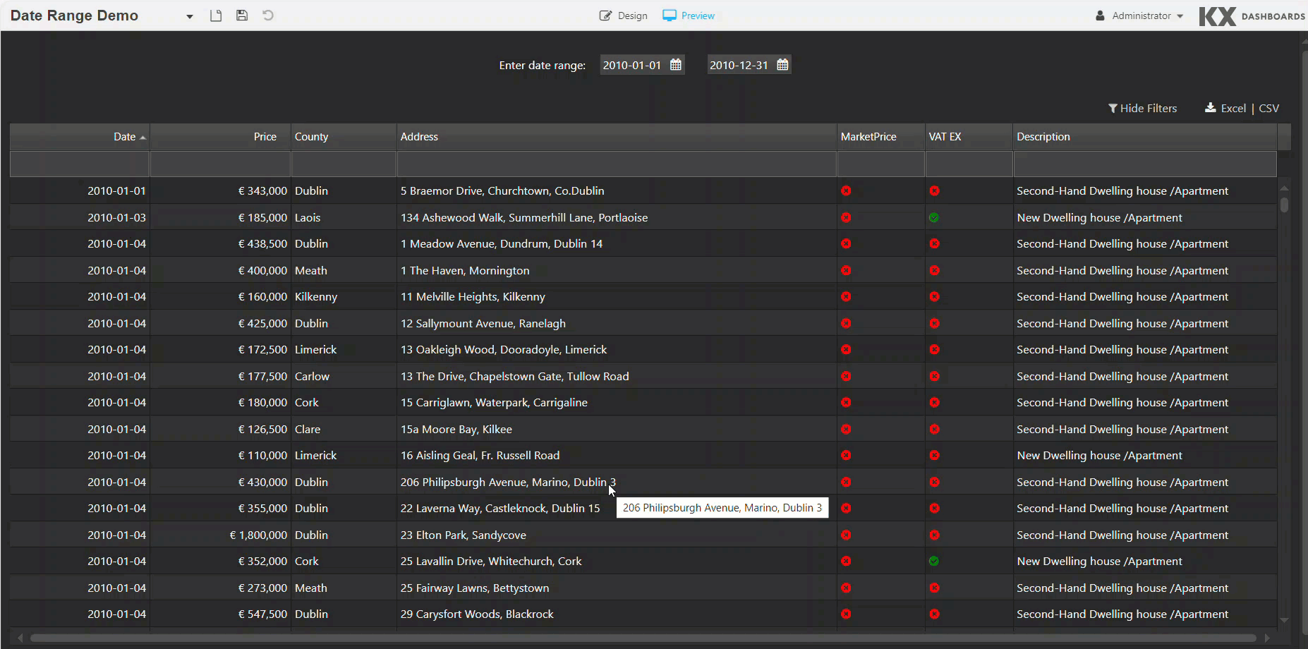
You can use the Date Range Picker to set up view state parameters which can be used by another component.
The following example shows the Date Range Picker being used to provide the filter date for the data grid. The data is filtered based on the date range selected.
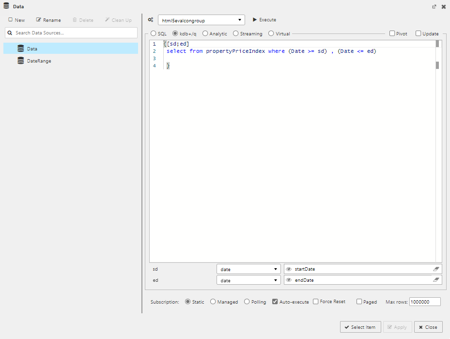
In the example above, view state parameters have been set up for the Selected Start Date and Selected End Date properties. The data dialog with the two view states, startDate and endDate, is shown below.
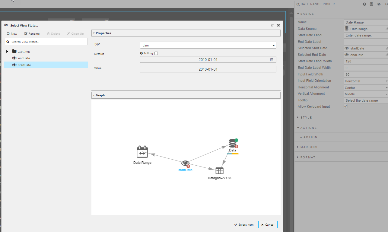
Click here to read more about the view state dialog.
These view states are set up as inputs to the data source query for the Data Grid. The sd and ed variables are defined at the start of the function and mapped to the startDate and endDate view states. This mapping is visible in the lower part of the data dialog, shown below.
Click here to read more about referencing view states in the query editor.