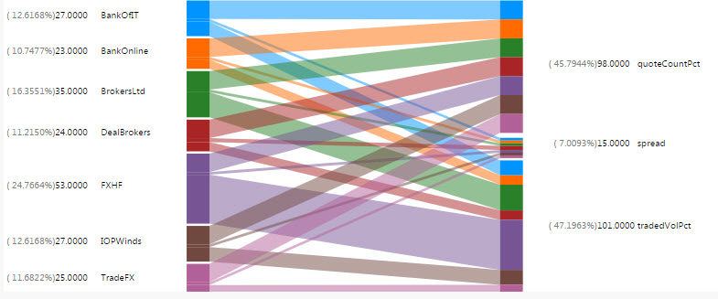
Bipartite Chart
This page explains how to set up and configure a Bipartite Chart, a unique two-way interactive chart featuring two independent data sets and associated relationships. It is compatible with Pivot/OLAP data.
Set Up a Bipartite Chart
To set up a Bipartite Chart, click-and-drag the component into the workspace and configure the properties described in the following sections.
Bipartite Chart Properties
The following sections provides details on how to configure the properties of the Bipartite Chart.
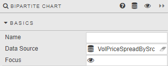
Basics
Open the Basics properties on the right and configure the properties described in the following table.
| Field | Description |
|---|---|
| Name | A name for the component provided by the user. |
| Data Source | Refer to Data sources for details. |
| Focus | A View State Parameter for linking components. |
Actions
Refer to Actions for details.
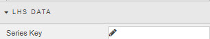
LHS Data
Configure the properties, described in the following table.
| Field | Description |
|---|---|
| Series Key | A Data Source column: the independent variable to categorize right-hand dependent variables. |
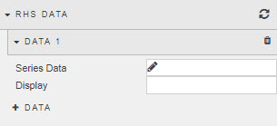
RHS Data
Configure the properties, described in the following table.
Data
| Field | Description |
|---|---|
| Series Data | A Data Source column to include in the right-hand data set. |
| Display Name | Enter a name to be displayed for Column. |
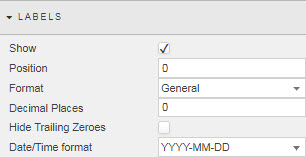
Labels
Configure the properties, as described in the following table.
| Field | Description |
|---|---|
| Show | Check this to display Bipartite labels. |
| Position | Adjust label position in pixels. |
| Format | Define the format of Data labels. Select from General, Number, Smart Number, Formatted Number, Datetime. |
| Decimal Places | Define the number of decimal places for number formats. |
| Hide Trailing Zeroes | Remove excess zeroes at the end of the number. |
| Date/Time format | For Datetime format. |
| Width | Pixel width between chart and chart value (occupied by the label). |
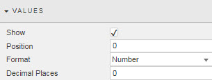
Values
Configure the properties, described in the following table.
| Field | Description |
|---|---|
| Show | Check this to display Bipartite values. |
| Position | This adjusts the position of values in pixels. |
| Format | Define the format of Data labels. Select from General, Number, Smart Number, Formatted Number, Datetime. |
| Decimal Places | Define the number of decimal places for number formats. |
| Width | Specify the pixel width between value and label. |
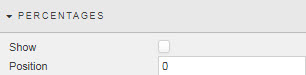
Percentages
Configure the properties, described in the following table.
| Field | Description |
|---|---|
| Show | Check this to display relative data distribution percentages. |
| Position | This adjusts the position of percentage values in pixels. |
| Width | The pixel width between the percentage label and the value label. |
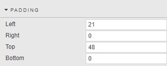
Padding
Configure the properties, described in the following table.
| Field | Description |
|---|---|
| Left / Right / Top / Bottom | Set padding of bipartite chart within the component. |
File Export
Refer to Export for details.
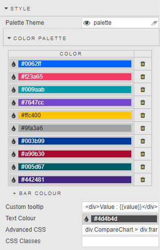
Style
Configure the properties, described in the following table.
| Field | Description |
|---|---|
| Custom Tooltip | Refer to Custom tooltips for details. |
| Advanced CSS | Refer to Advanced CSS for details. |
| Text Color | This defines the color of labels. |
| CSS Classes | Specify the CSS Classes that can be applied to style component. |
Refer to Style for common settings.
Format, Margins
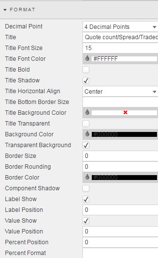
Refer to Style for common settings.