Treeview
This page describes how to set up and configure the Treeview component, an interactive tree used for navigation which is integrated with view state parameters.
Set Up a Treeview
To set up a Treeview component, click-and-drag the component into the workspace and configure the Treeview properties described in the next section.
Treeview Properties
The following sections provides details on how to configure the properties of the Treeview component.
Basics
Open the Basics properties on the right and configure the properties described in the following table.
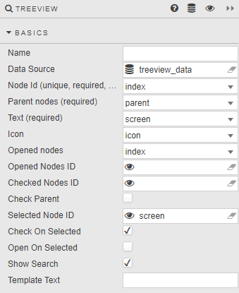
| Field | Description |
|---|---|
| Name | A name for the component provided by the user. |
| Data Source | The TreeView data source should include integer data columns for Node Id and Parent node, and a text label column. Refer to Data sources for further details. |
| Node ID | The data source column of unique integer values for each folder and item in the TreeView. Node IDs are used to define which items are checked, opened or selected. This is a required column. |
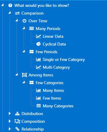
| Parent nodes | A data source column which defines the TreeView layout. Top level nodes are assigned a null value based on the kdb type used. Each node sharing a value is part of the same level — for example, the top level of an integer-based hierarchy must have a Parent nodes value of 0Ni; the next level would use 1i etc. This is a required column.Example query: q<br>([]<br> id:(1;2;3;4;5;6;7;8;9;10;...);<br> parent:(0n;1;1;1;1;2;2;6;6;7;...);<br> level:(1 2 2 2 2 3 3 4 4 4 ...);<br> name:("What would you like to show?";"Comparison";"Distribution";...);<br> icon:("fa fa-question-circle";"fa fa-exchange";...)<br>)<br>Generates this layout:  |
| Text | The data source column containing the label for each folder and item. This is a required column. |
| Icon | If an icon marker is to be used in place of the standard folder icon, define the data source column containing the list of 64-bit or image URL links. |
| Opened nodes | Define which set of Nodes will be open on load. |
| Opened Nodes ID | A view state parameter of Node IDs, type symbol, bound to expanded parent folders. Expanded nodes will display all child items. Warning! Default Opened Nodes ID values, if set, will be superseded by Opened Nodes ID values assigned by the data source. If Opened Nodes has no corresponding data source column, then default Open Nodes ID values will be used if assigned. |
| Checked Nodes ID | A view state parameter of Node IDs, type symbol, bound to all checked items in the tree — including parent folder node IDs. Warning! Default Checked Nodes ID values, if set, will be superseded by Checked Nodes values assigned by the data source. |
| Check Parent | Parent node (box) is checked on load. |
| Selected Node ID | A view state parameter of a single Node ID, type symbol, bound to an individually selected item — either a parent folder or child item. Note: The Selected Node ID is a single Node ID of the currently selected item, which may or may not be checked — only one item can be selected at any one time. Checked items are tracked by Checked Nodes ID. Warning! Default Selected Node ID value, if set, will be superseded by a value assigned by the data source. |
| Check on Selected | Check (box) when selecting nodes. |
| Open on Selected | Selecting the node name will expand child elements. |
| Show Search | Show/hide search input. Entering a search string displays the matched node and all ancestors and child nodes of the matched node.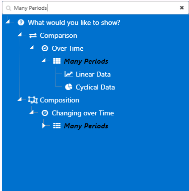 |
| Template Text | Formats tree labels. Text append example — interactive tree nodes with a parentId value of 1 precede node text with "Grand Prix Season:":html<br>{{#lt parentId 1}} Grand Prix Season: {{names}}{{/lt}}{{#gte parentId 1}}{{names}}{{/gte}}<br>See Template for details. |
Action
Refer to Actions for details.
Style, Margins and Format
Configure the Style properties defined in the following table.
| Field | Description |
|---|---|
| Hide Checkboxes | Disabled by default; hides checkboxes when enabled. |
| Show Tooltip | Enabled by default; shows node Text value as a tooltip. |
| Tooltip Text Template | Allows you to define tooltip template text. If not defined, defaults to the node Text. |
| Advanced CSS / CSS Classes | The treenode Node Id must be referenced when applying CSS styles to icons in the treeview. For example:css<br>[data-widgetid="xxxx-xxxx-xxxx-xxxx"]<br> div.treeview-container .treenode-id-x.jstree-leaf<br> > .jstree-anchor<br> > i.jstree-icon.jstree-themeicon.fa.jstree-themeicon-custom<br> {color: brown; }<br>where x in .treenode-id-x.jstree-leaf is the corresponding Node Id integer value, and data-widgetid is the TreeView component widget id. |
Refer to Style for additional information on common settings.