Drop Down List
This page describes how to set up and configure the Drop Down List component to your dashboard.
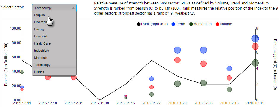
The following example shows a Bubble Chart with a drop down list.
Set Up a Drop Down List
To set up a Drop Down List component, click-and-drag the component into the workspace and configure the following:
- Define the view state parameter to map to the dropdown.
- Use either a data source or item list to populate your dropdown.
- Give your dropdown a label, check Multi-select if required.
Refer to Drop Down List properties described in the next section for details on additional properties.
Drop Down List Properties
The following sections provides details on how to configure the properties of the Drop Down List component.
Basics
Open the Basics properties on the right and configure the properties described in the following table.
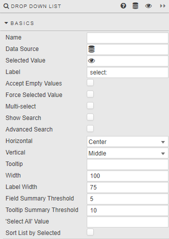
| Field | Description |
|---|---|
| Name | Enter a name for the component. |
| Data Source | Create a data source with the content of the dropdown menu. Using a data source automatically populates the dropdown; ensure the data source has values in the correct format and type to pass into the linked Selected Value View State Parameter. An optional text column can be included for value display names.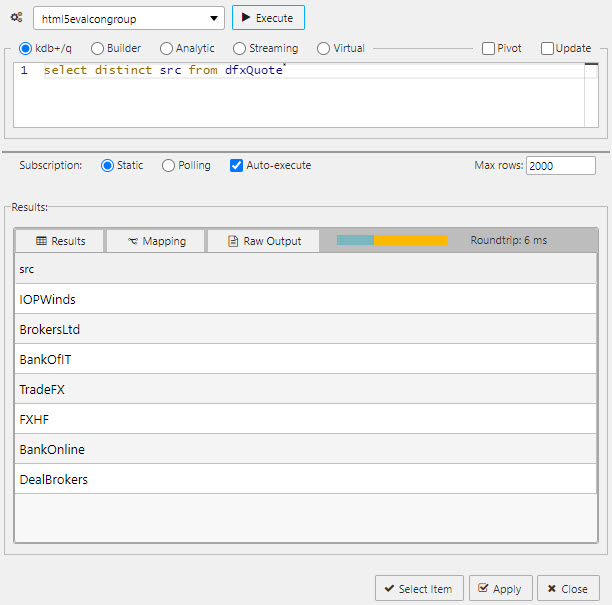 The following sample query can be used if connecting to the sample data connection source htmlevalcongroup:q<br>select distinct src from dfxQuote<br> |
| Selected Value | The view state parameter populated by the dropdown selection. See Selected values. |
| Label | The label next to the dropdown.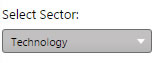 |
| Accept Empty Values | When checked, an available null value is added to the selection.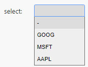 Note! Null value must be part of available data. When enabled, ensure the data column supplying the dropdown menu contains a null value. This will not add a null value if not already available. |
| Force Selected Value | When checked, the dropdown populates a Selected Value View State Parameter with either the defined default or selected value. This ensures any associated queries dependent on the dropdown input will have a value assigned to the View State Parameter. Note: Limited by available selection in dropdown. If the dropdown View State Parameter is used by another user input such as Text Input, the View State Parameter uses the most recent, viable value. If an outside range value is set in a Text Input, the dropdown shows the last selected value BUT the View State Parameter updates to the outside range value, which may break any query using the associated View State Parameter. |
| Multi-select | When checked, multiple selections can be made from the dropdown list and the selected items passed to the Selected Value View State Parameter.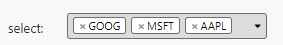 This controls the display of the Select All by Default property. |
| Select All by Default | Displayed when Multi-select is checked. When checked, all items in the dropdown are automatically selected. This ensures the dropdown is fully populated and the associated view state is updated immediately, without requiring manual user selection.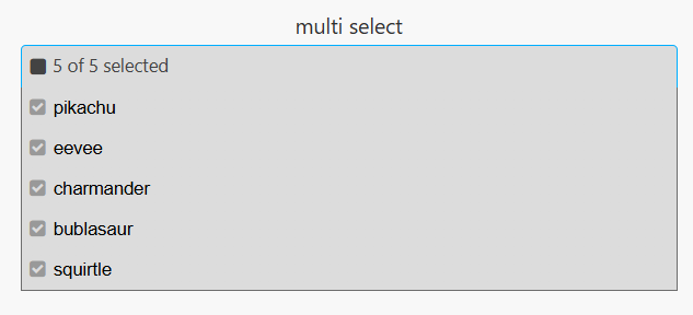 |
| Show Search | When checked, includes a search box for filtering results.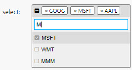 |
| Advanced Search | Supports wildcard searches, along with AND, OR, and excluding items using -. For example: EUR and GBP, EUR or GBP, EUR -*GBP. |
| Horizontal | Set the horizontal alignment of items within the list. |
| Vertical | Set the vertical alignment of items within the list. |
| Tooltip | Enter a text description to appear when user mouses over the dropdown. |
| Width / Label Width | Set the pixel width of the menu and dropdown Label. If the Label is wider than Label Width, it wraps.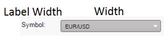 |
| Field Summary Threshold | How many items are shown in the input field before changing to summary. For example, 3 of 20 when value of 3 is set. |
| Tooltip Summary Threshold | How many items are shown in the tooltip before changing to summary. For example, 10 of 20 when value of 10 is set. |
| 'Select All' Value | The value assigned to the Selected Value viewstate when all items are selected. In the absence of an all-select, each individual selected item is listed. The default value is all.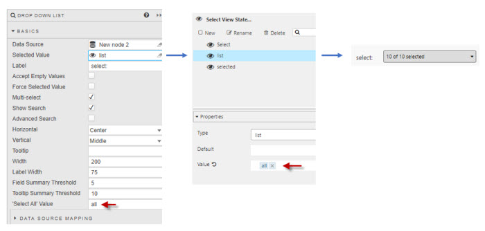 Tip: Your backend must expect all rather than the full list. This value can also be set as the default view state value to ensure all items are selected on load. |
| Sort List by Selected | When checked and the dropdown is expanded, the selected values are displayed at the top of the list. |
Data Source Mapping
Configure the properties, described in the following table.
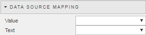
When a Data Source is used to populate the Drop Down List, the items are automatically assigned. For separate labels and values, use Data Source Mapping.
| Field | Description |
|---|---|
| Value | The column of the Data Source corresponding to the values to be passed into the Selected Value View State Parameter. |
| Text | The column of the Data Source corresponding to the text to be displayed as the dropdown options. |
Grouping
Configure the properties, described in the following table.
| Field | Description |
|---|---|
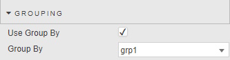
| Use Group By | When checked, an extra level of nesting within the dropdown list is used. |
| Group By | Determines which datasource column is used to group by. |
Items
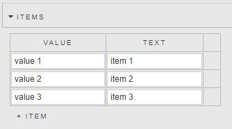
If Data Source is not used to populate a Drop Down List, individual values can be specified in the Items menu.
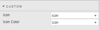
Custom
Customise dropdown selections with icons and icon colors.
| Field | Description |
|---|---|
| Icon | The column of the Data Source corresponding to the values to be used as an Icon. |
| Icon Color | The column of the Data Source corresponding to the values to be used as the Icon color. Tip: For Icon: you can set a Font Awesome class. For example fa fa-book sets the icon to a font awesome book icon.For Icon Color: you can use a hex or string color — for example "red" or "#ff0000". |
Actions
Refer to Actions for details.
Style
Refer to Style for common settings.
| Field | Description |
|---|---|
| Advanced CSS | See Advanced CSS. |