Reports
Reports offers a range of user interactive Dashboards. Dashboards are a visualization tool that enables non-technical and power users to query, transform, and present live data to the KX Insights Platform. Visualizations can be built using drag-and-drop and point-and-click operations in an easy to use editor.
Get Started
-
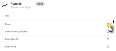
Create a new report or select a report from the entity tree or Overview page. Reports are accessible from the Document bar.
-
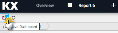
Click
Designto edit a report; click-and-drag components into the central workspace and assign data sources from pipeline data. Save changes andPreviewto interact with the updated view. -
Reports can be saved to your profile.
Saved Reports
Saved reports persist across sessions, but any required update will reset all changes.
Report Properties
Components within a report can be replaced and new data sets assigned. The report can be styled in a light or dark theme, and the arrangement of components changed.
Basics
Style
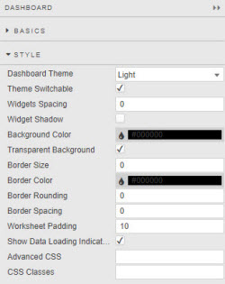
- Dashboard Theme
- Theme Switchable
- Sets Light or Dark theme for dashboard and define if theme can be switched. This should be disabled (theme-locked) if the dashboard uses custom styling which would not update on global theme switch.
- Widgets Spacing
- Widget Shadow
- Define distance in pixels between components and add optional shadow.
- Background Color
- Transparent Background
- Define background color of components.
- Border Size
- Border Color
- Border Rounding
- Border Spacing
- Define border criteria of components. Spacing is defined in pixels.
- Show Loading Indicators
- When checked, indicates when a report is loading data. If your report uses streaming, managed or polling data, leave this unchecked.
For more on Style
Popups
Shortcuts
Screens
New views can be created by adding a screen to an existing report. If adding screens, remember to define which screen is the default one by selecting the star icon. New screens start with a blank workspace into which components can be added and data sources assigned.
| button | action |
|---|---|
 |
Delete screen |
 |
Duplicate screen |
 |
Set screen as default on dashboard load |
 |
Edit screen |
 |
Take snapshot image of screen: used by Navigation Component tooltip |
Components
Click-and-drag a component from the left-hand menu into the workspace. When dragging a component into a workspace, be careful not to drop it on top of another as this will replace the underlying component; any such change (or others) can be undone by clicking the undo action in the report menu bar next to the save icon.
- 3D Charts
- Accordion
- Analyst Visual
- Bipartite Chart
- Bitmap
- Blob
- Breadcrumbs
- Button
- Canvas Chart
- Chart GL
- Code Editor
- Contour
- Data Filter
- Data Form
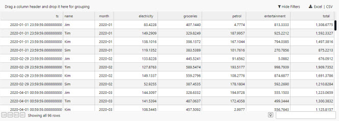
- Data Grid
- Date Picker
- Drop Down List
- Editable List
- External Content
- Financial Chart
- Flex Panel
- Form Builder
- Graph
- Layout
- Map
- Mapbox
- Pie Chart
- Pivot Grid
- Playback
- Radar Chart
- Selection Controls
- Range Slider
- Scatter
- Sunburst
- Tab Control
- Text
- Text Input
- Trade
- Tree Map
- TreeView
- Vega Chart
- Visual Query Builder
Data Sources
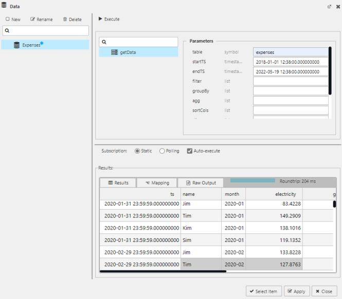
Each report comes with its own set of data sources. Data sources are managed in the Data Dialog under getData. The assembly database table name is referenced in the table property. The label property can be used to isolate data from shared name variables in different tables.
Set up
-
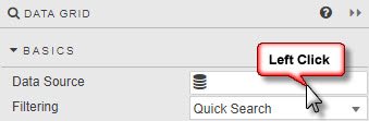
Open the data dialog by selecting Data Source in a component's Basics Properties; for Charts, the Data Source is available under Layers - Basics.
-
Create a new data query. Define a
tablefrom those available in the assembly databases and set the required filter properties. Properties can be assigned to view state parameters.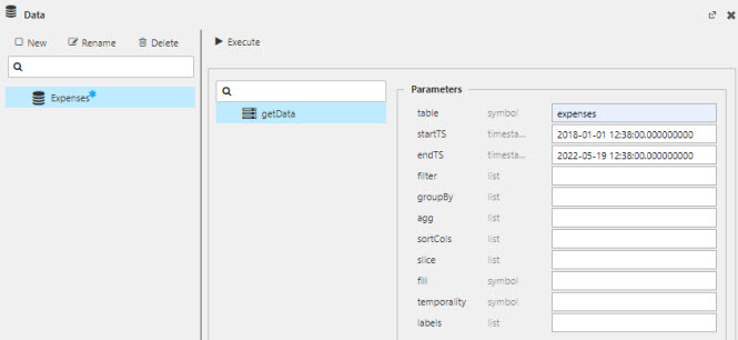
parameters description table* table name as referenced in the database startTS* Start time of returned data. If a preset date range is required for a Report, set temporality property to sliceand define the slice property for start timeendTS* End time of returned data; defaults to today's date. If a preset date range is required for a Report, set temporality property to sliceand define the slice property for end time.filter define by (function;columnname;parameter), for example >;valuecolumn;100to filter "valuecolumn" to values above 100. Selected functions include>,=or<and can include text values; for example=;name;Jimwill return rows of data where the "name" column contains 'Jim'.groupBy Select data column(s) for grouping data. agg Define columns to select: `price`size, an aggregation`col1`avg`price, or a dict(ionary) aggregation`col1`avg`price;`col2`sum`size.sortCols Sort results by selected column. slice Sets the time range for startTS and endTs when sliceis set for temporalityfill How to handle nulls in the data. Select between zeroto treat nulls as zeroes, orforwardto carry forward a previous, non-null value.temporaility Set to sliceif data returned is between a defined startTS and endTs; use the slice property to set the date range. Set tosnapshotfor a continous range of data.labels Where data columns are shared across different tables an (optional) label can be applied to restrict returned data. For example, table1has aregionproperty for 'north america' andtable2has aregionproperty for 'europe', then a label ofregion:europewill return data fromtable2only. Data can be returned from tables in different assemblies/databases.*required
View State Parameters
Get Data API
-
Click Execute to preview, success will populate the Results table or return an error message.
-
Click Apply and Select to assign the data to the component.
Subscription
Static
Default setting. Single request for data
Polling
A client-side poll of the database; this is a direct client request to the database. Server paging can be enabled to limit the amount of data returned to the report.
| option | effect |
|---|---|
| Interval | Time between client poll request |
| Key | Select which data source column to define Subscription handling; e.g. to have continual or static update |
| Force Reset | By default, for updating data sources Dashboards merges updates from the server with its existing dataset, unless a parameter is changed in which case the existing dataset is cleared. Enabling Force Reset will clear the existing dataset each time it receives an update, regardless of whether a parameter has changed or not. |
Auto-execute
True by default. When auto-execute is true, the data source will automatically execute whenever an input parameter is changed or on load if mapping is used.
When auto-execute is false, subsequent parameter changes won't execute the query. However, it will still execute normally if associated to a component, e.g., a data grid on load, or as an action tied to a button.
Mapping
Mapping maps results from a data source to View States. Results should include a column that contains keys and a column that contains values.
Mapping configuation is accessible from the Mapping tab in the Results panel.
Key and value columns should be defined in the Key and Value dropdowns.
Mappings can be added using the + button. Within each mapping you can define the Key and the View State that the Value should be mapped to.
Keys in the current results can be added using the dropdowns. Other keys can be added by typing them into the dropdown input field and pressing enter.
The Reset button will populate the list of mappings with all available keys.
View States
View States store values accessible to all components of the report. Use them to pass values like user selections or preferences between components and into queries.
View States can be edited from the View State dialog.
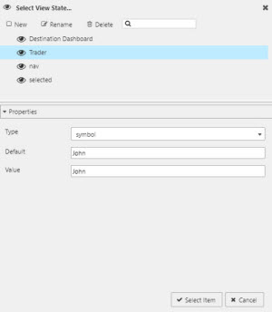
Select View State dialog showing a selected View State and its properties
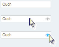
This dialog can be summoned by clicking inside any input box showing the eye icon  .
.
Hidden eyes
Some inputs offer View States, but the icon is hidden. If a View State is available, a rollover of the input will display the eye icon.
Selected Values
View State Routing
Component linking
Actions
Action is a common property set used to configure a view state, run a query or open an URL.
Highlight Rules
Highlight rules are a common property utilizing color and/or icon markers to notify users of value changes. Highlight rules are best used with real-time streaming, or polling data.
Additional Information
For more on Dashboards.