Sunburst Chart
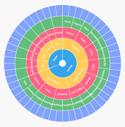
An inner circle surrounded by rings of deeper hierarchy levels. The angle of each segment is proportional to a value or divided equally under its parent node.
Set up
-
Assign a data source.
-
Set Breakdown with a view state parameter of type
list, with the categories from your data source.
Basics
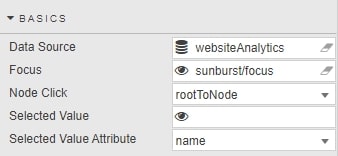
- Data Source
- Data sources
- Focus
- A view state parameter for linking components
- Node Click
- Select between
default, a fixed sunburst chart displaying all hierarchies as a single entity at all times, orrootToNodewhich redraws the chart based on the selected hierarchial interaction. - Selected Value
- Selected Value Attribute
- A view state parameter storing the selected hierarchy level as defined by Selected Value Attribute. Selected Value Attribute is one of
name,valueordataIndex
Data
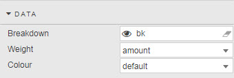
- Breakdown
- Type
listview state parameter to define hierarchial levels from the data source. - Weight
- Dependent (numeric) variable from data source to define node size.
Color
| option | description |
|---|---|
default |
Shared color across node hierarchies |
fixed |
One color across all nodes |
level |
Different colors at each hierarchial level |
visual map |
Gradient color by Weight range, |
| Data column | Selected from the data source. |
Config
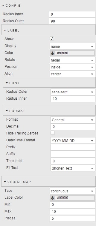
- Radius Inner
- Radius Outer
- A Radius Inner value above zero adds a 'doughnut' hole to the Sunburst chart. A Radius Outer value at 100 bounds the sunburst chart to the top and bottom of the component boundaries.
Label
- Show
- Display
- Toggle to show Display labels for each node value; Display values taken from a column in the data source.
- Color
- Font color for labels
- Rotate
- Position
- Align
- Set position and alignment of labels.
Font
- Radius Outer
- Radius Inner
- Font size and font style of node labels.
Format
- Format
- Format of label
- Decimal
- Hide Trailing Zeroes
- For numeric Formats
- Date/Time Format
- For Datetime Format
- Prefix
- Suffix
- Add a piece of text, e.g. currency symbol or percentage, before or after the label.
- Threshold
- Frequency of node labels.
- Fit Text
- Select between
Shorten TextorOverflowfor the fit of labels.
Visual map
Configuration for visual map of data color options
- Type
- Select between
continuousgradient or definedpiecewise - Label Color
- Font color of Pieces label
- Min
- Max
- Range of visual-map gradient
- Pieces
- Number of
piecewisesections to use for visual map
Tooltip
Display rollover of node values and labels