Accordion
A panel with expandable sections
The Accordion component is divided into sections. Each section can hold a single component - including a nested accordion - or a workspace like Layout Panel.
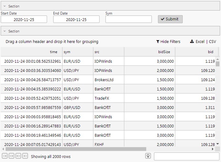
An Accordion panel with sections containing a Data Form and Data Grid
Set up
-
Define how many sections you need.
-
Within each section, add a single component, layout panel, or flex panel for multiple components.
Basics
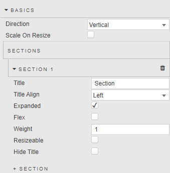
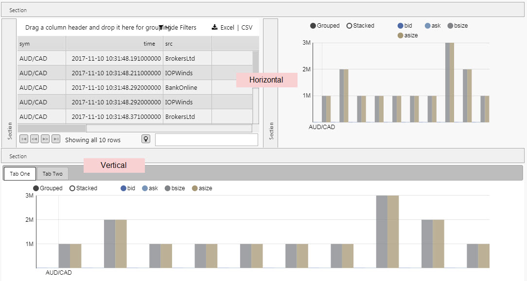
- Direction
- Switch between a Vertical and Horizontal accordion control. Can nest one Accordion component inside another.
- Scale on Resize
- Resize a child component when the accordion panel is resized, or wait until after accordion resize to resize child components.
Sections
- Title
- A name for the section
- Title Align
- Sets position of Title in section bar:
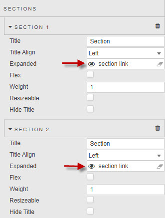
left,centerorright - Expanded
-
When checked, the Accordion will load with the section expanded.
Controlling the open and closing of accordion sections can be achieved by assigning a boolean View State Parameter to the Expanded property. By setting the View State Parameter to True – on a click of a Data Form Submit button for example – users can determine when elements of the dashboard become visible.
- Flex
- When enabled, the section will resize to accommodate its child component's dimensions where possible, for example resizing to accommodate a Dataform that can can take up different heights depending on the number of items and the width of the screen.
- Some components, such as charts, do not specify dimensions themselves but rather fill their parent. In these cases a Flex section's dimensions is defined in pixels by Min Size and Max Size. The Weight and Resizable properties below do not apply to Flex sections.
- Weight
-
This is a relative sizing measure to determine the viewable area for each section inside the Accordion.
For example, two sections of Weight
200will each take up half of the viewable area (200/(200+200)). A section with Weight of400and another of200will occupy 66% (400/(400+200)) of the viewable area.Section behavior on resize
If Resizable is checked, the values of Weight will change on interaction.
- Resizeable
-
If checked, the user will be able to adjust the section size
Manually adjusting section size - Hide Title
- When checked, suppresses the section title
Style, Format, Margins
Style for common style settings
- Advanced CSS
- Advanced CSS
Linking two sections
Multiple sections in a single accordion can share a behavior if they use the same View State Parameter as their Expanded setting:
Linking two accordions
Two or more Accordions can be linked so an expansion or contraction in a section of one will be reflected in another.
To do this, assign the same View State Parameter to the sections’ Expanded settings.