Tab Control
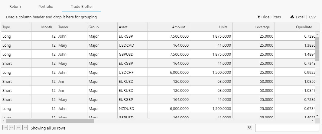
A Tab Control with five tabs. The first Tab, Trade Performance, is selected and visible
A container of displays selected by a tab menu. A tab can hold a single component or a Layout panel with multiple components.
Set up
-
Define the number of tabs you require.
-
Within each tab element, add a single component, layout panel, or flex panel for multiple components.
View State
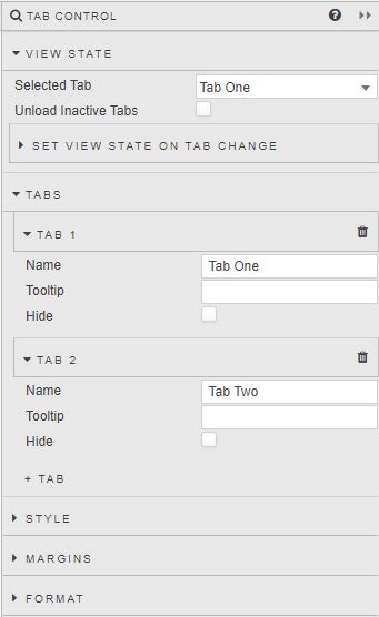
- Selected Tab
-
The Tab visible at launch
Linking Tab Controls
To link Tabs in two separate Tab Controls (so that clicking on Tab 1 of Tab Control 1 opens Tab 1 of Tab Control 2), create a View State Parameter and assign it to Selected Tab of Tab Control 1 and Tab Control 2.
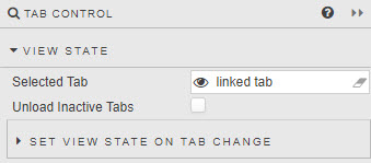
- Unload Inactive Tabs
- When enabled, uploaded tab content will be removed on tab switch.
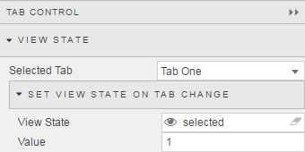
- Set View State on Tab Change
-
In addition to linking different tab components, switching tabs can be used to assign a value to a View State Parameter; for example, if looking to reset a default value on tab switch.
Tabs
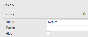
A Tab can be hidden by checking its Hide box. Hiding a Tab does not remove it, just the means to click its tab. Navigation to the hidden tab content can be achieved using a Button.
- Name
- Name displayed in tab
- Tooltip
- Description of tab on mouse rollover
- Hide
- Hide display of tab
Style
Style for common settings