Layout Panel
Layout panels are used to nest components within the dashboard, and are best used within Flex Panel, Tab Control and Accordion components or to create elements like navigation menus.
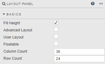
Basics
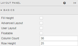
- Fill Height
-
When checked, autosizes nested components to fill the height of the Layout panel.
Tip
Enable after adding all required components to the panel
- Advanced Layout
-
Best-fit component according to panel width; components stack on resizing. Positioning components with Advanced Layout requires CSS.
Fill Height versus Advanced Layout
Fill Height auto scales components to browser height. Advanced Layout requires CSS to position components. If both are enabled, only Advanced Layout rules will apply.
- User Layout
- User arrangement of components; add, remove and reposition.
-
Enable User Layout. In
View on Webmode (or "Quickview") the customization icon will be visible
-
Once enabled components will become movable and can be repositioned
-
Components can be deleted
-
And removed (and hidden) components can be returned (or added)
-
Once complete, click the settings icon
-
Save layout
- Floatable
- When enabled, an added component will snap to nearest row anchor. Otherwise, component will always snap to top row.
- Column Count
- Row Count / Row Height
-
Define Layout grid size. Components added are locked in position to this grid. The grid is visible when a component is dragged into position.
Row Height
If Fill Height is disabled, Row Count becomes Row Height. Row Height is the height in pixels between each grid row. The number of grid rows used is defined by the prior Row Count value; e.g. if Row Count is 30 and Row Height is set to 30; then the distance from top to bottom - in the absence of Fill Height is 900 pixels; i.e 30 x 30. If the pixel height is greater than the browser height, a scroll bar will appear and some components may be positioned off-screen.
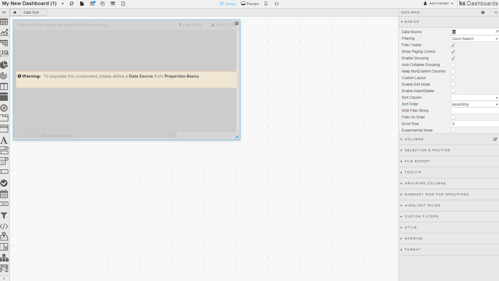
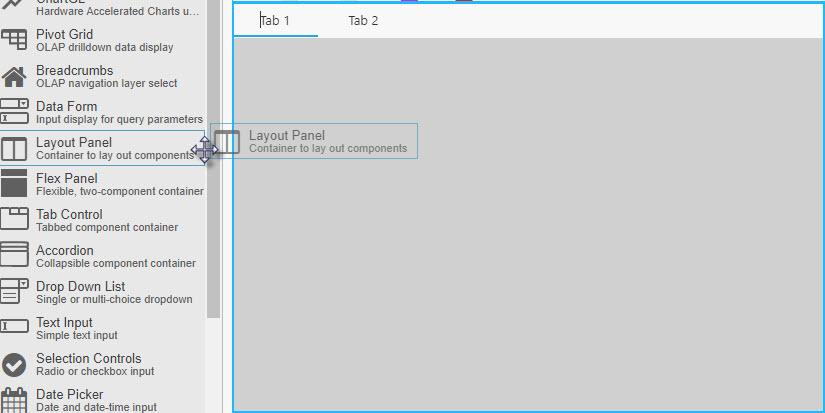
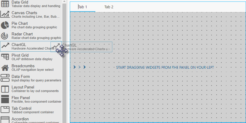
Using Layout Panel
-
Add a Flex Panel, Accordion or Tab Control component
-
Left-click-and-drag in a Layout panel
-
Add a component to the Layout panel; this will fill the area of the Layout panel, but can be resized to add additional components.
Check both
Unless you have a reason to lock the size of components dropped into a Layout panel, check both Fill Height and Advanced Layout. This ensures the components in your Layout panel autosize along with the Accordion or Tab Control section that contains it.
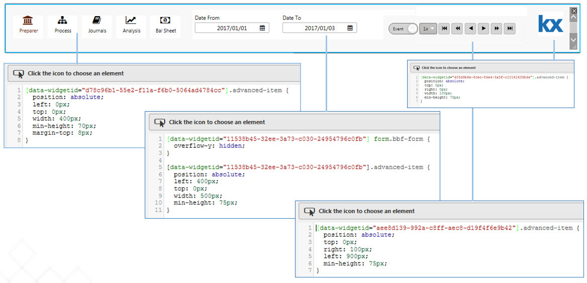
Using Advanced Layout CSS
CSS can be used to position components and use fixed-sizing to prevent component resizing on changes in browser width. Use .advanced-item[data-widgetid="xxxx-xxxx-xxxx-xxxx"] {} to configure Advanced Layout CSS
Style, Margins, Format
Style for common settings