Text Input
The Text Input component offers a means to make the user’s input available to dashboard components. The input can be text, dates, hex colors, etc.
Any dashboard component setting showing an eye icon ![]() can be set to a View State Parameter connected to a Text Input.
can be set to a View State Parameter connected to a Text Input.
Set up
- Assign a view state parameter to text for entering a value.
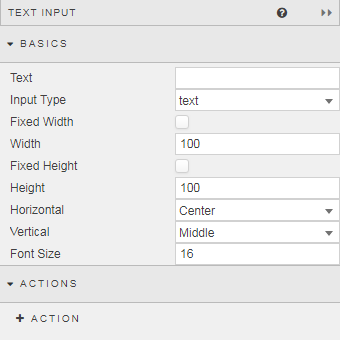
Basics

- Text
-
Text typed by the user
Validating user input
There is no provision for a callback to validate the content of this field. Consider using a Text component to advise the user what to type.
- Input Type
- Select from
text,searchormultiline - Height and width
- When Fixed Width is checked, the component width is Width pixels. When Fixed Height is checked, the component height is Height pixels.
- Alignment
- Horizontal and Vertical set the respective alignments of the text within the component
- Font Size
- In pixels
Action
Style, Margins, Format
Style for common styling parameters