Pie Chart
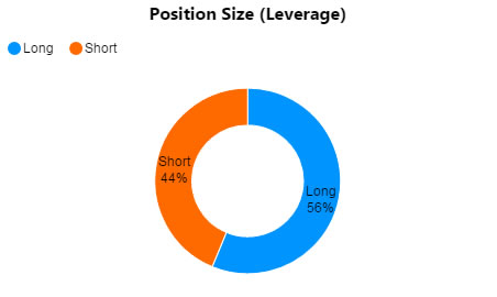
A pie chart in donut style
Set up
-
Define a data source.
-
Select Series Key for category data.
-
Add a Layer, and define the Series Data to plot.
Basics
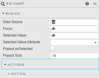
- Data Source
- A data source.
- Focus
- A View State Parameter for linking components.
- Selected Value
- Selected Value Attribute
- A View State Parameter/s and data-source column/s: maps to a chart (query) data point when a chart segment is clicked by the user.
- Viewstate routing
- Popout onSelected
- Popout Size
- Slide out pie selection.
Action
Data
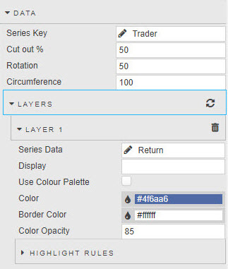
- Series Key
- Category from Data Source.
- Cut out %
- Size of donut hole.
- Rotation
- Rotation of Series Key labels.
- Circumference
- 100% is a full circle, 50% is half-circle.
Layers
- Series Data
- Data to define pie sections from Data Source.
- Display
- Title of pie chart.
- Use color Palette
- Check to replace standard single color per segment with Color Palette option.
- Color
- Border Color
- Color Opacity
- If not using a Color Palette, the single color and opacity (0-100) to be used for all segments.
Highlight rules
Rules for color-coding charts: best used with real-time streaming or polling data.
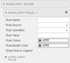
- Rule Name
- A name for the rule.
- Rule Source
- The Data Source column to which the rule will apply:
Allis an option. - Condition
- Highlight Rules
- Rule Color
- Rule Border Color
- The color to display when the condition is true.
- Show in Legend
- When checked, the highlight rule legend will appear in the chart.
Legend
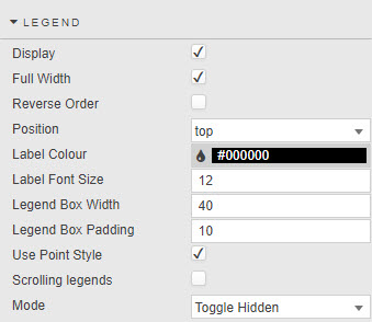
- Display
- Check to use a legend.
- Reverse Order
- Change direction of pie-chart labels.
- Position
- Location of pie chart.
- Label Color
- Label Font Size
- Color and font of text label.
- Full Width
- Width of label.
- Legend Box Width
- Legend Box Padding
- Dimension of text legend.
- Use Point Style
- Switch between block- and point-style legends.
- Scrolling Legends
- If pie-chart size is smaller than size required to display the legend, add a scroll bar for the legend.
- Mode
- With
Toggle Hiddenenabled, selecting a legend will remove selected datapoint from the pie chart, otherwise acts only as a data selector (data remains visible in pie chart).
Padding
- Left
- Right
- Top
- Padding
- Pixel size adjustments relative to the component / label.
Labels
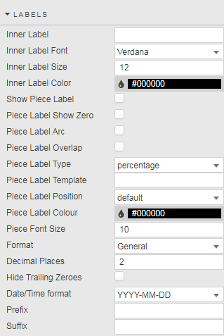
- Inner Label
- Inner Label Font
- Inner Label Size
- Inner Label Color
-
Text or icon display for center of pie chart.
Fontawesome
Fontawesome uses the same icon names found in icon-using components, e.g. in Highlight Rules.
- Show Piece Label
- Piece Label Show Zero
- Piece Label Arc
- Piece Label Overlap
- Piece Label Type
- Piece Label Position
- Piece Label Color
- Piece Font Size
- Formats for pie-chart labels; e.g. whether they follow the curve of the pie-chart circle (Piece Label Arc) or sit outside the pie chart (Piece Label Position).
- Format
- Sets format for label
- Decimal Places
- If a numeric Format is used it sets the number of decimal places to display in the label.
- Hide Trailing Zeroes
- Remove excess zeroes from label.
- Date/Time Format
- If a time Format is used it sets the format for time-based labels.
- Prefix
- Suffix
- Adds a text label before or after the display Label; e.g.
£,%,€.
Animations
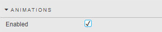
- Enabled
- When checked offers smoothing render animation.
File export
Style, Margin & Format
Style and Custom tooltips for common settings.