Templates
Templates are a way to modify how data is formatted and displayed. They can be created via the Template Editor.
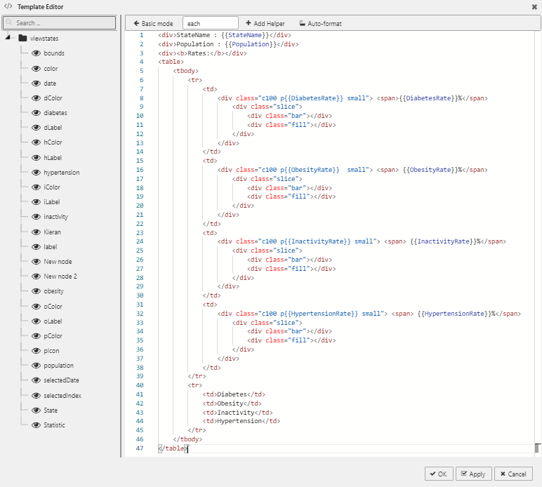
Editor
Basic
The Basic editor is a WYSIWYG interface.
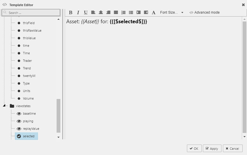
- Double-click from the left panel - a data source value or view state parameter - to add selection as a handlebars helper in the editor panel.
- Select the handlebars helper to apply font formats as required
- Add any additional text labels
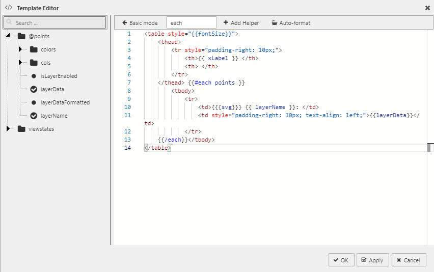
Folders prefixed by an @ designate the object as an array; double clicking an array will insert #each block helpers around the content (these are hidden in Basic mode editor). These are the only block handlebars helpers available in Basic mode; if other block helpers are selected, Advanced mode will be enabled.
Advanced
The Advanced editor displays template content as HTML giving more control on template customization. The full range of handlebars helpers are available for use in Advanced Mode.
Working examples
This tooltip
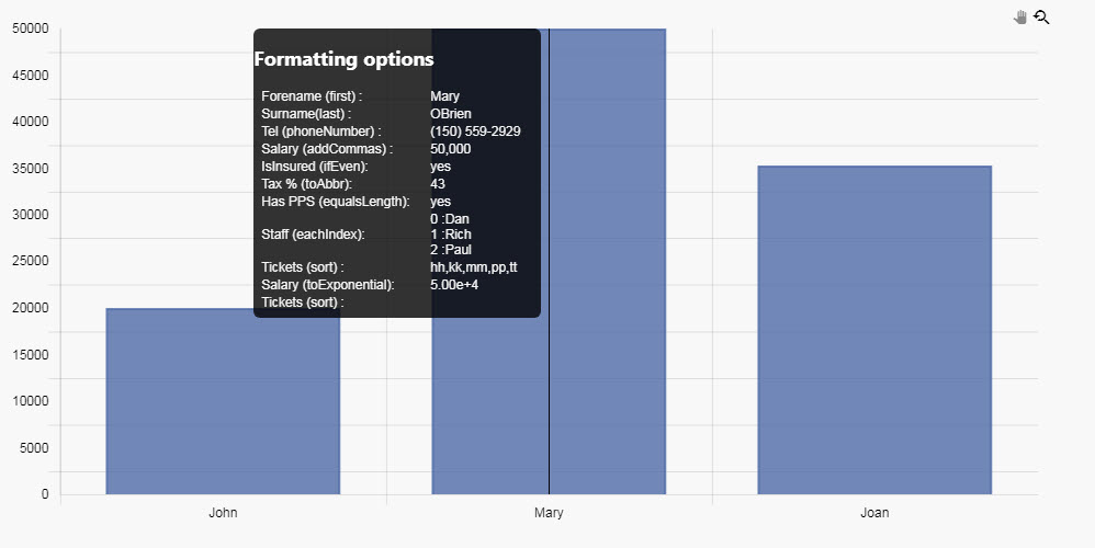
uses:
<h2> Formatting options</h2>

<table style="min-width:250px;">

    <tr>
        <td>Forename (first):  </td>
        <td>{{first points.0.cols.name}} </td>
    </tr>
    <tr>
        <td>Surname(last):  </td>
        <td>{{last points.0.cols.name}} </td>
    </tr>
    <tr>
        <td>Tel (phoneNumber):  </td>
        <td>{{phoneNumber points.0.cols.telephone}} </td>
    </tr>
    <tr>
        <td>Salary (addCommas):  </td>
        <td>{{addCommas points.0.cols.salary}} </td>
    </tr>
    <tr>
        <td>IsInsured (ifEven):  </td>
        <td>{{#ifEven (toInt points.0.cols.isInsured)}} mp{{else}} yes {{/ifEven}} </td>
    </tr>
    <tr>
        <td>Tax % (toAbbr):  </td>
        <td>{{toAbbr (toInt points.0.cols.tax) 2}} </td>
    </tr>
    <tr>
        <td>Has PPS (equalsLength):  </td>
        <td>{{#lengthEqual points.0.cols.pps 6}} yes {{else}} no {{/lengthEqual}} </td>
    </tr>
    <tr>
        <td> Staff (eachIndex): </td>
        <td>
            {{#eachIndex points.0.cols.staff}}
            {{index}} :{{item}} <br>
            {{/eachIndex}}
        </td>
    </tr>
    <tr>
        <td> Tickets (sort) :</td>
        <td>{{sort points.0.cols.openIssues}} </td>
    </tr>
    <tr>
        <td> Salary (toExponential): </td>
        <td>{{toExponential (toInt points.0.cols.salary) 2}} </td>
    </tr>
    <tr>
        <td> Tickets (sort): </td>
        <td>{{#withFirst array}}{{this}} is smart.{{/withFirst}} </td>
    </tr>

</table>
Example 1
Display price with two decimal places and use comma for digit grouping
([] marketPrice:(1154.0543f;101.8562f))Solution:
$ {{addCommas (toFixed marketPrice 2)}}Result:
$ 1,154.05 $ 101.86
Example 2
Display second currency of currency pair where it's listed first in a currency list.
([] currencyPairs:(("EUR/USD";"BRL/GBP"); ("JPY/AUD";"CHF/CAD";"NOK/INR")))Solution:
{{last (split (first currencyPairs) "/")}}Result:
USD AUD
Example 3
Display different message if the value is above 40%
([] performance:(0.43f;0.21f))Solution:
{{#gt (multiply performance 100) 40}}
    value is above 40%
{{else}}
    less than or equal to 40%
{{/gt}}
Result:
value is above 40% less than or equal to 40%
Example 4
Display index of each currency pair in the list
([] currencyPairs:(("EUR/USD";"BRL/GBP"); ("JPY/AUD";"CHF/CAD";"NOK/INR")))Solution:
{{#each currencyPairs}}
    {{add @index 1}}:{{this}}
{{/each}}
Result:
1:EUR/USD 2:BRL/GBP 1:JPY/AUD 2:CHF/CAD 3:NOK/INR
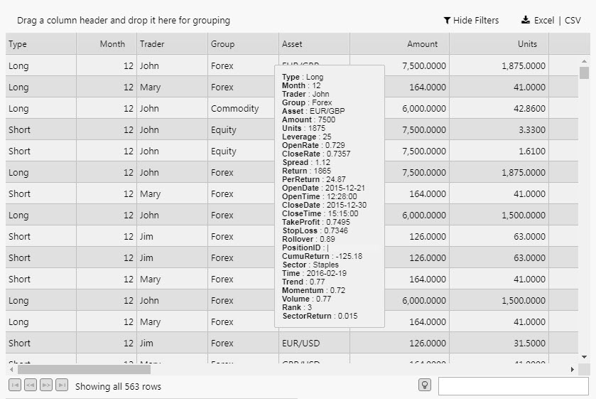
Data Grid
A sample data grid template tooltip:
<div style="margin:0 2px; padding:10px; background: #f0f0f0;
  color: #101010; font-size:11px;
  border:1px solid #c0c0c0; border-radius: 2px;">
    {{#each this}}
        {{#isnt @key "thisValue"}}
            {{#isnt @key "thisRawValue"}}
                {{#isnt @key "thisField"}}
                 <b>{{@key}}</b> : {{this}}<br>
                {{/isnt}}
            {{/isnt}}
        {{/isnt}}
    {{/each}}
</div>
will return column values on a rollover:
Custom tooltips
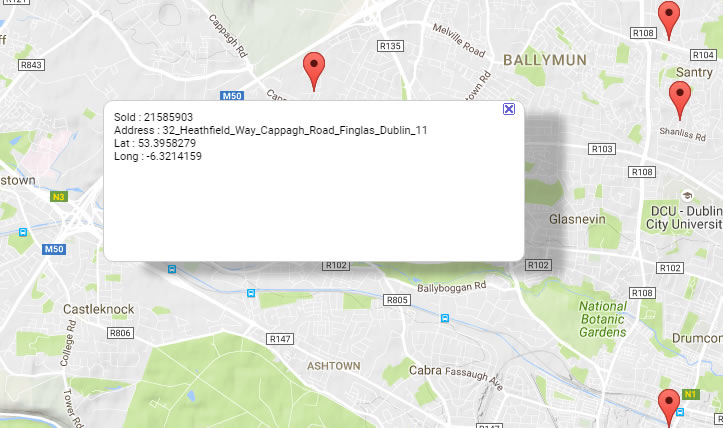
A Map with a tooltip display
Tooltips show data values associated with the cursor position.
To define a Tooltip display you need:
-
Data items from the components’s Data Source, mapped to View State Parameters.
The mapping is defined in the component’s Viewstate Routing table.
-
HTML for the Tooltip display; the View State Parameters mapped into it with Handlebars.
The HTML is defined in the Configure Tooltip dialog, summoned by clicking in the box for the component’s Custom Tooltip setting.
Standard Template
Custom tooltips for Chart can be found in the Overlay property
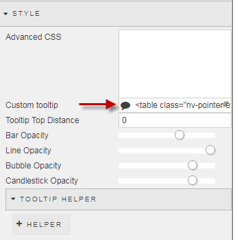
The standard template will pull in the default column names and column data
<table>
  <thead>
    <tr style="padding-right: 10px;">
      <th> {{xLabel}} </th>
      <th/>
    </tr>
  </thead>
  {{#each points}}
    <tr>
      <td>
        <svg height="12" width="12">
          <rectheight="12" width="12"
            style="fill: {{colors.backgroundColor}};
              stroke-width: 3; stroke: {{colors.borderColor}};" />
        </svg>
        {{layerName}}:
      </td>
      <td style="padding-right: 10px; text-align: left;">
        {{layerData}}
      </td>
    </tr>
  {{/each}}
</table>
Grouping layers
To group layers with the same name, modify the template as follows:
<table>
  <thead>
    <tr style="padding-right: 10px;">
      <th>{{ xLabel }}</th>
    </tr>
  </thead>
  {{#groupByLayer}}
    {{#each layers }}
      <tr>
        <td>
          <svg height="12" width="12">
          <rect height="12" width="12"
            style="fill: {{colors.backgroundColor}};
              stroke-width: 3; stroke: {{colors.borderColor}};" />
          </svg> {{ layerName }}:
        </td>
        {{#each layerPoints}}
         <td style="text-align: left;">
           {{data}}
         </td>
        {{/each}}
      </tr>
    {{/each}}
  {{/groupByLayer}}
</table>
To display selected layers, set the names attribute in #filterLayers as a comma-separated list of layers to display; for example, to show Layer 1 and Layer 3 use:
<table>
  <thead>
    <tr style="padding-right: 10px;">
      <th> {{xLabel}} </th>
      <th> </th>
    </tr>
  </thead>
  {{#filterLayers names="Layer 1,Layer 3"}}
    {{#each points}}
      <tr>
        <td>
          <svg height="12" width="12">
          <rect height="12" width="12"
            style="fill: {{colors.backgroundColor}};
              stroke-width: 3; stroke: {{colors.borderColor}};" />
          </svg>
          {{layerName}}:
        </td>
        <td style="padding-right: 10px; text-align: left;">
          {{layerData}}
        </td>
      </tr>
    {{/each}}
  {{/filterLayers}}
</table>
Supported Handlebar expressions
| category | functions |
|---|---|
| Arrays | after, arrayify, before, eachindex, filter, first, forEach, inArray, isArray, itemAt, join, last, lengthEqual, map, reverse, sort, sortBy, withAfter, withBefore, withFirst, withGroup, withLast, withSort |
| Comparison | and, compare, contains, eq, gt, gte, has, ifEven,ifNth, ifOdd, is, isnt, lt, lte, neither, or, unlessEq, unlessGt, unlessLt, unlessGteq, unlessLteq |
| Dates | moment |
| Math | add, avg, ceil, divide, floor, multiply, random, round, subtract, sum |
| Misc | typeOf |
| Numbers | addCommas, bytes, phoneNumber, toAbbr, toExponential, toFixed, toFloat, toInt, toPrecision |
| Strings | camelcase, capitalize, capitalizeAll, center, chop, dashcase, dotcase, hyphenate, isString, lowercase, occurrences, pascalcase, pathcase, plusify, replace, reverse, sentence, snakecase, split, startsWith, titleize, trim, uppercase |
| Utils | random |