Views
Views are embedded KX Dashboards of kdb Insights Enterprise.
Use the simple drag-and-drop interface to build visualizations - no programming experience required.
Get started
-
Deploy any pipelines and databases storing data to visualize.
-
Create a new view by clicking [+] next to Views in the left-hand-menu, the
 from the icon menu or ribbon menu, or Visualize of "Discover kdb Insights Enterprise".
 ![Create a view from the left-hand Views menu by clicking [+].](img/selectareport.jpg)
Create a view from the left-hand Views menu by clicking [+].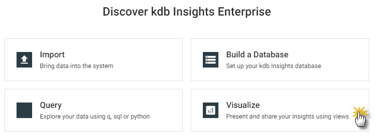
Create a view from Visualize of "Discover kdb Insights Enterprise". -
Click
Designto edit a view. -
Click-and-drag a component into the central workspace - a data grid is a good component to start with.
-
From the component in the workspace click populate Data Source. Inside the opened data editor, choose
APIand select a table generated by a pipeline. Define the date range of the data with startTS and endTS.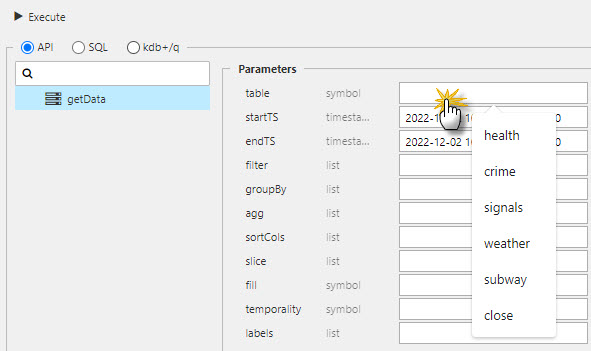
Inside data editor, selectAPI, then from the table menu, select a data table.The startTS and endTS range will be from the Timestamp column as set in the table schema.
-
Continue to build your View by adding components, defining data sources, and arranging the workspace as required.
-
Save and
Previewto view the dashboard. -
Views can be saved to your profile.
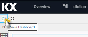
Click the save icon to retain your view in kdb Insights Enterprise.Saved Views
Saved views persist across sessions, but any required update will reset all changes.
-
Share a view with colleagues
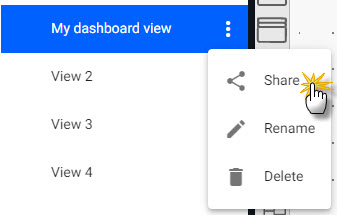
Open a share dashboard view link from the triple dot menu.
Build a view
There are over 40 components which can be added to your View.
A View can be styled in a light or dark theme from the right-hand menu; this Dashboard view will appear when no component is selected (a selected component will have a light-blue border).
To access the Dashboard properties menu, ensure no component is selected in the workspace.
Basics
Define name of dashboard view, link and setup the workspace area.
| item | description |
|---|---|
| Hash | Name of dashboard view. |
| Link | URL reference for view. |
| Hostname(s) access | List of hostnames (comma separated) permissioned to access few; if not set, all hostnames have view access. |
| Enable "Share Dashboard" | Not used by kdb Insights Enterprise. |
| Share Viewer State | When enabled, save current view states for use in next decision. If disabled, default view state values are used. |
| Unsaved Viewer Prompt | Not used by kdb Insights Enterprise. |
| Fill Height | When enabled, view scales to height of browser. When disabled, view height is Column Count * Row Count in pixels. |
| Floatable | When enabled, components can be locked anywhere in the workspace grid. When disabled, components lock from top-down of workspace. |
| Column Count | Define number of column anchor points. |
| Row Count | Define number of row anchor points. |
I want to learn more about the basics of dashboard view.
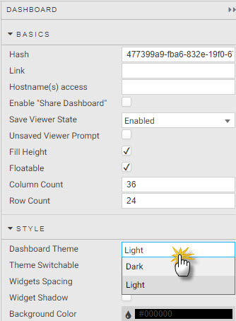
Style
Style components collectively; set border colors, background color and spacing between them.
Set overall styling for the View including light and dark theme, component borders, backgrounds and spacing.
| item | description |
|---|---|
| Dashboard Theme | Define if the View is to be a Light or Dark Theme. |
| Theme Switchable | Check to allow user switch between light and dark themes; uncheck to lock color to selected Dashboard Theme. |
| Widgets Spacing | Set distance between components in pixels. |
| Widget Shadow | Enable for component shadow. |
| Background Color | Define the background color of a component. |
| Transparent Background | Check to enable transparency; uncheck to use Background Color. |
| Border Size | Set width of border in pixels. |
| Border Color | Set color of border. |
| Border Rounding | Apply a rounding to border corners; 0 for no rounding. |
| Border Spacing | Define the amount of space between components; set in pixels. |
| Show Loading Indicators | Checked will show a loading icon when components are accessing data. |
For more on Dashboard view styling.
Popups
I want to learn more about popups.
Shortcuts
I want to learn more about shortcuts.
Notifications
I want to learn more about notifications.
Screens
Add a screen to an existing View. Define the default screen to load with the star icon. New screens start with a blank workspace into which components can be added and data sources assigned.
| button | action |
|---|---|
 |
Delete screen |
 |
Duplicate screen |
 |
Set screen as default on dashboard load |
 |
Edit screen |
 |
Take snapshot image of screen: used by Navigation Component tooltip |
Components
Click-and-drag a component from the left-hand menu into the workspace. When dragging a component into a workspace, be careful not to drop it on top of another as this will replace the underlying component; any such change (or others) can be undone by clicking the undo action in the report menu bar next to the save icon.
| component | description |
|---|---|
| Data Grid | Tabular data display and handling. |
| ChartGL | Hardware accelerated charts using WebGL; supports line, bar, bubble, waterfall, bounds, candlestick, heatmap and baseline charts. |
| Pie Chart | Circular statistical graphic. |
| Radar Chart | 2D multivariate data graphic. |
| Pivot Grid | OLAP drilldown data display. |
| Canvas Chart | Basic line, bar, bubble, candlestick, violin, boxplot and waterfall charts. |
| Breadcrumbs | Navigation element for OLAP data. |
| Data Form | Input display for query parameters; text, dropdown and date picker selectors. |
| Layout Panel | Container for components. |
| Flex Panel | Flexible, two-component container. |
| Tab Control | Tabbed component container. |
| Accordion | Collapsible component container. |
| Drop Down List | Single or multi-select dropdown component. |
| Text Input | A text input component. |
| Selection Controls | Radio or check-box selection control. |
| Date Picker | Date or date-time input. |
| Tree View | A tree-view navigation selection component. |
| Editable List | A custom dropdown menu. |
| Button | Single button supporting multi-action select. |
| Text | WYSIWYG text editor with HTML support. |
| Data Filter | User generated queries; text and dropdown filters (no coding required). |
| Visual Query Builder | Graph-based visual query builder; support for multi-data sources with update, group-by, join, filter and custom functions. |
| 3D Chart | 3D charting (with highlight rule support for 4D); dot, surface, bar, grid and line charts. |
| Sunburst | Sunburst (ring/doughnut) chart for hierarchical data. |
| Bitmap | Bitmap generated chart. |
| Treemap | Treemap or heatmap data graphic. |
| Graph | Network/Flow relationship map. |
| Map | Map component featuring Google maps. |
| Mapbox | Map component with 3D overlay driven by Mapbox. |
| Financial Chart | International financial charting component; OHLC, Line, Candlestick, Mountain, Heikin Ashi, Kagi, and over 20 technical indicators and user annotation support. |
| Code Editor | Embeddable code editor with support for json, plaintext, handlebars, html, java, javascript, markdown, python, r, sql, typescript, xml, and q. |
| Bipartite Chart | A chart of two independent data sets, with relationship connections between the data sets. |
| Range Slider | A data range selector; interval or time. |
| Playback | A multi-control stream player suitable for video content, interval or time sequence data playback. |
| External Content | Embed web page content. |
| Video | Add video content to a dashboard. |
| Vega Chart | Support for Visualization Grammar charts. |
| Analyst Visual | Embed a KX Developer graphic into a chart. |
| Scatter | Add a quartet or matrix graphic. |
| Contour | Add a contour graphic; plotting 3D data in 2D. |
| Blob Download | Download files from byte array in database. |
| Luna | A high-performance temporal geospatial visualization graphic. |
| Trade | Add a Forex trade panel with TWAP and VWAP support and tick updates. |
| Form Builder | Create a custom form for users. |
Data dialog
Each View has a set of queries to return data; queries are listed in the left-menu of the Data Dialog.
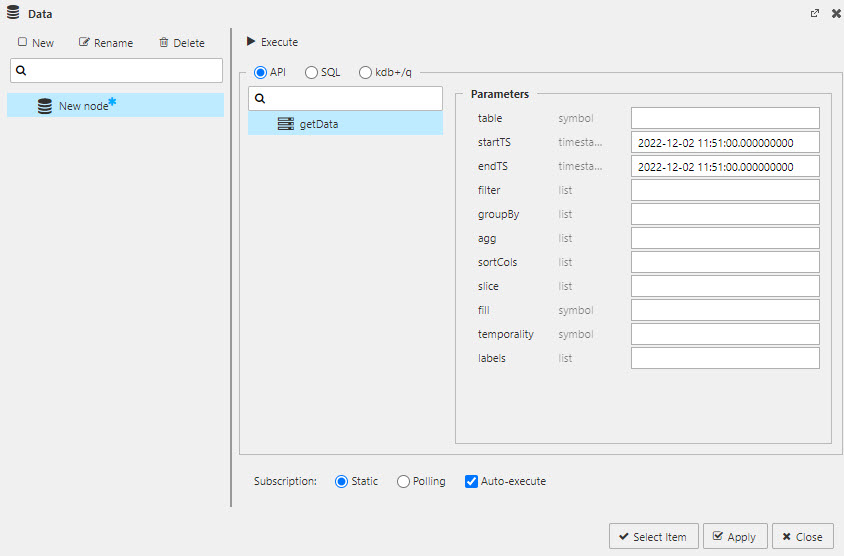
The Data Editor with getData API selected.
What is a Query?
A query is how data is returned to kdb Insights Enterprise. A query can use an (getData) API, with its click-and-set properties, or a code editor with support for q and SQL.
How do Labels work?
You can query data with API Labels; labels are defined in the database. You can use a label to select data from a particular table when data column names are shared across multiple tables.
Set up
-
Open the data dialog. This can be done with:
- "Click to populate Data Source" or
-
Select Data Source in Basics Properties; for Charts, the Data Source is available under Layers - Basics.
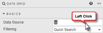
Click on the data source property, or "Click to populate Data Source" of the component to get data into the component.
-
Create a new data query.
Query data directly - without requiring code - with the
API.Select a
tablefrom the active data sets stored on your database. Define the startTS and endTS from thetimestampcolumn in yourtable; it can be helpful to use the scratchpad to get the date range.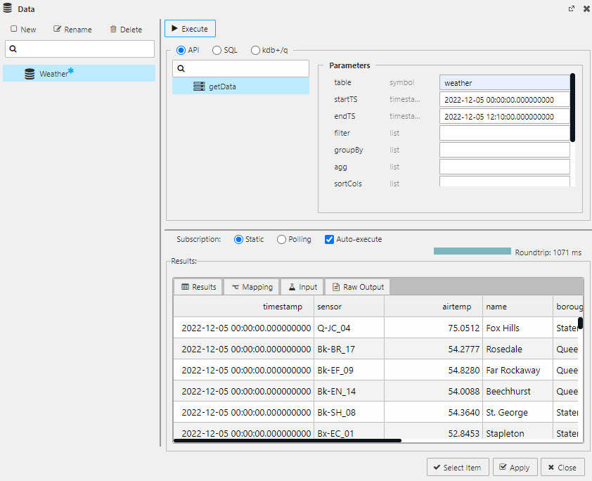
Querying data with theAPI. Select database table name and define the startTS and endTS as found in the dataTimestampcolumn.parameters description table* table name as referenced in the database (from the pipeline) startTS* Start time of returned data. If a preset date range is required for a View, set temporality property to sliceand define the slice property for start time.endTS* End time of returned data; defaults to today's date. If a preset date range is required for a View, set temporality property to sliceand define the slice property for end time.filter define by (function;columnname;parameter), for example >;valuecolumn;100to filter "valuecolumn" to values above 100. Selected functions include>,=or<and can include text values; for example=;name;Jimwill return rows of data where the "name" column contains 'Jim'.groupBy Select data column(s) for grouping data. agg Define columns to select: `price`size, an aggregation`col1`avg`price, or a dict(ionary) aggregation`col1`avg`price;`col2`sum`size.sortCols Sort results by selected column. slice Sets the time range for startTS and endTs when sliceis set for temporality.fill How to handle nulls in the data. Select between zeroto treat nulls as zeroes, orforwardto carry forward a previous, non-null value.temporaility Set to sliceif data returned is between a defined startTS and endTs; use the slice property to set the date range. Set tosnapshotfor a continous range of data.labels Where data columns are shared across different tables an (optional) label can be applied to restrict returned data. For example, table1has aregionproperty for 'north america' andtable2has aregionproperty for 'europe', then a label ofregion:europewill return data fromtable2only. Data can be returned from tables in different databases.*required
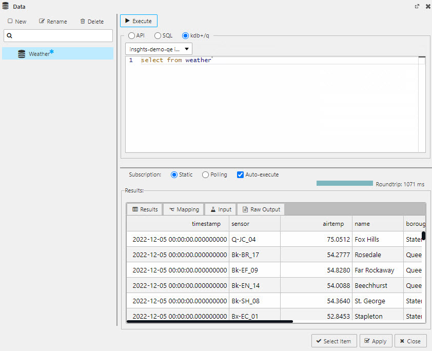
Use the code editor to write SQL
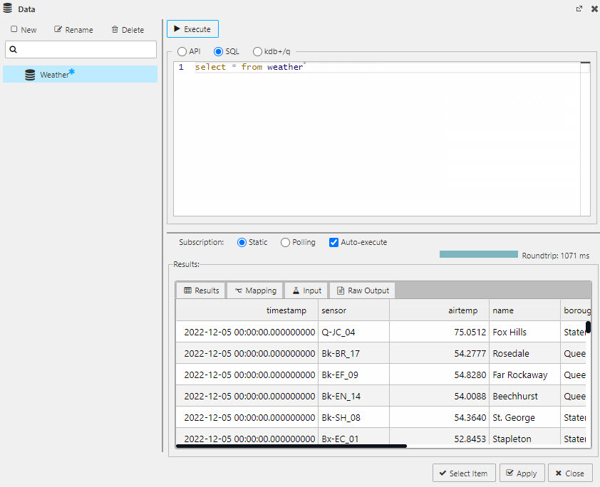
Querying data with theSQLeditor. Use a simple "select * from tablename" as a starter.select * from tablenameUse the code editor to write q/sql
Querying data with theqeditor. Use a simple "select from tablename" as a starter.select from tablenameI want to learn more about using view state parameters.
I want to learn more about the getData API.
I want to learn about writingqcode.
I want to learn about writingSQLcode. -
Execute to return Results in the lower panel of the dialog.
Execute to run a query. Results will load in the lower panel of the editor dialog. -
Apply and Select to add data to the component.

Apply and Select to return data to the component.
Subscription
Static
A single request for data; runs on every Execute.
Polling
A client-side poll of the database.
| option | effect |
|---|---|
| Interval | Set the time between each poll request (in seconds) |
| Key | Select which data source column to define subscription handling; for example, by column in situ, or by time for a streaming update. |
| Force Reset | When enabled (by default) the existing dataset is cleared on each update from the database, regardless of whether a parameter has changed or not. When disabled, merges updates from the database with the existing dataset, unless a parameter is changed in which case the existing dataset is cleared. |
Auto-execute
True by default. The query will run whenever there is a parameter change or on load if data mapping is used.
When auto-execute is false, parameter changes won't run the query unless its associated with a component, e.g. a data grid or as an action tied to a button.
Mapping
Access Mapping from a tab in the data editor. Mapping takes a Value from a column (Key) and maps it to a View State. Additional mapping actions can be added with [+].
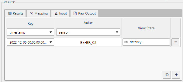
Mapping a _Value from a column Key to a View State parameter._
 will create a map of Values for all available Keys.
Input
This is the raw output of the query.
{"table":"weather","startTS":"2022-12-05T00:00:00.000000000,"endTS":"2022-12-05T23:59:00.000000000"}
Raw output
This is the raw output of the results; includes kdb+ type information.
{"primaryKey":"_rowIndex","columns":{"collection":[{"id":"timestamp","index":0,"kdbType":12},{"id":"sensor","index":1,"kdbType":11},{"id":"airtemp","index":2,"kdbType":9},{"id":"name","index":3,"kdbType":11},{"id":"borough","index":4,"kdbType":11},{"id":"longitude","index":5,"kdbType":9},{"id":"latitude","index":6,"kdbType":9},{"id":"color","index":7,"kdbType":11}],"reset":[{"id":"timestamp","index":0,"kdbType":12}
View states
View States are used to store values and states. They can be used to store user preferences or pass values into queries.
View States are edited from the View State dialog. The View State dialog can be accessed by clicking on  anywhere in the View
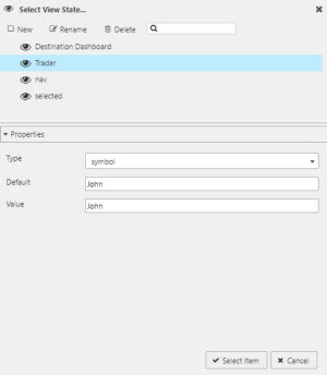
Select View State dialog showing a selected View State and its properties
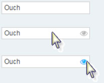
Hidden eyes
View states can also be assigned to properties where is hidden; such properties will reveal the icon on rollover.
Use in Data Dialog
In the code view of the data editor, view states are used to add variable inputs; for example, from a drop down, date picker or data form component.
Map view states with {{}}; for example
select * from mytable where datavariable = {{viewstate}}
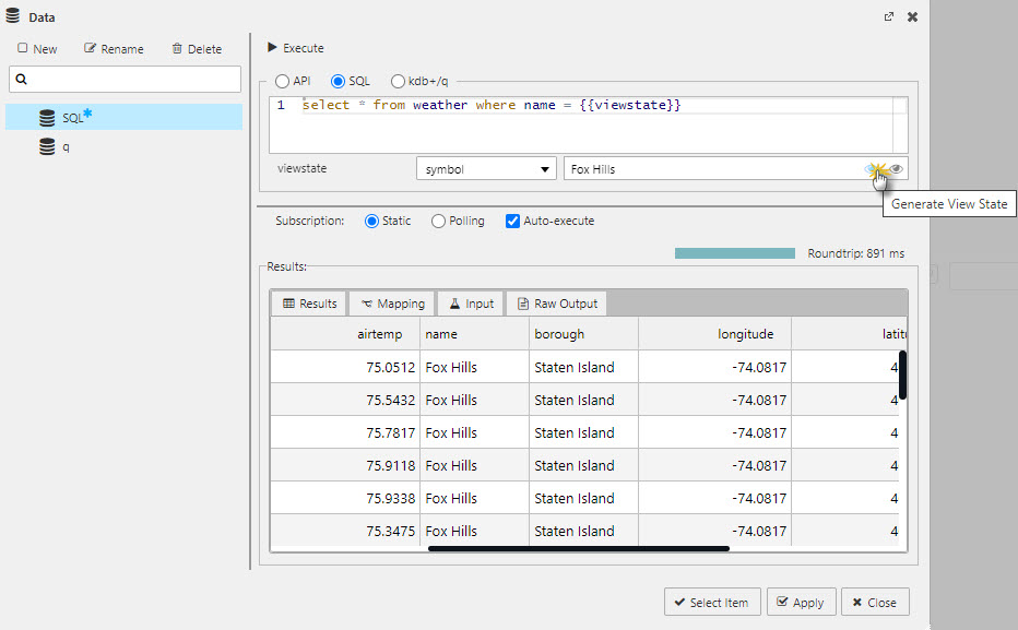
An example of adding a viewstate to a SQL query; example used is the weather data set.
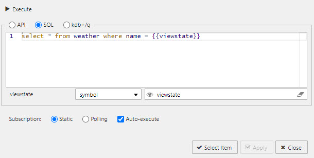
A mapped viewstate for SQL.
Map view states as a q function; for example
{[viewstate] select from mytable where datavariable = viewstate}
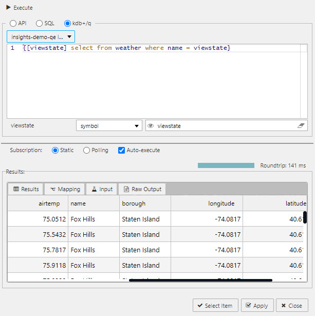
An example of adding a viewstate to a q query; example used is the weather data set on the idb database.
Selected values
View state routing
Component linking
Actions
Action is a common property set used to configure a view state, run a query or open an URL.
Highlight rules
Highlight rules are a common property utilizing color and/or icon markers to notify users of value changes. Highlight rules are best used with real-time streaming, or polling data.
Additional information
For more on Dashboards