Layout Panel#
This page describes the Layout Panel component and how it can be set up and configured.
Layout panels are used to nest components within the dashboard. You can add them to any panel component or directly to the dashboard itself.
Layout Panels are best used within Flex Panel, Tab Control and Accordion components or to create elements like navigation menus.
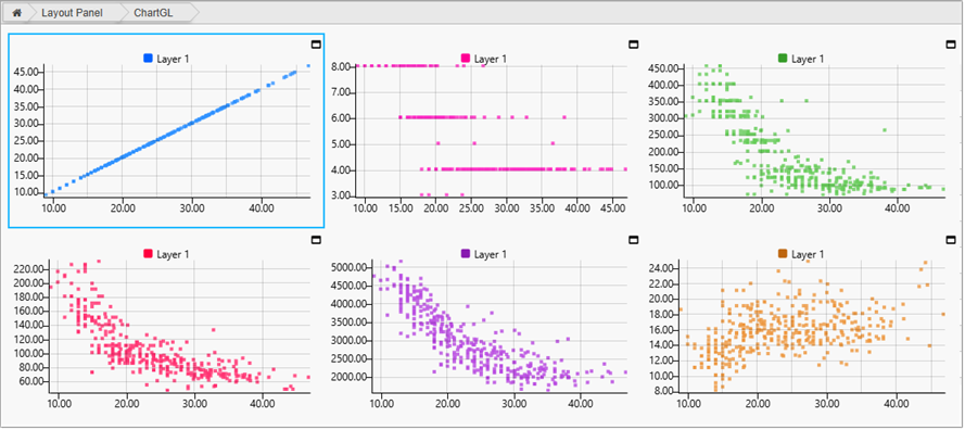
You can add any component to a Layout Panel. The following example shows a Layout Panel with multiple Chart GL components.
This page provides information on the following:
For details on common properties used by this component refer to the following:
Set up#
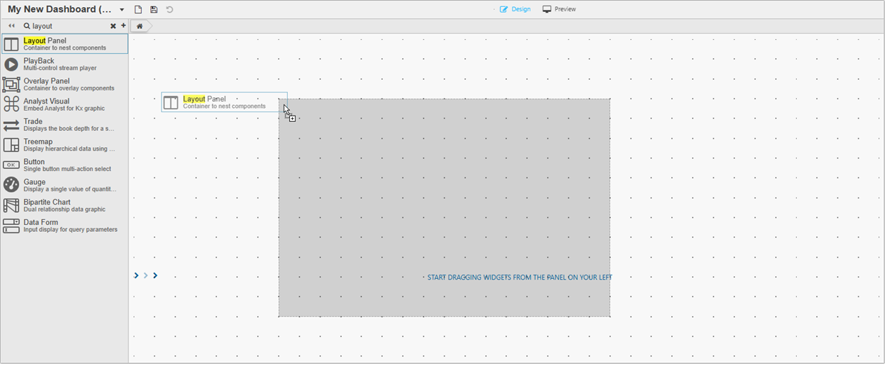
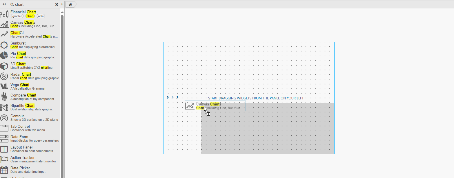
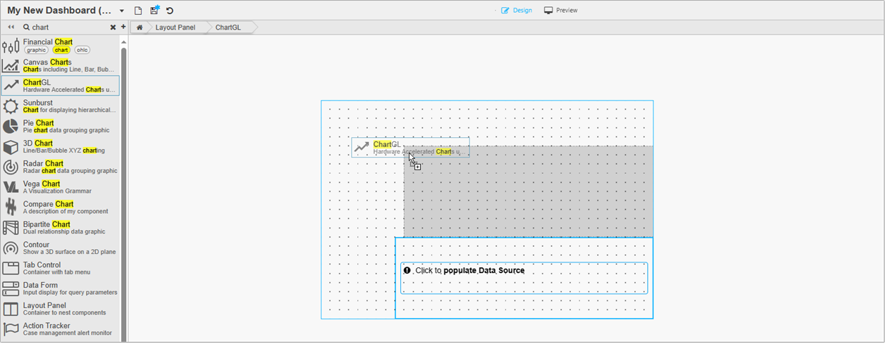
To set up a Layout Panel:
-
Click and drag a Layout Panel into the workspace.
-
Click and drag a component to the Layout Panel. This fills the area of the Layout panel, but can be resized to add additional components.
-
To add additional components, click and drag them from the left-hand panel and drop them within the boundary of the Layout Panel.
-
Next, configure the Basics properties.
Basics#
Open the Basics properties on the right and configure the properties described in the following table.
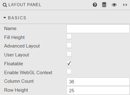
| Property | Description | Default |
|---|---|---|
| Name | Enter a name for the component. | Blank |
| Fill Height | When checked, this auto sizes nested components to fill the height of the Layout panel. If this is unchecked Row Count becomes Row Height. It is recommended to enable this after adding all required components to the panel |
Checked |
| Advanced Layout | This is used to best-fit components according to panel width. Components stack on resizing. CSS can be used to position components and use fixed-sizing to prevent component resizing on changes in browser width. Use .advanced-item[data-widgetid="xxxx-xxxx-xxxx-xxxx"] {} to configure Advanced Layout CSS. 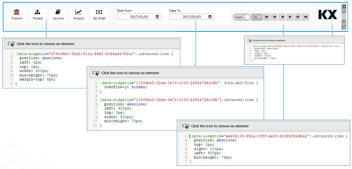 When both Fill Height and Advanced Layout are enabled, only Advanced Layout rules applies. |
Checked |
| User Layout | This allows for user arrangement of components. When checked, users can add, remove and reposition components. Refer to User Layout for further details. | Unchecked |
| Floatable | When enabled, an added component snaps to the nearest row anchor. Otherwise, the component always snaps to the top row. | Checked |
| Enable WebGL Context | When enabled, every ChartGL widget that is directly added to the Layout Panel shares a single WebGL context. | Unchecked |
| Column Count/Row Count/Row Height | These define the Layout Panel grid size. Components added are locked in position to this grid. The grid is visible when a component is dragged into position. Row Height is displayed when Fill Height is unchecked. This is the height in pixels between each grid row. 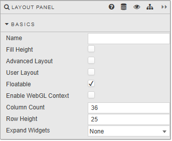 The number of grid rows used is defined by the prior Row Count value; for example if Row Count is 30 and Row Height is set to 30; then the distance from top to bottom - in the absence of Fill Height - is 900 pixels; that is 30 x 30. If the pixel height is greater than the browser height, a scroll bar appears and some components may be positioned off-screen. |
|
| Expand Widgets | This controls whether users can expand and collapse widgets within the Layout Panel. The options are: None: The expand button is not displayed. Fill Dashboard: The expand button is displayed, and when clicked the widget fills the entire dashboard. Fill Panel: The expand button is displayed, and when clicked the widget fills the space of the Layout Panel. The following screenshot shows a Layout Panel with 6 ChartGL components with Expand Widget set to Fill Panel. 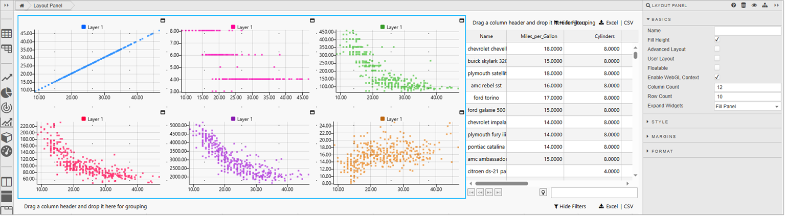 In Preview mode you can see that each widget has an expand icon in the top right-hand corner of the widget. 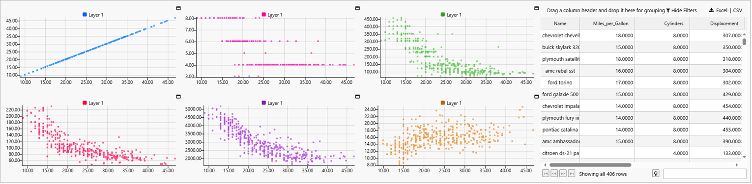 When you click on the expand icon the widget expands to fill the entire panel, as shown below. 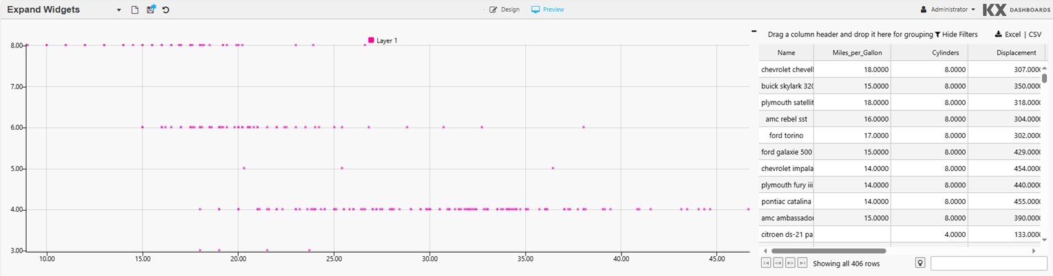 |
None |
Auto size components
Unless you have a reason to lock the size of components dropped into a Layout panel, check both Fill Height and Advanced Layout. This ensures the components in your Layout panel auto size along with the Accordion or Tab Control section that contains it. Refer to Basics for further information about these properties.
User Layout#
-
Enable User Layout by clicking User Layout in the Basics properties.
-
Save the Dashboard.
-
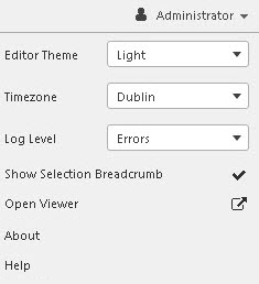
Click Open Viewer, in the User Menu, shown below, to open the dashboard in a new window.
-
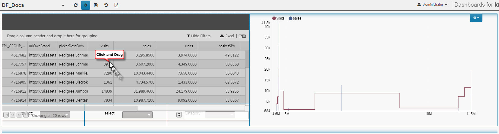
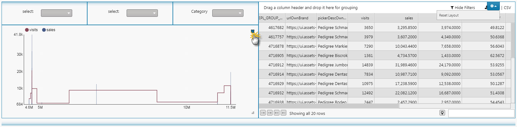
Click the Customise Dashboard icon, as shown below. This adds a Component Layout icon to the top right-hand corner of the panel
-
The components are now movable and can be repositioned. The following shows the position of the components has been swapped around.
-
Components can be deleted.
-
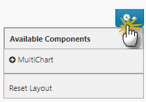
Components that have been removed (and hidden) can be returned (or included) by clicking on the Component Layout button and selecting them from the list. Components are identified by their title, user-defined name or component type, and in that order of preference. Clicking Reset Layout restores the layout of the components to their original state.
-
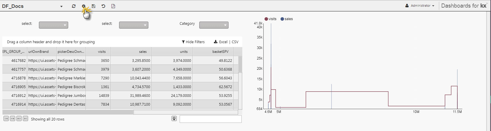
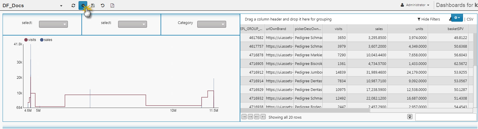
Once complete, click the settings icon
-
Click the Save Viewstate icon to save the new layout.
Style, Margins, Format#
Refer to Style for common Style, Margins and Format settings.