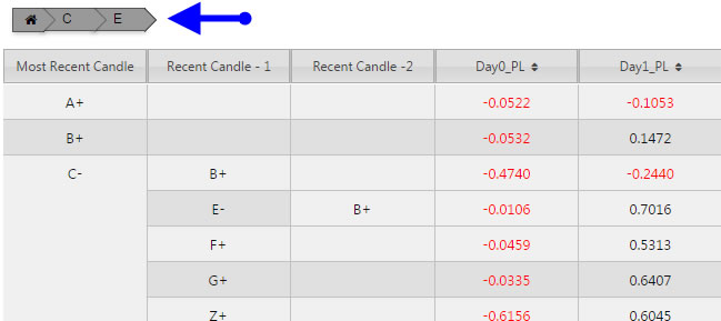
Breadcrumbs#
A screen control that can be used for Pivot/OLAP navigation
Set up#
-
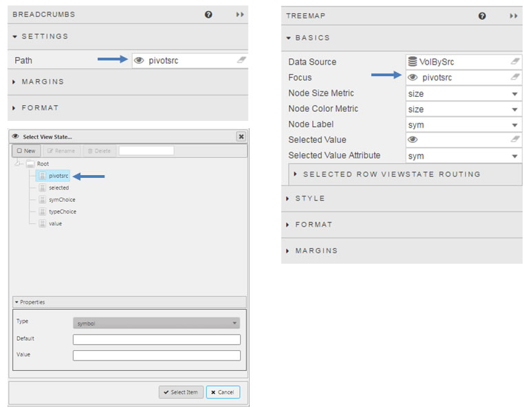
Assign a view state to the Path property. When using the Breadcrumbs component for Pivot/OLAP navigation, this viewstate is shared with the Focus property of the Pivot Grid.
-
Assign a view state of type
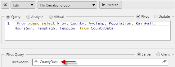
listto the Visible Breadcrumbs property. The value of this view state depicts the order of the visible breadcrumbs. When using the Breadcrumbs component for Pivot/OLAP navigation, this viewstate is shared with the Breakdown Cols field in the Pivot Grid's Data Source/Pivot Query section.
Settings#
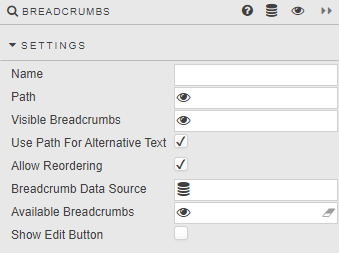
- Name
- A name for the component provided by the user.
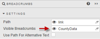
- Path
-
- With comma separated values or values from a list data type.
- Each value corresponds to the sequential list of visible breadcrumbs.
- Instead of using the Visible Breadcrumbs property for the breadcrumb text, the value from the Path property provides the text to be displayed, if a value is present and the Use Path For Alternative Text is checked. Otherwise, the text comes from the Visible Breadcrumbs property.
-
When using the Breadcrumbs component for Pivot/OLAP navigation, e.g. charts and Pivot Grid, this view state shares their Focus setting.
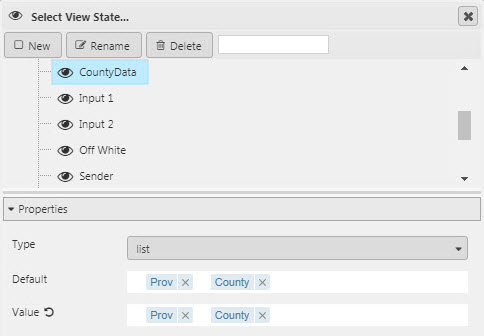
- Visible Breadcrumbs
-
A View State Parameter of
listdata type:- These values represent the sequential list of visible breadcrumbs in the order that they appear.
-
When using the Breadcrumbs component for Pivot/OLAP navigation, e.g. charts and Pivot Grid, this view state shares their Breakdown setting.
- Use Path For Alternative Text
- When checked, instead of using the Visible Breadcrumbs property for the breadcrumb text, the value from the Path property provides the text to be displayed, if present. If there is no corresponding value for a breadcrumb, the text will come from the Visible Breadcrumbs property.
-
When unchecked, the text of each breadcrumb comes solely from the values of the view state that has been assigned to the Visible Breadcrumbs property.
- For Pivot/OLAP navigation to use the data source column names in the breadcrumbs, uncheck the Use Path For Alternative Text property.
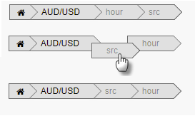
- Allow Reordering
-
When checked, each breadcrumb listed in the Visible Breadcrumbs view state can be reordered using drag and drop or the Edit Breadcrumbs dialog.
- Breadcrumb Data Source
-
(Optional) The list of values returned by the data source assigned to this property provides a complete set of breadcrumb elements available for use by this component. The first column in each row returned by this data source becomes a breadcrumb element. This property is only available when the Allow Reordering property is checked.
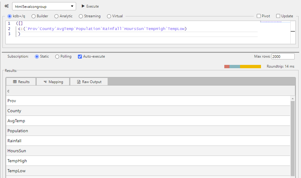
([]
        c:(`Prov`County`AvgTemp`Population`Rainfall`HoursSun`TempHigh`TempLow)
)
- Available Breadcrumbs
-
(Optional) As an alternative to the Breadcrumb Data Source, users can assign a view state parameter of type
listto provide a complete set of breadcrumb elements available for use by this component. However, if the Breadcrumb Data Source is defined, that setting will supersede this property. This property is only available when the Allow Reordering property is checked.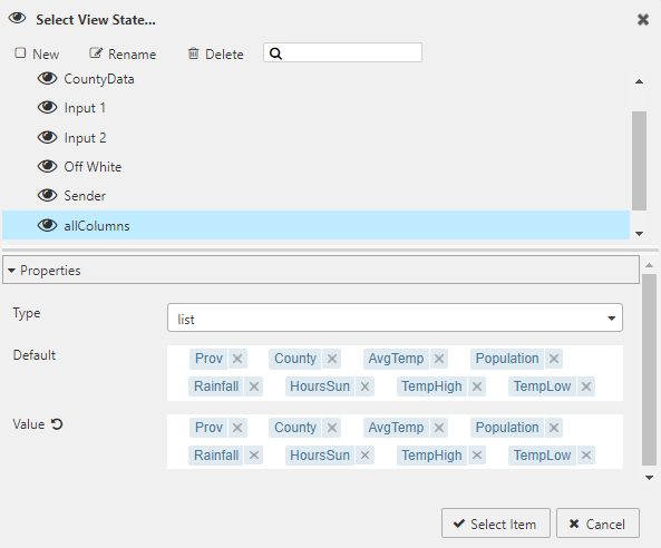
- Show Edit Button
-
When checked, displays the Edit button
 to the left of the Home icon. This property is only available when the Allow Reordering property is checked.
Edit Breadcrumbs dialog#
Clicking on the Edit button will bring up the Edit Breadcrumbs dialog. This dialog allows users to add, remove and change the order of the breadcrumbs.
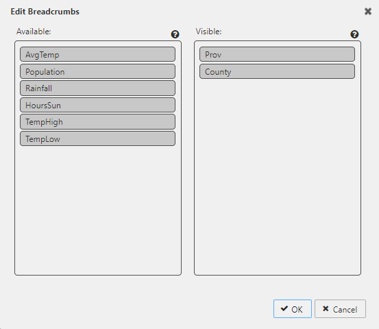
- Available
- This section contains a list of breadcrumbs that are available but not visible in the Breadcrumbs component. To make an available breadcrumb visible, drag and drop it from the Available breadcrumbs list to the Visible breadcrumbs list.
- Visible
- This section contains a list of the visible breadcrumbs in the order that they will appear. To rearrange the list, drag and drop the breadcrumbs within this section.
- To remove a visible breadcrumb, drag and drop it from the Visible breadcrumbs list to the Available breadcrumbs list.
- Warning Icon
-
A warning icon may appear to the right of a breadcrumb element in the Available list when a breadcrumb is moved from Visible to Available.
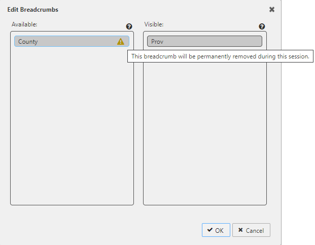
-
This occurs if one of the following is true:
- The Breadcrumb Data Source or Available Breadcrumbs property is not defined.
- The breadcrumb element exists in the Visible Breadcrumbs viewstate but it is not found in the complete set of breadcrumbs defined by the Breadcrumb Data Source or Available Breadcrumbs property.
-
In either case, any breadcrumb element displaying a warning icon will be permanently removed during the session when the user commits their change by clicking the OK button.
Component behavior#
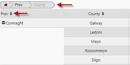
- Breadcrumbs with a corresponding value in the Path property can be clicked on and rearranged.
- Breadcrumbs without a corresponding value in the Path property can only be rearranged.
- When the user clicks on a breadcrumb with a corresponding value in the Path property, the path will be truncated to that point.
Style#
Style for common settings