Selection Controls#
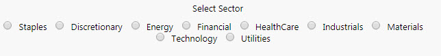
Some Radio Buttons
Set up#
-
Use a data source to define the items in the selection control.
-
Define in the mapping which column represents the text labels in the selection control, and which column is the value passed to the view state on selection.
-
Set the Selected Value as a view state parameter which carries the value of the selected item.
Basics#
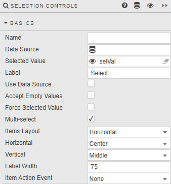
- Name
- A name for the component provided by the user.
- Data Source
-
A data source: include the list of values to pass into the linked View State Parameter and possibly a list of value names to display in the dropdown. For example:
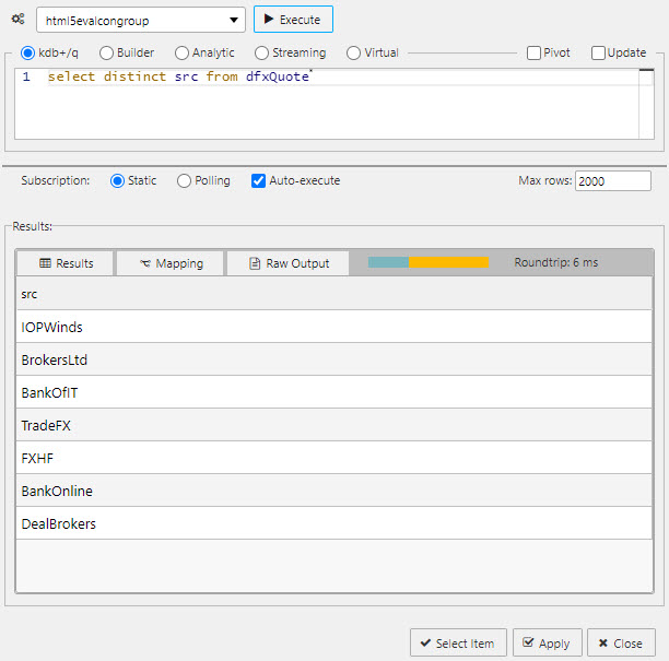
A query for a Radio Button data sourceTip
When using Data Source to create a set of radio buttons, ensure Use Data Source is checked and Data Source Mapping is defined.
-
A sample query to use is (if connecting to the sample data connection source
htmlevalcongroupavailable in the sample demo dashboard set):q select distinct src from dfxQuote - Selected Value
-
The view state parameter populated on selection.
- Label
- Label description for the Radio Button
- Use Data Source
- When checked, Data Source is used to build a Radio Button
- Accept Empty Values
- When checked, a null value is available for selection
- Force Selected Value
- When checked, the Radio Button will always populate a Selected Value View State Parameter; either default or selected value (which may be null if not set).
- Multi-select
-
When checked, multiple radio button selections are supported and selected items passed to the Selected Value View State Parameter.

- Items Layout
- Configure Radio Button layout:
HorizontalorVertical - Horizontal
- Radio button alignment:
Left,RightorCenter - Vertical
- Radio button alignment:
Top,MiddleorBottom - Label Width
- Width of the main label
- Item Action Event
- Sets the type of action event when useDatasource is set to false
- none : (default) no action when changing a selection
- always : always runs actions when changing a selection
- index - only run actions when changing to the selected index
- value - only run actions when changing to the selected value
Data source mapping#
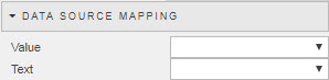
When a Data Source is used to populate Radio Buttons, the items of the Data Source will represent values. Labels must be assigned using Data Source Mapping – else the list will be empty.
- Value
- The column of the Data Source corresponding to the values to be passed into the Selected Value View State Parameter
- Text
- The column of the Data Source corresponding to the text to be displayed as the dropdown options
Items#
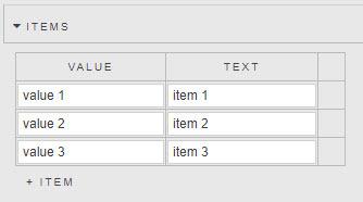
If Data Source is not used to create Radio Buttons, individual values can be specified in the Items menu.
Action#
Style#
Template
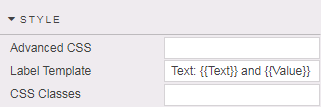
-
Sets the label text for each selection item. The parameters passed to the template depend on whether Use Data Source is enabled.
- if using a data source then the parameters reflect the column names
- if inputting items manually then Text and Value parameters are passed
Format, Margins#
Style for common settings