Contour#
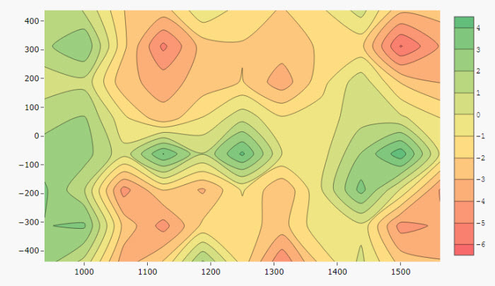
Contour plots are a way to show a three-dimensional surface on a two-dimensional plane.
Set up#
-
Add a data source.
-
Define the X- and Y-Axis to plot.
-
Shading is defined by the Z-axis and the color gradient. Use the Tick interval to set the gap in the number of display labels for the z-axis.
Basics#
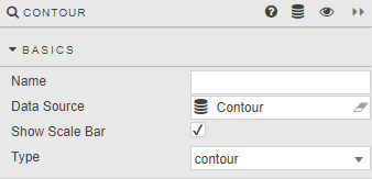
- Name
- A name for the component provided by the user.
- Data Source
- Data sources
- Show Scale Bar
- Display scale for the response (contour) variable, Z-axis.
- Type
-
Select between
contourorheatmap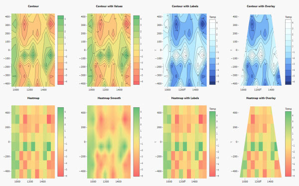
X-, Y- and Z-Axis#
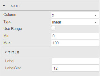
- Column
- Select data column from Data Source.
- Type
- Select axis type:
linear,categoryordate;categoryanddateare only available forheatmapType contour charts. - Use Range
- Min
- Max
- Set axis range values, axis will default to data range if not set.
Z-axis
Determines the line interpolation and contour colors as defined by range Min and Max, or default data minimum and maximum.
Title#
- Label
- Label Size
- Give axis a name and set the font size.
Layout#
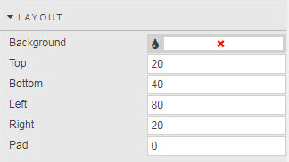
- Background
- Set color background of chart
- Top
- Bottom
- Left
- Right
- Set chart margins (pixels)
- Pad
- Set central chart image padding (pixels)
Palette Theme#
Contour Palette#
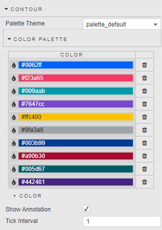
- Sets the number of colors used in the range; range values will be spread evenly across the number of defined colors.
- Show Annotation
- Adds overlay of contour values
- Tick Interval
- Define tick label frequency on gradient bar.
Tooltip#
- Show Tooltip
- Default to display of x-, y- and z-axis (shade) values; defined in Custom Tooltip.
- Custom Tooltip
- Create a custom tooltip; default sample tooltip used by Show Tooltip.
Image#
- Source
- Replace map with an image sourced from an URL. Can be a view state parameter
Style, Margins, Format#
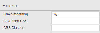
- Line Smoothing
- Determines line smoothing; a value of zero reflects no smoothing, 100 is maximum smoothing.
Style for common settings