Bipartite Chart#
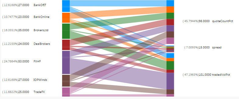
A unique two-way interactive chart featuring two independent data sets and associated relationships. Compatible with Pivot/OLAP data.
Basics#
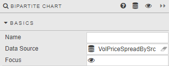
- Name
- A name for the component provided by the user.
- Data Source
- Data sources
- Focus
- A View State Parameter for linking components
Actions#
LHS Data#

- Series Key
- A Data Source column: the independent variable to categorize right-hand dependent variables
RHS Data#
Data#
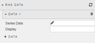
- Series Data
- A Data Source column to include in the right-hand data set
- Display Name
- For Column
Labels#
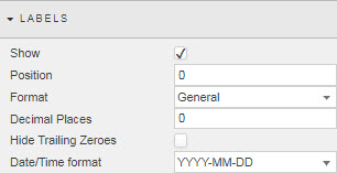
- Show
- Display Bipartite labels
- Position
- Adjust label position in pixels
- Format
- Define format of Data labels. Select from
General,Number,Smart Number,Formatted Number,Datetime - Decimal Places
- Define number of decimal places for number formats
- Hide Trailing Zeroes
- Remove excess zeroes at the end of the number
- Date/Time format
- For
Datetimeformat - Width
- Pixel width between chart and chart value (occupied by the label)
Values#
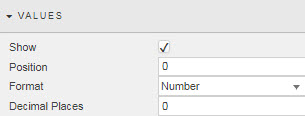
- Show
- Display Bipartite values
- Position
- Adjust position of values in pixels
- Format
- Define format of Data labels. Select from
General,Number,Smart Number,Formatted Number,Datetime - Decimal Places
- Define number of decimal places for number formats
- Width
- Pixel width between value and label.
Percentages#

- Show
- Display relative data distribution percentages
- Position
- Adjust position of percentage values in pixels
- Width
- Pixel width between percentage label and value label.
Padding#
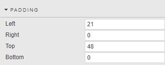
- Left
- Right
- Top
- Bottom
- Set padding of bipartite chart within the component
File export#
Style#
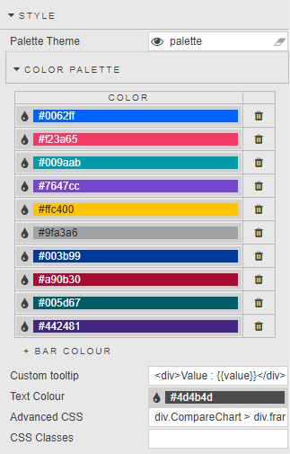
- Custom Tooltip
- Custom tooltips
- Advanced CSS
- Advanced CSS
- Text Color
- Defines color of labels.
- CSS Classes
- Can be applied to style component
Style for common settings
Format, Margins#
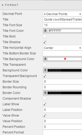
Style for common settings