Guide to Building Views
This page provides a detailed guide to building visualizations using Views.
kdb Insights Enterprise Views enable you to build visualizations that help you to understand complex data. This page follows on from the quick-start guide and provides more detailed instructions on setting up Views. For examples of the types of views that you can access see demo views.
The following sections explain how to create, configure, and share Views.
Views & Dashboards
In the context of kdb Insights Enterprise Web Interface the terms Dashboards and Views are synonymous.
Views-only users
For users with the views-only role, Views provide a secure way to explore and interpret data without the ability to alter it. These users can open and interact with the Views, such as filtering or drilling down into data but cannot create, edit, or delete any visualizations or underlying queries. Refer to the web interface for views-only users for details.
Create a View and add a component
-
Before you can create a View, you must deploy the following:
-
Create a new View in one of the following ways:
-
click + on the ribbon menu and then click on View
-
click the + beside Views on the left-hand panel
-
click Create View in the Views index
-
click Visualize on the Overview page, as shown below
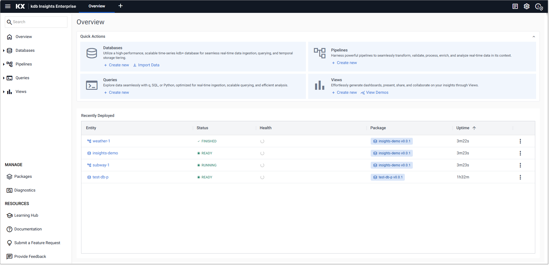
The Create View dialog opens.
-
-
In the Create View dialog:
SETTING DESCRIPTION View Name Enter a name for the View. The name must be unique inside the package, be between two and 32 characters long, have a combination of lowercase, uppercase, hyphens and spaces, and start and end with an alphanumeric character. Add to Package Choose the package to add this view to. Alternatively, click Create new package in the drop-down list. Add Folders and Tags Optionally add folders and tags to your View. While not required, they help organize multiple Views more effectively. For more information, see Folders and Tags
- Click the dropdown to open the full list of available folders and tags and scroll to browse through them.
- Click on a folder or tag to add it to the View. Once selected, a folder or tag cannot be selected again.
- Alternatively start typing in the field. Matching folders and tags appear in a filtered list for quick selection.
- If no matching filters or tag exists, continue typing your desired name and press Enter.
- Tags must be between 2 and 20 characters long, start with an alphanumeric character or emoji, and may only contain letters (uppercase or lowercase), numbers, hyphens (-), underscores (_), or emojis.
- Folders start with a forward slash
Tags must be between 2 and 20 characters long, start with an alphanumeric character or emoji, and may only contain letters (uppercase or lowercase), numbers, hyphens (-), underscores (_), or emojis.
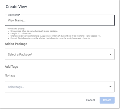
- Repeat the process to add multiple tags as needed.Folders and Tags are displayed in a column of the Index of views and the header of each View. In the example below, the
derivative-positionsView shows the tagsderivative,positions, andoptionsin its header.
 |
|Folders are also added to the left-hand menu of the web interface.
-
Click Create to open a new View workspace.
-
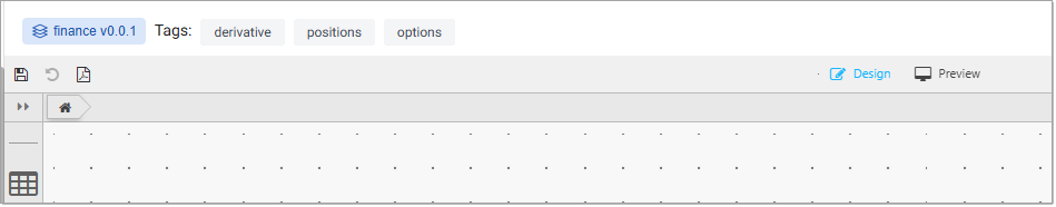
Click Design at the top of the workspace to design and edit your view.
-
Click-and-drag a component into the central workspace. A Data Grid is a good component to start with, as shown here.
Breadcrumbs at the top of the workspace indicate the selected item and the package its contained in, for example, Data Grid. Click on the package name to open the package entities dialog, showing all the entities in the same package.
-
With the new component selected, Click to populate Data Source to open the data editor.
For this example, choose API and select a table generated by a pipeline. Define the date range of the data with startTS and endTS.
The startTS and endTS range are from the Timestamp column as set in the table schema.
-
Continue to build your view by adding more components, defining data sources, and arranging the workspace as required.
-
Click Preview at the top of the workspace to interact with your dashboard.
-
Click the Undo icon, in the top left-hand corner of the workspace, at any stage to undo any actions taken.
-
Click the Save Dashboard icon, in the top left-hand corner of the workspace, and name the View.
Saved Views
Saved Views persist across sessions, but any required update reset all changes.
Save a View as a pdf
To save a view as a pdf:
-
Click the Generate pdf document icon, in the top left-hand corner of the workspace. A Print
dialog is displayed, allowing you to choose the pdf print size. -
Enter a file name, select a pdf width, and click Print.
OPTION DESCRIPTION File Name Enter a name for the pdf file. PDF Width Choose a width for the pdf:
-Standard- Generates a pdf with the dimensions 1920 x 1080.
-Current preview- Generates a pdf with the same dimensions as the current view. Use this option to ensure the exported PDF matches the on-screen view width.
A status indicator is displayed showing the progress of the PDF generation. The generated PDF file opens in a new browser tab where you can view or save it.
Exporting data and generating pdfs: role-based permissions
To save dashboards as PDF and export data to CSV, Excel, and PNG, you need the insights.builder.report.export role, included in the Viewer preconfigured role. For more details on roles, refer to keycloak permissions.
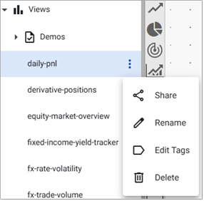
View Actions
Click on the three dots beside the View name on the left-hand menu or on the Views index, to access the view actions:
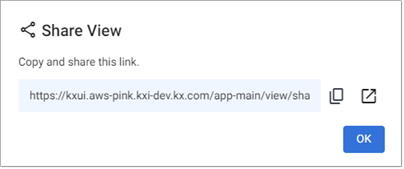
Share a View
To share any of the Views you have created:
-
Click on the three dots beside the View name on the left-hand menu or on the Views index, and click Share.
-
The View link is displayed in the Share View dialog. Copy the link displayed, or open the link in a new tab. Anyone you share with must have read access to view the Views you share with them.
-
Click OK when done.
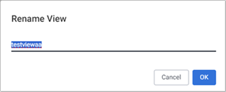
Rename a View
To rename any of the Views you have created:
-
Click on the three dots beside the View name on the left-hand menu or on the Views index, and click Rename.
-
Enter a new name in the Rename View dialog and click OK.
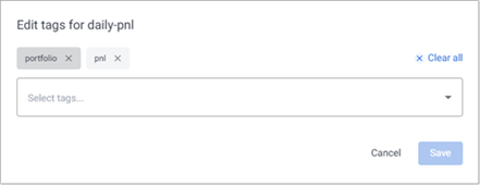
Edit Folders and Tags
To edit the folders and tags assigned to a view:
-
Click on the three dots beside the View name on the left-hand menu or on the Views index, and click Edit folders and tags.
-
To add a new folder or tag, you can:
- Start typing a name that meets the following conditions:
- Folders start with a forward slash (/) and contain only letters (A–Z, a–z), numbers (0–9), emojis, hyphens (-), or underscores (_).
- Tags contain only letters (A–Z, a–z), numbers (0–9), emojis, hyphens (-), or underscores (_).
- Or select an existing tag from the dropdown list.
- To remove a folder or tag, click the x icon next to it.
- To remove all folders and tags, click Clear all.
- Click Save to apply your changes.
- Start typing a name that meets the following conditions:
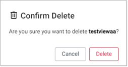
Delete a View
To delete any of the Views you have created:
-
Click on the three dots beside the View name on the left-hand menu or on the Views index, and click Delete.
-
Click Delete in the Confirm Delete dialog.
Configure View properties
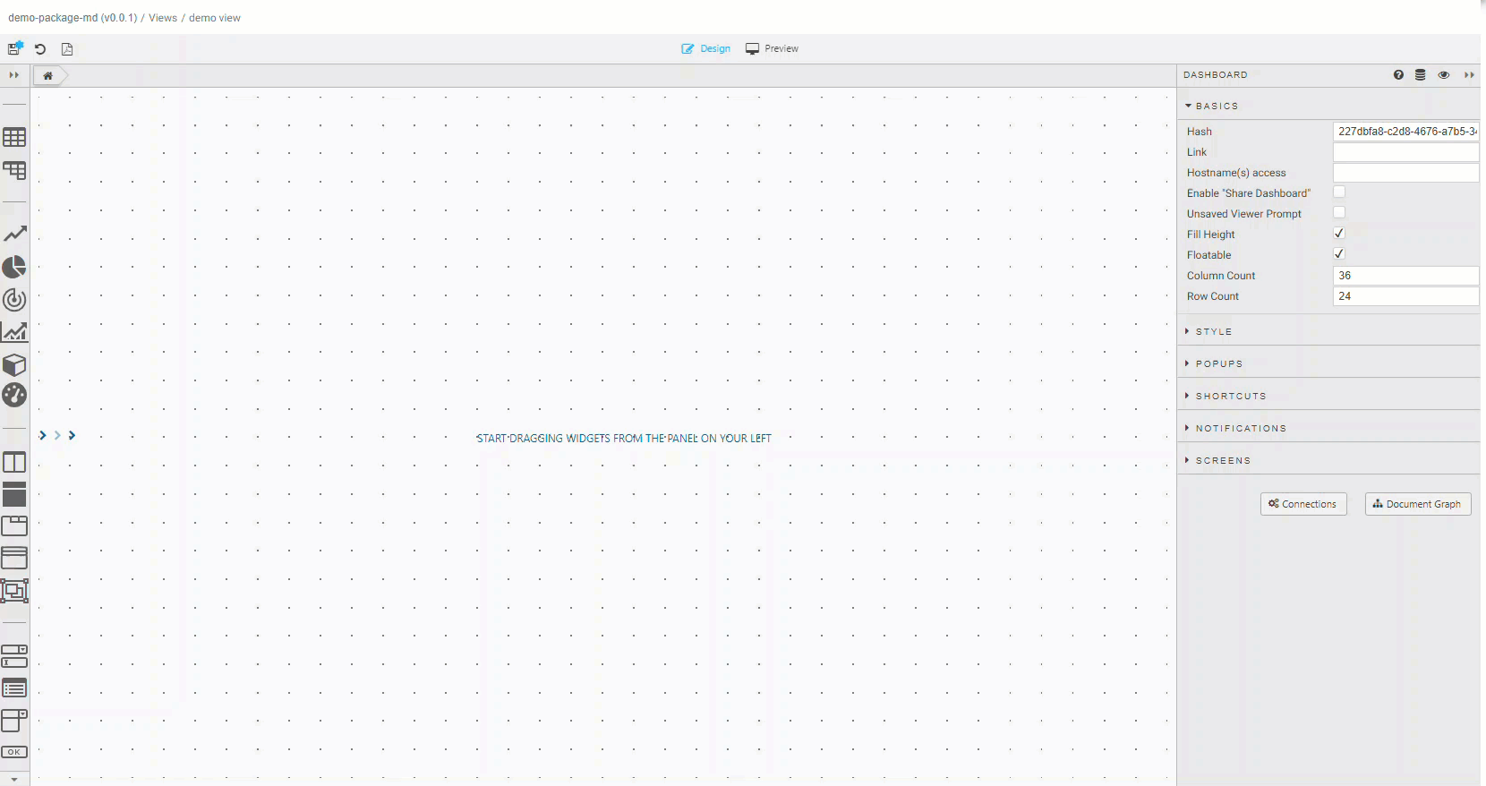
When no component is selected in the workspace, the properties of the view are displayed in the right-hand panel. These are referred to as dashboard properties, as shown below.
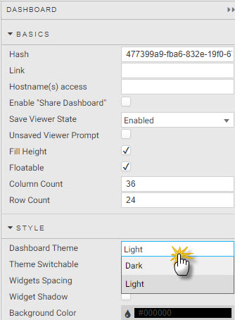
The dashboard properties are described in the following sections.
Basics
These are the basic properties for the dashboard. You can define a name for the dashboard and then link and setup the workspace area using the properties described in the following table.
| Property | Description |
|---|---|
| Hash | Name of dashboard view. |
| Link | URL reference for the view. |
| Hostname(s) access | List of hostnames (comma separated) permissioned to access the view; if not set, all hostnames have view access. |
| Enable "Share Dashboard" | Not used by kdb Insights Enterprise. |
| Share Viewer State | When enabled, the current view states are saved for use in the next decision. If disabled, default view state values are used. |
| Unsaved Viewer Prompt | Not used by kdb Insights Enterprise. |
| Fill Height | When enabled, view scales to height of browser. When disabled, view height is Column Count * Row Count in pixels. |
| Floatable | When enabled, components can be locked anywhere in the workspace grid. When disabled, components lock from top-down of workspace. |
| Column Count | Defines the number of column anchor points. |
| Row Count | Defines the number of row anchor points. |
Click here to learn more dashboards basic properties.
Style
Style properties allow you to set border colors, background color, and spacing between components on the dashboard.
| Property | Description |
|---|---|
| Dashboard Theme | Defines whether the view is to be a Light or Dark Theme. |
| Theme Switchable | Check if you want to be able to switch between light and dark themes; uncheck to lock color to selected Dashboard Theme. |
| Widgets Spacing | Set distance between components in pixels. |
| Widget Shadow | Enable for component shadow. |
| Background Color | Defines the background color of a component. |
| Transparent Background | Check to enable transparency; uncheck to use Background Color. |
| Border Size | Sets the width of border in pixels. |
| Border Color | Sets the color of border. |
| Border Rounding | Applies a rounding to border corners; 0 for no rounding. |
| Border Spacing | Defines the amount of space between components; set in pixels. |
| Worksheet Padding | The padding in pixels around each component. |
| Show Loading Indicators | When Checked the dashboard shows a loading icon when components are accessing data. |
| Advanced CSS | Any Advanced CSS component can be used to define the CSS for any component in a dashboard. See here for details. |
| CSS Classes | CSS Classes can be used to style components. Read CSS classes for details. |
Click here to learn more about dashboard styling properties.
Popups
You can create a popup and then edit it to add content into the popup element.
Click here to learn more about popups.
Shortcuts
You can assign a keyboard key to the data source and execute when pressed.
Click here to learn more about shortcuts.
Notifications
You can specify whether notification messages, for example a failed login attempt, appear on the screen.
Click here to learn more about notifications.
Screens
Each dashboard has a main screen; other screens can be added and linked using the Button component.
Click here to learn more about screens.
Components
Views support over 40 configurable components. When you click on a component in the workspace, its configurable properties are displayed on the right-hand panel. A selected component has a light-blue border.
To add a component to your view:
- Click-and-drag a component from the left-hand menu into the workspace. When dragging a component into a workspace, be careful not to drop it on top of another as this replaces the underlying component. Any such change (or others) can be undone by clicking the undo icon in the report menu bar next to the save icon.
Click to view the full set of components.
| Component | Description |
|---|---|
| Data Grid | Tabular data display and handling. |
| Pivot Grid | OLAP drilldown data display. |
| ChartGL | Hardware accelerated charts using WebGL; supports line, bar, bubble, waterfall, bounds, candlestick, heatmap and baseline charts. |
| Pie Chart | Circular statistical graphic. |
| Radar Chart | 2D multivariate data graphic. |
| Canvas Chart | Basic line, bar, bubble, candlestick, violin, boxplot, and waterfall charts. |
| 3D Chart | 3D charting (with highlight rule support for 4D); dot, surface, bar, grid, and line charts. |
| Gauge | Display a single value of quantitative value. |
| Layout Panel | Container for components. |
| Flex Panel | Flexible, two-component container. |
| Tab Control | Tabbed component container. |
| Accordion | Collapsible component container. |
| Overlay Panel | A container to overlay components. |
| Data Form | Input display for query parameters; text, dropdown, and date picker selectors. |
| Form Builder | Create a custom form for users. |
| Drop Down List | Single or multi-select dropdown component. |
| Button | Single button supporting multi-action select. |
| Text Input | A text input component. |
| Text | WYSIWYG text editor with HTML support. |
| Selection Controls | Radio or check-box selection control. |
| Date Picker | Date or date-time input. |
| Date Range Picker | Date range input. |
| #Navigation Menu | A navigation bar. |
| Breadcrumbs | Navigation element for OLAP data. |
| Tree View | A tree-view navigation selection component. |
| Data Filter | User generated queries; text and dropdown filters (no coding required). |
| Visual Query Builder | Graph-based visual query builder; support for multi-data sources with update, group-by, join, filter and custom functions. |
| Editable List | A custom dropdown menu. |
| Range Slider | A data range selector; interval or time. |
| Playback | A multi-control stream player suitable for video content, interval, or time sequence data playback. |
| Upload | File transfer to/from server. |
| Map | Map component featuring Google maps. |
| Treemap | Treemap or heatmap data graphic. |
| Sunburst | Sunburst (ring/doughnut) chart for hierarchical data. |
| Graph | Network/Flow relationship map. |
| Sankey | A flow diagram where the width is proportional to the rate. |
| Bipartite Chart | A chart of two independent data sets, with relationship connections between the data sets. |
| Vega Chart | Support for Visualization Grammar charts. |
| Financial Chart | International financial charting component; OHLC, Line, Candlestick, Mountain, Heikin Ashi, Kagi, and over 20 technical indicators and user annotation support. |
| Trade | Add a Forex trade panel with TWAP and VWAP support and tick updates. |
| Contour | Add a contour graphic; plotting 3D data in 2D. |
| Blob Download | Download files from byte array in database. |
| Bitmap | Bitmap generated chart. |
| Video | Add video content to a dashboard. |
| Analyst Visual | Embed a KX Developer graphic into a chart. |
| Code Editor | Embeddable code editor with support for json, plaintext, handlebars, html, java, javascript, markdown, python, r, sql, typescript, xml, and q. |
Configure the data source for a component
Each component on your View must have a data source. The following sections describe how to:
- Setup a data source using each of the methods; API, SQL, kdb/q, Streaming and Virtual
- Setup the subscription type
- Verify results of the data source queries
Set up a data source for Views
-
Open the Data Editor by doing one of the following:
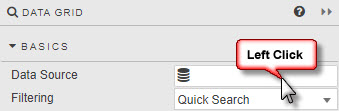
- Click on Click to populate Data Source in the component on the workspace.
-
Select Data Source in Basics Properties for the component, as shown below.
-
Click New to add a new data source.
-
Click on the relevant radio button to select the type of query you are adding. The following query options are available:
- API - an API (getData) or UDAs
- SQL - an SQL query
- kdb/q - a kdb/q query
- Streaming - a pipeline setup to subscribe to streaming data
- Virtual - a query using javascript
The configuration for each of these query methods is described in the following tabs.
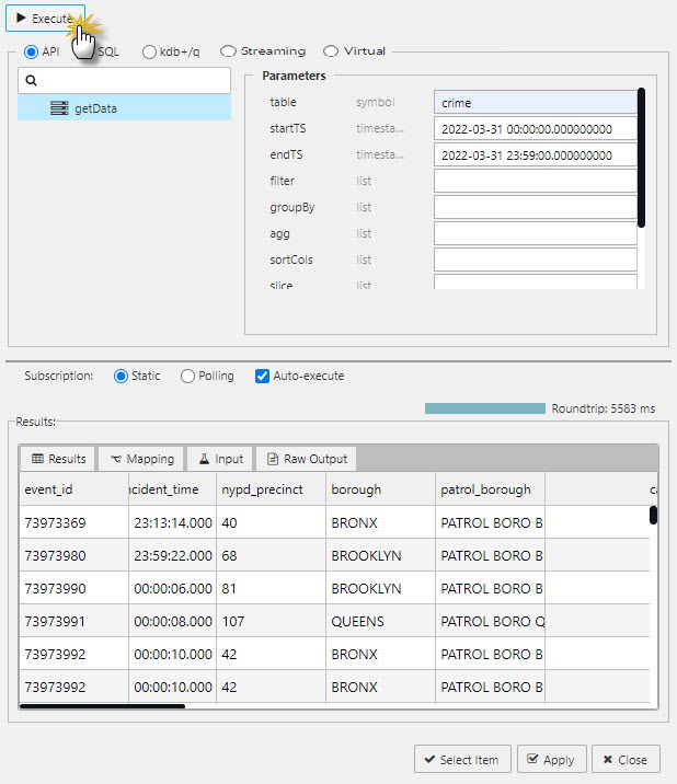
You can query data directly through the API option, without needing to write any code.
When you add a New node, the default is to use the getData API. Alternatively, you can use any UDAs that have been loaded into your deployment. These appear as namespace/name in the list of available APIs in the data source window, to the left.
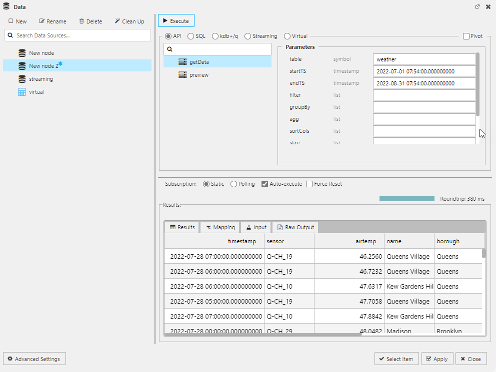
Set values for the API parameters described in the following table. Required properties are denoted with an asterisk (*).
| Parameters | Description |
|---|---|
| table* | Select a table from the list of active tables. |
| startTS* | Start time of returned data. If a preset date range is required for a View, set temporality property to slice and define the slice property for start time. Note that it can be helpful to use the scratchpad to get the date range. |
| endTS* | End time of returned data; defaults to today's date. If a preset date range is required for a View, set temporality property to slice and define the slice property for end time. |
| filter | define by (function;columnname;parameter), for example >;valuecolumn;100 to filter "valuecolumn" to values above 100. Selected functions include >, = or < and can include text values; for example =;name;Jim will return rows of data where the "name" column contains 'Jim'. |
| groupBy | Select data column(s) for grouping data. |
| agg | Define columns to select: `price`size, an aggregation `col1`avg`price, or a dict(ionary) aggregation `col1`avg`price;`col2`sum`size. |
| sortCols | Sort results by selected column. |
| slice | Sets the time range for startTS and endTs when slice is set for temporality. |
| fill | How to handle nulls in the data. Select between zero to treat nulls as zeroes, or forward to carry forward a previous, non-null value. |
| temporality | Set to slice if data returned is between a defined startTS and endTs; use the slice property to set the date range. Set to snapshot for a continuous range of data. |
| labels | Where data columns are shared across different tables, an (optional) label can be applied to restrict returned data. For example, table1 has a region property for 'north america' and table2 has a region property for 'europe', then a label of region:europe returns data from table2 only. Data can be returned from tables in different databases. |
To manage memory usage effectively with large datasets, set the Query Limit parameters outlined in the table below:
| Parameters | Description | Default |
|---|---|---|
| Apply Limit | Applies query limits based on the Row Limit specified below. When unchecked, no query limits are applied. | Checked |
| Row Limit | The number of rows returned from the API. | 2,000 |
| First/Last | Use this toggle to indicate whether the database returns the first or the last rows based on the Row Limit value. | Last |
| Timeout(s) | Set a data source-specific query timeout using the Timeout(s) field. If left blank, the default Views system timeout is used. Note that a maximum timeout is configured by your Administrator, and if the value you enter exceeds this maximum, the maximum is used instead. |
Labels
You can query data with API Labels. Labels are defined in the database. You can use a label to select data from a particular table when data column names are shared across multiple tables.
UDA with scope parameter defined
When your datasource uses a UDA, if the scope parameter is defined you must set it to the name of the package that the UDA is defined in. This ensures the appropriate aggregator is used when running the query.
- Click the + icon below the scope field.
- The key is automatically set to assembly.
- Set the value of the assembly to the name of your package.
- Click Execute.
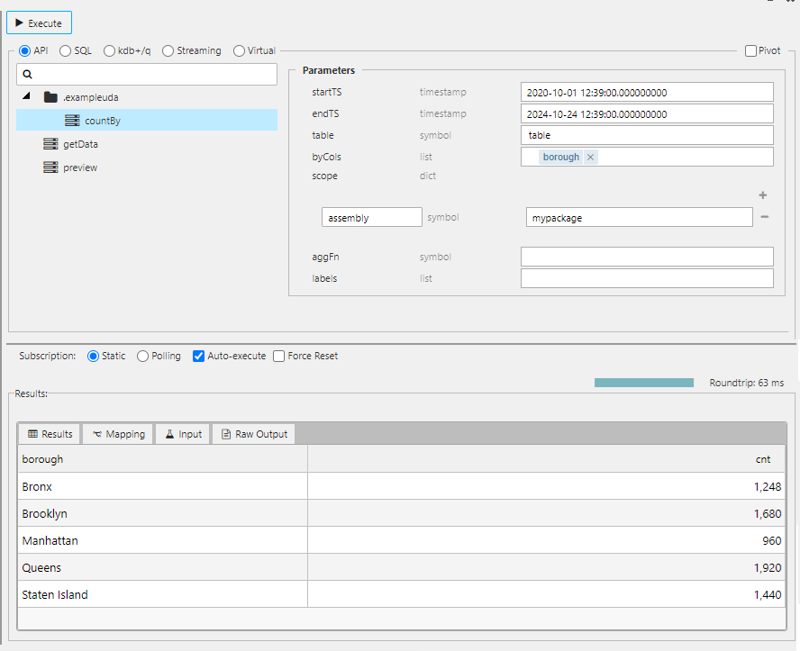
For information on creating UDAs, refer to the UDA documentation.
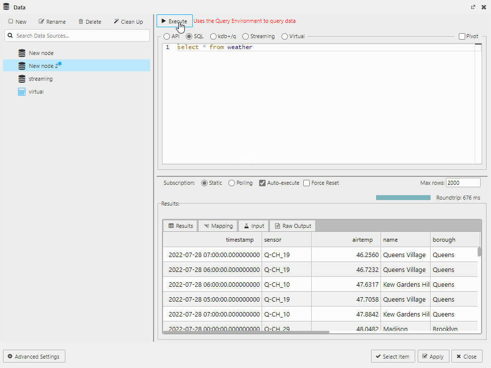
Use the code editor to write SQL queries. The following select query is illustrated in the screen below.
select * from tablename
To manage memory usage effectively with large datasets, set the Query Limit parameters outlined in the table below:
| Parameters | Description | Default |
|---|---|---|
| Timeout(s) | Set a data source-specific query timeout using the Timeout(s) field. If left blank, the default Views system timeout is used. Note that a maximum timeout is configured by your Administrator, and if the value you enter exceeds this maximum, the maximum is used instead. |
Use the code editor to write q/sql.
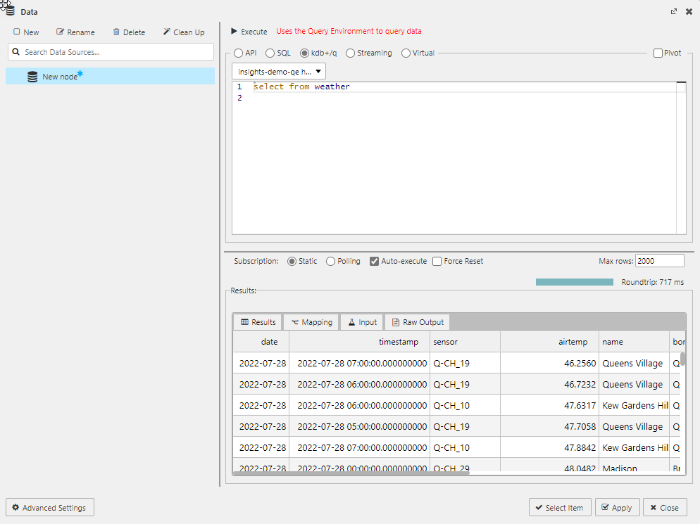
This option only works when Query Environment(s) are enabled
Refer to System Information for details on how to check the status.
select from tablename
qsql bypasses entitlements. You must disable qsql to enforce database and row level entitlements. Refer to the disable qsql instructions.
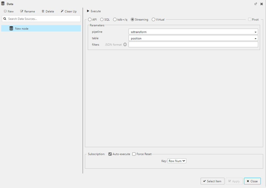
A Streaming data source requires a pipeline that writes to a subscriber node (a generic named target that can be subscribed to later). The View component is then linked to this pipeline to listen to this subscriber and receive real-time data updates. The following screen shows the data source setup for streaming data.
For entitlements, only package entitlements apply to streaming data. Data entitlements do not apply because the data is streamed and not from an existing database/table.
The data source parameters you need to configure for streaming components are defined here.
| Parameter | Description |
|---|---|
| pipeline | This field provides a list of running pipelines with subscriber nodes. Select the pipeline that contains the data you want to stream to your component. |
| table | This is a dropdown list of available tables. Select the table containing the data you want streamed to your component. |
| filters | You can filter streaming data, based on any column, to show a subset of the data. It is also possible to set filters using view states. |
Current limitations
- The filter cannot use wildcards, but can support lists of values for a column and must be defined using the following JSON format:
{"column1":"value1","column2":["value2","value3"]}. Multiple values listed for a single column are ORed together and the values for each different column are ANDed together. - The keyed columns can be symbols, integers, longs or GUIDs, but they cannot be strings. If the keyed columns are strings, the filtering does not work. The columns need to be converted to symbols.
- For data entitlements, only package entitlements apply to streaming data. Database and row level entitlements do not apply because the data is streamed and not from an existing database/table.
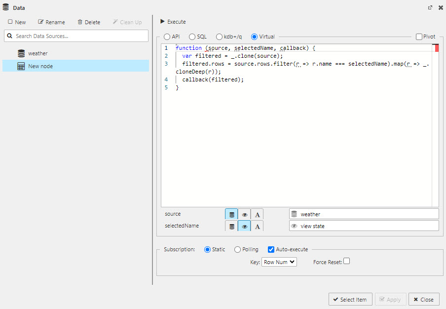
Use the code editor to write Javascript to meld data from multiple data sources, view state parameters or text inserts. Virtual queries run against data stored on the client.
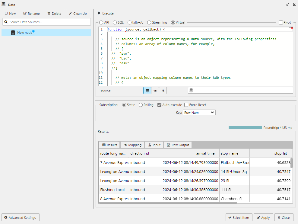
function (source, selectedName, callback) {
    var filtered = _.clone(source);
    filtered.rows = source.rows.filter(r => r.name === selectedName).map(r => _.cloneDeep(r));
    callback(filtered);
}
Use these links to find our more information about:
- Data Source configuration
- View state parameters
- The getData API
- Writing q code
- SQL code
-
Click Execute to generate results to the lower panel, as shown below.
Results are described here.
-
Click Apply to add data to the component. The following screenshot shows data displayed in a Data Grid component.
Subscription
The subscription type specifies whether the query subscribes to the database in one of the following methods:
These settings are not relevant to the streaming query method.
The options, illustrated below, along with the Auto-execute and Force Reset are displayed at the bottom of the data source configuration screen.
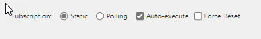
Static
A static subscription involves a single request for data when you run the database query.
Polling
A polling subscription involves a client-side poll of the database when you execute the database query. When selected, there are two parameters to be set as described in the following table:
| Option | Effect |
|---|---|
| Interval | Set the time between each poll request (in seconds) |
| Key | Select which data source column to define subscription handling. For example, by column in situ, or by time for a streaming update |
Auto-execute
The Auto-execute option controls whether the query runs when there is a parameter change.
- When this is checked, the query runs whenever there is a parameter change or on load if data mapping is used. This is the default option.
- When this is unchecked, parameter changes don't run the query unless its associated with a component, e.g. a data grid or as an action tied to a button.
Force Reset
The Force Reset option specifies what happens to the existing dataset on each update.
- When this is checked, the existing dataset is cleared, on each update from the database, regardless of whether a parameter has changed or not. This is the default option.
- When this is unchecked, updates from the database merge with the existing dataset, unless a parameter is changed in which case the existing dataset is cleared.
Results
Once you have added a data source to a component as described here you click Execute. The results of the query are displayed in the main Results tab, at the bottom of the screen, with additional information in the following tabs:
Mapping
The Mapping tab takes a Value from a column, Key, and maps it to a view state as shown here.
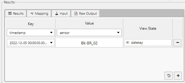
Additional mapping actions can be added with by clicking the + icon.
Click the reset icon to create a map of values for all available keys.
Input
The Input tab shows the raw output of the query as shown in the following example.
{"table":"weather","startTS":"2022-12-05T00:00:00.000000000,"endTS":"2022-12-05T23:59:00.000000000"}
Raw output
The Raw Output tab shows the raw output of the results. This includes kdb+ type information.
{"primaryKey":"_rowIndex","columns":{"collection":[{"id":"timestamp","index":0,"kdbType":12},{"id":"sensor","index":1,"kdbType":11},{"id":"airtemp","index":2,"kdbType":9},{"id":"name","index":3,"kdbType":11},{"id":"borough","index":4,"kdbType":11},{"id":"longitude","index":5,"kdbType":9},{"id":"latitude","index":6,"kdbType":9},{"id":"color","index":7,"kdbType":11}],"reset":[{"id":"timestamp","index":0,"kdbType":12}
View states
View states are used to store dynamic values and states that can be used by components and queries. They can be used to store user preferences or pass values into queries.
This following section summarizes how to use view states in Views. For comprehensive details about using view states, see the Dashboards documentation.
Using view states in data editor
In the code view of the data editor, view states are used to add variable inputs; for example, from a drop down, date picker or data form component.
To create a view state in the data editor:
- Click on the generate view state icon
 in the relevant field of the data editor.
 - Click New to add a new view state. The following screen shot shows a Select View State dialog with properties that must be configured.
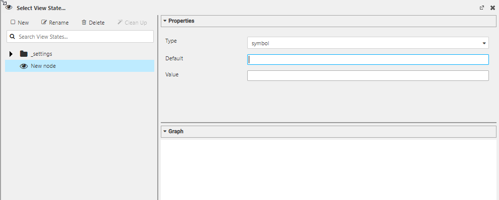
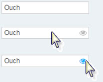
Hidden Eyes
View states can be assigned to properties where the generate view state icon is hidden; such properties reveal the icon on rollover.
Rolling Syntax
When you select one of the following options from the Type drop-down list: date, datetime, minute, month, second, time, timestamp, a Rolling checkbox appears above the Default field. Refer to Rolling for more details.
The following tabs provide examples of using view states for SQL, q and virtual query methods.
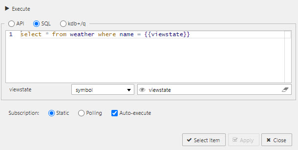
You can map view states with {{}}; for example:
select * from mytable where datavariable = {{viewstate}}
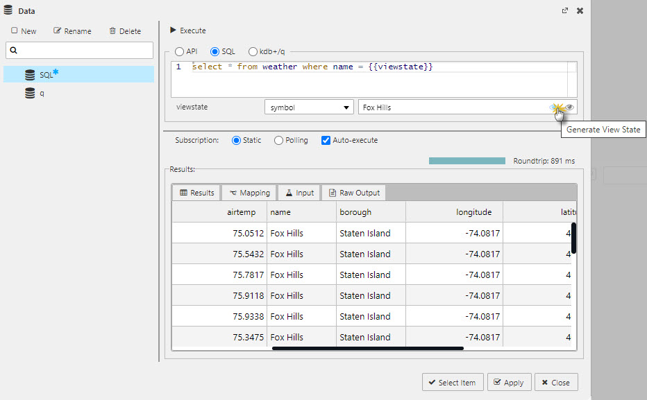
The following screenshot shows a mapped view state.
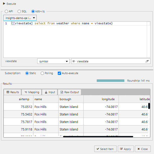
You can map view states as a q function; for example:
{[viewstate] select from mytable where datavariable = viewstate}
You can map view states with a Javascript function; for example:
function (source, selectedName, callback) {
var filtered = _.clone(source);
filtered.rows = source.rows.filter(r => r.name === selectedName).map(r => _.cloneDeep(r));
callback(filtered);
}
Pass user information as a viewstate
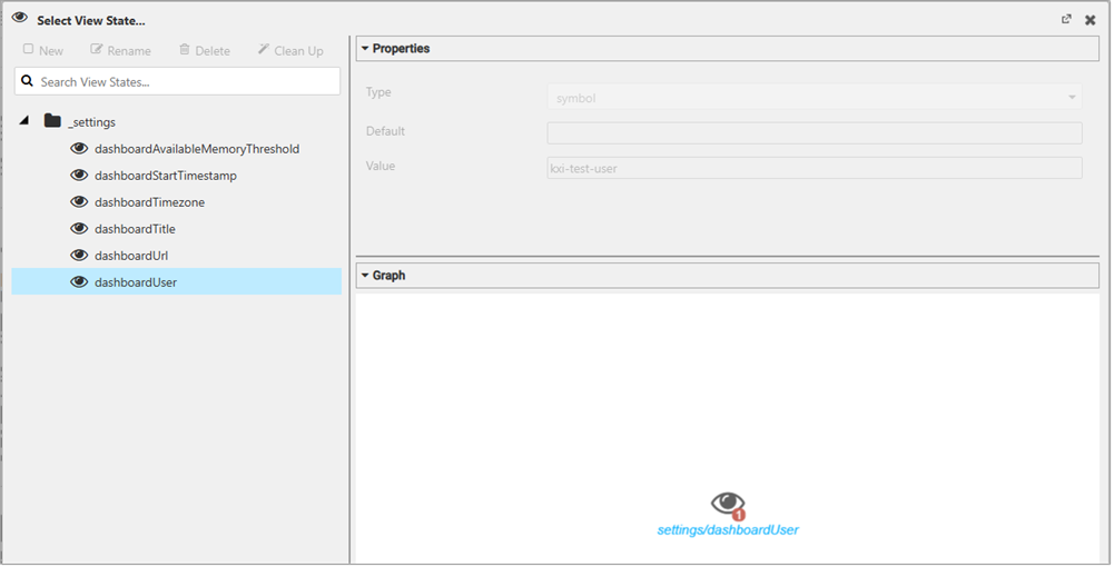
You can pass user information as a viewstate into your Views. To create a new viewstate variable go to the _settings group and select dashboardUser as illustrated below.
For further information about view states, refer to:
Actions
An action is a common property set that you can use to configure a view state, run a query, or open an URL. For further information on actions see here.
Highlight rules
You can configure highlight rules, a common property utilizing color and/or icon markers, to notify users of value changes. Highlight rules are best used with real-time streaming, or polling data. For further information on highlight rules see here.
Load a ready made view
You can load a pre-made view, which must be saved in a JSON file.
- Drag a JSON file over a View.
-
When the workspace is highlighted in blue and Drop Dashboards to Import is displayed in the center of the workspace you can drop the file.
-
The Create View screen is displayed. The name of the view you are loading is populated in the View Name field, but you can change this. Select a package to add this view to or create a new package, as per details in the create a view section.
The ready-made View is displayed in a new tab.
Refer to the finance tutorial for an example of this in action using this example view.