Overlay Panel#
The Overlay Panel enables you to overlay components on your dashboard. One component serves as the background, with one or two more laid on top. These overlaid components can be placed on either the left or right-hand side of the background component.
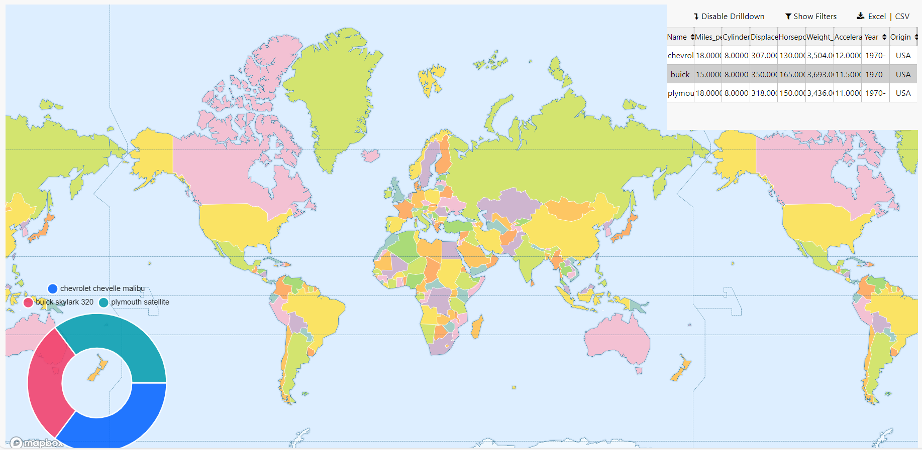
In the following example a pie chart and pivot grid have been overlaid on the map component.
This page explains how to setup and configure the basic properties for an Overlay Panel.
Set up an Overlay Panel#
- Drag the Overlay Panel component onto the canvas and resize as required.
- Add the first component, which is the background component.
- Add the second component to either the left or right-hand panel. This is the first overlay component.
- Optionally, add a third component to the available panel. This is your second overlay component.
- Configure the basic properties for your Overlay Panel.
- Configure the properties for the additional components you have chosen to overlay.
You can add a maximum of 2 overlay components on top of your background component, one on each side panel. To overlay additional components you could add a Layout panel configured with multiple components.
Basics#
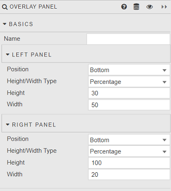
These properties allow you to configure the position and size of the Overlay Panels that can be added to the left and right panels.
- Name
- Enter a name for the component.
Next, set the following properties for the left and right panels.
- Position
- Select
ToporBottomto set where you want to place the overlay component on the panel. - Height/Width Type
- Select whether you want to define height/width as a Percentage of the overall component, or in pixels with Fixed Width.
- Height
- Define the height of the overlay component.
- Width
- Define the width of the overlay component.
When you are working with overlay components, the properties on the right-hand side vary depending on the component selected in the design view. Check the tabs at the top of your canvas to see which component is selected. Click on the Overlay Panel tab to go back to the basic properties for this component.

Style, Margins, Format#
See Style for details on configuring these settings.