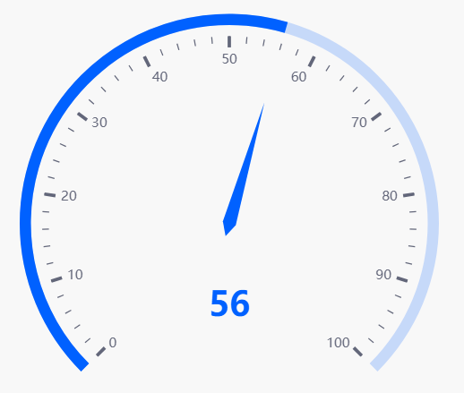
Gauge#
A Gauge chart is used to display a single value of quantitative data.
Set up#
- Select a Data Source
- Select a Data Column
- Set your Min and Max
Basics#
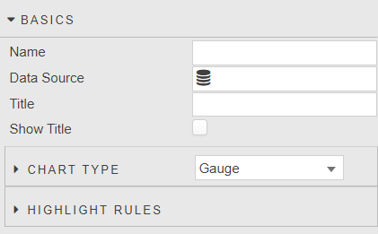
- Name
- A name for the component provided by the user.
- Data Source
- Data sources
- Title
- Show Title
- Set a title label which will be displayed on Tooltip. Toggle Show Title to control visibility on Gauge chart type.
Chart Type#
- Toggle between
GaugeandBullettype chart.
Gauge#
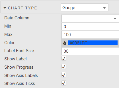
- Data Column
- Select data column to plot from the data source.
- Min
- Max
- Set min and max of the chart.
- Color
- Default color used when
Progressis enabled or when highlight rules not set. - Label Font Size
- Define font size of data label.
- Show Label
- Toggle display of data label.
- Show Progress
- Show the Progress bar. When enabled, toggles off the highlight rules and uses default color
- Show Axis Labels
- Toggle display of axis labels.
- Show Axis Ticks
- Toggle display of axis ticks.
Bullet#
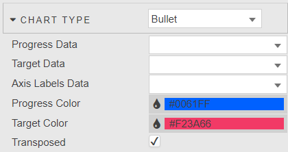
- Progress Data
- Define data column for progress bar
- Target Data
- Define data column for target bar
- Axis Labels Data
- Define data column for axis labels
- Progress Color
- Target Color
- Define color of progress and target bars.
- Transposed
- Toggle between vertical and horizontal chart.
Highlight Rules#
Format Data#
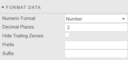
- Numeric Format
- Select x-axis format between
Number,Smart Number,Formatted Number. - Decimal Places
- Set precision point for x-axis numeric label.
- Hide Trailing Zeroes
- Hide display of trailing zeroes in x-axis tick values.
- Prefix
- Suffix
- Add text to the data label; e.g. currency or percentage symbol.
Tooltip#
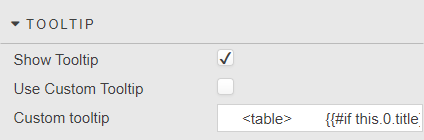
- Show Tooltip
- Toggle display of tooltip.
- Use custom tooltip
- Enable custom tooltip.
- Custom tooltip
- Define tooltip; simple example:
<table>
    {{#if this.0.title}}<thead><tr><th>{{this.0.title}}</thead><th></tr>{{/if}}
    <tbody>{{#each this}}
        <tr>
            <td>{{dataCol}}: </td>
            <td>{{dataVal}}</td>
        </tr>
        {{/each}}
    </tbody>
</table>
Style, Margins, Format#
Style for common settings