Style
This page explains how to configure both global dashboard styles and common component-level settings, including themes, margins, borders, and advanced CSS customization.
Dashboard style
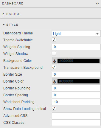
These global settings apply to every component in a dashboard.
Warning
Changes you make in the global Style menu overwrite any changes you made at the component level.
| Field | Description |
|---|---|
| Dashboard Theme | Select from Light, Dark, KX Light, or KX Dark. Controls the theme for the dashboard visualization area only. To change the editor interface theme, use the Editor Theme setting in the User Menu. |
| Widgets Spacing | Margin in pixels around each component. |
| Widget Shadow | When selected, applies a drop shadow to each component. |
| Background Color | Background color of every component in the workspace, unless the component's own style overrides it. |
| Transparent Background | When selected, Dashboards ignores Background Color and makes the background transparent. |
| Border Size / Border Color / Border Rounding / Border Spacing | Defines the border applied to components. To apply a border, set Border Size to a value greater than 1. Border Spacing sets the distance between the border and the inner component. |
| Worksheet Padding | Padding in pixels around each component. |
| Show Loading Indicators | When the dashboard requests data, a spiral loading indicator appears until the data loads. Tip: If your dashboard uses streaming, managed or polling data, clear Show Loading Indicators. |
Logo
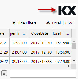
You can add an image logo to a dashboard with a Text Input component.
-
Drag the Text Input component into the dashboard, then select it.
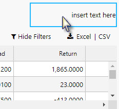
-
Select the Formatted Text box in the Basics properties to open the editor.
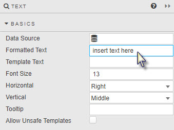
-
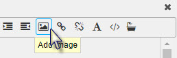
Use the menu bar to add an image.
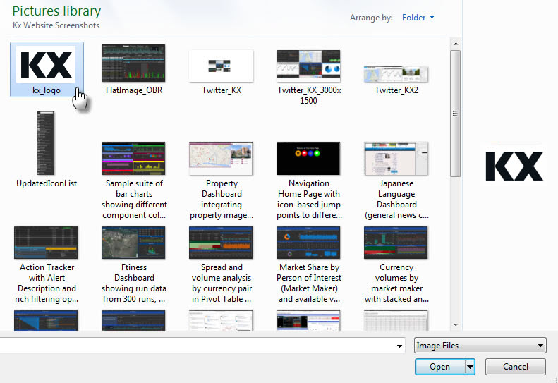
Use a logo image with a transparent background, so that it matches the dashboard background.
-
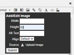
Set the height and width of the logo in pixels.
Tip
A height of 50 pixels works well for a logo. If you set only the height, Dashboards rescales the logo and keeps its aspect ratio.
-
Delete any remaining
insert text hereplaceholder text. -
For a logo on the left of the dashboard, set the Horizontal alignment to Left. For a logo on the right, set it to Right.

-
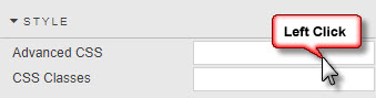
To stop unnecessary scroll bars appearing around the logo when you resize the browser, update Advanced CSS from the Style menu.
-
Click the CSS icon to activate the selector.
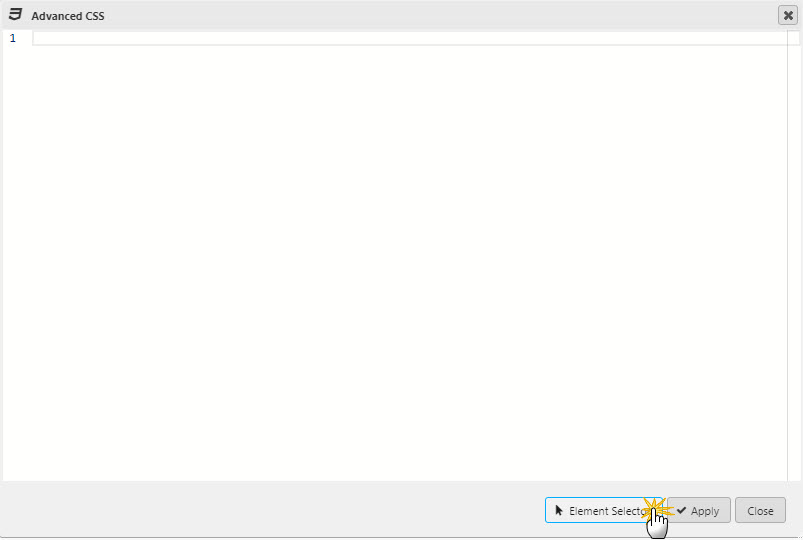
-
Roll over the component until the
div.htmlContentbox is selected.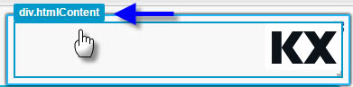
-
Edit the CSS to hide scroll bars: set the
overflowproperty tohidden. Add the CSS inside the curly braces{}.
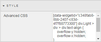
-
Tip
If you use dashboard styling to align and position components, update the Margins setting of the Text Input component to undo any unwanted changes to the logo's position.
Component style
These style settings are common to many components.
Title
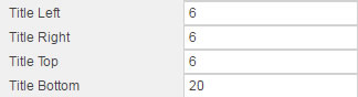
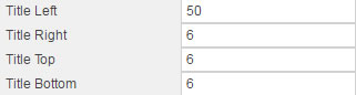
The Title settings control where the title sits relative to the component pane and outer border.
| Sample title settings | Results |
|---|---|
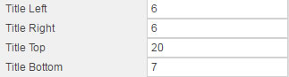 |
 |
 |
 |
 |
 |
Title Left and Title Right add margin even when Title Horizontal Align centers the title in the Format dialog.
Margins
| Field | Description |
|---|---|
| Outer margins | Spacing in pixels outside the component and its border. |
| Inner margins | Spacing in pixels between the rectangular component area and the border, if any. |
Tip
Without a border, inner and outer margin changes look similar.
Widgets Spacing at the dashboard level is the equivalent of outer margins in a component's Margins menu.
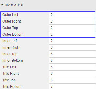
Border Spacing sets the spacing between the elements of the component and the border.
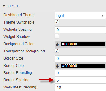
Border Spacing is the equivalent of inner margins in a component's Margins menu.
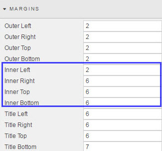
You can round borders only when Border Size is greater than 1. More rounded borders need more border spacing, to stop the border being cut off at the edges.
Tip
Dashboard margin settings override component margin settings. When styling dashboards, set margins at the dashboard level before setting them for individual components.
Format
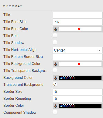
| Field | Description |
|---|---|
| Title | The title text shown at the top of the component.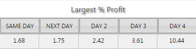 |
| Title Font Size | In pixels. |
| Title Font Color | Click the color bar to open the palette menu.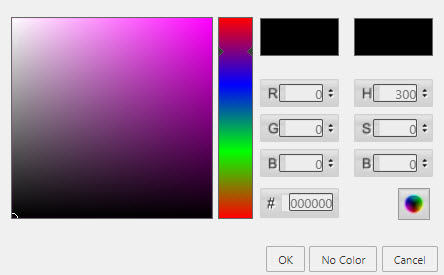 |
| Title Bold | When selected, shows the title in bold.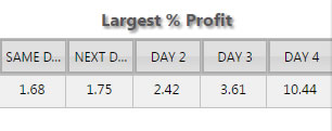 |
| Title Shadow | When selected, applies a shadow to the title. |
| Title Horizontal Align | Horizontal position of the title within the component. |
| Title Bottom Border Size | Pixel distance between the title and the component content.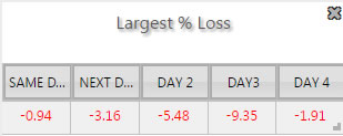 |
| Border and background color | Component Color is the color of the component's border and title background when Transparent Background is cleared.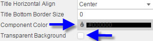 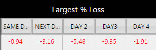 |
| Border Size / Rounding / Color | These three parameters control the borders of a component.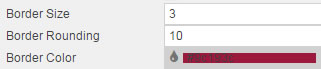 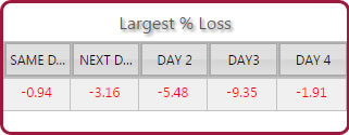 Tip: Adjust the Inner Top and Inner Bottom margins if you need to, so that the rectangular box of the component doesn't cut into a rounded border. |
| Component Shadow | When selected, applies a drop shadow to the component.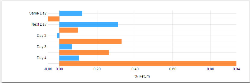 |
Palette Theme
See Palette Theme.
Palettes
See Palettes.
Advanced CSS
Advanced CSS lets you override the default appearance of dashboard components — colors, fonts, spacing, borders, and more — using standard Cascading Style Sheets (CSS), the same styling language used to build websites.
You don't need to be an expert in CSS to use it. This guide walks through everything step by step.
Where to add Advanced CSS
You can add Advanced CSS at three levels. Each level controls a different scope: how many components your styling affects.
| Level | Where to add it | What it affects |
|---|---|---|
| Component | Component settings → Style → Advanced CSS | Only that one component. |
| Dashboard | Dashboard settings → Style → Advanced CSS | Every component on that dashboard. |
| Global | Global properties → Advanced CSS | Every dashboard, everywhere. |
Which level should you use?
Add Advanced CSS at the dashboard or global level wherever you can, rather than at the component level. This gives you a single, central place to manage your custom styling, instead of small rules scattered across many individual components, which become hard to track and to update consistently. It also makes duplicate or conflicting rules easier to spot before they cause problems — see Common gotchas.
Use component-level CSS only for genuine one-off tweaks that shouldn't apply anywhere else.
Selecting an element to style
Before you can write a CSS rule, you need a selector: a way of telling the browser which element on the page you want to style. Dashboards includes a built-in tool that generates the selector for you, so you don't have to write it by hand.
-
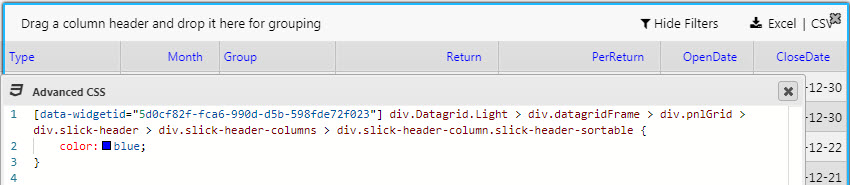
Open the Advanced CSS editor at the level you want, then click inside it.
-
Click the Element selector.
-
Click the element in the dashboard that you want to style, such as a cell in a Data Grid. The editor detects the element and generates the full selector for it, including the widget ID. All you add is the styling itself, such as
colororbackground-color.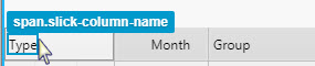
-
Apply the changes.
A generated selector looks like this:
[data-widgetid="57931b79-10f7-9005-7532-499410b79081"] div.Datagrid.Dark > div.datagridFrame > div.pnlGrid > div.slick-pane.slick-pane-top.slick-pane-left > div.slick-viewport.slick-viewport-top.slick-viewport-left > div.grid-canvas.grid-canvas-top.grid-canvas-left > div.slick-row.odd > div.slick-cell.l2.r2.center {

}
How to read a generated selector
A selector that long looks daunting, but it's only a path from the outside of the component down to the element you clicked, one piece at a time:
[data-widgetid="..."]is the unique ID of that one component instance on your dashboard.- Each
div.SomeClassis a layer of the component's internal structure. Dashboards builds each component from several nested layers. >selects a direct child. Indiv.A > div.B,div.Bsits immediately insidediv.A— not just somewhere inside it, but as its direct child.
You don't need to understand every layer. Each part of the selector narrows the match further, ending at the exact element you clicked.
Finding a widget ID by hand
Any Advanced CSS editor can define the CSS for any component in a dashboard — all it needs is the correct widget ID.
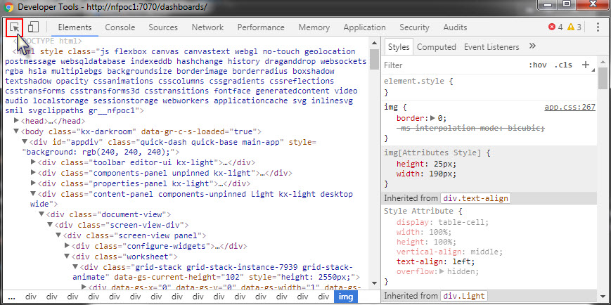
To find a widget ID, open the Elements inspector in Chrome DevTools and point the inspector at the component in your dashboard. The Elements pane then shows that component's HTML, with the widget ID in the markup and the associated CSS in the Styles pane.
Controlling how widely a rule applies
By default, a generated selector targets one element on one component. To broaden it, remove parts of it.
| Remove this | Effect |
|---|---|
[data-widgetid="..."] |
Applies to every component of that type, not just the one you clicked. |
The theme class, such as .Dark or .Light |
Applies to every theme, instead of only the one you selected. |
For example, for a Data Grid component:
/* Only this Data Grid, and only in the Dark theme */
[data-widgetid="57931b79-10f7-9005-7532-499410b79081"] div.Datagrid.Dark { }

/* Every Data Grid on the dashboard or globally, only in the Dark theme */
div.Datagrid.Dark { }

/* Every Data Grid, in every theme */
div.Datagrid { }
The more you remove, the more widely the rule applies. Start specific, then broaden deliberately once you're sure that's what you want.
Common gotchas
Watch out for these problems.
Specificity conflicts. CSS doesn't apply rules in the order you add them; it applies the most specific matching rule, wherever that rule was added. A component-level rule includes a widget ID, so it usually overrides a dashboard-level or global rule targeting the same element, even if you added the dashboard or global rule later. If your CSS appears to do nothing at all, this is the most likely reason: a more specific rule elsewhere is winning.
Theme mismatches. If you added a rule with .Dark or .Light and it doesn't apply, check that the component is actually using the theme you targeted. A .Dark rule never matches a component set to the Light theme. The theme class comes from the dashboard's Dashboard Theme setting, not from the Editor Theme in your user menu — switching your Editor Theme restyles the editor around the dashboard, but leaves the theme class on components unchanged.
Leftover widget IDs. If you copy a rule that worked on one component and paste it onto another, it still contains the original widget ID, so it silently does nothing on the new component. Either remove the widget ID, as described in Controlling how widely a rule applies, or generate a fresh selector for the new component.
Using !important to force a style to apply
If you're confident your CSS is correct but a specificity conflict is stopping it from taking effect, add !important to force your rule to take priority:
color: #FFFFFF !important;
Use !important deliberately rather than by default. Overusing it makes styles harder to change later, including your own, because any future rule targeting the same property also needs !important to override it. Treat it as a fix for a specific conflict, not a habit.
Example: changing the font color in a Data Grid
This example changes the text color inside a Data Grid to white.
-
Open the Advanced CSS editor, choosing the level based on how widely you want the change to apply.
-
Click the Element selector, then click a cell of text inside the Data Grid.
-
Review the generated selector. It looks something like this:
[data-widgetid="57931b79-10f7-9005-7532-499410b79081"] div.Datagrid.Dark > div.datagridFrame > div.pnlGrid > div.slick-pane.slick-pane-top.slick-pane-left > div.slick-viewport.slick-viewport-top.slick-viewport-left > div.grid-canvas.grid-canvas-top.grid-canvas-left > div.slick-row.odd > div.slick-cell.l2.r2.center { } -
Inside the curly braces, add the property for text color:
[data-widgetid="57931b79-10f7-9005-7532-499410b79081"] div.Datagrid.Dark > ... > div.slick-cell.l2.r2.center { color: #FFFFFF; } -
Decide how widely the rule should apply:
Goal What to do Only this Data Grid, Dark theme only Leave the selector as generated. Every Data Grid on this dashboard, Dark theme only Remove the widget ID. Every Data Grid, every theme Remove the widget ID and .Dark.For example, to apply it to every Data Grid regardless of theme:
div.Datagrid > div.datagridFrame > div.pnlGrid > div.slick-pane.slick-pane-top.slick-pane-left > div.slick-viewport.slick-viewport-top.slick-viewport-left > div.grid-canvas.grid-canvas-top.grid-canvas-left > div.slick-row.odd > div.slick-cell.l2.r2.center { color: #FFFFFF; } -
If the color doesn't change, another more specific rule is probably overriding yours. See Common gotchas. Add
!importantto confirm that's the cause:color: #FFFFFF !important;If that fixes it, find the conflicting rule rather than leaving
!importantin place long term.
Customizing error messages
You can style error messages defined by cssClass:".." in the Advanced CSS editor. For example, the following error:
'"cssClass:\"criticalError\":Invalid parameter!"
This error uses the following CSS format:
[data-widgetid="widgetIdGuid"] .criticalError .statusText {
    font-size: 60px;
    color: red !important;
}
CSS classes
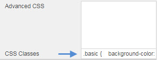
Use CSS classes to style components. Create a class directly, or assign one to a view state parameter.
For more information about class selectors, see the CSS class selector reference on W3Schools.
Custom tooltip
To customize the tooltip shown on a component, see Custom tooltips.