Text
This page describes how to set up and configure the Text component, a container for text and images.
A Text component can contain everything from a short string, through HTML tables, to entire web pages. Content may include values from the component's data source.
Text Properties
The following sections provides details on how to configure the properties of the Text component.
Basics
Open the Basics properties on the right and configure the properties described in the following table.
These properties also apply to the Text to Speech component.

| Field | Description |
|---|---|
| Name | Enter a name for the component. |
| Data Source | Select a data source. Refer to data source for details. |
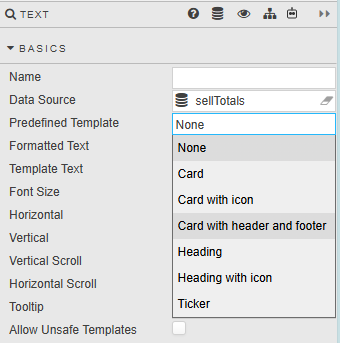
| Predefined Template | Applies a predefined Handlebars template to the component, so you don't need to write HTML or CSS. See Predefined templates. Options: None (default), Card, Card with icon, Card with header and footer, Heading, Heading with icon, Ticker. |
| Template Layout | Sets how the template repeats for each row of data. Displayed only when Predefined Template isn't None. Options: Simple, Row, Columns. See Predefined templates. |
| Formatted Text | Clicking on the field opens the Text Editor, which toggles between WYSIWYG and HTML modes. |
| Template Text | Template text can include data from the Data Source. Clicking on the field opens the Template Editor. |
| Font Size | Default type size, in pixels. |
| Horizontal | Horizontal alignment of text. |
| Vertical | Vertical alignment of text. |
| Vertical Scroll | Sets whether a vertical scrollbar appears when the content is taller than the component. Default: No Scroll. |
| Horizontal Scroll | Sets whether a horizontal scrollbar appears when the content is wider than the component. Default: No Scroll. |
| Tooltip | Display text information on mouse rollover. |
| Allow Unsafe Templates | Click when using third party embedded code. |
Script is not supported
It is not possible to embed third-party JavaScript code into the HTML editor. All script code is removed on application.
Predefined templates
Use a predefined template to apply a common card or text style without writing HTML or CSS. Each template is a Handlebars template that can display values from the component's Data Source.
Selecting a template replaces your content
When you change Predefined Template, Dashboards replaces the existing HTML content of the component with the template you select. Copy any custom content before you change the template.
Use Template Layout to choose how the template displays your data. Dashboards applies a CSS class to the parent element of the content, based on your selection.
| Template Layout | CSS class | Behavior |
|---|---|---|
| Simple | kx-card-simple |
Renders one card. |
| Row | kx-card-rows |
Renders multiple cards, arranged in rows. |
| Columns | kx-card-columns |
Renders multiple cards, arranged in columns. |
All predefined templates work with each layout.
Text Editor
Click inside the Formatted Text property in Basics to open the Text Editor.

The following example shows the Text Editor in WYSIWYG mode.

The following example shows the Text Editor in HTML mode, displayed when you click the Edit raw HTML icon on the toolbar.

Toolbar
This table describes the purpose of each of the icons on the Text Editor toolbar.
| Button | Function |
|---|---|
 |
Bold, italic or underline |
 |
Left, center, right and justify alignment |
 |
Numbering or bullet points |
| Font Size | 8pt, 10pt, 12pt, 14pt, 18pt, 24pt |
| Font Family | Arial, Comic Sans, Courier New, Georgia, Helvetica, Impact, Times, Trebuchet, Verdana |
| Font Format | Paragraph, Pre, Heading 6, Heading 5, Heading 4, Heading 3, Heading 2, Heading 1 |
 |
Increase or decrease paragraph indent |
 |
Insert an image. Includes options to set width, height, Alt Text and image alignment. Click Upload Image to locate and upload an image. |
 |
Add or remove URL links. Define the URL, give the URL a descriptive Title, and configure whether the link should open in the current window or a new window. |
 |
Text color |
 |
Toggle between HTML and WYSIWYG mode |
 |
HTML formatter |
Style, Margins, Format
Refer to Style for common settings.