Map (Offline)
This page describes the offline Map component and how it can be set up and configured to create visually appealing, engaging, and performant geographic maps.
This component uses WebGL technologies, enabling maps to render quickly and smoothly, which is highly beneficial when working with large datasets. The benefit of using this Map component over the standard Map (External API) component is that you do not need external access to the internet or external APIs.
There is a wide range of customizations available including adjusting styles, colors, fonts, adding custom icons and interactive layers (Points, Circles, Lines, Animated Points, Heatmaps, and customizable Layers).
Two Map components
KX Dashboards includes two Map components, both displaying geographical data but used for different purposes. To use the Map (External API) component, you need a stable internet connection and access to external APIs. If you need to use maps offline, the Map component described on this page allows you to visualize geographical data without an internet connection or external APIs. The properties for the two maps differ, so choose based on your needs.
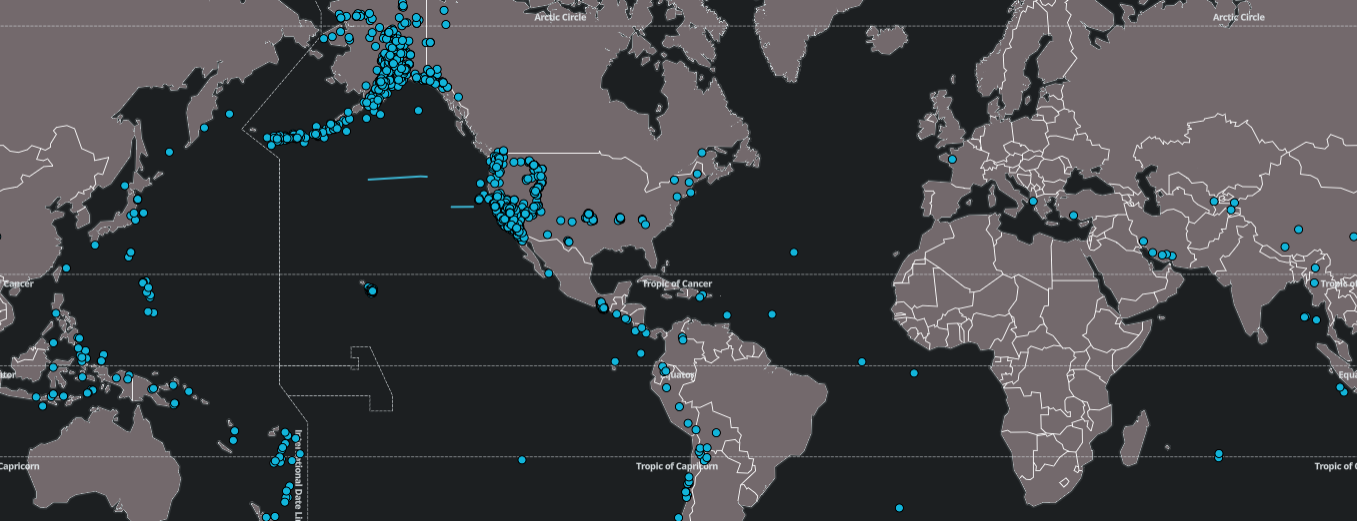
The Map has features that enable you to: visualize and animate geographic data; visualize streaming and moving data geographically; display and interact with large quantities of data; query and filter map features; dynamically display and style custom client-side data; programmatically add points, circles, lines, and popups; annotate polygons and lines and store annotated points in view states; and overlay multiple layers of data.
Note
The Map component is built using the MapLibre libraries.
Set Up an Offline Map
To set up an offline Map component, click-and-drag the component into the workspace. Refer to Offline Map properties described in the next section for details on additional properties.
Offline Map Properties
The following sections provides details on how to configure the properties of the Offline Map component.
Basics
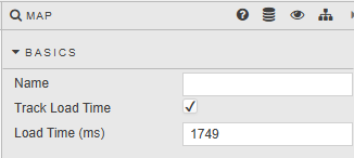
Open the Basics properties on the right and configure the properties described in the following table.
| Property | Description |
|---|---|
| Name | Enter a name for the component. |
| Track Load Time | When checked, the time it takes to load the Map is tracked in the Load Time (ms) field below. This includes the time to load all defined layers. Monitoring load time helps identify performance issues. |
| Load Time (ms) | When Track Load Time is checked, this field is updated with the loading time in milliseconds. |
Map
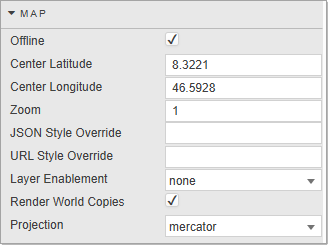
Configure the properties, described in the following table. The Map properties allow you to configure the zoom setting, latitude and longitude coordinates, and style of the map on load.
| Property | Description |
|---|---|
| Map Box Key | This key (access token) associates API requests with an external map account. Required for online mode only. |
| Offline | Click to switch between offline mode and online mode. Offline mode requires no internet access. This must be unchecked to use the Map offline. |
| Center Latitude/Longitude | Sets the map center when the dashboard loads. Defined in longitude and latitude values. |
| Zoom | The initial zoom level. |
| JSON Style Override / URL Style Override | When set, the default style is overridden with JSON/GeoJSON (Offline mode) or a URL string (Online mode). Offline Mode: The default style uses a baked-in vector and country tile server (.pbf file), a baked-in font for glyphs, and a set of countries with a color scheme. These defaults can be overridden here; no external API requests are needed. Online Mode: Default styles are "mapbox://styles/mapbox/dark-v11" (Dark Theme) and "mapbox://styles/mapbox/light-v11" (Light Theme). |
| Layer Enablement | Options: None, Quick, All. |
| Render World Copies | Choose between a single constrained map instance (minimal GPU/tile resources) or duplicating the world horizontally for seamless wrap-around past the antimeridian (at the cost of extra tiles and memory). Unchecked by default (single world view).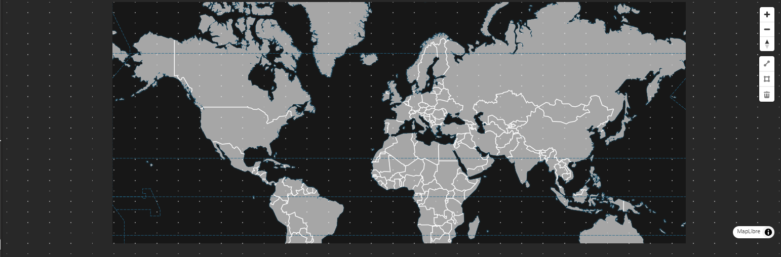 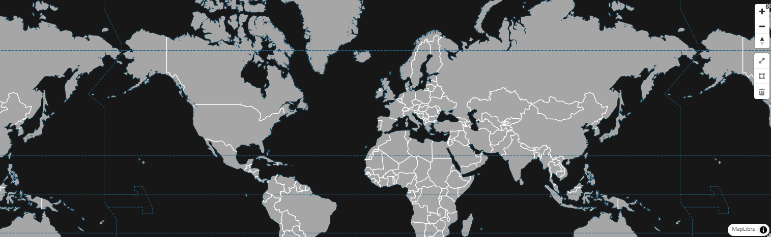 |
| Projection | Choose how geographic data is displayed. Mercator: default cylindrical projection, ideal for street-level and navigation maps. Globe: renders the earth as a 3D sphere, ideal for global overviews and animated visualizations like flight paths.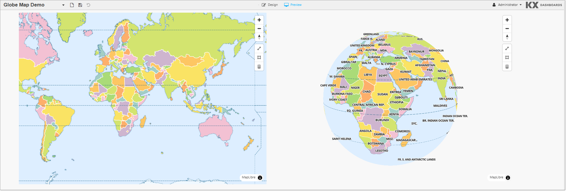 |
Points
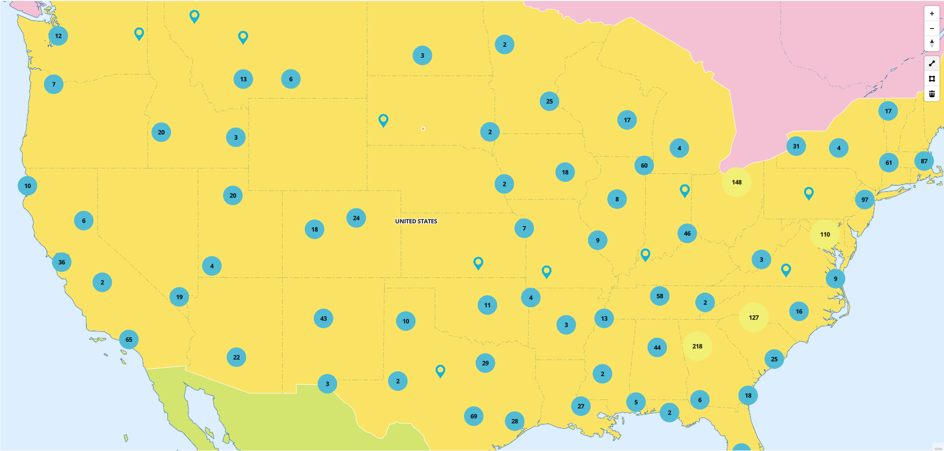
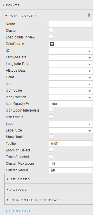
Use the Points properties to configure a custom point image at a specific geographic coordinate, with an option to add clustering.
| Property | Description |
|---|---|
| Name | Define a name for the layer. If blank, the default name (Layer Type Layer Index) is used. |
| Cluster | When checked, grouped individual points are replaced with a numeric cluster icon. Points outside the cluster remain as individual points. |
| Load points in view | When checked, the map zooms and pans to the area containing points. When unchecked, the default zoom and center point is used. |
| ID | A distinct identifier for a point. |
| Latitude / Longitude Data | The data source columns for latitude and longitude. |
| Altitude Data | The data source column for altitude. |
| Color | The color of the map point graphic. |
| Icon | The shape of the map point graphic. A pointer is used by default. |
| Icon Scale | The proportional size of the shape. A value of 1 is used by default. |
| Icon Rotation | Sets the rotation angle of the icon from 0–360. |
| Icon Opacity % | The opacity of the shape. |
| Icon Zoom Interpolate | When checked, icon sizes smoothly scale in proportion to the map's zoom level. |
| Use Labels | When checked, the Map displays a label for each of the points. |
| Label | The label displayed next to each point. |
| Label Size | The label font size. |
| Show Tooltip | When checked, displays a tooltip on points mouseover. |
| Tooltip | Set the value you want to see for tooltip at mouse-over. |
| Zoom on Select | When checked, the map is centered and zoomed in on this point when clicked. |
| Track Selected | When checked, you can link/track a selected point on the map. |
| Cluster Max Zoom | The maximum zoom level at which nearby points are grouped into clusters. Above this zoom level, individual points are displayed. |
| Cluster Radius | Defines the clustering radius in pixels. A larger radius groups points that are farther apart, resulting in fewer but larger clusters. |
Selected
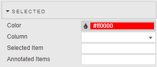
The Selected properties relating to the configured Points are shown below.
| Property | Description |
|---|---|
| Color | The color of the selected point. |
| Column | The data source column used in the selected row(s). |
| Selected Item | The current selected value. A point is highlighted with the specified color if the Selected Item value equals the value for the specified Column. |
| Annotated Items | When annotations are enabled, you can draw a polygon around a set of circles or points. The map captures the corresponding coordinates and selects all point IDs within that range, stored in this view state. These values can then be used in other components such as a data grid. |
Actions
Refer to Actions for details.
Icon Scale Interpolate
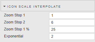
Icon scale interpolation means the map holds each property constant until you hit the next defined zoom stop, then jumps to the new value rather than smoothly scaling continuously.
| Property | Description |
|---|---|
| Zoom Stop 1 / Zoom Stop 2 | Define the set of zoom stops. |
| Zoom Stop 1% | Defines the minimum zoom percentage (relative to icon size) at which a zoom stop occurs. |
| Exponential | Applies exponential scaling to icon sizes across zoom levels, creating a smoother and more natural growth effect compared to linear scaling. |
Circles
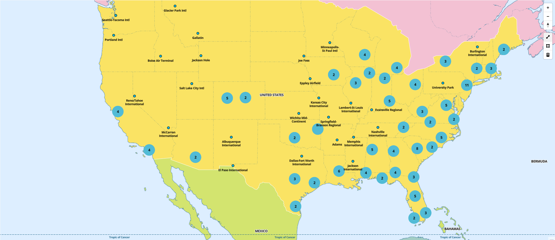
You can configure custom circles with clustering.
| Property | Description |
|---|---|
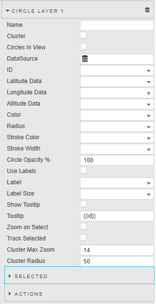
| Name | Define a name for the layer. If blank, the default name (Layer Type Layer Index) is used. |
| Cluster | When checked, grouped individual Circles are replaced with a numeric cluster icon. |
| Circles in View | When checked, all circles are zoomed in and in view when the map is loaded. |
| Data Source | A data source that includes geographic coordinates. |
| ID | A distinct identifier for a circle. |
| Latitude / Longitude Data | The data source columns for latitude and longitude. |
| Altitude Data | The data source column for altitude. |
| Color | The color of the map circle graphic. |
| Radius | The radius of the map circle graphic. |
| Stroke Color | The border color of the map circle graphic. |
| Stroke Width | The border width of the map circle graphic. |
| Circle Opacity % | The percentage opacity of a circle. |
| Use Labels | When checked, each circle displays a label. |
| Label | The label displayed next to each circle. |
| Label Size | The label font size. |
| Show Tooltip | When checked, circles display a tooltip on mouseover. |
| Tooltip | Set the value you want to see for tooltip at mouse-over. |
| Zoom on Select | When checked, the map is centered and zoomed in on this circle when clicked. |
| Track Selected | When checked, you can link/track a selected circle on the map. |
| Cluster Max Zoom | The maximum zoom level at which nearby circles are grouped into clusters. |
| Cluster Radius | Defines the clustering radius in pixels. |
Selected
| Property | Description |
|---|---|
| Color | The color of the selected circle. |
| Column | The Data Source column used in the selected row(s). |
| Selected Item | The current selected value. A circle is highlighted with the Color property if the Selected Item value equals the value for the specified Column. |
| Annotated Items | When annotations are enabled, you can draw a polygon around a set of Circles or Points. The map captures coordinates and selects all circle IDs within the range, stored in this view state. |
Actions
Refer to Actions for details.
Lines
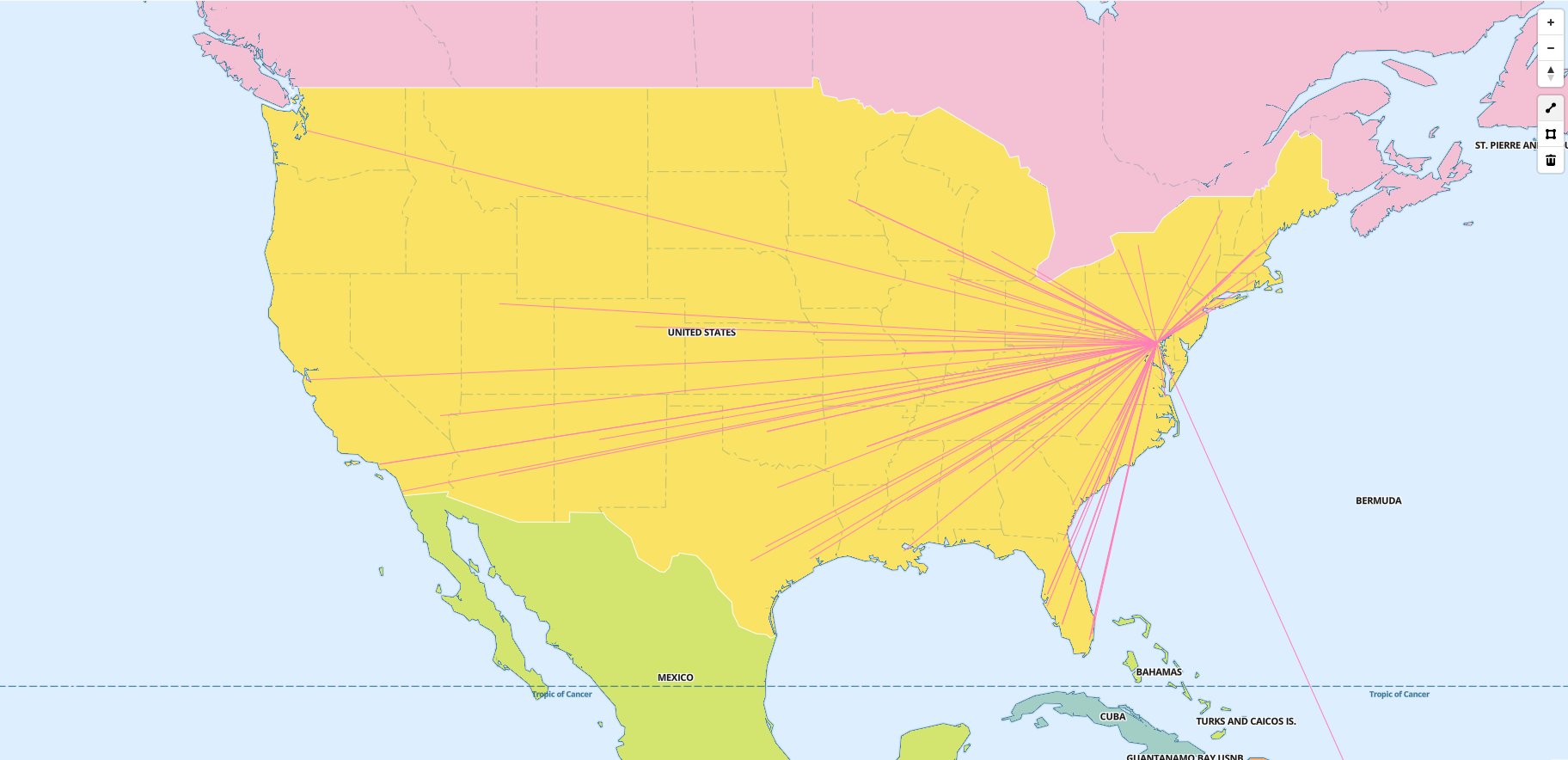
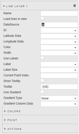
The Lines properties enable you to configure lines with customizable styling.
| Property | Description |
|---|---|
| Name | Define a name for the layer. If blank, the default name (Layer Type Layer Index) is used. |
| Load lines in view | Positions the map so that all points are zoomed in and visible when loaded. |
| Data Source | A data source that includes geographic coordinates. |
| ID | Lines are grouped by common IDs. To draw multiple lines from a single data source, group each set by the same ID. |
| Latitude / Longitude Data | The data source columns for latitude and longitude. |
| Color | The color of the map line graphic. |
| Width | The width of the map line graphic. |
| Use Labels | When checked, each line displays a label. |
| Label | The label displayed next to each line. |
| Label Size | The label font size. |
| Current Point Index | Set a value or view state with the current point index to highlight that point on the line. |
| Show Tooltip | When checked, the Map displays a tooltip when you mouse over a line. |
| Tooltip | Set the value you want to see on mouse-over from altitude, ID, latitude, or longitude. |
| Use Gradient | When checked, the color gradient indicator is shown. |
| Gradient Type | Select from linear (consistent color transition on a fixed scale) or data-driven (adapts to the data). |
| Gradient Column Data | Uses color gradients to visually represent data values within a column. |
Colors
| Property | Description |
|---|---|
| Color | Specifies the color used at a specific point in the gradient. Multiple colors can be defined for smooth transitions. |
| Percent | Position of the color stop within the gradient as a percentage (0–100%). |
Point
| Property | Description |
|---|---|
| Color | The color used by the current selected point on the line. |
| Size | The radius size of the current selected point on the line. |
Actions
Refer to Actions for details.
Concentric Circles
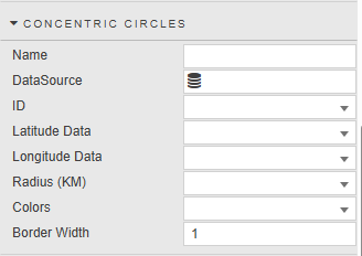
The Concentric Circles properties enable you to add concentric circle layers to maps, useful for: visualizing range (coverage areas like cell tower range); data analysis (segmenting areas for demographic or environmental studies); navigation (indicating distances for logistics and emergency planning); comparative studies; and interactive maps.
You can specify a latitude and longitude to set the center of the first circle. The radius can be defined based on a distance from this center point. Subsequent circles can be drawn from the edge of the first circle or independently.
| Property | Description |
|---|---|
| Name | Define a name for the layer. If blank, the default name (Layer Type Layer Index) is used. |
| DataSource | Specify the data source. The data source must have: Radius (KM) — a list of distances (KM) for each circle from the center point (e.g. ((25 50 100);(50 75))); Latitude and Longitude — center point coordinates (Latitude: -90 to 90, Longitude: -180 to 180); Colors — optional colors for each circle. See the sample data source query. |
| ID | A distinct identifier for each circle. |
| Latitude Data | The data source columns for latitude. |
| Longitude Data | The data source columns for longitude. |
| Radius (KM) | The radius of the concentric circle graphic. |
| Colors | The color of the concentric circle graphic. |
| Border Width | The border width of the concentric circle graphic. |
Sample Data Source
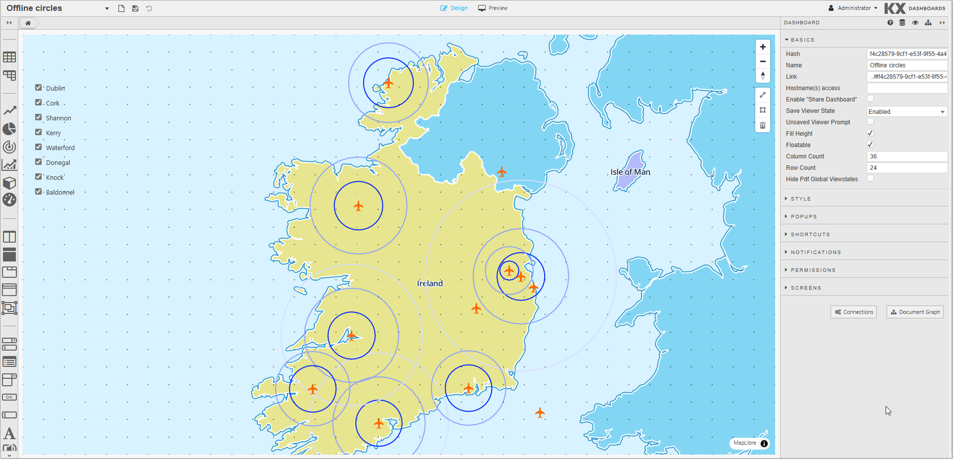
The following example shows concentric circles over Irish airports.
([]
    id:(1 2);
    location:(`Dublin`Cork);
    distance:( (25 50 100);(25 50 75));
    colors:(("#FF0000";"#FFA500";"#00FF00");("#FF0000";"#FFA500";"#00FF00"));
    latitude:( 53.2528 51.8491);
    longitude:(-6.2574 -8.4899)
    )
Heatmap
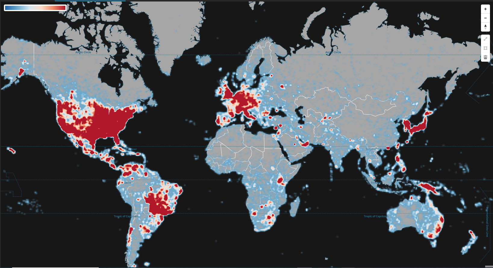
Heatmaps show the density of points over an area by displaying a continuous gradient between points. They are also useful for visualizing relative differences between those points.
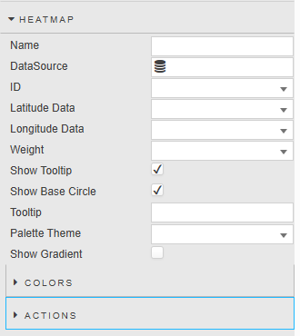
| Property | Description |
|---|---|
| Name | Define a name for the layer. If blank, the default name (Layer Type Layer Index) is used. |
| Data Source | A data source that includes geographic coordinates. For a worked example, see the sample data source below. |
| ID | A distinct identifier for a point. |
| Latitude / Longitude Data | The data source columns for latitude and longitude. |
| Weight | Selects the data column used to weight each point in the heatmap. Refer to Weight for details. |
| Show Tooltip | When checked, a tooltip is displayed on mouse-over. |
| Show Base Circle | When checked, the Map displays a circle for each of the specified coordinates. |
| Tooltip | Set the value you want to see for tooltip at mouse-over. |
| Palette Theme | Define the Palette Theme for the Heatmap colors. |
| Show Gradient | When checked, the color gradient indicator is shown. |
Weight
Each row's value in the Weight column determines how strongly that point contributes to the heatmap:
- Zoomed out, higher-weighted points intensify the heatmap blob more than lower-weighted points at the same location.
- Zoomed in, in individual point mode, higher-weighted points are drawn as larger, more intensely colored circles.
If you leave Weight blank, or a row has no value in the selected column, that point defaults to a weight of 1.
Tip
Keep weight values within a range of roughly 0–6. The color intensity and circle sizing scales are tuned to that range, so values well outside it clip to the extremes of the scale rather than continuing to grow.
Sample Data Source
The following example shows rainfall intensity across 100 locations in central Europe. Each row carries a coordinate pair and a weight value between 0.01 and 5.95, which sits inside the 0–6 range the intensity scale is tuned for.
Sample data source query — weighted rainfall
([]
    id:1+til 100;
    lat:(52.29 47.5 49.45 49.04 53.04 52.58 54.26 47.98 50.59 47.53
         49.01 51.24 47.51 48.85 52.37 51.55 49.02 51.9 53.61 47.35
         53.59 52.75 49.95 48.51 54.77 49.93 48.02 48.05 53.91 52.01
         53.6 52.99 51.48 54.89 50.25 51.61 53.77 52.12 54.02 51.8
         52.8 47.66 49.08 49.56 47.92 49.12 48.09 49.47 52.26 50.15
         50.19 48.93 49.38 54.61 52.35 52.05 48.63 52.99 48.57 50.26
         55.02 52.29 51.64 52.64 53.87 53.35 49.09 47.55 49.76 49.39
         48.95 54.65 54.14 49.75 52.41 50.39 54.43 50.88 49.37 49.22
         51.68 49.35 51.86 54.3 50.42 49.01 55.08 51.27 48.01 47.67
         48.16 52.19 53.48 50.59 47.8 50.28 55.07 51.43 54.87 54.01);
    lon:(6.0 12.46 12.1 10.79 8.33 11.73 6.92 9.86 10.03 14.58
         13.87 8.3 10.46 7.53 14.2 13.82 8.62 11.71 11.44 7.29
         12.84 10.81 12.99 10.73 5.91 8.85 6.08 14.35 13.9 13.47
         8.7 6.43 13.89 14.52 6.68 10.32 6.53 12.82 12.87 7.07
         10.23 10.9 8.31 13.84 9.75 7.83 10.81 12.54 7.73 8.74
         14.96 11.81 9.89 10.61 7.0 7.94 8.98 11.25 7.99 7.9
         6.55 11.64 7.98 14.14 13.72 6.54 8.07 11.99 7.85 7.1
         14.41 11.1 10.2 13.04 13.25 7.63 6.78 9.82 9.75 10.15
         12.53 12.03 14.86 6.8 9.56 8.99 13.74 8.16 7.63 9.98
         9.74 8.43 8.17 14.3 9.93 13.74 10.91 6.36 14.99 13.51);
    weight:(5.78 2.83 5.79 0.26 5.9 0.15 0.4 5.52 5.32 5.81
            0.01 5.53 0.12 0.23 5.92 5.82 5.83 5.64 5.48 4.04
            0.11 0.04 2.5 2.43 4.74 0.1 2.85 2.49 0.31 1.85
            0.17 4.29 0.12 0.03 1.39 5.72 0.37 0.32 0.21 0.13
            4.52 0.44 0.2 3.71 0.49 0.13 2.14 0.04 0.29 0.3
            5.73 2.92 5.93 0.08 4.59 0.09 5.2 0.48 3.52 5.55
            0.48 0.35 0.41 5.65 0.36 0.11 5.93 5.64 1.52 0.13
            5.53 0.18 5.57 5.95 3.78 5.79 0.02 0.46 5.31 0.32
            5.87 0.5 0.27 5.0 4.02 5.08 5.84 4.86 5.9 3.36
            5.69 5.8 0.32 4.9 2.44 3.4 5.92 0.38 0.3 5.62)
    )
Because the query returns a table literal, it runs against any kdb+ connection without requiring a matching table in the database.
To build the example:
-
Create a data source named
Weighted Rainfallthat runs the query above. -
Drag a Map component into the workspace, then open the Heatmap properties.
-
Set the Heatmap properties as follows:
Property Value Data Source Weighted RainfallID idLatitude Data latLongitude Data lonWeight weightShow Tooltip Checked Show Base Circle Checked Show Gradient Checked -
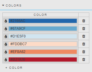
In the Colors properties, leave Palette Theme unset and define six colors, running from low density to high density:
#2166AC,#67A9CF,#D1E5F0,#FDDBC7,#EF8A62,#B2182B -
In the Map properties, center the map on the data and set the zoom level:
Property Value Center Latitude 53.01Center Longitude 17.78Zoom 3.08
Show Base Circle and Show Gradient are both worth enabling for this example: the base circles show where the individual readings are as you zoom in, and the gradient indicator gives you a scale for the colors.
Colors
| Property | Description |
|---|---|
| Color | Set the gradient color from minimum density to maximum density. |
Actions
Refer to Actions for details.
Heatmap Grid
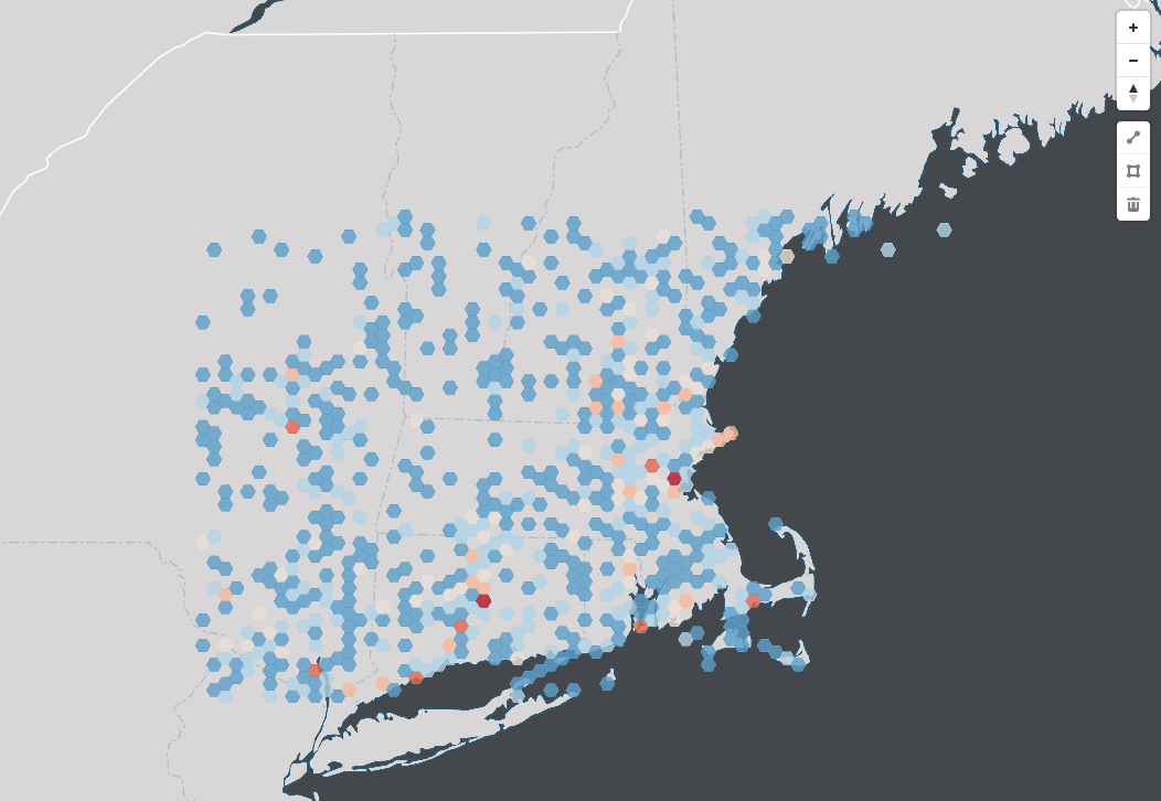
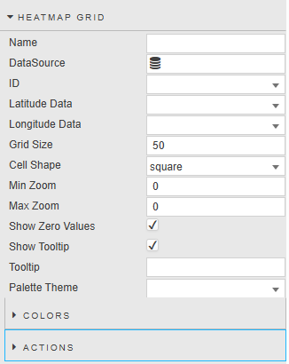
The Heatmap Grid allows you to visually represent large datasets using color gradients, making it easier to identify patterns, trends, and outliers. Each grid cell corresponds to a data point, with colors indicating values.
| Property | Description |
|---|---|
| Name | Define a name for the layer. If blank, the default name (Layer Type Layer Index) is used. |
| Data Source | A data source that includes geographic coordinates. |
| ID | A distinct identifier for a point. |
| Latitude / Longitude Data | The data source columns for latitude and longitude. |
| Grid Size | The length of each cell side (in kilometers). |
| Cell Shape | The shape of each cell: Square or Hexagon. |
| Min Zoom / Max Zoom | The zoom range in which the heatmap is displayed. The map provides 23 zoom levels (0 = fully zoomed out, 22 = fully zoomed in). At level 0 you see the Earth; at 3, a continent; at 4, large islands; at 6, large rivers; at 10, large roads; at 15, buildings. |
| Show Zero Values | If true, shows the color gradient for values that are zero; otherwise transparent. |
| Show Tooltip | When checked, a tooltip is displayed on mouse-over. |
| Tooltip | Set the value you want to see for tooltip at mouse-over. |
| Palette Theme | Define the Palette Theme for the Heatmap Grid Colors. |
Colors
| Property | Description |
|---|---|
| Color | Set the gradient color from minimum density to maximum density. |
Actions
Refer to Actions for details.
Bounds
| Property | Description |
|---|---|
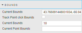
| Current Bounds | A bound is defined by its southwest and northeast points in longitude and latitude. Saves the current bound location when you zoom in or out. Used to map selected bounds coordinates to a View State Parameter. |
| Track Point click Bounds | When checked, you can track the bounds coordinates of a point when clicked. |
| Selected Point Bound Size | Defines a bounds around a point. Clicking on a point draws a rectangle around it, with width and height defined by this property. |
| Current Point Bounds | Displays the point bounds coordinates. |
Annotation
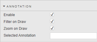
The Annotation properties enable you to add annotations to the map using lines or polygon shapes.
| Property | Description |
|---|---|
| Enable | When checked, you can annotate on the map using lines or polygons. A set of annotation controls appears below the map's zoom controls, providing Line Draw, Polygon Draw, and Delete Annotation options. |
| Filter on Draw | When drawing a polygon, if checked, only the points and circles inside the drawn area remain; the rest are filtered out. |
| Zoom on Draw | When checked, the map zooms to the polygon area after you finish drawing. |
| Selected Annotation | The specific annotation currently highlighted or selected on the map. |
Animated Circles
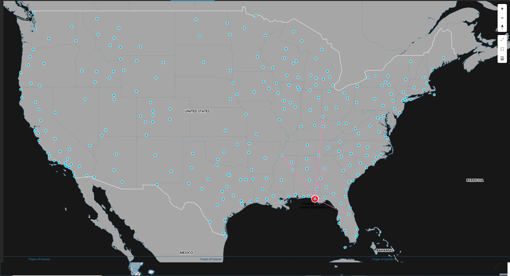
These properties enable you to configure customized animated circles on your map.
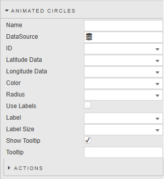
| Property | Description |
|---|---|
| Name | Define a name for the layer. If blank, the default name (Layer Type Layer Index) is used. |
| Data Source | A data source that includes geographic coordinates. |
| ID | A distinct identifier for an animated circle. |
| Latitude / Longitude Data | The data source columns for latitude and longitude. |
| Color | The color of the animated circle graphic. |
| Radius | The radius of the animated circle graphic. |
| Use Labels | When checked, the map displays a label for each animated circle. |
| Label | The label displayed next to each animated circle. |
| Label Size | The label font size. |
| Show Tooltip | When checked, the map displays a tooltip on animated circle mouseover. |
| Tooltip | Set the value you want to see for tooltip at mouse-over. |
Actions
Refer to Actions for details.
Icons
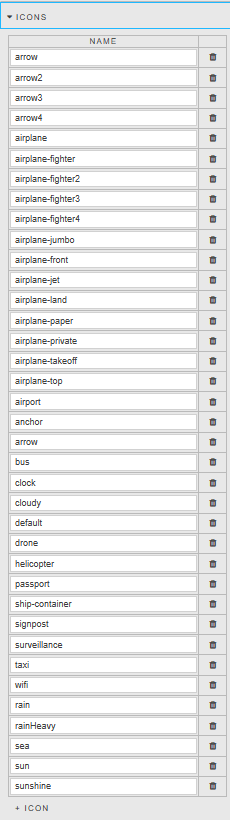
These properties present a list of icons added to the css\assets\images folder on the server. These icons can be used by the Icon property in the Points properties. Click + Icon to add more icons.
Night/Day Layer
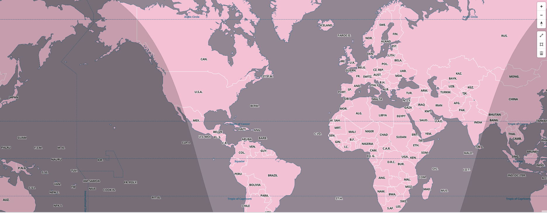
These properties enable you to add a layer to determine the region of day and night time based on a current date/time value.
| Property | Description |
|---|---|
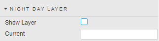
| Show Layer | Toggle to specify whether the map shows the Night and Day layer. |
| Current | The current date/time value. |
Style
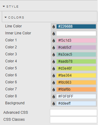
You can use the Style properties to override the default colors used in the map component.
3D Models
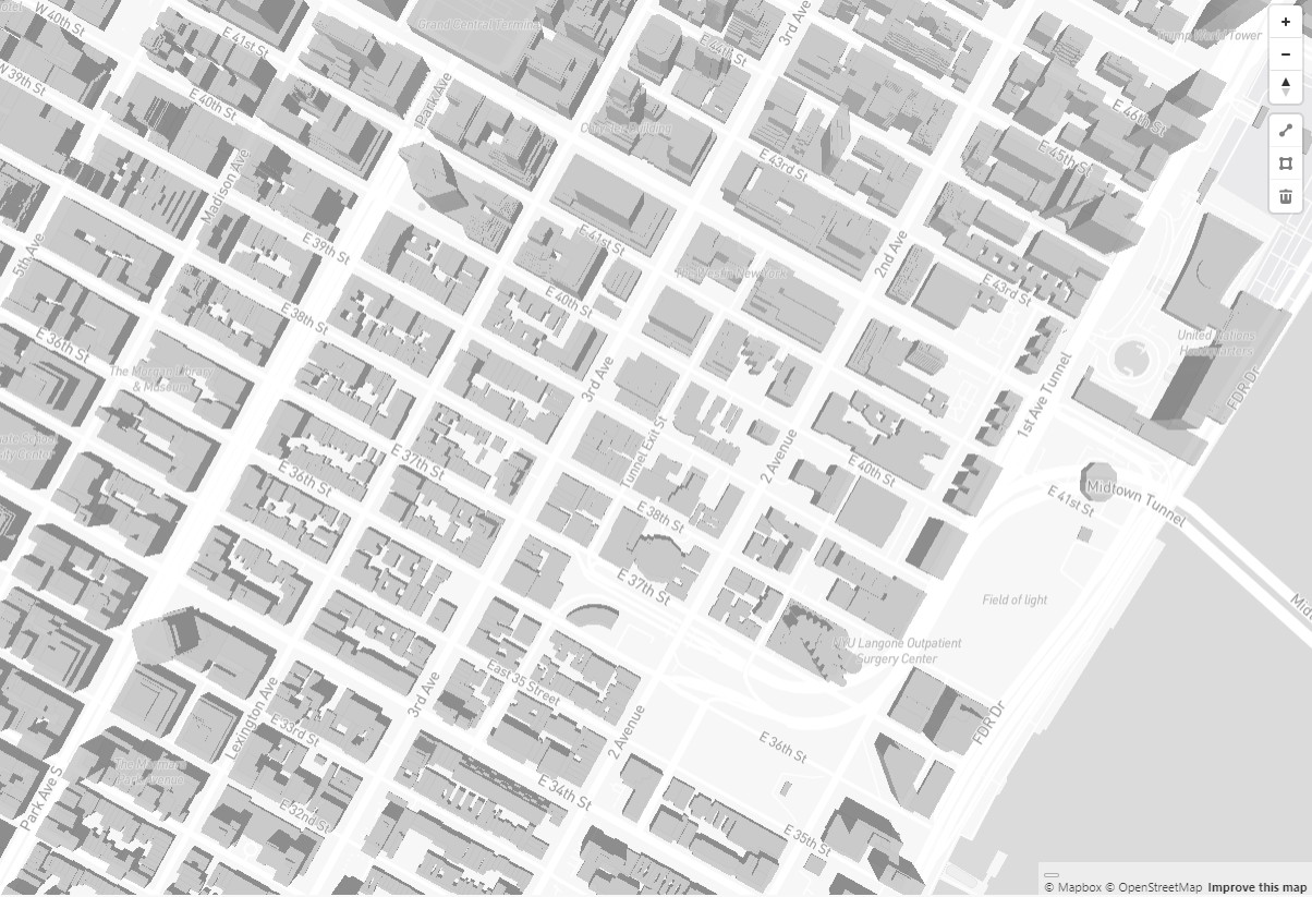
With 3D Models, you can see 3D models when you zoom into the data property.
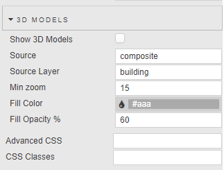
| Property | Description |
|---|---|
| Show 3D Models | Check this box to enable the display of 3D models on the map. |
| Source | Defines the origin of the geographical data (vector tile, raster, or GeoJSON). Defaults to Composite, which combines multiple vector tile sources into a single source for efficient handling of complex maps. |
| Source Layer | Specifies a particular layer within a vector tile source. Necessary when a vector tile source contains multiple layers (like roads or buildings). |
| Min Zoom | Sets the minimum zoom level at which the 3D models are visible. |
| Fill Color | Sets the color used to fill the 3D models. |
| Fill Opacity | Controls the transparency of the fill color. |
Tile Server
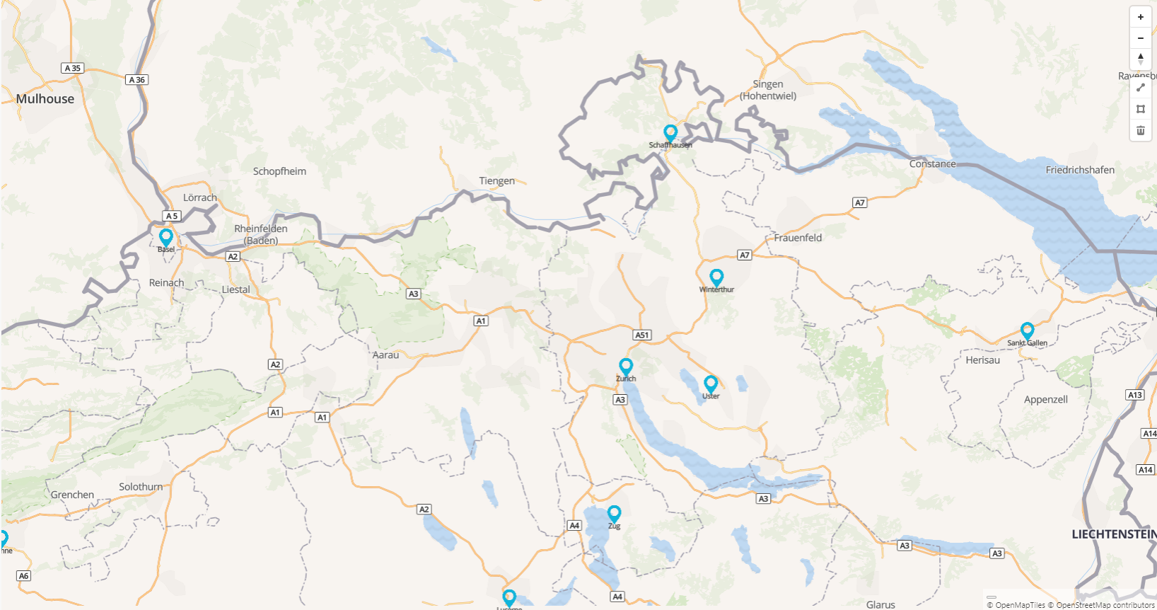
Integrating a custom-styled tile server allows you to load and display dynamic, custom-designed map layers with full control over appearance.
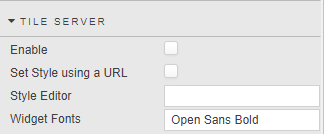
| Property | Description |
|---|---|
| Enable | When checked, interaction with a custom Tile Server is enabled. Note: To see the results after changing this property, the Dashboard must be saved and reloaded. |
| Set Style using a URL | Defines whether to set the style using a URL endpoint or using the editor to define JSON. |
| Style URL | Set the style of the map based on a URL endpoint. |
| Style Editor | Define the JSON style configuration. |
| Widget Fonts | Set the font name to be used by the Map Component (for example, "Open Sans Bold"). This font is stored on the tile server and will be used by point clusters and labels. |
Refer to Tile Server Installation and Setup for detailed instructions.
External API
This Map component can also be used online, enabling you to set external APIs.
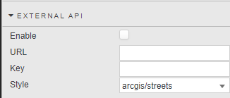
| Property | Description |
|---|---|
| Enable | When checked, you can use the external API on the map. |
| URL | The endpoint of the external API. |
| Key | The authentication key required to access the external API. |
| Style | Allows you to choose the visual representation of the map. |
Layers
A layer is a transparent overlay on top of the base map. Each layer adds its own information — colored regions, an image, a video, a custom shape — without changing the map underneath. You can stack as many layers as you need, and turn each one on or off independently.
The Layers properties enable you to add five types of layer to your map:
| Layer type | What it adds | Typical use case |
|---|---|---|
| Data Layers | Colors regions, such as countries, states, or zones, according to a value in your kdb+ data. | Choropleth maps, for example, shading US states by population. |
| Media Layers | Pins an image or video to a specific location on the map. | Overlaying a drone photo or satellite image on its real coordinates. |
| Hosted Layers | Adds a fixed GeoJSON shape stored on your server. | Showing geography that rarely changes, such as flood zones, districts, or routes. |
| Simple Layers | Does the same job as a Hosted Layer, but you paste the shape data directly into the property instead of pointing at a file. | One-off shapes, without uploading a file first. |
| Raster Layers | Pulls in a grid of pixels from an external map server. | Weather radar, satellite imagery, elevation maps. |
If you are unsure which type to use, choose a Data Layer whenever you want to color a region based on a number in your dataset. The other four types add fixed shapes, images, or external imagery that aren't driven by a color gradient from your data.
Terms used in this section
- GeoJSON is a text format that describes shapes on a map — the outline of a country, a district boundary, a route — using latitude and longitude coordinates. You don't need to understand its internal structure; it's the file that describes the shape.
- kdb+ data is the dataset from your data source: a table of rows and columns that supplies the values you want to show, such as a population count or a sensor reading.
- WMS and WMTS are standard protocols that mapping servers use to serve image tiles on request. Third-party providers, such as weather services, use them to share imagery. See Raster Layers.
Data Layers
A Data Layer combines a shape from a GeoJSON file with a number from your kdb+ data, so that each region on the map is colored according to its value. This kind of map is also called a choropleth map — think of a weather map where each country is shaded by temperature. The following example shows unemployment rate data across US states, highlighted in a color gradient from highest (bright red) to lowest (bright green).
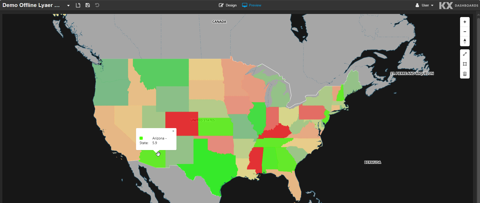
Two separate identifiers do the matching for you:
- The GeoJSON file has its own ID for each shape; for example, each US state has an internal ID.
- Your kdb+ table has a matching ID column, such as a state code, plus a value column, such as a population count.
You tell the Data Layer which ID field to use on each side, and it joins them and colors each region accordingly.
To set up a Data Layer:
- Get or create a GeoJSON file describing the regions you want to color, and place it in the
modules\OfflineMap\css\assets\layersfolder on your server. - Point File at that file.
- Set File Id to the field inside the GeoJSON that identifies each shape.
- Set Id to the matching column in your kdb+ data source.
- Set DataValue to the column holding the number you want to visualize.
- Choose a Palette Theme to control the color gradient.
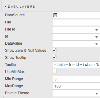
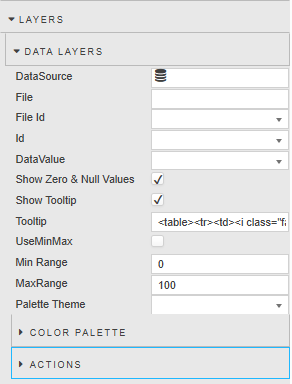
| Property | Description |
|---|---|
| DataSource | The data source supplying the values for each region. |
| File | The GeoJSON file name. Files must be hosted locally in modules\OfflineMap\css\assets\layers; the Map component doesn't fetch this file over the internet. |
| File Id | The field name inside the GeoJSON file that uniquely identifies each shape, such as a state code. Used to link the GeoJSON coordinates to the kdb+ data. |
| Id | The column name in your kdb+ data that matches File Id, so each row of data lines up with the correct shape. |
| DataValue | The column holding the number to visualize. This value drives the color of each region. |
| Show Zero & Null Values | When checked, regions with zero or null values are displayed. Clear it to omit those regions. |
| Show Tooltip | When checked, a tooltip appears when a user hovers over a region. |
| Tooltip | The content shown in the tooltip. Reference the region's {{color}}, {{id}}, and {{value}} using template syntax. Refer to Custom tooltips for details. |
| UseMinMax | When checked, Min Range and Max Range define the numeric range over which colors are mapped, instead of the gradient auto-scaling to your data. Use this to keep colors consistent across dashboards that show different date ranges. |
| Min Range | The smallest data value that maps to the start of the color range. Only used when UseMinMax is checked. |
| Max Range | The largest data value that maps to the end of the color range. Only used when UseMinMax is checked. |
| Palette Theme | The preset color scheme used for the gradient. Refer to Palette Theme for details. |
If your regions don't appear
Check that the File Id and Id values match exactly. They are often in subtly different formats — for example, US-CA against CA. A mismatch here is the most common reason a Data Layer renders blank.
Sample Data Source
The following example shades US states by population. It uses the us_states.json GeoJSON file, whose GEO_ID field holds US Census identifiers such as 0400000US06 for California.
The data source returns an ID column in that same GEO_ID format, together with a POPULATION column:
Sample data source query — US state populations
([]
    ID:(`0400000US06;`0400000US48;`0400000US12;`0400000US36;`0400000US42;`0400000US17;`0400000US39;`0400000US13;
        `0400000US37;`0400000US26;`0400000US34;`0400000US51;`0400000US53;`0400000US04;`0400000US47;`0400000US25;
        `0400000US18;`0400000US29;`0400000US24;`0400000US08;`0400000US55;`0400000US27;`0400000US45;`0400000US01;
        `0400000US22;`0400000US21;`0400000US41;`0400000US40;`0400000US09;`0400000US49;`0400000US32;`0400000US19;
        `0400000US72;`0400000US05;`0400000US20;`0400000US28;`0400000US35;`0400000US16;`0400000US31;`0400000US54;
        `0400000US15;`0400000US33;`0400000US23;`0400000US30;`0400000US44;`0400000US10;`0400000US46;`0400000US38;
        `0400000US02;`0400000US11;`0400000US50;`0400000US56);
    NAME:(`$"California";`$"Texas";`$"Florida";`$"New York";
          `$"Pennsylvania";`$"Illinois";`$"Ohio";`$"Georgia";
          `$"North Carolina";`$"Michigan";`$"New Jersey";`$"Virginia";
          `$"Washington";`$"Arizona";`$"Tennessee";`$"Massachusetts";
          `$"Indiana";`$"Missouri";`$"Maryland";`$"Colorado";
          `$"Wisconsin";`$"Minnesota";`$"South Carolina";`$"Alabama";
          `$"Louisiana";`$"Kentucky";`$"Oregon";`$"Oklahoma";
          `$"Connecticut";`$"Utah";`$"Nevada";`$"Iowa";
          `$"Puerto Rico";`$"Arkansas";`$"Kansas";`$"Mississippi";
          `$"New Mexico";`$"Idaho";`$"Nebraska";`$"West Virginia";
          `$"Hawaii";`$"New Hampshire";`$"Maine";`$"Montana";
          `$"Rhode Island";`$"Delaware";`$"South Dakota";`$"North Dakota";
          `$"Alaska";`$"District of Columbia";`$"Vermont";`$"Wyoming");
    POPULATION:"i"$(39355309 31709821 23462518 20002427 13059432 12719141 11900510 11302748
                    11197968 10127884  9548215  8880107  8001020  7623818  7315076  7154084
                     6973333  6270541  6265347  6012561  5972787  5830405  5570274  5193088
                     4618189  4606864  4273586  4123288  3688496  3538904  3282188  3238387
                     3184835  3114791  2977220  2954160  2125498  2029733  2018006  1766147
                     1432820  1415342  1414874  1144694  1114521  1059952   935094   799358
                      737270   693645   644663   588753)
    )
Because the query returns a table literal, it runs against any kdb+ connection without requiring a matching table in the database.
Configure the Data Layer as follows:
| Property | Value |
|---|---|
| DataSource | The data source running the query above. |
| File | us_states.json |
| File Id | GEO_ID |
| Id | ID |
| DataValue | POPULATION |
The NAME column isn't read by the Data Layer — Id and DataValue are the only columns it uses — but it makes the data source easier to read and to reuse in other components.
Color Palette
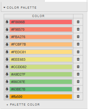
The Color Palette preview shows the colors applied across your chosen range, so you can check the gradient before publishing.
Actions
Data Layers support interactive actions; for example, clicking a region can filter another component on your dashboard. Refer to Actions for details.
Media Layers
A Media Layer overlays a single image or video onto the map, pinned to real-world coordinates — like taping a photo onto a spot on a physical map, but stretched to fit exactly. Use it to show a drone photo of a site, a satellite snapshot, or a video feed over its real geographic footprint.
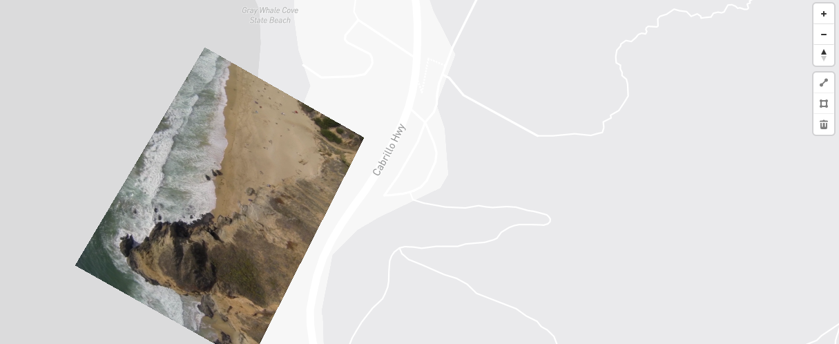
To position the media, you provide four coordinate pairs, one for each corner. The Map component then stretches your image or video to fit between those four points.
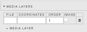
| Property | Description |
|---|---|
| File | The image or video file name. Files must be hosted locally in modules\OfflineMap\css\assets\layers; you can't link to an external URL. |
| Coordinates | Four georeferenced coordinates (longitude, latitude) corresponding to the top-left, top-right, bottom-right, and bottom-left corners of the image, in that order. For example: [-122.516, 37.562], [-122.514, 37.564], [-122.513, 37.563], [-122.514, 37.561].If these are wrong, the image appears skewed, flipped, or in the wrong place. |
| Order | The order in which the media layers are applied to the map, if you're stacking multiple Media Layers. Where layers overlap, a higher value draws closer to the viewer. |
| Image | Must be checked if the media file is an image. Clear it for a video. |
To remove a layer you have added, click the trash can icon next to it.
If your overlay looks flipped or skewed
Check the order of the four coordinate pairs. They must run top-left, top-right, bottom-right, bottom-left. Listing them in a different order mirrors or rotates the image.
Hosted Layers
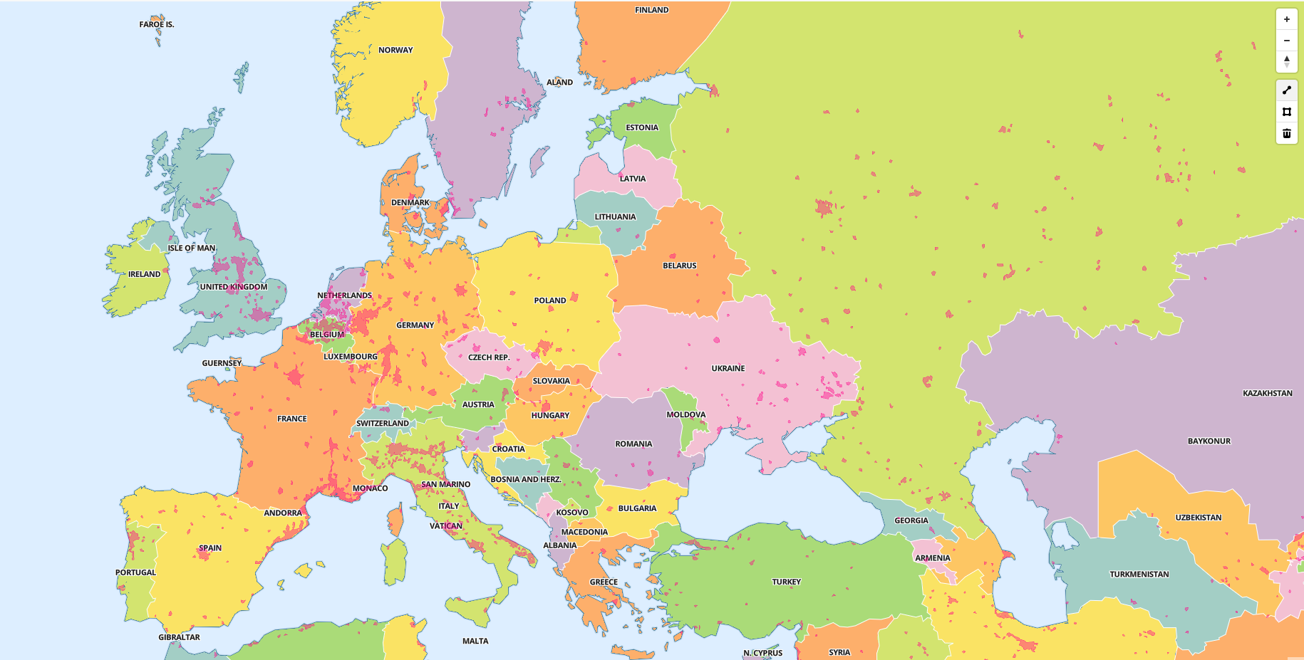
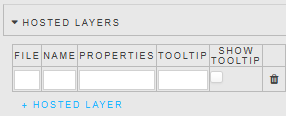
A Hosted Layer adds a fixed shape to the map from a GeoJSON file stored on your server. Use it for geography that doesn't change often and isn't tied to a live data value, such as district boundaries, flood zones, or fixed routes. Unlike a Data Layer, there is no color gradient driven by a data column; you set a single static style for the whole layer.
| Property | Description |
|---|---|
| File | The GeoJSON file name. Files must be hosted locally in modules\OfflineMap\css\assets\layers. |
| Name | The label for the layer, used to identify it in the map legend and settings panel. Name it something recognizable, such as Flood Zones. |
| Properties | The visual styling — fill color and opacity — written as JSON. For example, {"paint": {"fill-color": "#f08","fill-opacity": 0.4}} sets a pink fill at 40% opacity. Adjust the hex color code and the opacity value, where 0 is fully transparent and 1 is fully solid. |
| Tooltip | The content shown when you hover over the shape. You can reference live field values using template syntax rather than typing static text. Refer to Custom tooltips for details. |
| Show Tooltip | Enables or disables tooltips for this layer. |
To remove a layer you no longer need, click the trash can icon.
Editing the styling JSON
If you aren't comfortable writing JSON by hand, copy the example above and change only the fill-color and fill-opacity values.
Simple Layers
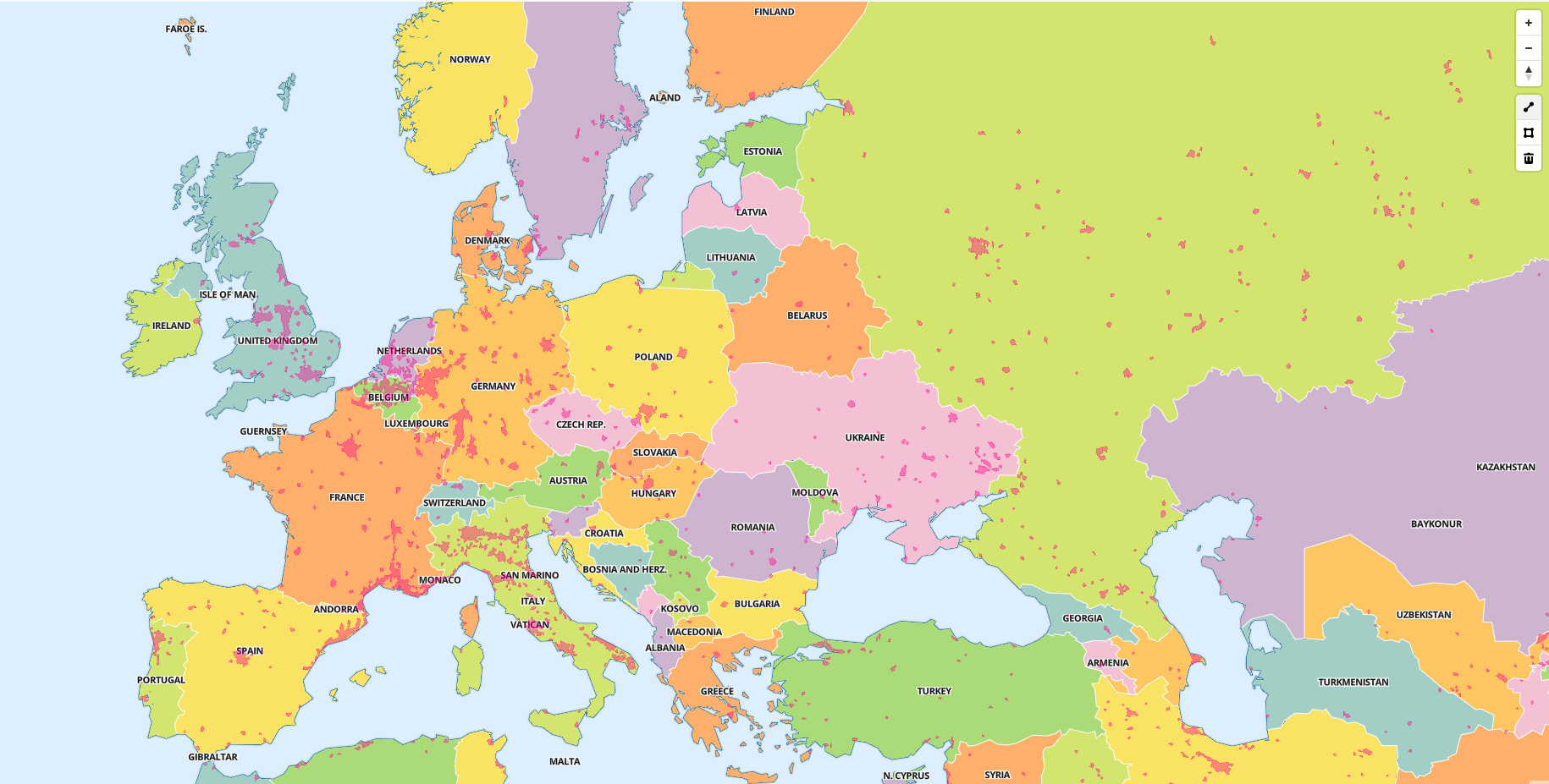
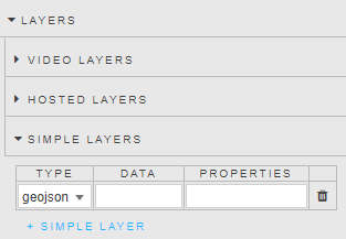
Simple Layers do almost the same job as Hosted Layers — adding a shape onto the map — but instead of pointing at a file already on the server, you paste the shape data directly into the property. This suits quick, one-off shapes when you don't want to upload a separate file.
| Property | Description |
|---|---|
| Type | The format of your data: GeoJSON, which describes shapes with coordinates, or vector. |
| Name | A label to identify this layer. |
| Data | The shape data itself, pasted in directly as JSON or GeoJSON text. This replaces the need for a separate uploaded file. |
| Properties | The style properties used by the layer, written as JSON. For example: { "id": "urban-areas-fill", "type": "fill", "source": "urban-areas", "layout": {}, "paint": { "fill-color": "#f08", "fill-opacity": 0.4 } }. |
| Tooltip | The content shown when a user hovers over the shape. Refer to Custom tooltips for details. |
| Show Tooltip | Enables or disables tooltips. |
Choose a Simple Layer over a Hosted Layer when your shape is small, temporary, or generated dynamically — for example, from a template or view state. Pasting it inline avoids uploading and managing a separate file on the server.
Asset storage
Because the Map component is designed to work offline, every visual asset it needs — glyphs, images, and map tiles — is stored locally in the css\assets\ folder inside the component code, rather than being fetched from external APIs.
Raster Layers
Unlike the other layer types, which draw vector shapes such as lines, polygons, and points, a Raster Layer displays a grid of colored pixels, similar to a digital photograph. Each pixel holds a value, such as temperature, elevation, satellite imagery, or precipitation. Use a Raster Layer for continuously varying data, where a smooth image conveys more than distinct shapes.
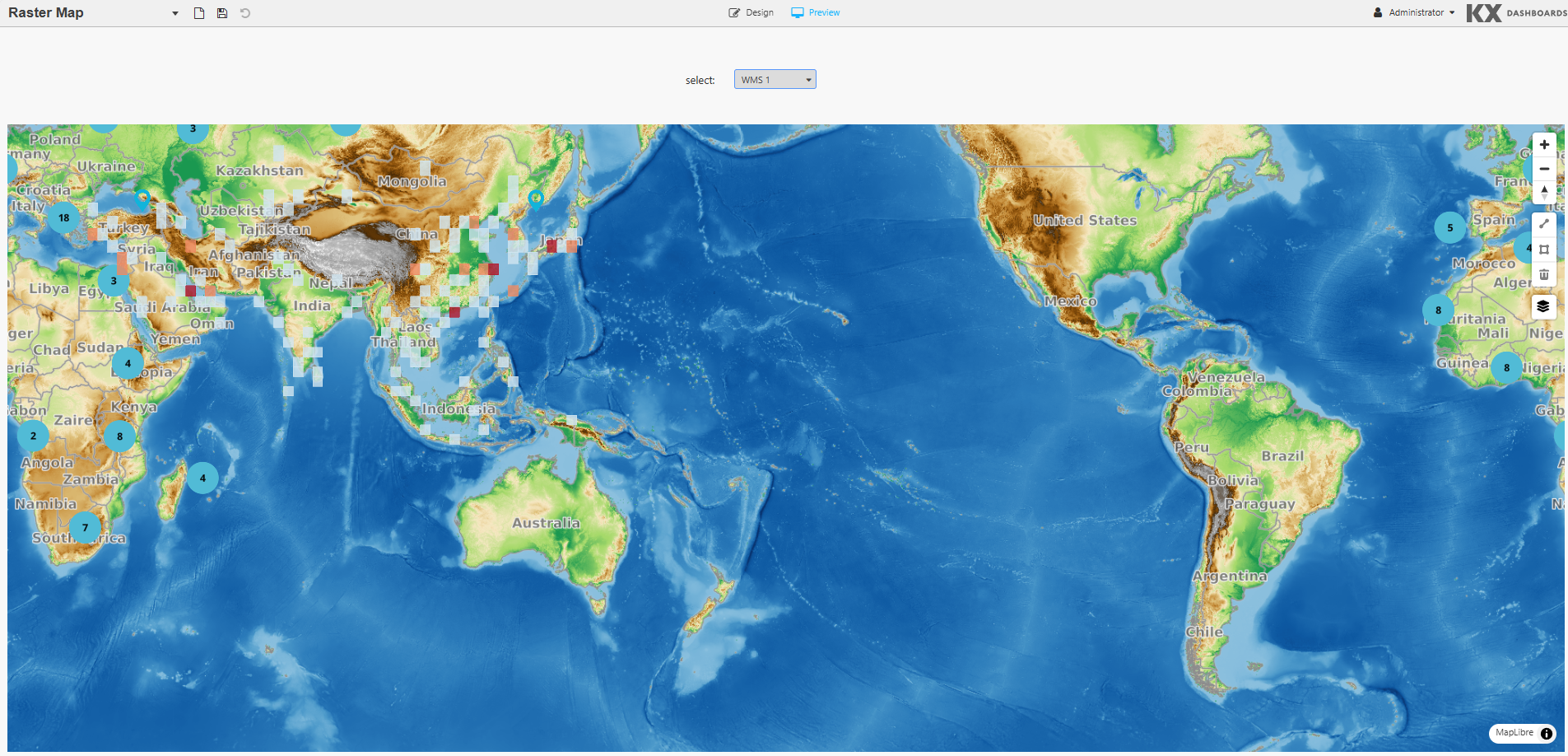
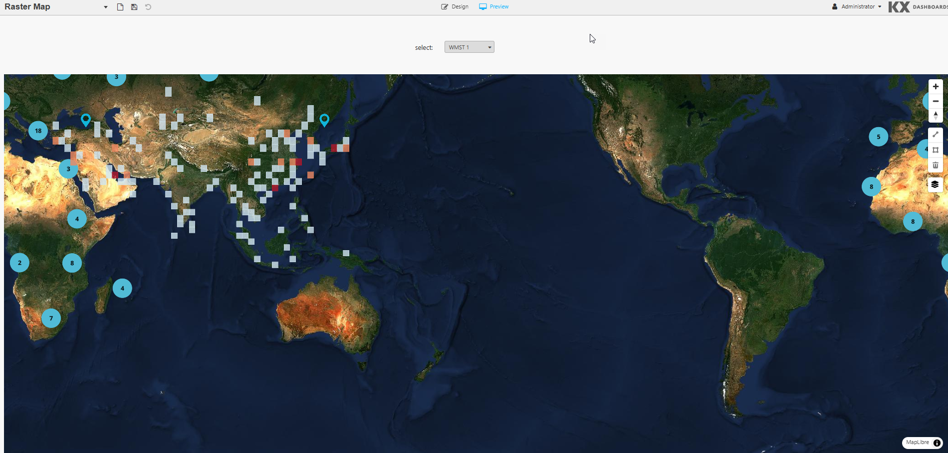
Raster Layers pull their imagery from an external WMS or WMTS endpoint. You typically don't set these up yourself; instead, your organization or a third-party provider, such as a weather data service, gives you a ready-made tile URL to use.
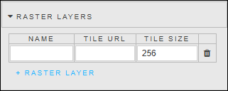
| Property | Description |
|---|---|
| Name | A descriptive label for the raster layer (for example, Weather Radar). |
| Tile URL | The URL template your WMS or WMTS provider gives you for requesting image tiles. It typically includes placeholders for the bounding box (bbox), coordinate system (srs/epsg), width, height, and format. Copy it from your provider's documentation rather than writing it from scratch. You can also use a view state here if the URL needs to change dynamically, for example, to update a radar timestamp. |
| Tile Size | The pixel dimensions of each map tile, typically 256 or 512. This must match what your provider's service expects; check their documentation if you are unsure. |
If your raster imagery doesn't appear
The most likely causes are a Tile Size that doesn't match what the server sends, or a Tile URL missing one of the parameters your provider's documentation specifies.
Margins
Refer to Margins for details.
Format
Refer to Format for details.
Drawing a Line
This section describes how to draw a line on a map to calculate the distance between two or more points. After you draw the line, the distance in kilometers is shown in a popup.
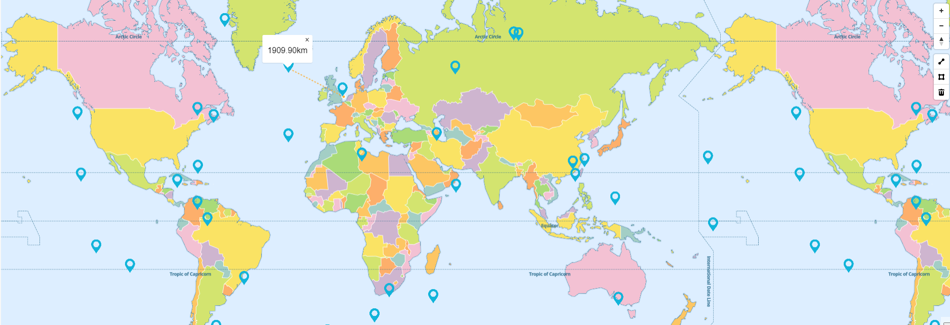
To draw a line annotation:
-
In the annotation controls, below the map's zoom controls, click the line icon.
-
Click the starting point on the map.
-
Click any other point on the map to connect the line.
While you're still adding points, the line appears as a yellow dashed line, which means it isn't finished.
-
When the line covers the distance you want, click the line itself rather than placing another point. The line turns blue, which means it is complete.
To delete a line, select the line and click the trash icon in the annotation controls.
Working with polygons
A polygon is a shape you draw directly on the map to mark out an area — for example, to select every data point within a region.
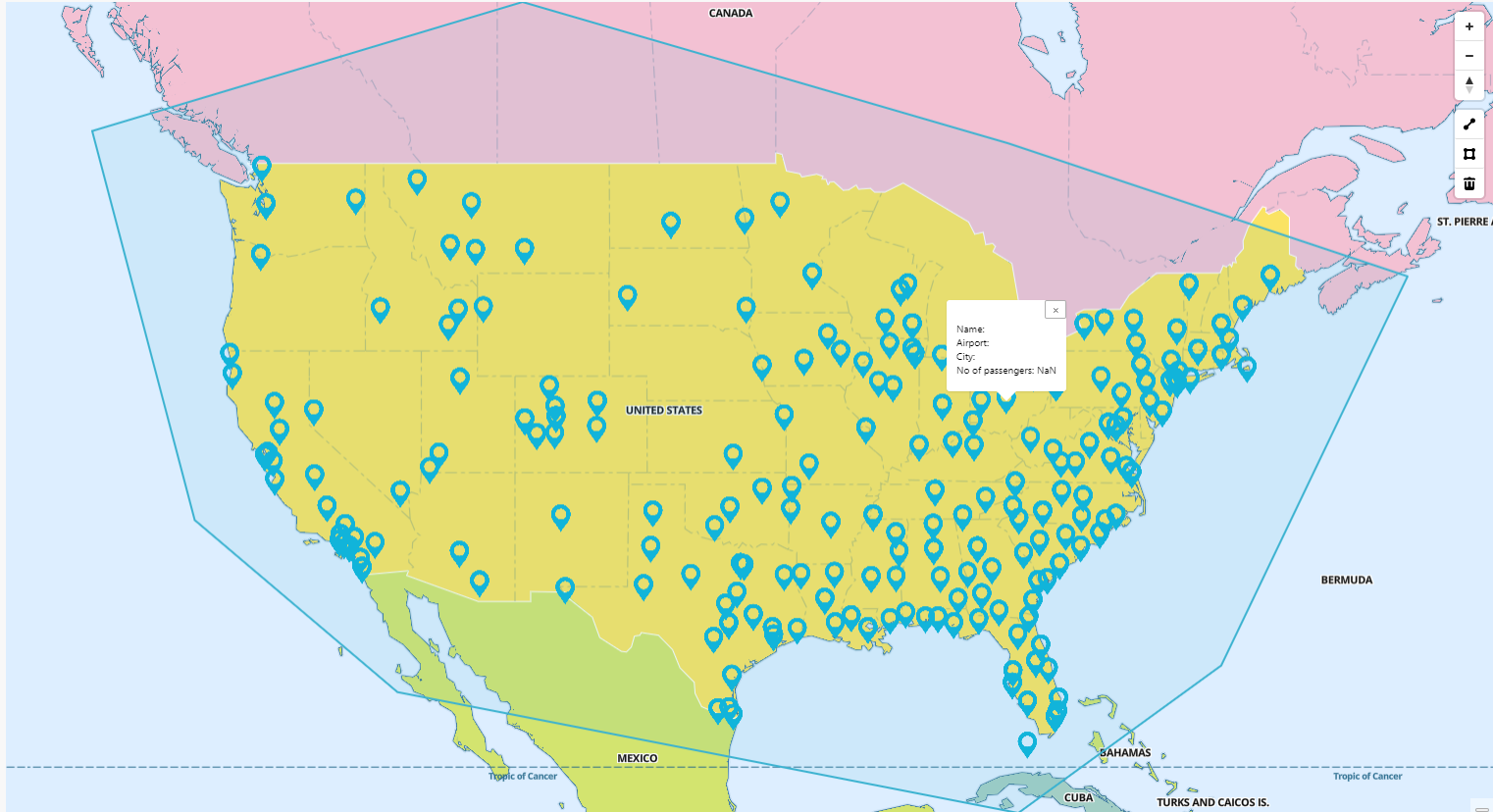
Draw a polygon
Before you start, enable annotations for the map. Refer to Annotation for details.
-
Switch to Preview mode.
-
In the annotation controls, below the map's zoom controls, click the polygon icon.
-
Click the map to place your first point, then keep clicking to add more. Each click adds a corner, or vertex, to the shape. Add as many points as you need to outline the area you want.
While you're still adding points, the shape appears as a yellow dashed line, which means it isn't finished.
-
When the shape covers the area you want, click the line itself rather than placing another point. The line turns blue, which means the polygon is complete and active.
Tip
If you make a mistake while drawing, delete the polygon and start again. Refer to Delete a polygon for details.
Note
When Zoom on Draw is selected, the map zooms in on the polygon after it is applied.
Filter data inside a polygon
Once you've drawn a polygon, you can use it to filter the data shown on the map.
When Filter on Draw is selected in the Annotation properties, the map updates as soon as you draw, edit, or delete a polygon: any Point or Circle layers then show only the data inside your shape.
To reuse a filtered selection later, for example, to show it again after a page refresh, save it with the Annotated Items property. You'll find it in the Selected properties of the Points or Circles layer.
Save a polygon to reload later
To keep a polygon's exact shape so that you can bring it back later, or share it with another part of your dashboard, use the Selected Annotation property in the Annotation properties. This saves the shape as a JSON object, which you can:
- Store, so that the polygon reloads automatically next time.
- Share with other components on the dashboard.
Delete a polygon
-
Click the polygon to select it.
-
Click the trash icon in the annotation controls.
Tile Server Installation
KX Dashboards uses tileserver-GL, a self-hosted map tile server for use when leveraging web-based maps and online map tilers are unavailable in offline and air-gapped environments.
Tile Server Documentation
Tile Server GitHub guide: https://github.com/maptiler/tileserver-gl
Full documentation: https://tileserver.readthedocs.io/en/latest/
Prerequisites
- Latest Version of KX Dashboards 2.2.5 or greater, or KX platform build 4.9.2 or greater
- Node JS 18.17.0 or greater
- https://github.com/maptiler/tileserver-gl
Operating Systems
- Windows (x64) or greater
- Ubuntu 22.04 or greater
- macOS 14 (x64/arm64) or greater
Getting Started
Install from npm to the directory you wish to install to.
Option 1: Install globally from npmjs:
npm install -g tileserver-gl
Option 2: Install locally from source:
git clone https://github.com/maptiler/tileserver-gl.git
cd tileserver-gl
npm install
Using tileserver-gl-light
tileserver-gl-light can be used but is unable to handle any raster functions. If raster functions may be required in future, install the full version.
Map Data
To render data offline, an mbtiles file is required for the area of interest. It is recommended to use the mbtiles files at: https://osm.dbtc.link/mbtiles/
mbtiles Recommendation
- Recommended mbtiles file download:
2024-06-25-planet.mbtiles - This file is for OpenStreetMap Data last updated in June 2024. As this is a static file, map updates must be obtained by the user.
- KX is not responsible for providing map updates.
Adding Map Data and Styles
Once the OSM data is downloaded, copy it to the same directory as the tileserver-gl install (along with the accompanying config.json file, if present).
Sample fonts and files for the tile server can be obtained from: https://github.com/maptiler/tileserver-gl/releases/download/v1.3.0/test_data.zip
From test_data.zip, copy the styles and fonts directories to the tileserver-gl installation folder.
Tile Server Configuration File
The config.json file configures map styles, fonts, and data sources. If no config.json is defined, the server will use its default settings.
The tileserver-gl directory structure should look similar to this:
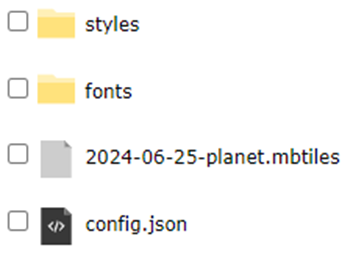
Inside the styles folder, the following styles are provided: osm-bright and klokantech-basic.
Additional styles
Additional styles can be added by following the user guide in the tileserver-gl documentation.
Before You Start the Tile Server
Tileserver-gl defaults to port 8080. Assign a new port to avoid conflicting with your KX install. Port 8082 is recommended.
tileserver-gl 2024-06-25-planet.mbtiles -p 8082
KX Dashboards Tile Server Integration
- Drag the Map component onto the canvas.
- In the Tile Server property section, check Enable.
- The Style can be specified in one of two ways:
Set the Style Using URL

- Check Set Style using a URL.
- Using a browser, navigate to the host and port for the Tile Server. Right-click the link for the chosen Style and copy the link to the clipboard.
- Paste the URL into the Style URL property in KX Dashboards.
- Save and reload/refresh the page.
Set the Style Using Editor
- Uncheck Set Style using a URL.
- Using a browser, navigate to the host and port for the Tile Server. Click the link for the chosen style and copy the contents to the clipboard.
- Paste the contents into the Style Editor property.
- Save and reload/refresh the page.