Map#
This page describes the offline Map component and how it can be set up and configured to create visually appealing, engaging, and performant geographic maps.
This component utilizes WebGL technologies, enabling Maps to render quickly and smoothly which is highly beneficial when working with large datasets. The benefit of using this Map component over the standard Map (External API) component is that you do not need to have external access to the internet or external APIs.
There is a wide range of customizations available for the Map including adjusting styles, colors, fonts, adding custom icons and interactive layers (including Points, Circles, Lines, Animated Points, Heatmaps, and customizable Layers).
Two Map components
The Dashboards UI includes two different Map components, both displaying geographical data but used for different purposes. To use the Map (External API) component, you need a stable internet connection and access to external APIs. If you need to use maps offline, the Map component described on this page allows you to visualize geographical data without the need of an internet connection or access to external APIs. The properties you can set for the two maps are different so it's recommended you choose which component to use based on your needs.
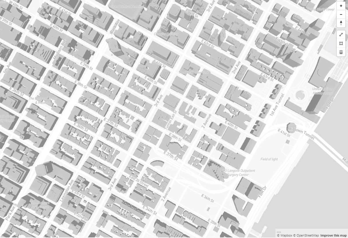
The following screenshot illustrates a sample Map with defined circles.
The Map has features that enable you to:
- Visualize and animate geographic data
- Visualize streaming and moving data geographically
- Display and interact with large quantities of data on a map
- Query and filter map features
- Dynamically display and style custom client-side data on a map
- Programmatically add points, circles, lines, and popups to maps
- Annotate polygons and lines on geographic data and store annotated points in view states for use in other components
- Overlay multiple layers of data on top of each other
The following sections describe how to configure the properties of the Map component. To access these properties, simply click and drag the Map component into your workspace. Once it's placed, you can modify the following properties on the left-hand panel.
- Basics
- Map
- Points
- Circles
- Lines
- Concentric Circles
- Heatmap
- Heatmap Grid
- Bounds
- Annotation
- Animated Circles
- Tile Server
- Icons
- Night Day Layer
- Style
- External API
- Layers
- Margins
- Format
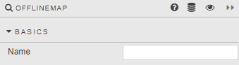
Basics#
The Basics just require you to set a name for the component.
| Property | Description |
|---|---|
| Name | Enter a name for the component. |
Map#
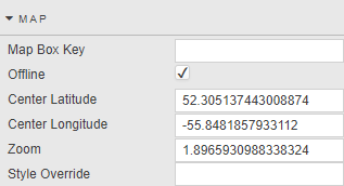
The Map properties allow you to configure the zoom setting for the map when it loads latitude and longitude coordinates and the style of the map.
| Property | Description | |||||
|---|---|---|---|---|---|---|
| Map Box Key | This key (access token) associates API requests with a Mapbox account. This is required for online mode only. | |||||
| Offline | Click this to switch between offline mode and online mode. Offline mode requires no access to the internet. This must be unchecked to use the Map offline. | |||||
| Center Latitude/Longitude | This sets the map center when the dashboard loads. This is defined in longitude and latitude values. | |||||
| Zoom | This is the initial zoom level. | |||||
| Style Override | When this is set, the default style is overridden with the JSON/GeoJSON (for Offline mode) or URL string (for Online mode) set in the style. Offline Mode: The map component is set with a default map style. This style uses:
These default style settings can be overridden by this property. The default properties are part of the component and no external API requests are needed. Online Mode: For Online mode, we use the following default styles:
|
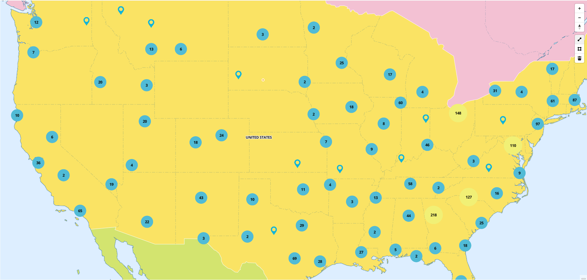
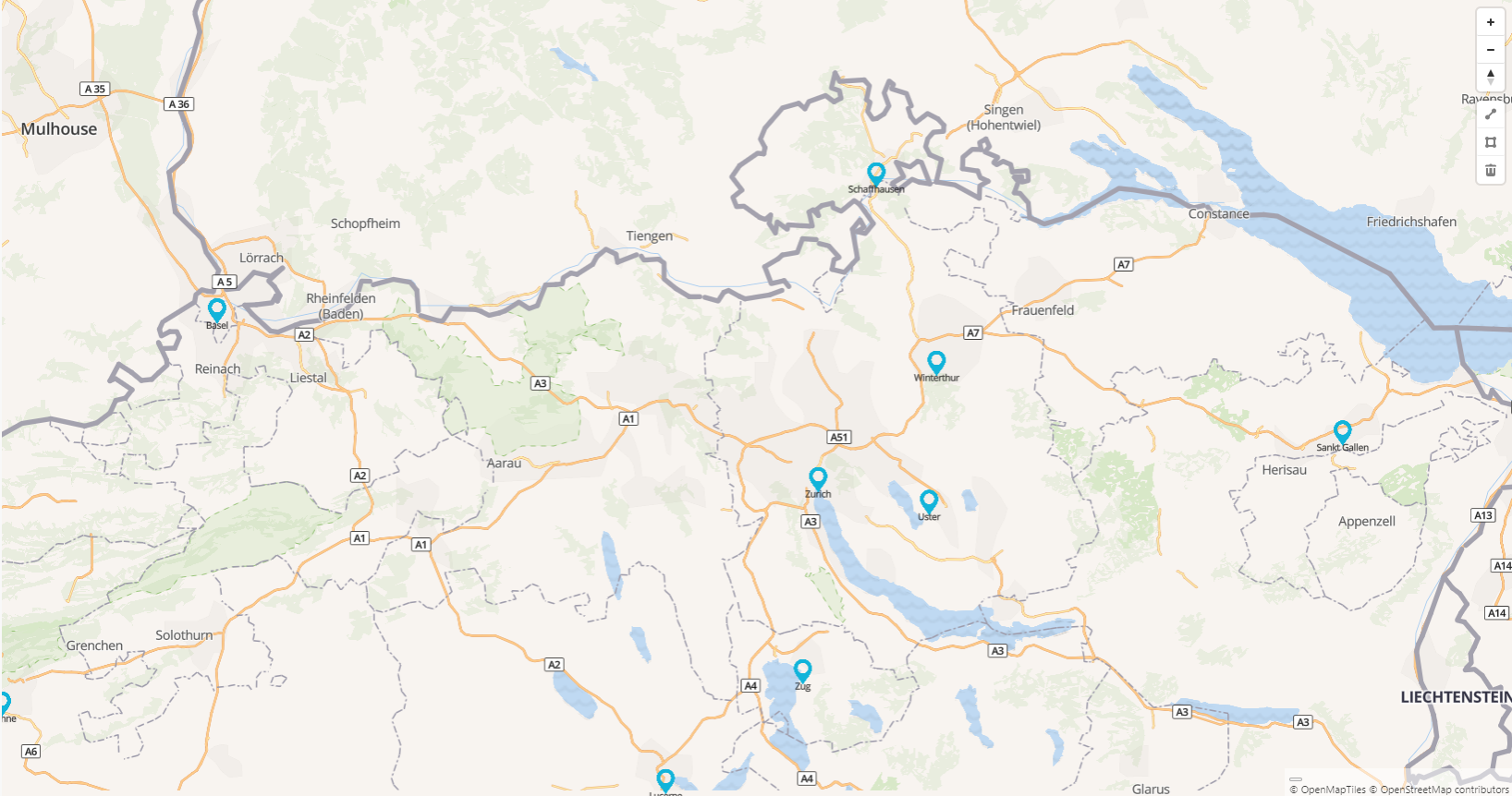
Points#
Through the Points properties you can configure a custom point image at a specific geographic coordinate, with an option to add clustering. The following screenshot shows an Map with clustering.
The Point properties illustrated in the following screenshot are described in the table below.
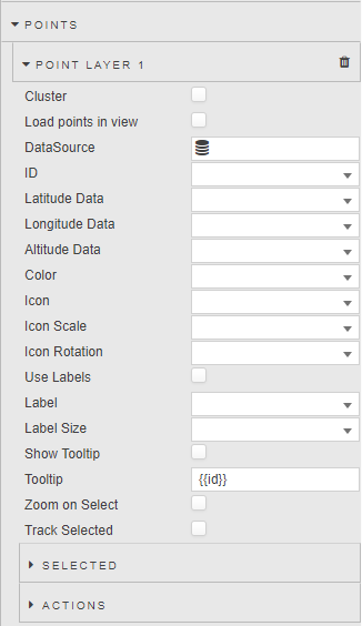
| Property | Description |
|---|---|
| Cluster | When this is checked, grouped individual points are replaced with a numeric cluster icon. Circles outside the cluster remain displayed as individual points. |
| Load points in view | When this is checked, the map zooms and pans to the area of the map that contains points. When unchecked, the default zoom and center point is set. |
| ID | A distinct identifier for a point. |
| Latitude / Longitude Data | The data source columns to be used for latitude and longitude. |
| Altitude Data | This is the data source column to be used for altitude. |
| Color | The color of the map point graphic. |
| Icon | The shape of the map point graphic. A pointer is used by default. |
| Icon Scale | The proportional size of the shape. A value of 1 is used by default. |
| Icon Rotation | This sets the rotation angle of the icon from 0-360. |
| Use Labels | When this is checked, the Map displays a label for each of the points. |
| Label | The label displayed next to each point. |
| Label Size | The label font size. |
| Show Tooltip | When this is checked, it displays a tooltip on points mouse-over. |
| Tooltip | Set the value you want to see for tooltip at mouse-over. |
| Zoom on Select | When this is checked, the map is centred and zoomed in on this point for a selected point click event. |
| Track Selected | When this is checked, you can link/track a selected point on the map. |
Selected#
The Selected properties, relating to the Points you have configured, are shown in the following screenshot and described below.
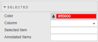
| Property | Description |
|---|---|
| Color | The color of the selected point. |
| Column | The data source column used in the selected row(s). |
| Selected Item | The current selected value. |
| Annotated Items | When annotations are enabled, as described here, you can draw a polygon around a set of circles or points. Once the polygon shape is drawn, the map component captures the corresponding coordinates and selects all point ids that exist within the coordinate range. These are then stored in this Annotated Items view state. You can then use these view state values in other components, for example in a data grid. If you then update the polygon, the values in the grid update. Note: A point is highlighted with the color specified if the Selected Item value equals the value for the specified Column. |
Actions#
Click here to read more about Actions.
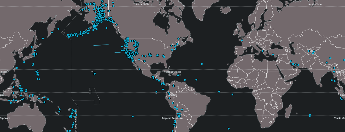
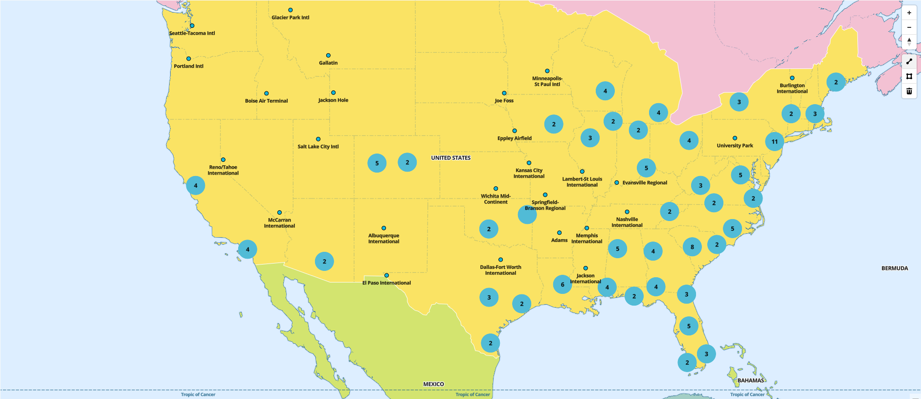
Circles#
You can configure custom circles with clustering as illustrated in the following screenshot.
The Circle properties shown in the following screenshot are described below.
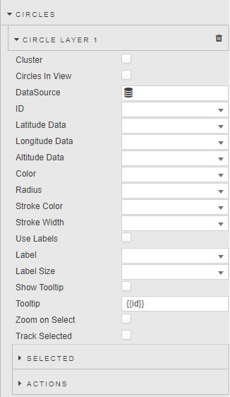
| Property | Description |
|---|---|
| Cluster | When this is checked, grouped individual Circles are replaced with a numeric cluster icon. Circles outside the cluster remain displayed as individual Circles. |
| Circles in View | When this is checked, all circles are zoomed in on and in view when the map is loaded. |
| Data Source | A data source that includes geographic coordinates. |
| ID | A distinct identifier for a circle. |
| Latitude / Longitude Data | The data source columns for latitude and longitude. |
| Altitude Data | The data source column for altitude. |
| Color | The color of the map circle graphic. |
| Radius | The radius of the map circle graphic. |
| Stroke Color | The border color of the map circle graphic. |
| Stroke Width | The border width of the map circle graphic. |
| Use Labels | When this is checked, the circle display a label for each of the circles. |
| Label | The label displayed next to each circle. |
| Label Size | The label font size. |
| Show Tooltip | When this is checked, the circles display a tooltip when on mouseover. |
| Tooltip | Set the value you want to see for tooltip at mouse-over. |
| Zoom on Select | When this is checked, the map is centred and zoomed in on this circle for a selected circle click event. |
| Track Selected | When this is checked, you can link/track a selected circle on the map. |
Selected#
The Selected properties, shown in the following screenshot, are described below.
| Property | Description |
|---|---|
| Color | The color of the selected circle. |
| Column | The Data Source column used in the selected row(s). |
| Selected Item | The current selected value. Note: A circle is highlighted with the Color property specified if the Selected Item value equals the value for the specified Column. |
| Annotated Items | When annotations are enabled, as described here, you can draw a polygon around a set of Circles or Points. Once the polygon shape is drawn, the map component captures the corresponding coordinates and selects all circle ids that exist within the coordinate range. These coordinates are stored in this Annotated Items view state. You can use these view state values in other components, for example in a data grid. When you update the polygon on the map, the values in the grid update. |
Actions#
Click here to read more about Actions.
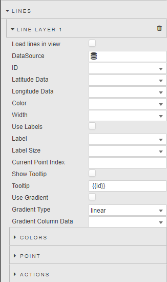
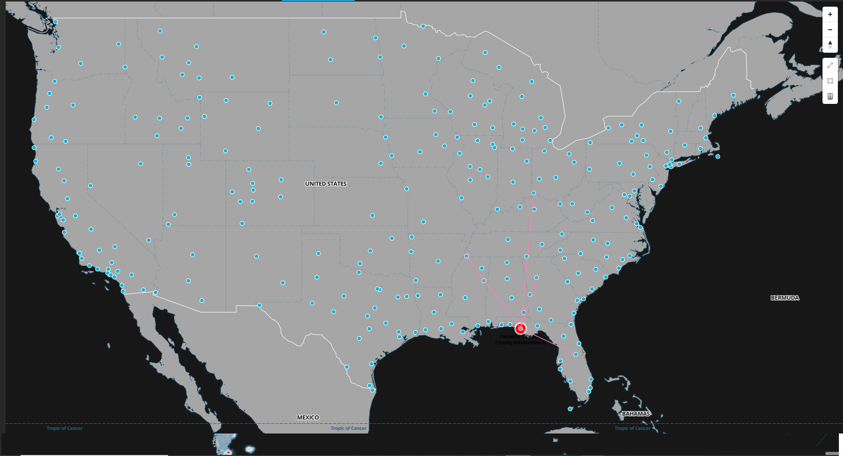
Lines#
The Lines properties enable you to configure lines with customizable styling, as illustrated in the following screenshot.
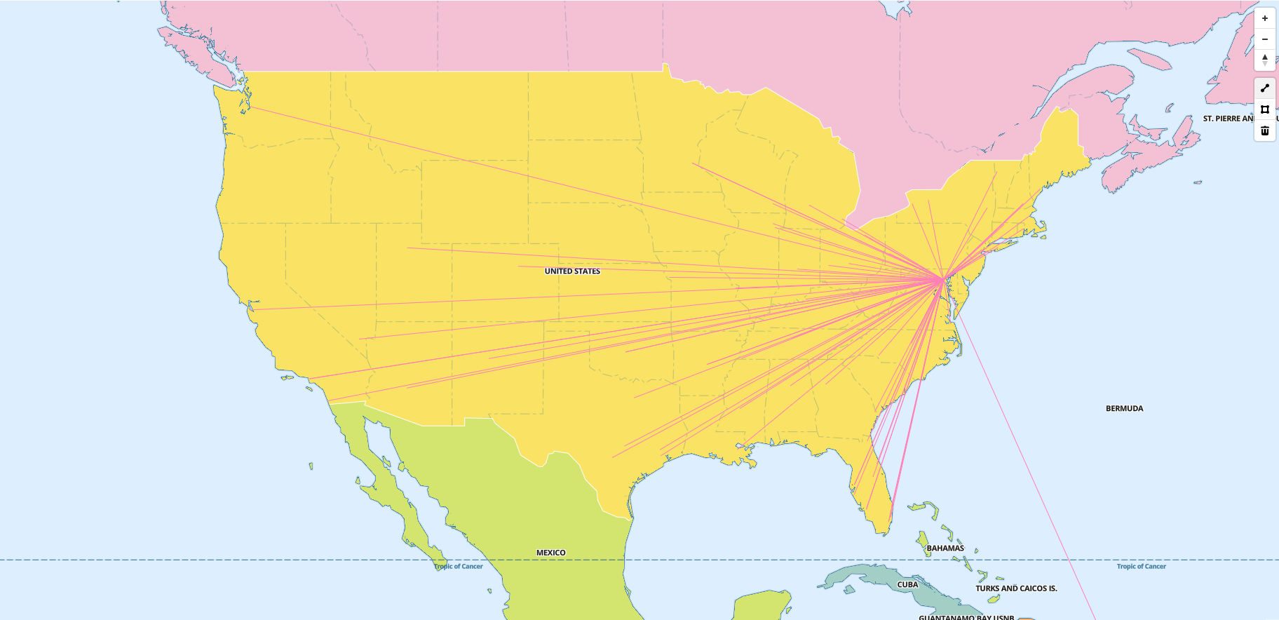
The Lines properties, shown in the following screenshot, are described below.
| Property | Description |
|---|---|
| Load lines in view | Positions the map so that all points are zoomed in and visible when the map is loaded. |
| Data Source | A data source that includes geographic coordinates. |
| ID | Lines are grouped by common IDs. Note: To draw multiple lines from a single data source, simply group each set of lines by the same ID. |
| Latitude / Longitude Data | The data source columns for latitude and longitude. |
| Color | The color of the map line graphic. |
| Width | The width of the map line graphic. |
| Use Labels | When this is checked, each line displays a label. |
| Label | The label displayed next to each line. |
| Label Size | The label font size. |
| Current Point Index | You can set a value or view state with the current point index and this highlights the point on the line. |
| Show Tooltip | When this is checked, the Map displays a tooltip when you mouse over a line. |
| Tooltip | Set the value you want to see on mouse-over from altitude, ID, latitude, or longitude. |
| Use Gradient | When this is checked the color gradient indicator is shown. |
| Gradient Type | Select the gradient type from linear or data driven. A linear gradient provides a consistent color transition based on a fixed scale, while a data-driven gradient adapts to the data, offering a more tailored visualization. |
| Gradient Column Data | This uses color gradients to visually represent data values within a column. |
Concentric Circles#
The Concentric Circles properties enable you to add concentric circles layers to maps, helping you with:
- Visualizing Range: Showing coverage areas, like cell tower range.
- Data Analysis: Segment areas for demographic or environmental studies.
- Navigation: Indicate distances for logistics and emergency planning.
- Comparative Studies: Compare impacts at different distances.
- Interactive Maps: Enhance user engagement with dynamic information.
You can specify a latitude and longitude to set the centre of the first circle at that location. The radius of the first circle can be defined based on a distance from this center point, such as a 50KM radius. Subsequent circles can either be drawn from the edge of the first circle or independently, each with its own specified radius and center point.
The Concentric Circles properties, shown in the following screenshot, are described in the table below.
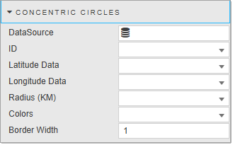
| Property | Description |
|---|---|
| DataSource | Specify the data source for the Concentric Circle. The data source of the concentric circles layer must have the following properties defined: Radius (KM): A list that contains a set of distances (KM). For each distance in the list it draws a circle xKM from the center point. For example ((25 50 100);(50 75)). Here we have 2 items, the first list contains 3 values which draw 3 circles from its center point at 25KM, 50KM and 100KM, the 2nd item in the list draws 2 circles from its center point at 50KM and 75KM Latitude and Longitude: The column coordinates for the central point of the circles. (Latitude Range: -90 to 90),(Longitude Range: -180 to 180). Colors: Colors can be defined for each concentric circle. This is optional. Refer to the note below this table for a sample datasource query. |
| ID | A distinct identifier for each circle. |
| Latitude Data | The data source columns for latitude. |
| Longitude Data | The data source columns for longitude. |
| Altitude Data | The data source column for altitude. |
| Radius (KM) | The radius of the concentric circle graphic. |
| Colors | The color of the concentric circle graphic |
| Border Width | The border width of the concentric circle graphic. |
Sample datasource
q
    ([]
    id:(1 2);
    location:(`Dublin`Cork);
    distance:( (25 50 100);(25 50 75));
    colors:(("#FF0000";"#FFA500";"#00FF00");("#FF0000";"#FFA500";"#00FF00"));
    latitude:( 53.2528 51.8491);
    longitude:(-6.2574 -8.4899)
    )
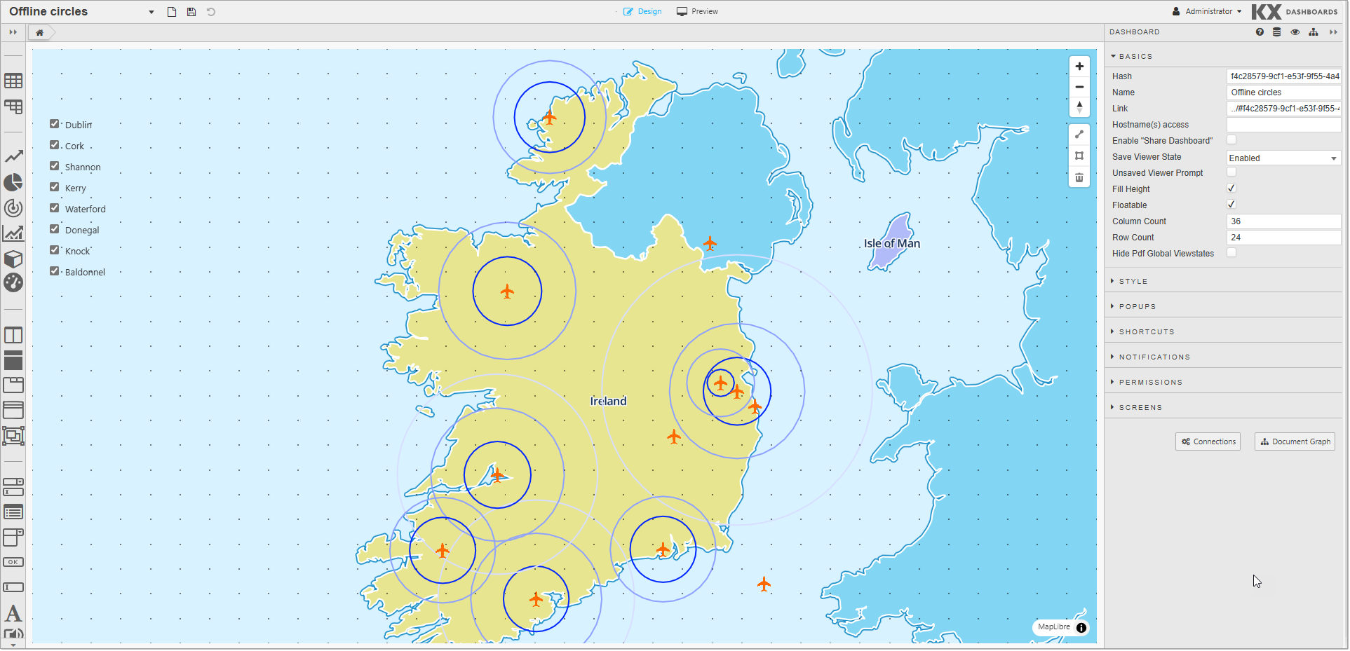
The following example shows concentric circles over Irish airports.
Colors#
These properties set the gradient colors for lines.
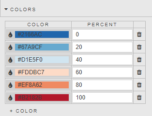
| Property | Description |
|---|---|
| Color | The gradient color stop value. |
| Percentage | The color-stop's position can be explicitly defined by using a percentage. |
Point#
These properties, shown below, set the color and size of a tracked points on Lines.
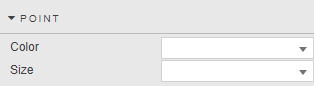
| Property | Description |
|---|---|
| Color | The color of the tracked point on a line. |
| Size | The size of the tracked point on a line. |
Actions#
Click here to read more about Actions.
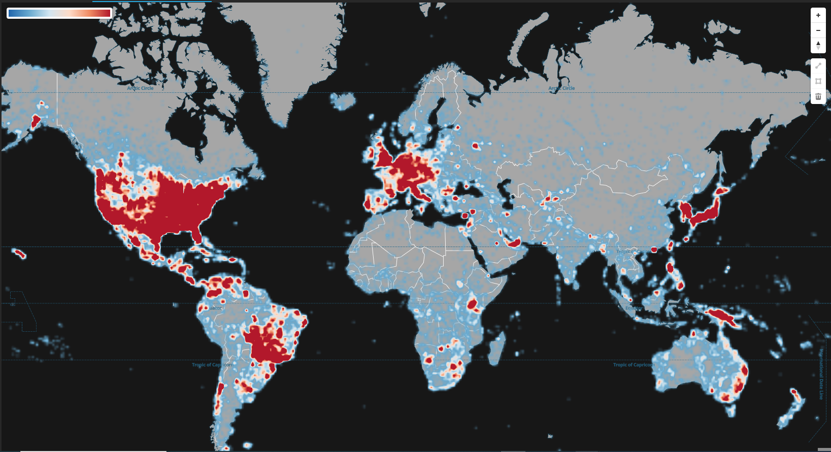
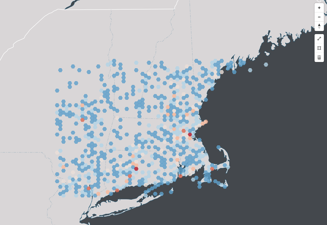
Heatmap#
Heatmaps show the density of points over an area by displaying a continuous gradient between points.
As well as being useful for visualizing point density, heatmaps also help you to visualize relative differences between those points. The following screenshot shows an example of a heatmap.
The Heatmap properties, shown in the following screenshot, are described below.
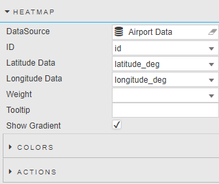
| Property | Description |
|---|---|
| Data Source | A data source that includes geographic coordinates. |
| ID | A distinct identifier for a point. |
| Latitude / Longitude Data | The data source columns for latitude and longitude. |
| Weight | This determines the weight for each individual node. |
| Show Tooltip | When this is checked, a tooltip is displayed when you move the mouse over points on the map. |
| Tooltip | Set the value you want to see for tooltip at mouse-over. |
| Palette Theme | Define the Palette Theme for the Heatmap Colors. |
| Show Gradient | When this is checked the color gradient indicator is shown. |
Colors#
These settings, shown below, specify the gradient colors used in the Heatmap.
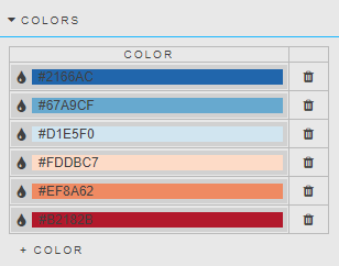
| Property | Description |
|---|---|
| Color | These allow you to set the gradient color from minimum density to maximum density. |
Actions#
Click here to read more about Actions.
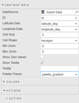
Heatmap Grid#
The Heatmap Grid feature in KX Dashboards allows you to visually represent large datasets using color gradients, making it easier to identify patterns, trends, and outliers. Each grid cell corresponds to a data point, with colors indicating values, enabling you to quickly assess variations across the data. This feature is highly effective for data analysis, providing an intuitive way to interpret complex information at a glance.
| Property | Description | ||||||||||||||
|---|---|---|---|---|---|---|---|---|---|---|---|---|---|---|---|
| Data Source | A data source that includes geographic coordinates. | ||||||||||||||
| ID | A distinct identifier for a point. | ||||||||||||||
| Latitude / Longitude Data | The data source columns for latitude and longitude. | ||||||||||||||
| Grid Size | The length of each cell side (in kilometers). | ||||||||||||||
| Cell Shape | The shape of each cell, either Square or Hexagon. | ||||||||||||||
| Min Zoom / Max Zoom | The Min and Max Zoom levels determine the range in which the heatmap range is displayed. Note on zoom level: A zoom level determines how much of the world is visible on a map. Map component provides maps in 23 zoom levels, with 0 being the lowest zoom level (fully zoomed out) and 22 being the highest (fully zoomed in). Zoom Levels:
|
||||||||||||||
| Show Zero Values | If True shows the color gradient for values that are zero, otherwise the color gradient is transparent. | ||||||||||||||
| Show Tooltip | When this is checked a tooltip is displayed when you move the mouse over points on the map. | ||||||||||||||
| Tooltip | Set the value you want to see for tooltip at mouse-over. | ||||||||||||||
| Palette Theme | Define the Palette Theme for the Heatmap Grid Colors |
Colors#
These settings, shown below, specify the gradient colors used in the Heatmap Grid.
| Property | Description |
|---|---|
| Color | These allow you to set the gradient color from minimum density to maximum density. |
Actions#
Click here to read about Actions..
Bounds#
The Bounds properties shown in the following screenshot are described below.
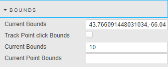
| Property | Description |
|---|---|
| Current Bounds | A bound is defined by its southwest and northeast points in longitude and latitude. If you zoom in or out on the map, the current bound location is saved to this property. This is used to map selected bounds coordinates to a View State Parameter. |
| Track Point click Bounds | When this is checked, you can track the bounds coordinates of a point when clicked. |
| Selected Point Bound Size | This property is used to define a bounds around a point. This allow you to click on a point and draw a rectangle around the point . The width and height of the rectangle is defined by this property. |
| Current Point Bounds | Displays the point bounds coordinates. |
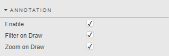
Annotation#
The Annotation properties, shown below, enable you to add annotations to the map using lines or polygon shapes.
| Property | Description | ||
|---|---|---|---|
| Enable | When this is checked, you can annotate on the map, using either lines or polygons. A set of annotation controls are displayed on the left-hand side of the map. Annotation Controls: There are 3 options in the annotation controls.
|
||
| Filter on Draw | This is used when you are drawing a polygon on an area of the map. When this box is checked and when you are finished drawing, all the points/circles inside the area remain and the rest of the points/circles are filtered out. | ||
| Zoon on Draw | This is used when you are using a polygon to draw on an area of the map. When this box is checked the map zooms to the area after you finish drawing. | ||
| Selected Annotation | Specific annotation currently highlighted or selected on the map. |

Drawing a line#
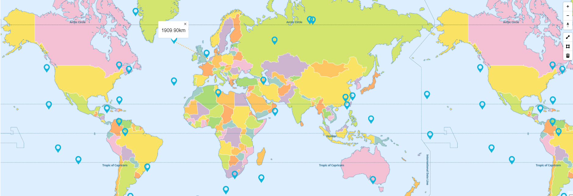
This section describes how to draw a line on a map to calculate the distance between 2 or more spots. Once the line is drawn, the distance (in kilometers) is shown in a popup. An example of this is illustrated in the following screenshot.
To draw a line annotation on an Map:
-
In the annotation control, on the right-hand side of the map, click on the line icon.
-
Select the starting point on the map by using a left or right mouse click.
-
You can click at any other point on the map to connect this line.
-
The line is displayed as a yellow dashed line while editing.
-
Once you are finished editing you can click on the line. This sets the line to blue.
To delete a line from an Map:
- Select the line and click on the trash icon in the annotations properties, on the left-hand side of the map.
Drawing a polygon#
This section describes how to draw a polygon on an Map by selecting a set of points/circles. This is illustrated in the following screenshot.
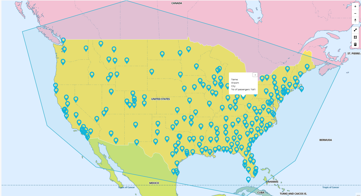
To draw a polygon on an Map:
-
In Preview mode, click on the polygon icon in the annotation controls, on the right-hand side of the map.
-
Click on the map where you want to start the polygon and then click on multiple sections of the map to connect the polygon points.
-
The polygon is displayed as a yellow dashed line while editing.
-
Once you are finished editing, you can click on the line. This sets the polygon to blue.
Note
If Zoom on Draw is checked then the map zooms in on the polygon after the polygon is applied. If Filter on Draw is checked then the map only displays the points/circles inside the polygon shape after the polygon is applied.
To delete a polygon:
- Select the polygon and click on the trash icon in the annotations menu.
Animated Circles#
These properties enable you to configure customized animated circles on your map, as illustrated below.
The Animated Circles properties, shown in the following screenshot, are described below.
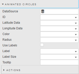
| Property | Description |
|---|---|
| Data Source | A data source that includes geographic coordinates. |
| ID | A distinct identifier for an animated circle. |
| Latitude / Longitude Data | The data source columns for latitude and longitude. |
| Color | The color of the animated circle graphic. |
| Radius | The radius of the animated circle graphic. |
| Use Labels | When this is checked the map displays a label for each of the animated circles. |
| Label | The label displayed next to each animated circle. |
| Label Size | The label font size. |
| Show Tooltip | When this is checked, the map displays a tooltip on animated circle mouseover. |
| Tooltip | Set the value you want to see for tooltip at mouse-over. |
Actions#
Click here to read about Actions..
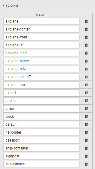
Icons#
These properties present a list of icons that have been added to the css\assets\images folder on the server. These icons, shown in the following screenshot, can be used by the Icon properties in the Points properties.
Night/Day Layer#
These properties enable you to add a layer to determine the region of day and night time based on a current date/time value, as illustrated below.
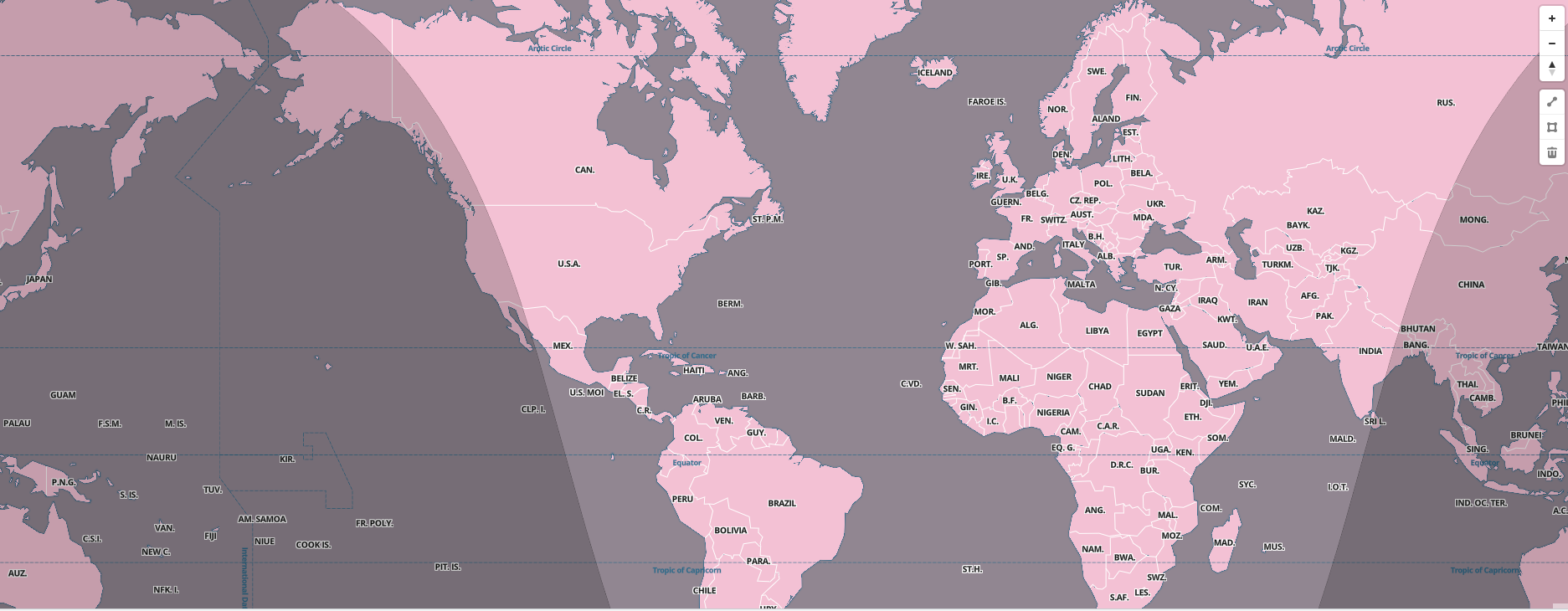
The properties, shown in the following screenshot, are described below.
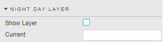
| Property | Description |
|---|---|
| Show Layer | Use this toggle to specify whether the map shows the Night and Day layer. |
| Current | The current date/time value. |
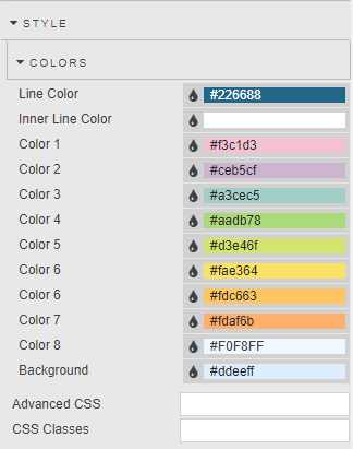
Style#
You can use the Style properties, shown below, to override the default colors used in the map component.
3D Models#
With the 3D Models in map, you can see 3D models when you zoon into the data property, as illustrated in the screenshot below.
You can set the 3D Models properties shown in the following screenshot, as described in the table below.
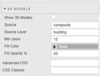
| Property | Description |
|---|---|
| Show 3D Models | Check this box to enable the display of 3D models on the map. |
| Source | This defines the origin of the geographical data, such as a vector tile, raster, or GeoJSON. It provides the data to be visualized in the map layers. By Default, this value is set to Composite. A composite type is a type of source that combines multiple vector tile sources into a single source. This allows for efficient handling of complex maps with multiple datasets by merging layers across sources, which optimizes data loading and performance, especially for high-detail or 3D maps. |
| Source Layer | A source layer specifies a particular layer within a vector tile source. This is necessary when a vector tile source contains multiple layers, each representing different feature types, like roads or buildings. The source layer allows the map style to target and style individual layers within a vector source. |
| Min Zoom | This sets the minimum zoom level at which the 3D models are visible. |
| Fill Color | This option allows you to set the color used to fill the 3D models. |
| Fill Opacity | This controls the transparency of the fill color. |
Tile Server#
Integrating a custom-styled tile server with Maps in KX Dashboards allows you to load and display dynamic, custom-designed map layers. This integration provides full control over the map's appearance, enabling you to apply unique styling and visual elements to geographic data. By leveraging vector tiles from external servers, you can create highly customizable, interactive maps tailored to your specific needs, enhancing the overall data visualization experience in KX Dashboards. The following illustrates a map using custom tile server.
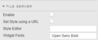
| property | description |
|---|---|
| Enable | When this is checked, interaction to a custom Tile Server is enabled. Note: To see the results after changing this property, the Dashboard must be saved and reloaded. |
| Set Style using a URL | Defines whether to set the style using a URL end point or by using the editor to define JSON. |
| Style URL | Set the style of the map based on a URL end point. |
| Style Editor | Define the JSON style configuration. |
| Widget Fonts | Set the font name to be used by the Map Component, e.g. "Open Sans Bold." This font is stored on the tile server and will be used by point clusters and labels. |
Tile Server Installation#
tileserver-GL provides a self-hosted map tile server for KX dashboards, for use cases where leveraging web-based maps and online map tilers are unavailable to be used in offline use cases and air gapped environments.
Tile Server Documentation
Tile Server Github guide found here https://github.com/maptiler/tileserver-gl
Full documentation can be found here https://tileserver.readthedocs.io/en/latest/
Prerequisites#
-
Latest Version of KX Dashboards 2.2.5 or greater or KX platform build 4.9.2 or greater
-
Node JS 18.17.0 or greater
- https://github.com/maptiler/tileserver-gl
Operating systems
-
Windows (x64) or greater
-
Ubuntu 22.04 or greater
-
macOS 14 (x64/arm64) or greater
Getting Started#
Install from npm, to the directory which you wish to install to.
Choose from one of the following options:
Option 1: Install globally from npmjs
npm install -g tileserver-gl
Option 2: Install locally from source
    git clone https://github.com/maptiler/tileserver-gl.git
    cd tileserver-gl
    npm install
Using tileserver-gl-light
- tileserver-gl-light can be used but is unable to handle any raster functions, if this is required for future use, please install the full version
Map Data#
To render data offline, an mbtiles file is required for the area of interest. While there are many ways to acquire and create mbtiles files, it is recommended that you use the mbtiles files here: https://osm.dbtc.link/mbtiles/
mbtiles Recommendation
- Recommended mbtiles file download - 2024-06-25-planet.mbtiles
- This mbtiles file is for OpenStreetMap Data that was last updated in June 2024. Note as this is a static file, map updates must be obtained by the user.
- KX is not responsible for providing map updates.
Adding Map Data and Styles#
Once the OpenStreetMap (OSM) data is downloaded, this needs to be copied to the same directory as the tileserver-gl install (along with the accompanying config.json file, if present).
The following URL can be used to obtain a set of sample fonts and files for the tile server:
https://github.com/maptiler/tileserver-gl/releases/download/v1.3.0/test_data.zip
From the test_data.zip file, the styles and fonts directories should be copied to the tileserver-gl installation folder.
Tile Server Configuration File
The config.json file in Tile Server GL configures map styles, fonts, and data sources for the server. It helps define how map data is rendered, including the structure of the directories containing styles and fonts. If no config.json is defined for Tile Server GL, the server will use its default settings for rendering map tiles.
The tileserver-gl directory structure should therefore look similar to this:
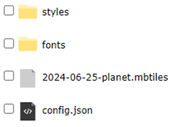
Inside the styles folder, the following styles are provided: osm-bright and klokantech-basic.
Additional styles
Additional styles can be added by following the user guide in the tileserver-gl documentation.
Before you start the tile server#
Tileserver-gl defaults to port 8080, therefore it is important to assign a new port config when starting the tileserver-gl, to target a different port as your KX Install will likely conflict with this port assignment.
It is recommended to use port 8082, which was tested abd working.
For longer term use, it is recommended that the user write a startup script for ease of deployment, KX is not responsible for providing this.
Start up code below:
tileserver-gl 2024-06-25-planet.mbtiles -p 8082
KX Dashboards Tile server Integration#
-
From KX Dashboards, drag the Map component onto the canvas.
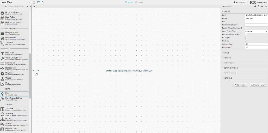
-
In the Tile Server Property section, check Enable.
- The Style can be specified in one of two ways:
Set the style using URL#
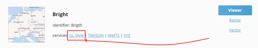
- Check the "Set Style using a URL" option
- Using a browser, navigate to the host and port for the Tile Server. Right click the link for the chosen Style and copy the link to the clipboard.
- Paste the URL into the "Style URL" Property in KX Dashboards
- Save and Reload/Refresh the page.
Set the style using Editor#
- Uncheck Set Style using a URL.
- Using a browser, navigate to the host and port for the Tile Server. Click the link for the chosen Style and copy the contents to the clipboard.
- Paste the contents into the Style Editor property.
- Save and Reload/Refresh the page.
External API#
This Map component can also be used online, if needed, which enables you to set external APIs.
External APIs refer to external services that provide mapping data and functionalities. You can set the following properties.
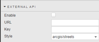
| property | description |
|---|---|
| Enable | When checked, you can use the external API on the map. |
| URL | This is the endpoint of the external API. |
| Key | This is the authentication key required to access the services of the external API. |
| Style | This field allows you to choose the visual representation of the map. |
Layers#
The Layers properties, shown below, enable you to add the following types of layers on to your map.
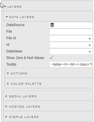
Data Layers#
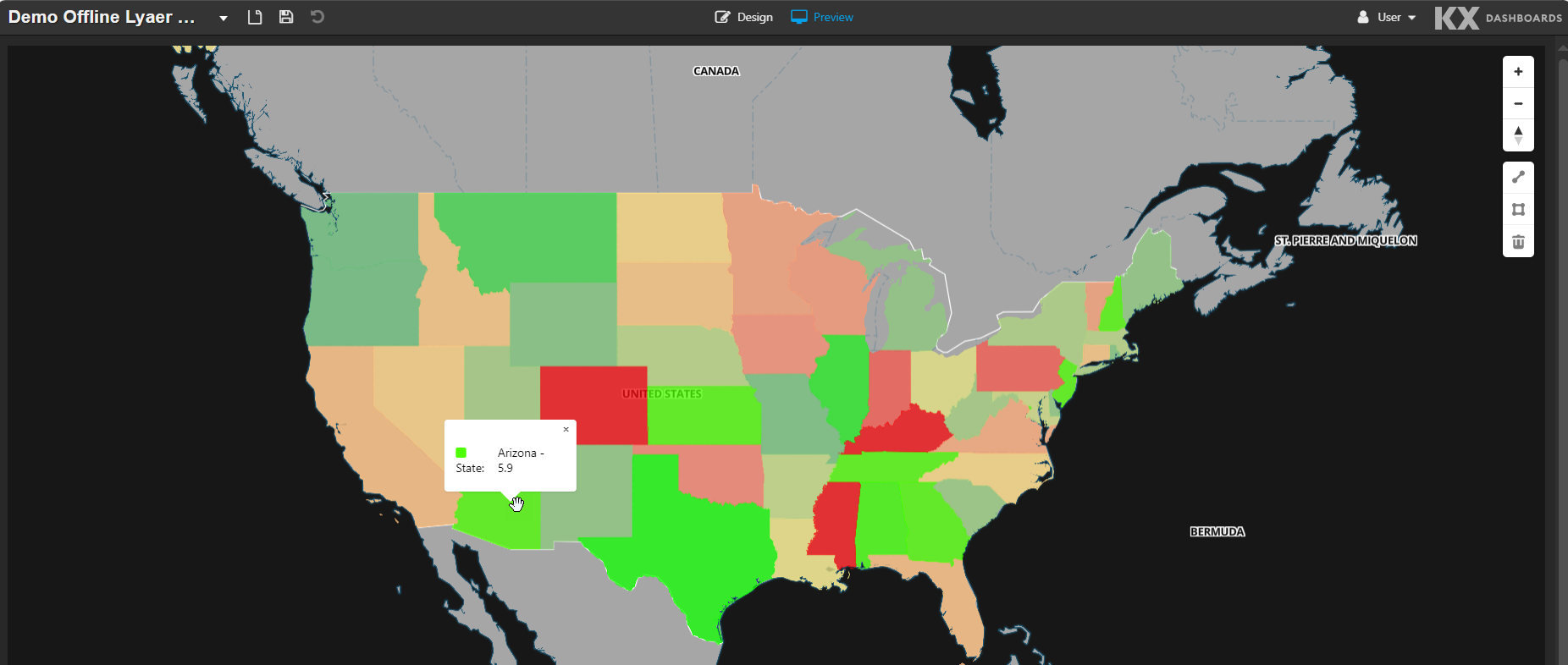
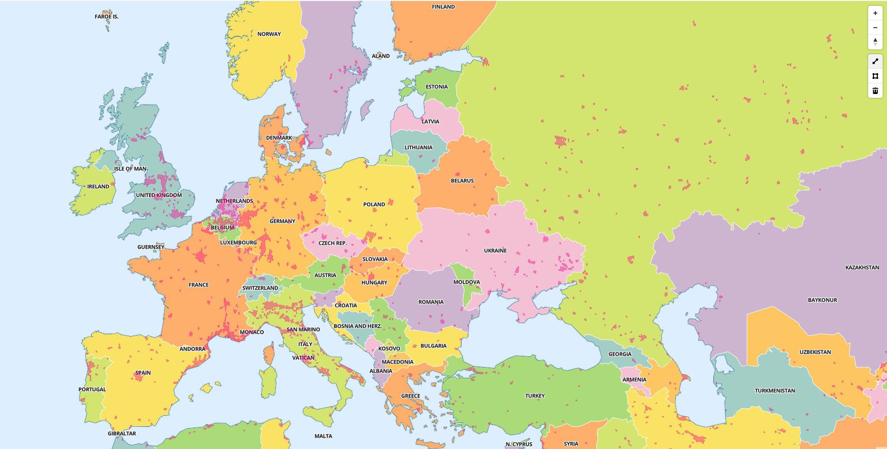
A Data layer combines GeoJSON geometric coordinates with kdb+ data. You can draw regions on the map based on GeoJSON coordinates and then map kdb+ data to each of these regions to create insightful visualizations. This enhances your ability to derive meaningful insights from complex geographic and tabular datasets. The following example shows unemployment rate data across US states. Values are highlighted in color gradient from highest (bright red) to lowest (bright green).
The Data Layers properties, shown in the following screenshot, are described below.
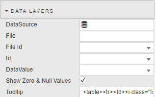
| Property | Description |
|---|---|
| Data Source | A data source that defines the underlying dataset to be used by the Layer. |
| File | Set the file name for the GeoJSON file. Files must be hosted locally in the Map modules directory for example modules\OfflineMap\css\assets\layers. |
| File Id | This is the id used in the GeoJSON file. It is used to link coordinates from the GeoJSON file with the kdb+ Data. |
| Id | This is the ID used in the kdb+ data. It is used to link data with the GeoJSON file coordinates. |
| Data Value | A column from the data source that is used to define the color of each of the regions. |
| Show Zero & Null Values | When this is checked, any region that has a zero or null value is displayed. If unchecked regions with zero or null values are not displayed. |
| Show Tooltip | When checked, it enables the display of a tooltip. |
| Tooltip | This displays a tooltip over each map region. By default we map the color, id and value of the region. |
Media Layers#
A media layer allows you to add a georeferenced video or image on top of a map layer, as illustrated in the following screenshot.
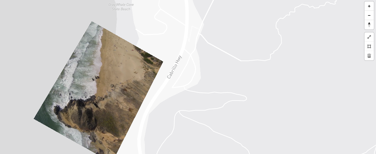
The Media Layer properties, illustrated in the following screenshot are described below.
| Property | Description |
|---|---|
| File | Set the file name. Files must be hosted locally in the Map modules directory for example modules\OfflineMap\css\assets\layers. The file can be either a video or image file. |
| Coordinates | Set the georeferenced coordinates. The media image requires four geographic coordinates (latitude and longitude) that correspond to the four corners of the image. These are specified in an array and represent the top left coner, the top right corner, the bottom right corner, and the bottom left corner. For example: [-122.51596391201019, 37.56238816766053], [-122.51467645168304, 37.56410183312965], [-122.51309394836426, 37.563391708549425], [-122.51423120498657, 37.56161849366671] These coordinates map the raster image to a specific region on the map, basically “stretching” the image to fit the bounding box formed by these points, as seen in the screenshot above. |
| Image | This must be checked if the media file is an image. |
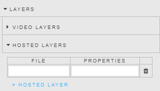
Hosted Layers#
You can add a hosted GeoJSON layer to your maps. Each layer provides rules about how the renderer must draw certain data in the browser and the renderer uses these layers to draw the map on the screen, as illustrated below.

The Hosted Layers properties, shown in the following screenshot, are described below.
| Property | Description |
|---|---|
| File | Set the file name. Files must be hosted locally in the Map modules directory, for example modules\OfflineMap\css\assets\layers. |
| Properties | The properties section defines the colors used by the layer. For example: {"paint": {"fill-color": "#f08","fill-opacity": 0.4.}} |
Simple Layers#
You can add a text based GeoJSON layer to the maps. Each layer provides rules about how the renderer draws certain data in the browser and the renderer uses these layers to draw the map on the screen. An example of a text file converted to GeoJSON is shown below.
The Simple Layers properties, shown in the following screenshot, are described below.
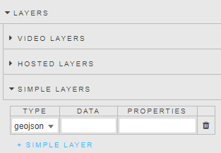
| Property | Description |
|---|---|
| Type | Determine the layer type, which can be either GeoJSON or vector. |
| Data | The data used by the layer (specified in either JSON or GeoJSON format) Example: { "type":"FeatureCollection", "features": [{ "type":"Feature", "properties": { "scalerank":3, "area_sqkm":1002.565, "featureclass":"Urban area" }, "geometry": { "type":"Polygon", "coordinates": [[[-121.37881303595779,38.39168793390614],[-121.37881303595779,38.39168793390614], [-121.37881303595779,38.39168793390614],[-121.42144609259859,38.3858743352733], [-121.48040890184362,38.39168793390614],[-121.51616899298959,38.444811306302185], [-121.58203060594559,38.4678848333205],[-121.5930118478076,38.626428127591964], [-121.46772233771595,38.671102403308296],[-121.39491024461671,38.75068410903778], [-121.31532853888723,38.82349620213702],[-121.23913163947286,38.82349620213702], [-121.19226111538413,38.73701569269657],[-121.13750993537089,38.65836416274834], [-121.19386308478518,38.61312144627681],[-121.26453060594432,38.58219310155013], [-121.32057369676485,38.53666616470099],[-121.37881303595779,38.4933096380081], [-121.37062232143953,38.43667226821621],[-121.37881303595779,38.39168793390614]]] } } }] } |
| Properties | The style properties used by the layer. Example: { "id": "urban-areas-fill", "type": "fill", "source": "urban-areas", "layout": {}, "paint": { "fill-color": "#f08", "fill-opacity": 0.4 } } |
Asset storage
To avoid having to use any external APIs - we store all our assets including glyphs, images, and tiles in the "css\assets\" folder inside the component code.
MapboxGL
The Map component is built using the MapboxGL libraries.
Margins#
Click here to find out more about margins.